Software
Houzz Logo Print
mythreesonsnc_gw

Ceiling coffer question

15 years ago

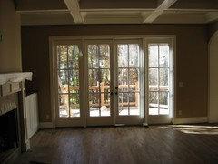
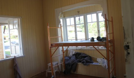
Is it OK for coffers to be different sizes? I have a larger window (48" x 8' tall) going in to a center space, with a 36" door on either side.... Here it is as framed so far....

On my plans, my architect has the coffers equal sizes, which means that the coffer will slightly overlap the center window. When I saw the chalk line on the floor today and visualized this in real life, I panicked! I think the coffer beams should be centered in the framed space between the window / door --- almost as if it were a continuation of that framing. Do you think this is right? This would make the center coffer larger, but I think that is OK, or am I wrong?

Fortunately, this would not be a re-do --- I just saw the chalk line on the floor representing where the beams will go and I can go talk to them in the morning and ask them to shift it, but I am questioning it now?

What do you all think?

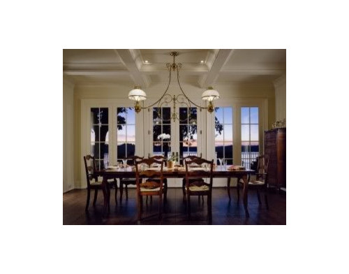
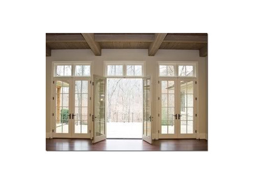
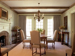
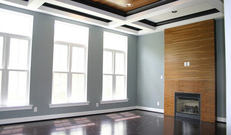
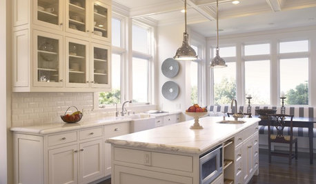
I always visualize coffers like these 2 pics --- and they are both aligned between the window / doors, not partially over one....


or....

Any input would be greatly appreciated!

Comments (12)

  • 15 years ago

    Thank you for the picture --- now I feel much much better about it because yours looks awesome!

    It turns out they had the chalkline snapped, but it won't be built for a long, long time, so I didn't need to be in "crisis mode."

    I like your bump out solution too -- that worked perfectly. Like everything else about your house, I love it!

    Thanks for posting....

  • 15 years ago

    Our center coffer is wider than the side ones. The center coffer is centered on the fireplace and the fireplace is wider than the bookshelves on either side. Now you have me worried that this will look funny!!! The coffers are centered on the french doors, however (the second picture is what I gave my architect to show him what I wanted the doors and transoms to look like, but the coffering will be painted like the first picture.

    The coffers do not line up perfectly with a bar we have across from the french doors. The bar has to go there though and can't be moved either direction, so hopefully it is more important that they are lined up with the french doors than the interior doors (the bar will have narrow double pocket doors).

  • 15 years ago

    Here is a link from our architect's website. Ours is designed similarly to the attached house, with the center coffer wider. Our coffers will look more like Kate's or the first picture though.

    There is another house on his website (the Seigal House) which has coffers that are centered on the room. He has a soffit running around the edge for some reason though.

    Might be worth looking at these to see which you like better.

    Here is a link that might be useful: The Baldwin House

  • 15 years ago

    Thanks for the pictures Athensmom! I think yours will look great because it will line up with the fireplace, and it will highlight the lines of the fireplace. The book, "Traditional Construction Patterns" talks about proportion quite a bit and your fireplace should be wider than the bookshelves on either side to look "visually pleasing!" I always like it when the coffer looks intentional, not just randomly spaced. Kateskouros' room looks amazing because the window frames the coffers and it is set within the window. The issue with mine is that if I make them equal, then it will be part over the window, part not over the window, so it might visually look like a mistake, vs. intentionally aligned.

    I know I have some other pictures of coffers lining up with the fireplace, but I can't find them right now.... I'll keep looking.

    Thanks again for the links / pics!

  • 15 years ago

    mythreesonsnc - Our coffers are unequally spaced in one direction because of the fireplace & I think it looks fine. (This was one of our "issues". It's not the way we would have done it, but we doubt many folks will see it. At least, it no longer has that horrid "jog".)

    In the other direction they are equal. The center one should have spanned the middle doors, but I changed the doors w/o changing the coffer spacing. I don't think is it very noticeable.

    HTH - Jo Ann

  • 15 years ago

    Hi,
    Here's my generic "uneven coffer" ceiling layout.
    {{gwi:1475441}}
    It was built thus to hide wall-washer lighting, which otherwise would have been in the middle of ceiling panels, as is, they are right alongside the inner edge of the small panels, and invisible most of the time.

    Casey

  • 15 years ago

    casey ...it looks like there is a polar bear hiding under your table. just thought you should know!

    athensmomof3: i don't think there's any chance your ceiling would ever look "funny"! every room really is different so you should work within the parameters of the space. so often i find a pic i love and try to almost copy it. until i realize it just doesn't work that way. so i let go and instead of trying to copy, i might implement one or two things i liked best. it sounds corny, but if we honor the individual space it always turns out better than expected. and really, your architect does gorgeous work. definitely trust him to work it out. i can't wait to see your house!

  • 15 years ago

    These pictures are so helpful.... thank you all! I am realizing Kateskouros is right... it all depends on the space. I love all of these coffers and now think we can can make the coffers fit the windows. I'm also wondering if we should maybe think of an entirely different ceiling solution --- like an X shaped coffer, or maybe rustic beams (the mantel will be an old beam), or maybe coffers in one direction only (3 big rectangular boxes, vs. 9). I have a picture which I have always liked with rustic beams in a dining room. Do you think this could look dated though?

    Thanks again for all of the help, Rachel

  • 15 years ago

    Beautiful coffer pictures everyone!

    Rachel-
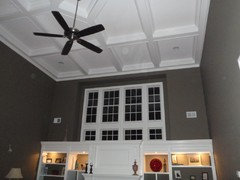
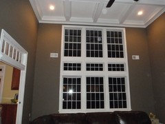
    I wanted our coffers to be symmetrical & wanted them to be within the frame of the windows on both the front and back wall.
    The trim guy suggested putting a square in the center of the room & work out from there.
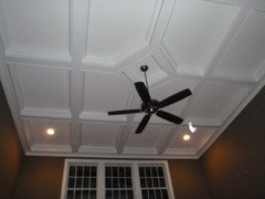
    Below are some pictures of our solution.
    I think it turned out great. It was actually a misunderstanding that the square got turned on an angle and now the "center diamond" is my favorite part & one of the 1st things people comment on when they come in the room.
    :)

    GL in your decision & I can't wait to see pictures!

    Front Wall:

    Back Wall:

    Center "Diamond":

  • 15 years ago

    that looks beautiful crescent! i don't think i've seen this room before. why are you holding back on us??!

  • 15 years ago

    I have a picture which I have always liked with rustic beams in a dining room. Do you think this could look dated though?

    I wouldn't put rustic beams in the DR if they are the only rustic beams in the house. We have cedar beams inside and out. None in the DR, although I have thought about adding them. Dated? Not in our home, as it's a new "old" house.

    Our kitchen ceiling has a coffer ceiling that is evenly spaced. There is a large support (structural) beam between the kitchen and the breakfast area. The breakfast area coffer spaces are smaller than over the kitchen, but they are even within the area. Consistency is the key - whether they are evenly spaced or not (as in sombreuil_mongrel's) although personal preference places a key role.

    Here is a link that might be useful: my kitchen