Software
Houzz Logo Print
dprae

Floor plan advice, Alberta build ver 2

12 years ago
Hello,

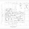
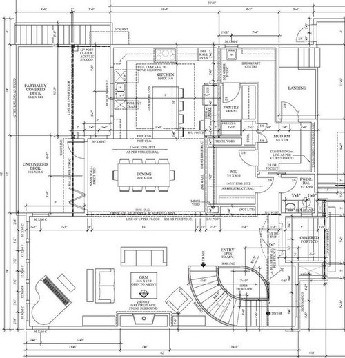
Thanks for the help so far in planning our home! After a couple of months, we have another set of plans for review there on gardenweb. The advice we've received has be invaluable. Please let me know what you think of the latest revision!

The full res pictures are here: http://imgur.com/a/cKLxy#7oC1IuU

Notes:

1. We are 2 adults, 2 children
2. We like the 2 story great room concept, and are aware of the drawbacks / benefits
3. Thick hatched lines are immovable beams, and the black dots in the basement are posts (which made the basement configuration difficult)
4. View is out the back of the house (left on the screen), which is west facing. Neighbors to the north and south.
5. The small office located off the master is optimal for the type of work I do (I get called in all hours of the night where I have to review info on the computer, clients never visit my house), rather than on the main floor.
6. The basement - we decided to close off the playroom as a type of "away space," and the games room left open (no walls on the west or south), but with decorative beams to delineate the space because of where the posts and beams have to be.

Specific questions:

1. Are there better WIC and mudroom door configurations that would work better on the main floor?
2. Is there a better way to arrange the kitchen triangle? We're thinking of swapping the fridge and oven, and putting a prep sink on the northwest corner of the island.

Comments (9)

  • 12 years ago
  • 12 years ago
  • 12 years ago

    The first thing I notice is the super tiny garage for such a large house. The single bay is nice and wide, but will be difficult to access since you need to drive right in front of the entry. The double bay is only 20' wide - you'll be bumping car doors and walls. You really need 12' of width per vehicle. And with vehicles such as SUVs, trucks, minivans, you need 24' of depth if you have any hopes of opening you hatch with the garage door closed.

  • 12 years ago

    For the size of the house I think your kitchen will feel cramped. You won't be able to open the refrigerator when someone is seated at that end of the island (and if you swap ovens and ref as you mentioned, you run some risks taking things out of the ovens if someone is seated there.) And the breakfast center might feel like a bit of no man's land over in the corner.

    I'd rather see the entrance from the back hall area to the kitchen moved down so it's next to the WIC. That will give you more protected space in the kitchen so you won't have a walkway past an oven or the refrigerator. The WIC should only need one door (you'll get more hanging/shelf space that way.)

    If you can rework that whole rectangle-shaped area (kitchen / pantry / breakfast center) into a large kitchen space, maybe with a pantry in the upper right corner, I think it will feel more spacious. I'd post on the kitchens forum - some of those folks are great with layouts.

    Looks like it will be lovely. Love the curved staircase.

  • 12 years ago

    Love the great room, it will be beautiful. I do agree about the kitchen feeling cramped, especially on the side with the stools. Have you considered combining the breakfast area and pantry, walking through from the mudroom along the wall by the wic and pushing back the wall with the refrigerator to give more space at the breakfast bar?

    Where in Alberta are you building? We are building a home in Calgary right now.

  • 12 years ago

    Couldn't agree more about the island seating and a narrow space behind w any appliance. I had that in our last house and it made me hate my kitchen w a passion.

  • 12 years ago

    Thanks for all of your advice. We're building in Red Deer.

    Our garage is tight, but our lot size is maximized. I'll check if we can squeeze more width. It looks like we'd ideally want 24' for the double, and absolute minimum of 21'.

    Our original version of the kitchen had the configuration as attached (pantry entrance further south). But our biggest problem was the refrigerator - we wouldn't be able to have the double doors open. So the idea was to move it to the north wall, and have the contiguous space out to the right / east to facilitate doors. That would also help with the triangle (I posed this dilemma to the kitchen forums).

    I masking taped out the kitchen in the basement and you're right, the kitchen is surprisingly on the small side... To make matters worse, our selected fridge is 3' depth whereas it's drawn as 2' !!

    In terms of solutions, which one(s) would you prefer? (using the drawing of from the first post of this thread)

    A: Increase the sitting side of the island / desk by 1' (total 5' width)
    B: Increase island width by 1' (total 5' width) allowing a prep sink on the northwest corner
    C: All extra width is bumped out to the west keeping the mudroom area the same. The exterior elevation on the west will be less interesting as a result.
    D: Place the fridge on the north wall, but then we'll have to move the entire kitchen south 1' - the island will be 7' long instead of 8', and we'll probably take one stool out from the side
    E: Just get a 2' fridge (eg SubZero) and call it a day :)
    F: Other?

  • 12 years ago

    Get rid of tbe breakfast area entirely. It's wasted square footage that will never get used as there is no traffic path to make anyone want to use it. Add it to the dining area if you want it to be useful. Or just leave it off. That whole area of storage is a nightmare maze of poorly designed and wasted space. If you have a size restricted lot, you can't afford such poor design. Sorry, but tbe whole house has the same symptoms. Poor flow, wasted spaces, awkward and poorly laid out rooms. I'd really recommend starting over entirely with a different architect. One that cooks and drives a normal sized automobile and has had a 3 year old needing to go to the bathroom ASAP from every room in the house at one time or another. Normal every day tasks in this home are made much more difficult by this design, not easier. That's a fail.

  • 12 years ago

    I think other people have hit the big stuff: The kitchen is too cramped to allow for the island seating, especially.

    What is the breakfast center concept?

    You'll want to get the dishwasher out of that corner. When it's open, you can't reach the upper cabinets to put away dishes. It'll be a constant aggravation.

    The kitchen island is too close to the dining room table -- it looks fine now, but when someone's seated at the table, he or she will block access to the kitchen.

    I wouldn't have two doors into the same closet -- I'd rather have that space for shelves or at least hooks.

    Because the picture is awfully busy with lines, I'm not sure, but I think the entrance seems awfully crowded. That is, you'll walk in . . . and you're already at the staircase.