Software
Houzz Logo Print
woodas

What color should I paint my porch?

13 years ago
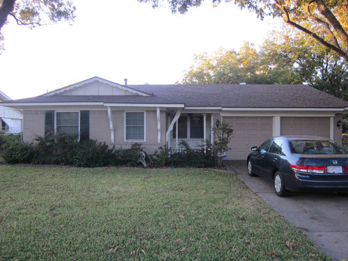
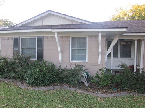
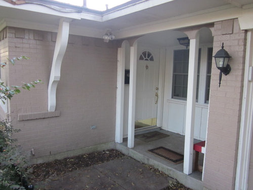
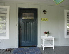
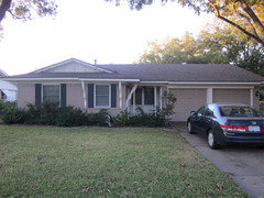
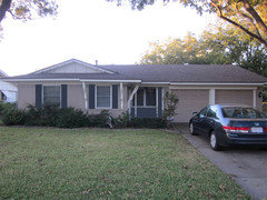
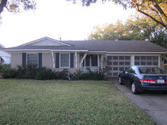
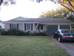
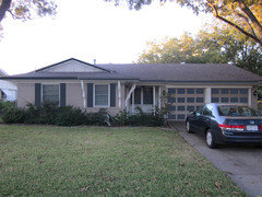
We're repairing and painting trim, doors, and shutters (basically all the white and black areas in the photos). The taupe/beige/slightly-pink color of the bricks and garage doors will remain. We're thinking a shade of mid to deep blue for the front door and probably some shade of off-white for the trim.

Since the front door isn't very visible from the street, should we accent the recessed porch area and maybe add a bit more color? How would you paint this house?

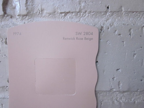
I grabbed a punch of paint chips at Sherwin Williams. The closest match to the existing paint (which will remain) is SW2804 You can see it's too pink.

Comments (27)

  • 13 years ago
    So my original question sounds pretty vague. Let me try to be more specific.

    Assuming the taupe brick and garage doors stay the same color:
    1. Do you think a blue door would look good? What shade?
    2. Would you paint the porch area something other than white?
    3. What would you do with the shutters, butresses, and columns on the porch?
  • PRO
    13 years ago
    Kelly Moore Spanish Sand would look great on the porch
  • 13 years ago
    last modified: 13 years ago
    This is a ranch with some Swiss Chalet detailing. Quite nicely done actually.

    You could go with the Mid-century vibe and paint the little squares along the roofline a charcoal grey, perhpas tending toward a slight blue cast, and the inside of the dormer, the front entry a lighter cleaner grey, and inside the panels of the garage doors (Perhaps just a line second down from top) a combination, darker on the outer rim and lighter in the center.

    Then the pop of blue could be nice.on the door, or black. And I would keep the trim bright white so there is enough contrast with the other colors. Not a huge fan of fake shutters, but I think it would look better to add black ones to the bare window, or take the others off.

    It will be a little tricky to get just the right colors--need to be light/dark enough to contrast. Too much blue in the gray can make it look baby room. TRy painting some posterboard with samples and see if the colors work together.

    I think it could look terrific--just enough to bring a little life to the front. Putting some cross pieces on the poles could add to the effect, perhaps in the charcoal or black if very thin. Best in-between or tacked behind neatly (lath)

    A tile red (sort of a red/brown) could substitute for the charcoal grey, and then no blue.

    A Japanese Maple would be a nice touch to complement the colors in the front yard.
  • 13 years ago
    Wow...you're totally right about the Swiss chalet + ranch mash-up! I never thought about it that way. I really like your color ideas but I'm hesitant to go the midcentury route (in terms of painting the brick squares and garage door panels). Maybe, though...I'll play with it in photoshop to see what I think.

    We actually did have a rusty Japanese Maple on the left side of the house, but it died in last year's Texas drought :(
  • 13 years ago
    I would remove the brackets and the plants by the door. Enlarge the walkway from the driveway to the doorway. Either have trim around your front windows or shutters on both windows.
    From the front it doesn't seem you can really see the door from the street but assume from the driveway you can. The colour suggestion thus far are all great ideas
  • 13 years ago
    Oh and remove the inner post of the porch, beef up the ends if need be and add one long matt to fit the space.
  • 13 years ago
    A staggered stone walkway would be nice. http://houzz.com/photos/18950 this pic is much too modern but I think it shows nicely a stone staggered walkway.
  • 13 years ago
    I hope you post what you do in Photoshop. I don't have time to do it myself.

    Do not strip those brackets and such. Sure they are not everyone's taste, but this is a cool subset of ranch and this one is nicely proportioned, unlike some that are kind of hodge-podge. Somebody thought this one through..

    If I was to quibble, it would be the porch pillars, but the little blocks on top convince me it was original. I would even think of painting them charcoal with the gray background to unify it.

    I suggested the squares to be just one row so it wont be too much work, and it will not be too out there because the colors are very soft and related. This is a traditional paint treatment that goes back to Colonial times and really brings out the dimensional quality of a paneled door. Often people don't notice because the effect is subtle, not POW in your face, although that is an option too.

    The old garage illustration is for giggles and for people who are not faint of heart!
  • 13 years ago
    I like black and gray
  • 13 years ago
    Adding the shutters and trim paint on the garage looks great, I would suggest trying an all together different color on the porch to draw people to the front door. Maybe yellow and then the front door a darker shade of the gray. When you get a chance working with the landscaping should also make a differecnce. Take out the shrubs in front of the porch and replace with all low growing plants or shurbs so you will also know where the front door is located. Or a stone path from the front porch curving into to the drive would give a great new look.
  • 13 years ago
    OR BM HALE NAVY!
  • 13 years ago
    I like back instead navy with the pink undertones that you described.
  • 13 years ago
    What do you all think about painting the battens white like I showed in the last photos? Also, what about painting the gable ends grey...or should I leave them white?
  • 13 years ago
    I would not paint the battens white, as it would add nothing.

    Leave the gable ends white.

    Add shutters to the bare window.

    I would paint the porch and trim the shrubs.

    The house is too small to be so "choppy"
  • 13 years ago
    I would not paint the battens but do like the idea of the gables gray.
  • 13 years ago
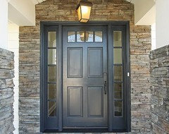
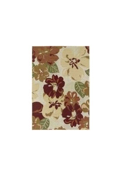
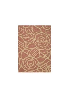
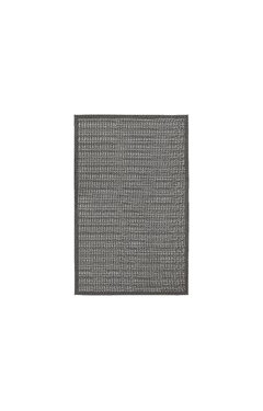
    I like the second one with the painted squares and the grooves not picked out. Add a black door (including the door window framing) and a white frame and paint the tops of the pillars white. And I would add a big outdoor rug (they go on sale regularly on One Kings Lane) rather than a bunch of little mats with some harmonizing colors, maybe even with a dash of other colors that won't be that visable from the street but will liven things up close.

    Looking at it, I think maybe the porch windows frames and all should be the same gray. That way it will simplify the porch, and then you can put a pot of flowers or a nice white wicker chair or something there to set it off. Perhaps try taping some strips up first to see if you like that.

    I think the color harmony is nice and subtle and not choppy, but harmonizes the best of what you have. It is a little different from what people are used to, but this sort of thing was fairly common back when they were built.

    By the way is that red and white thing a bench? If so it should be white or maybe black. Then put some pillows on it to make it look inviting and a pot stand in front of the window with something that doesn't need a lot of light and is hard to kill, or a little tea table--something to draw the eye there, I like the undulating brick border, but would pul low ground cover or maybe some flagstones directly in front of the door so the view isn't blocked.

    Too bad, I have the perfect little 50s garden table that doesn't fit my house! I hope you post pics when you are finished!

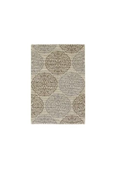
    These flat woven outdoor rugs from Wayfair.com are about $100 for a 4 x 6. The grey one has a pinch of turquoise, which might be nice.
  • 13 years ago
    Thanks for the thoughts on the porch furnishings. I like th idea of a large rug.

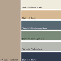
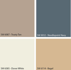
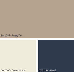
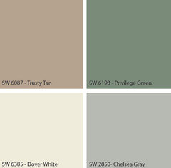
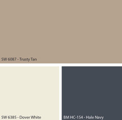
    We went to the Sherwin Williams store yesterday and I took a sample of the brick paint and found a good match (Trusty Tan...most boring paint name ever?). I then found other colors that work well with it. Here they are, along with a few potential combinations.

    I like the Benjamin Moore Hale Navy suggestion, too...I'll play around with it.
  • 13 years ago
    Here is the Hale Navy. We might have a winner!

    What do you think about the Hale Navy for shutters, door, and an accent wall on the porch (the wall with the window that faces the street)? We could leave the side walls on the porch white, that way the space doesn't feel so small.
  • 13 years ago
    That would be my choice!
  • 13 years ago
    I like it too--maybe for the door? I like the Needlepoint Blue and the Priveledge Green (now that's a weird name).too, Don't like Bagel much with the tan except with the green.

    The trusty tan looks so much lighter and rosier in the picture, but it is hard to predict just what paint colors will look like. The Chelsa Gray is probably pretty close to what you did in Photoshop, and that looks pretty dull too, but good in the image.

    I think their online paint program is pretty good to image colors on your house--works pretty much like Photoshop to make and load in the masks, but has limited capacity on how many masks to make. Seems to adjust for shadows and whatnot quite well.
  • 13 years ago
    The thought at this point (suggested by the SW salesman) is to paint the shutters (including the additional pair) as well as the porch area all the same color. I did a mock-up in photoshop as well as the SW online paint program and the Hale Navy looks completely grey with just a faint blue tint. I guess I need to buy some samples and paint some cardboard.
  • 13 years ago
    Here are a few color "layout" ideas. Any thoughts? I really wanted a way to emphasize the porch area, but I don't think doing so looks all that good.
  • 13 years ago
    And a couple more ideas...
  • 13 years ago
    I like the blue porch the best. I don't think emphazing squares in a garage door is attractive, too busy. You want your attention at the front door. I would dress up the porch with a bench, or chair if you have room, pillows and flowers and put a potted plant in between the garage doors. Take down the shrubs in front of the porch and add flowers. Like the new shutters on all the windows. Did you try blue porch with blue garage doors and a beige front door?
  • 13 years ago
    The squares do not work because there is too much contrast. Picking stronger color and higher contrast will make it look more "choppy" and harder to balance, and it will look somewhat different in real life, so it is hard to make a final decision.

    I guess I'm biased, but I liked the lower contrast scheme with the squares you did before and you could do the lighter grey with Navy shutters and door instead of black. Plus if you paint the front door to match the alcove, it will all blend together--do you plan on keeping it white?.

    My second favorite is the one that is close to what you have already, perhaps with the darker facia, but not on the dormer.

    My third favorite is the one with the Navy entrance (with the window frame painted out perhaps--too many interfering lines) but I would paint the dormer to match the brick in that one--looks like it is floating up there, and the paint will bring out the scalloped trim and visually "glue" it to the rest of the house and help balance out the heaviness of the entry, but would maybe be a little busy.

    Like the dark garages one too--seems balanced-- but wonder if there is too much emphasis on garage and not enough on entry.

    Well, whatever you pick, I think you are on the right track with the colors and placement.