Software
Houzz Logo Print
mysterypoodle

Help finding a backsplash?

13 years ago
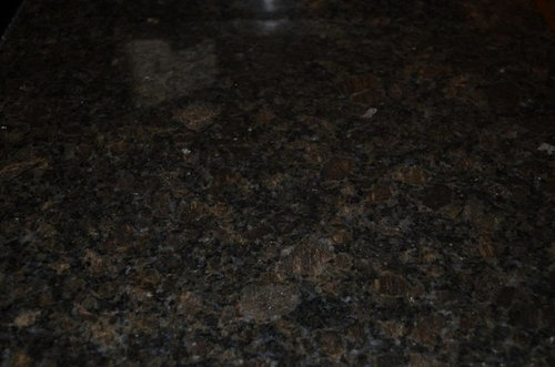
We started our house 16 years ago and it is still largely unfinished, so now we are changing things . Dh said,"before I put trim in the kitchen, do you maybe want to switch to stone countertops?" Silly question. So we swapped out our dark blue Corian for Coffee Brown granite , which we absolutely fell in love with within minutes of seeing it, a first for us!

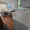
The assumption, then, was we'd find a backsplash tile. Problem is, we can't find anything we like! It's a simple kitchen, L-shape with a large island but the only space for the backsplash tile is on the L between refrigerator and corner and then corner and stacked double oven. It's not much real estate.

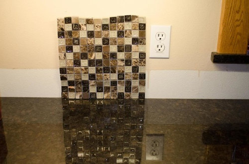
So far, we tried Joe Ventura Glass Tile - Tranquil Glass Tile 1" X 1" - Chocolate Blend. It turns out to actually have a lot of pepto-bismol pink in it, and I also just didn't like the sort of bisque coolness of it.

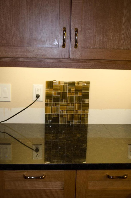
The one that looked better is Bellavita Glass Tile - Vivo Glass Tile Mixed Mosaic 1" x 1", X 2" x 2" - Sassy Cinnamon but it seems like it would be VERY shiny. Also, it's a bit modern and tends to lead one toward brown-ness which really doesn't fit the rest of the open room. (Sorry about the sticky fingerprint on the cupboard door! :sigh:


I have no idea whether I'm making any sense here or not and I'm sure that lack of coherence is part of our problem!

Anyway, we would *greatly* appreciate any suggestions. Dh seems to like the idea of something a little larger, maybe a 2x2 or 3x2 but neither of us can seem to find tiles we'd like to mix and match along those lines...

THANK YOU!

Comments (34)

  • 13 years ago

    It would help to see a full pic of the space to get an idea of the natural and artifical light. Also, if these are the only two choices; could you put them next to each other under the cab?

  • 13 years ago

    Jeffrey Court Tiles. I like the idea of Fire and Ice for your BS. The sunwashed mini brick looks like it has brown and tan tones. Since your counter can read almost solid, a multi toned BS would be the star of your kitchen.
    Jeffrey court has many other beautiful tiles as well.

  • 13 years ago

    As you said the first has the pink, but the second doesn't flatter the reddish tones of your cabinets. What's on the floor? We really do need to see a photo of the whole space. A cool gray would look nice and enhance your cabinet color. There's some gray in the granite. What colors are in your home? We need more info.

  • 13 years ago

    you're on the right track but maybe try a few others. The granite is beautiful with your cabinets.

  • 13 years ago

    Thank you all so much for your replies! The colors I like are clear and tend to be more blue than yellow (dh is colorblind and so gives me free rein!) The kitchen is part of a great room with dining table and sitting area all with the same oak floor. The sitting area has dark blue leather furniture and the walls are Sherwin Williams Interactive Cream, which you can see above where the old backsplash used to be. The area rugs in the sittng area and under the table are aa short confetti shag, oatmal but with specks of green, burgundy, blue and gold in it to make it look darker.

    I'm sure many won't like the white appliances, but they are there until attrition takes them. At that time, I'd consider black but I'm afraid my mum was frightened by stainless before I was born or something as I just dislike it intensely. ;-p

    Neither of the two samples I posted are contenders -- we don't like them. If someone wants to try one of them, let me know and I can send them your way. I have seen so many great samples here from others' suggestions... and they are nailed to the wall...

  • 13 years ago

    Elendi, I like the brick pattern in the slate fire and ice by Jeffrey Court very much! Thank you! Dense O'Brien has posted extensive installation pictures on a Pinterest board and I am sure she has a presence here on GW but I haven't figured out how to reference them all. Oh, I DO like them!

    On one of the other threads, someone posted tiles from Stone Tile Depot and I also kind of like the California Gold Tumbled Slate 2x2

    Thank you!

    --Kristi

    Here is a link that might be useful: D. O'Brien's pictures in Pinterest

    This post was edited by mysterypoodle on Sun, Jan 27, 13 at 21:52

  • 13 years ago

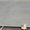
    I saw this in a tile store yesterday, seems like it might have the colors you like, plus it looks mission style, like your cabinets. Sorry the picture is so blurry.

  • 13 years ago

    Lovely kitchen - where have you been hiding!
    I would love to see what the JC fire and ice looks like in that gorgeous kitchen.

    I thought it might work for mine - but alas - not a match, so hope you are successful.

  • 13 years ago

    You could incorporate some of your blue with your browns in a mosaic tile.

  • 13 years ago

    EAM44, those are nice! Any idea who makes them? I have a tortoiseshell from Lowes but it had too much yellow in it.

    Meek95 -- would love to see blurry picture :hint hint: ;-)

    There are retailers for the Jeffrey Court two hours west and two hours east with no regular weekend hours, so it may take me a bit to get my hands on that tile to try. I'll post back once that happens, though.

    THANK YOU!!!! And thanks for all the kind words about the kitchen. Like the rest of the house, very much an EXTENDED work in progress?

    Um, what is the ABB club?

    --Kristi

  • 13 years ago

    "I'm afraid my mum was frightened by stainless before I was born or something as I just dislike it intensely"
    LOL !!

    abb-all but backsplash

    I'm posting a thread that shows this shape of that backsplash--not the color though.The colors EAM44 would look nice with your color cabinets.

    Here is a link that might be useful: diff color but same shape backsplash

  • 13 years ago

    EAM44, both of those tiles are lovely. There are too many warm tones in the adjecent area, and your yellow for the cool gray to work I had suggested. The cabinets are also more golden than reddish so the second mosaic would work too. Those tiles also bring in the warm tones in your home but they might be expensive.

    Look at honey onyx and china gold slate mosaics. The china gold below is from American Olean. They both should work well in your space but the slate also will bring in your counter color.

  • 13 years ago

    This is also china gold slate. Some have some blue in them too. I think this would be gorgeous in your home. So pretty and warm looking.

    For some reasons the board is enlarging my photos.

  • 13 years ago

    I love the soft colors Blondelle has posted. They don't steal as much attention from your granite and the QS oak as the darker/busier tiles. They will play nice with your white appliances too.

    This post was edited by may_flowers on Mon, Jan 28, 13 at 12:46

  • 13 years ago

    Ok, I'll try to upload the photo again. It shows up on the preview screen but if it doesn't work, I'll email it to you.

  • 13 years ago

    Here's a mock-up of the china gold slate. You would need to use an enhancing sealer to bring up the gold tones. I also added a see through shade and darkened the ceiling. Is it a tray ceiling? It's a bit stark in the white. Let me know what you think!

  • 13 years ago

    That is on the right track Bondelle!

  • 13 years ago

    Thanks Ellendi. I hope the OP at least gets to see it. It's so frustrating to spend all that time in Photoshop trying to help and then the OP goes missing. It happens in all too many threads when so many people try to help. I think a lot of OP's don't really want help, but only post here to have their own choices validated. Oh well! No more PS for me!

  • 13 years ago

    That is an awesome PS job! I have that same backsplash but in the african gold (much darker) but bebated between those two. Not sure if I'd seen it with PS that my mind wouldn't have changed. It was a tough call at any rate and being able to see it like that is so helpful!

    I hope the op does come back, pictures are worth a 1,000 words. There are quite a few of you that are so helpful and generous with your time and mad ps skills. :)

    I hopped on here to show mine in the darker african gold in case that is helpful at all:

  • 13 years ago

    Thanks, Autumn. Your kitchen is lovely. I like that slate as much as the china gold with your cabinets. I woud have a hard time choosing. It really works well and I love your floor choice too. Did you enhance the tile with a sealer? Maybe that ceiling color would work for her too instead of the gray as she has golden tones elsewhere. It really would have helped her to see these two kitchens.

    There are just so many hit and runs here. So much help is offered with lots never seen or commented on by the OP, and then they are never heard from again and we never get to see the choices made. There's no sense in my spending my time to help if I'm only going to be aggravated by doing so.

  • 13 years ago

    Even if the OP never comes back, it helps other people, blondelle. I don't have a backsplash yet and this helps me visualize what might work with my natural cherry. Thank you!

    What does enhancing do for tile?

  • 13 years ago

    I know it has to be frustrating blondelle but I am with may_flowers too. I have learned and SEEN a ton sifting through all of these threads!

    Thank you for the kind comments on our kitchen. We did a face lift 2 years ago and are going to be selling hopefully next year. It was downright dreadful before. I was only a lurker here at that point but did a ton of research and reading on here on various topics and so far happy with all of the choices we made (okay not loving the paint choice but at least that is the cheapest correction). The backsplash was tough though. One drew itself to the counter and the other more toward the cabinets. Very hard to choose with a 6x6 sample.

    I didn't enhance. I was told it would look similar to what it does when wet so we wet a fair amount with a sponge and I thought it had enough 'pop' without. I think that pic is misleading as far as ceiling color. They are white.

    Mayflowers-some tile places have displays of the sample tiles that are with and without enhancement. It was just another step and we liked it well enough without so we skipped it. Not a hard process but we had just installed the floor tile and the backsplash was next. We were ready to be done! :)

  • 13 years ago

    Mayflowers, most natural stone is porous and an enhancer brings out all the color in the stone and it permanently looks as though you wet it with water. On most beige stones like travertine and slate it goes darker and more golden in color. On some it can go too murky and brownish. All porous stones go darker. Some stones look better unenhanced. It depends on what look you want.

    I guess I didn't consider how many other people see it too and maybe seeing their cabinet color with the slate helps their choice also. Backsplashes look so much different in a large area than the small sample you take home. That makes me feel much better knowing my work might have helped others besides the OP. Thanks :-).

  • 13 years ago

    blondelle, I'm so sorry not to have replied sooner. Not missing, just having some technical difficulties. My deepest apologies for not being able to check in sooner.

    I really, really appreciate your Photoshop work! It is amazing. I want to get dh to take a look at all the suggestions -- despite the color-blindness, he's great with pattern and contrast (plus, he's gotta live with it!) I probably will try to get 1' samples of many of these and replace our current samples with them just to see how they work in different light, etc.

    Mayflower, your cabinet color does look very similar to mine, and, frankly, I like the African Gold and the China Gold, both! If I'm looking at the right Honey Onyx, that one doesn't do nearly as much for me.

    It's probably going to take me a bit to collect these since many aren't available locally (which is GREAT because that means I haven't already sorted past them for some reason as I KNOW I've seen everything in the stores here 5 or 6 times!). I mail-ordered the samples I have, so that's a possibility, but I'm afraid I can't make any kind of move until I see these "in place."

    So I probably won't be out of the ABB club any time soon BUT I think I can hopefully make that happen by spring. I PROMISE that I will post back if we have further decision problems. I do want to say thank you again (because I was absolutely at wit's end, feeling like we had NO options), and when we finally choose something, I will let you know and (please, God!) post finished pictures.

    And then I need to think about the idea that the ceiling (yes it is a 2-sided tray with indirect lighting) is stark... dh is the ceiling-crazy guy (if my Mum was scared by stainless, his was frightened by a flat ceiling...) but, again, he's not the color expert!

    THANK YOU!!!!

    --Kristi

  • 13 years ago

    Thanks for the explanation about enhancing stone tile. I've come across that term a few times and never knew what it meant.

    My sister did a subway tile in slate with white cabinets, black granite, beadboard ceiling, and hardwood floors. She wanted a touch of natural stone against the painted cabinets. It came out really nice.

  • 13 years ago

    Don't forget that if the glass tile is too strong, you can break it up and use just as an accent with a more solid ground. We did that at gf's house and I think her BS is lovely...

  • 13 years ago

    No idea who makes them. Glass tile Oasis sells them for $29/sf. I picked these mosaics to give you an idea of how nice the combo of blue/brown/cream can be, but there are lots of ways to get a similar look in a less expensive mosaic. Let us know your budget and we can all be more helpful.

    I think the look of small stone tiles is a little dated and not terribly attractive for your space. It has the appearance of a brick wall that should have been painted over during the reno. There's something about the contemporary, crisp lines of the cabinets and counter that screams out for the precise, rectilinearity of glass. But I'm sure whatever you pick it will be lovely, like all your choices thus far.

    Here is a link that might be useful: Glass

  • 13 years ago

    We are partial to glass, also, but also like the idea of a mix of textures and reflectability (is that a word?) if it doesn't get too cluttered. The all-glass sample we had was just too reflective and seemed so contemporary.

    Budget... that's the nice thing. This is SUCH a small area -- it is less than 20 square feet. Obviously, one may need to buy more tile than that but I haven't met any tiles yet that would put this over $750 and that's not bad at all -- I'd go higher for something we loved! dh will install, so that helps a lot, too, of course. At my current rate, the most $$ will be in buying samples! I just can't "see" it when they are the tiny 4x6 pieces or on a board that is too big to put between cabinet and counter.

    Since the space is so small, we're not big on the idea of doing a "neutral tiles with accent" pattern. I think those are lovely when there is space above the range to accent, for example, but I really think it would just clutter up our small space.

  • 13 years ago

    Duplicate post, sorry!

    This post was edited by mysterypoodle on Wed, Jan 30, 13 at 20:54

  • 13 years ago

    Here's another option with a bit different look in Quartzite. The link below is for American Olean slate mosaics. They also have glass mosaics. They will also send you samples.

    Here is a link that might be useful: Slate mosaics

  • 13 years ago

    may_flowers I would love to see your sisters kitchen....have any pics? ;) We hope to start building next year and are leaning toward which cabs (stained island) but still love slate/natural stone. Anyhow - if she is willing or you have a pic that would be awesome. If not - no worries. I thought it never hurts to ask.

    Annie-I like that little bit of accent in there, very pretty.

  • 13 years ago

    blondelle, that is funny -- we had the American Olean slate tiles at home, were thinking about a diamond 4" accent pattern in a larger tile. Decided we'd look a little harder for something with some glass, but it was close!

  • 13 years ago

    Glass tiles come in glossy or frosted/matte finishes, so you could actually choose a non-reflective glass if you prefer that look.

    If budget is not an issue, you might want to look at something really special from Artistic Tile. I love this foliage tile in glass, and the colors would be lovely in your space.

    They also have stone mosaics you might like, like Celestial Starry Blue below that combines Azul Cielo and other marbles, or a mixed sized modular mosaic.


    Here is a link that might be useful: Artistic

  • 13 years ago

    Thanks, EAM44! I love the "leaves"! I'll spend some time on that site this weekend, for sure!