

Needs a new color
13 years ago
last modified: 13 years ago




Featured Answer
Sort by:Oldest
Comments (21)
 13 years ago
 13 years ago
Related Professionals
Woodward Interior Designers & Decorators · Harrisonburg Interior Designers & Decorators · Mission Viejo Interior Designers & Decorators · Santa Maria Interior Designers & Decorators · Lake Charles Architects & Building Designers · Ardmore Architects & Building Designers · Lufkin Architects & Building Designers · Norfolk Architects & Building Designers · Rochester Architects & Building Designers · Pittsburgh Architects & Building Designers · Wilmington Kitchen & Bathroom Designers · McAlester Kitchen & Bathroom Designers · New Braunfels Kitchen & Bathroom Designers · Dodge City Kitchen & Bathroom Designers · Carson City Kitchen & Bathroom Designers PRO13 years ago
- 13 years ago
- PRO13 years ago
- 13 years ago
- PRO13 years ago
- 13 years agolast modified: 13 years ago
- 13 years ago
 PRO13 years ago
 13 years ago
 PRO13 years ago
- 13 years ago
 13 years agolast modified: 13 years ago
 13 years ago
- 13 years ago
- PRO13 years ago
- PRO13 years ago
- PRO13 years ago
- PRO13 years ago
Related Stories
MAN SPACESWhy Men Really Do Need a Cave
Don't dismiss cars, bars and the kegerator — a man space of some kind is important for emotional well-being at home
Full Story
REMODELING GUIDESGet What You Need From the House You Have
6 ways to rethink your house and get that extra living space you need now
Full Story
HOUSEKEEPINGWhen You Need Real Housekeeping Help
Which is scarier, Lifetime's 'Devious Maids' show or that area behind the toilet? If the toilet wins, you'll need these tips
Full Story
WORKING WITH PROSWorking With Pros: When You Just Need a Little Design Guidance
Save money with a design consultation for the big picture or specific details
Full Story
ORGANIZINGGet the Organizing Help You Need (Finally!)
Imagine having your closet whipped into shape by someone else. That’s the power of working with a pro
Full Story
MOST POPULARHow Much Room Do You Need for a Kitchen Island?
Installing an island can enhance your kitchen in many ways, and with good planning, even smaller kitchens can benefit
Full Story
WORKING WITH AN ARCHITECTWho Needs 3D Design? 5 Reasons You Do
Whether you're remodeling or building new, 3D renderings can help you save money and get exactly what you want on your home project
Full Story
LIFEDecluttering — How to Get the Help You Need
Don't worry if you can't shed stuff and organize alone; help is at your disposal
Full Story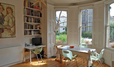
MOVING10 Rooms That Show You Don’t Need to Move to Get More Space
Daydreaming about moving or expanding but not sure if it’s practical right now? Consider these alternatives
Full Story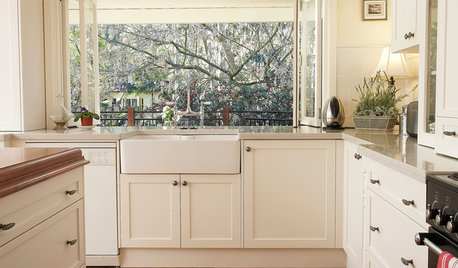
KITCHEN SINKSEverything You Need to Know About Farmhouse Sinks
They’re charming, homey, durable, elegant, functional and nostalgic. Those are just a few of the reasons they’re so popular
Full Story


GARY FINLEY