Software
Houzz Logo Print
mrcubbage

which entertainment unit

17 years ago
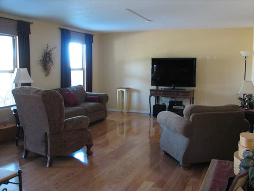
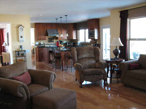
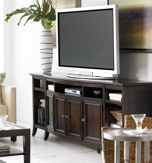
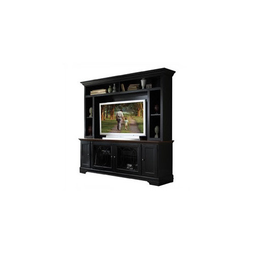
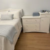
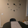
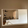
I hope you all can help me with deciding on entertainment furniture for our new tv. I read all of your help to others and really value the knowledge and opinions here. That said I can't really move any of the furniture around as that is the only place the tv doesn't have a terrible glare and the furniture placement really works for us. I am currently looking for a rug to bring some color into the room. So which of the two entertainment units do you think work the best. Ceilings are only 8' high. I am attaching pictures of the room and kitchen which attaches to this room and the two ideas I have for tv units.

option #1

option #2

Comments (42)

  • 17 years ago

    #1, then wall mount the TV above it. It's a more versatile piece and could be used for other things if you move, etc. I think the second one would just dominate your space; especially with the 8 ft. celings. Lovely room.

  • 17 years ago

    #2. It makes the unit look like furniture. I, for one, do not care for TVs that are mounted on the wall....and putting it above your chair-railing would make it too high and you would always have to look up....bad on the neck~~

  • 17 years ago

    I prefer number 1. It seems to balance more with the room.

  • 17 years ago

    Thanks for the replies I really appreciate it. the opinions are split just like my family.

  • 17 years ago

    DH and I both just voted for #2. The room is lovely, but the carpet/rug will make it sing.

  • 17 years ago

    I could be the tie-breaker! I vote for #2, as the weight of the piece would visually balance the kitchen cabinets. I would maybe use the same finish as the end table.

  • 17 years ago

    Here's a vote for #1 - very tasteful and versatile. The second one looks very common, ala "Pottery Barn" to me.

  • 17 years ago

    I vote for #1. I like the stain color and the style.

  • 17 years ago

    #1... definitely #1.

    And I would wall mount it.
    (I don't see the 'chair-railing' phoggie mentions....)

  • 17 years ago

    I like number 1 better than 2, but it doesn't have closed storage. For me that would matter since components attract dust and I hate to have to clean them. Number 2 is pretty, but I think it might swallow up the room. I think if you could find a lower cabinet with closed storage and an upper with open storage for decorative items, it might give you storage, function and a place for decorative items. Let us know what you decide.

  • 17 years ago

    Wow you guys are great and thanks again for the replies. I love the opinions and really value the reasoning from everyone. I will let you know what I decide but it will probably be next week before I finally decide since I am meeting with a custom cabinetmaker on Friday.

    If I get #1 I can either go with the finish shown or one lighter closer to my kitchen cabinet color. If I go with #2 I can pick what finish I want.

  • 17 years ago

    I like the height of #2. And it would "balance" the kitchen hood on the opposite side of your rooms. If that makes sense?

    #1 reminds me of a credenza, or an office piece of furniture. So while I like it, I just don't see it as "tv room" furniture.

    I really like your room. It's beautiful. You really have great taste, so whatever you do choose, it's gonna look good. :o)

  • 17 years ago

    #1 gets my vote. The finish is really pretty.

    Our TV console is configured similarly. The TV is not wall mounted and we were able hide all the wires pretty well. There are BOSE speakers that are placed behind the TV and behind the plate. We choose not to wall mount because it is more comfortable to view the TV lower.

  • 17 years ago

    Definitely #2...it's looks cozy. #1 is too modern for my taste, but, if you like modern it would be a great option.

  • 17 years ago

    #2, I like the shelving to display other things. I think the space needs something to fill the wall.

  • 17 years ago

    You guys are great. It seems pretty well split as to what people think.

    I like #2, less modern and I think we need a little balance to the kitchen. DH likes #1, he thinks the other will be too overpowering and while I am pretty traditional or transitional he likes more modern elements. This is so hard.

  • 17 years ago

    I like #2 best; I think it will fill your wallspace nicely. And I can't wait to see the rug you choose to enhance your already beautiful room :-)

  • 17 years ago

    Neither!

    Wall mount it, that is why we have flat panels :)

    Use other architectural elements to be the focal point in the room - fireplace, large tapestry, artwork, etc.

  • 17 years ago

    #2 looks more casual traditional and seems to match the pieces you already have.

  • 17 years ago

    Thanks again everyone I will let you all know my final decision and probably be back for advice on rugs.

  • 17 years ago

    I think that end of the room will look better with the weight of #2. I like # 1, but something about the different style and height of all the different legs together is distracting to me. I even like the black finish especially if your new rug has some black in it and it also looks as though your kitchen counters may be black(ish). BTY, your kitchen is lovely.

  • 17 years ago

    Very pretty rooms! I normally lean traditional but I really like the lines of #1. It's kind of different and I think it's not going to look as overpowering in the room. I like the color finish of the one shown also. #2 looks like TV cabinet which is exactly what it is I guess. #1 looks more versatile while still the perfect table for nearly any size flat screen.

  • 17 years ago

    Thanks for the comments on the kitchen that was our labor of love a few summers ago. My design and almost total DIY, I love it. It does have dark brown and black counters and bronze black finish on the lights and stools, that was why I was thinking of bringing the black into the family room.

    I am thinking to help with my decision I will have DH help me mock something up out of cardboard the size of the black unit to see if it feels too big and heavy and maybe that will help. I am so confused.

  • 17 years ago

    I love the looks of both. We have a unit similar to #1 in our basement family room and a unit like #2 in our main floor family room. I'd probably lean towards #1. Your room isn't excessively large and the larger unit will definitely take up space, physically & visually.

    Here's some thoughts:

    #1 - the style matches that in your room well, i.e. the gentle curve of the legs and the front match the rounded curves of stuffed chairs and end table. It has nice storage for DVD player. It won't dominate the room. Note that the picture for #1 shows artwork on the wall behind the TV--if you don't have artwork, it will look a little more stark. The smaller size of this unit makes it more mobile therefore easier to paint around. It will accommodate any TV size. Has a contemporary look with traditional styling.

    #2 - will anchor the room; however the style (squared/blocked) doesn't match your furnishings as well. Will a DVD player go in the cubbies above? That's where ours is located, so if you use the remote, you have to sit up & reach high up to get the signal to connect well. The larger unit is fun to decorate at Christmas (lights above); however difficult to access outlets behind, difficult to move for painting and difficult to maneuver wiring when new purchases are made. As TV's get larger you'll be confined to a limited space. Ours has doors which can close off the TV area; however we can no longer use them. The TV barely fits inside the opening and the doors hit the side of the TV if we try to move them.

    Good luck with your decision. They're both beautiful pieces.

  • 17 years ago

    #1 definitely #1. I think your rooms have so much weight already, that more weight isn't going to balance it, it's just going to add, well, more weight! I like the idea of having a little more space to breathe.

    Have fun!

  • 17 years ago

    More to think about I love this site, so many helpful people.

    Answers to last questions. In the base of #2 are glass doors which is where all of the components would go, DH says that would be fine in regards to signal and use.

    If I go with #1 I will put some art on the wall and probably some type of floating shelves or something of that sort on that wall too on either side of the tv most likely. DH really likes this idea.

  • 17 years ago

    Here are a couple of crude attempts at photoshop to get an idea.

    I couldn't find a straight on picture of #2 so I used the wall unit in the same collection of #1 which I never considered but maybe I need to.

    {{!gwi}}

    {{!gwi}}

    Not sure if the scale is right but it seems close.

  • 17 years ago

    I still like the BIG one. :o)

  • 17 years ago

    My favorite is the tall one in your first mockup over your original two. I like how it fills the space and it has nice lines.

  • 17 years ago

    One step closer in making a decision, soon.

  • 17 years ago

    #2 has my vote. The 1st one looks too contemporary.

    I think you need some height and weight down at the end of that room.
    Of course, I'm partial to the enclosed unit because we bought one similar to it. And we're so happy we did that rather than just sit the TV on a console base.

    One feature I like about ours is that it has side doors that can close and conceal the TV or open and slide into the side of the unit. AND the added bonus is that we can leave the doors open without sliding them in to hide them and we have a way to block the glare from the window.

  • 17 years ago

    cubby the photoshop one is what I was trying to describe. Here is a photo of the one I am replicating to a point. Mine will not have the doors and mine will stand directly on the base cabinet. The side and upper cubbies and trim will be the same. Mine will be white and the beadboard in the back of the upper will be painted the same color as my wall.

  • 17 years ago

    Brutuses, that is beautiful. I totally understand now what you were saying. thanks

  • 17 years ago

    Well I finally made a decision to go with something very much like #2 in the original post. I am having it made so it won"t be exactly like it but kind of a combo of the two pieces. I will post a picture when it is done probably a month or so.

    Thanks again for all the help and opinions from everyone.

  • 17 years ago

    Can't wait to see it.

  • 17 years ago

    oooh, brutuses, that is nice! I want to see YOURS when it is done. :o)
    Congrat's, Cubby, on making a decision. I can't wait to see how yours turns out.

  • 17 years ago

    #1...that said, I am NOT into the BIG entertainment centers.

  • 17 years ago

    Great job with the photoshop! Both are nice, but I prefer the height of #2.

    brutuses - I have that same exact photo saved as an example of the entertainment unit I'd like to have made for my living room. Are you having yours custom made also? I haven't even begun to get quotes yet.

    I'd love to see a photo of yours when it's done. It sounds like the changes you've made will be perfect!

  • 17 years ago

    I don't have any advice, sorry! I just wanted to say that I want your island and wondered if you had any specifics on it.

    Thanks
    Alicia

  • 17 years ago

    Alicia,

    not sure what specifics you needed, but it is 8' long and 39" wide with drawers on the side facing the window and on the end without the stools and a bookshelf unit on the refrigerator side. Here is the link to my kitchen album with some other pictures of the island. Anything else just ask.

    Here is a link that might be useful: kitchen album

  • 17 years ago

    Hey! I want #1 for ME! Seriously. Where could I find it?

    I do agree that the bigger one would probably balance your space better, but #1 is far more appealing to me visually.

  • 17 years ago

    #1 is Hudson Street Entertainment Console made by Stanley furniture. Here is the link to where I found it but then I went to some local stores and found a deal on it.

    Here is a link that might be useful: link to site

Sponsored
The Creative Kitchen Company
Average rating: 5 out of 5 stars51 Reviews
Columbus Area Kitchen Remodeling and Refacing Professional