Software
Houzz Logo Print
ellenj_gw

need your suggestions for outside paint colors

20 years ago

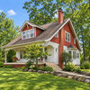
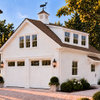
I'm trying to spruce up the outside of my new aquired 50's split level (yes..I know, not a favorite style of lots of you, but I love it). It is currently a bland taupe from top to bottom. We are keeping the taupe siding color, but want to repaint the bottom stucco part. My next door neighbor has the same color top part, but his bottom is a dark slate grey so I don't want to be the same. Suggestions for bottom, trim and front and garage door? Its a wooded neighborhood.

Comments (25)

  • 20 years ago
  • 20 years ago

    here are your pictures.
    {{!gwi}}

    {{!gwi}}

    I hate making color recommendations based on snapshots, because I know how often the color doesn't come out true.
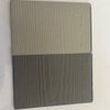
    Why don't you try getting an assortment of paint chips in colors you like and stand across the street from your house and check them out. Just hold up a strip against the house color you want to compliment and close one eye and see how you like it.

  • 20 years ago

    What about a creamy, off white or cream color? That would give the place just enough contrast, while lightening it up a bit.

  • 20 years ago

    I tend toward thinking that a deep green might ground the house to the earth... but more than anything make sure that the bottom is DARKER than the top... otehr wise it will make the house look top heavy :)

    maddiemom

  • 20 years ago

    maddimom6, you are absolutely right! When I read the forum again, I realized it's the bottom she wants to paint! I agree with you 100%!

  • 20 years ago

    Personally, I thought of dark green too, but the shrubbery in front would tend to just blend in with the bottom of the house.
    A sort of nutmeg brown occured to me too, but I'm not 100% sure about the colors in the photo as I mentioned before.
    The dark slate gray the neighbor used, is it more charcoal or blue? A blue gray often goes nicely with a taupe.
    That's the thing...there's taupe and there's taupe.

  • 20 years ago

    I kinda like the smokey bluish gray idea. Or a really soft green, like a sage?

  • 20 years ago

    I second the idea of a gray-green, any of the sage shades. That was my first thought when I saw the pictures.

  • 20 years ago

    I like sage green too,although a warm rust would also be nice. What are you using to paint stucco tho? If you use regular paint, won't it be a pita to scrape if it starts to flake in a few years? If you use the "thorocoat" a synthetic stucco you can get any color. If you restucco with real stucco, then the choices are much more pastel. I just redid the stucco on my house, so I learned all this.

  • 20 years ago

    My daughter tried a little something on "paint it" (she's only 13). We tried a dark olive on the bottom, a dark red door, black trim and black garage door. She also added small shutters to the two windows over the garage (bedrooms) and shutters to larger front window on the left. Looked pretty good. A few other houses on our street have hunter green bottoms, the houses on either side have butter yellow bottom (looks yucky!) and slate bluish grey (nice!). What do you think of the dark olive?

  • 20 years ago

    Dark olive sounds good. Much of the shrubbery has a bit of bluishness to it, so it would show up well against the olive.
    I'd steer away from the black garage door, though. If you paint it the same as the background it will blend in more, if it's a contrast it will jump right out at you.
    We lived in a neighborhood of similar houses at one time and there were several of us who painted the garage door panels seperately for a little visual interest. The trim on our house was white and we painted the door a sort of pumpkin color, the garage door was white, but we painted alternating panels on the garage door pumpkin too. You could do your gargae door in the olive green, and when you were done if you wanted a little oomph, paint the alternating panels black.

  • 20 years ago

    Here's a quick mock-up in a dark greenish olivey colour.

    {{!gwi}}

    {{!gwi}}

    I put the window boxes in to create the illusion of larger windows. Sorry they aren't very well done.

    Does this help?

  • 20 years ago

    Wow! What did you do that with? The flower boxes would be a good idea. I could see my self watering the ones below the main window but up high? Those are my kids rooms and they would never do it. Doesn't get rain up there because of the overhang, but I'll think about it!

    Can you paint the door red too? If you tell me how, I'll try it too.

  • 20 years ago

    How's this?

    {{!gwi}}

    The program I use is called Custom LandDesigner by Sierra. I picked it up at Best Buy for all of $9.99. I use the Photo Garden Designer section of it for the mockups.

    The TEXTURE feature is for siding, grass, glass, stone, brick etc. Hope you can find it. It's great fun, and easy to work with.

  • 20 years ago

    It looks fun! I could sit and do that on the computer all day. Is that a good thing?

  • 20 years ago

    Would you consider removing the storm door so that there is some depth to the entrance? I think you could make the front porch and door the focal point of the front, especially with the lovely landscaping you already have there.

  • 20 years ago

    I would love to see what the house would look like with a bluish/gray bottom!

  • 20 years ago

    Having a storm door in some parts of the country may not be an option. DD got a new door a few years ago and was told not to use a storm. Door is on the south side and the heat build up could damage the 'plastic' trim.

  • 20 years ago

    ellenj: you said: I could sit and do that on the computer all day. Is that a good thing?
    I could do the same - whether or not it's a good thing doesn't really matter. Problem is, life tends to get in the way LOL!

    westranch: here's the blue-gray. Is this the colour you were thinkiing?

    {{!gwi}}

    {{!gwi}}

  • 20 years ago

    Homemaker, I like that color better than the green. It looks almost lavender on my computer. It could just be my moniter though. And, I would have never even thought of a lavender shade, but I like! The color I was thinking of is a lot lighter with more gray and less blue. I know I've seen it on rustic homes with board and baton styling before. And, what do you think of a lighter shade, but not too light at the bottom, with the garage door painted the same color, but the trim around the door painted one shade darker, to give it depth and definition. BTW, that's what I did with my garage doors. They were deeply inset. The trim was originally white, but it looked deep and hollow. The doors were cream overlayed with white. The shutters are an earthy brown. There was one thin strip of trim inside the garage door frames, closest to the doors, that I painted in that brown. It brought the doors out a bit while framing them.

  • 20 years ago

    Although I would love that color too, unfortunately my neighbor to the right has it already! I think we need to keep the storm door, not because of weather necessity but because I have two escape artist dogs who would tear out at a moments notice and 2 children who would just let them go. The storm door gives me a minute to corral them before they escape. Another case of need over beauty!

    My other color option would be a dark eggplant. Is that too weird?

  • 20 years ago

    I think eggplant would certainly look good with the taupe on the upper half. Personally, I would not want to go that dark on such a thick coverage area. I tend to think of really dark colors for trim areas such as eaves, gutters, windows, and shutters. Have you considered a medium blue shade? Blue was a popular color for ranches and split levels of the '50's and '60's. The contrast would not be so great, and it would still be darker at the bottom. And, what about a white garage door?

  • 20 years ago

    Homemaker's rendition looks purplish on my monitor too.
    I can do an awful lot with my photo program. I took my husband's leg, foot and a bottom of a chair out of a picture taken at my son's house and replaced him with a big potted plant I had at my house. I took about 30 pix of my then 8 year old youngest son and my baby grandaughter on the sofa together and when one looked good the other was staring out into space with a goofy look. ..in every single shot! I finally put two pictures into one and it looked great. No one can tell that i did anything to alter these photos. But I CANNOT colorize a picture for beans. No matter what I do it looks terrible and not nearly even close to what the color I picked looks like.
    Is it me? Is it Photosuite? Or is it a normal failing of these programs? I can never get any sublety into the colors. When I need to colorize something I go looking for something around the house that's the right color, scan it into the computer, get it onto my photo, then use the cloning feature.

  • 20 years ago

    ewwwwwww I don't like the blue, try a burnt orange color on the bottom of the house and do the door and garage door olive green. Or change that around and do the olive green on the house and door the burnt orange. On the one picture you have the olive green looks more brown. I like the brown idea also, but with cream doors. Post the pic on here so we can see it. Where did you find how to do that? Is is a software program you have?
    Karri

  • 20 years ago

    Ask you neighbors you like what they want to look at. They may have some opinions.