

Bed & Breakfast color scheme?
17 years ago
Sort by:Oldest
Comments (7)
Related Stories
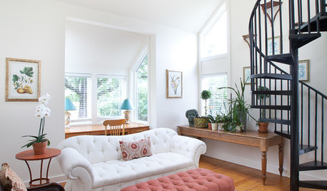
TRAVEL BY DESIGNHomes Away From Home: 10 Charming U.S. Bed-and-Breakfasts
Looking for a more personal stay on your getaway? These homey bed-and-breakfasts roll out the welcome mat in style
Full Story
PRODUCT PICKSGuest Picks: Settees for Every Room and Style
Tuck one of these smaller-than-a-sofa seats by a bed, in a niche or in a breakfast nook for comfort that goes the distance
Full Story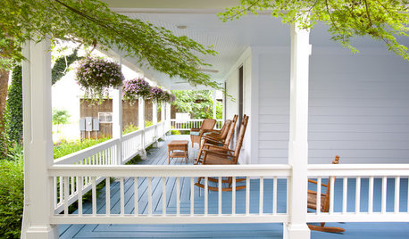
TRAVEL BY DESIGNShould You Open a Bed-and-Breakfast?
Before you commit to innkeeper dreams in your home or an existing B and B, here's what you need to know
Full Story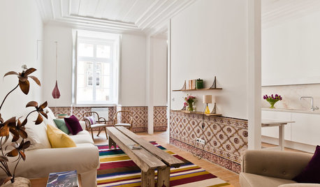
TRAVEL BY DESIGNHomes Away From Home: 6 Appealing International Bed-and-Breakfasts
Live like a local in a foreign land. These design-friendly B and Bs offer comfort and style for a wide range of budgets
Full Story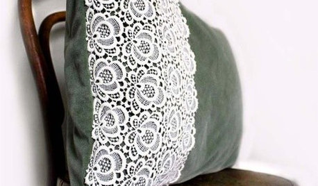
PRODUCT PICKSGuest Picks: Irish Bed-and-Breakfast Inspiration
20 ways to take a style cue from the cozy inns and traditional homes of Ireland
Full Story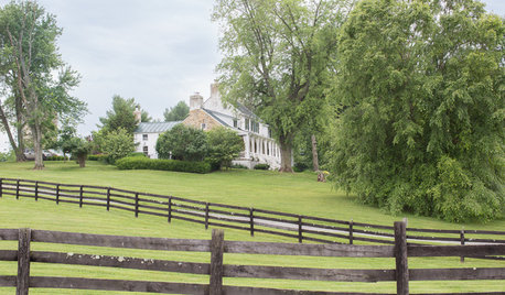
MY HOUZZMy Houzz: Farmhouse Style in a Virginia Bed-and-Breakfast
A country home includes gorgeous grounds, whimsical spaces, a barn as a wedding venue and chandeliers throughout
Full Story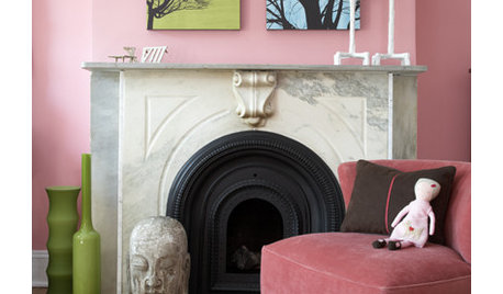
COLORPretty Pink Color Schemes, Subtle to Sensational
How do we love pink? Let us count the ways: soft, sassy, with chartreuse and electric blue and, yes, even red ...
Full Story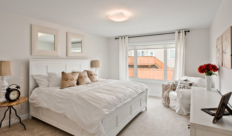
DECORATING GUIDES9 Ways to Boost Your All-White Color Scheme
Grays, seafoam, metal, wood and more help embolden a white-on-white look so it doesn't leave you cold
Full Story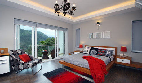
DECORATING GUIDESGreat Color Palettes: 8 Hot Bedroom Color Schemes
Go spicy, mild or a mix of both with warm and cozy hues in your bedroom
Full Story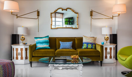
LIGHTING8 Ways to Use Plug-In Sconces in Your Lighting Scheme
Plug-in, wall-mounted sconces help unclutter desks, add visual interest and more. See if they are right for you
Full Story

awm03
newdawn1895
Related Professionals
Norfolk Interior Designers & Decorators · Lansing Interior Designers & Decorators · Fargo Interior Designers & Decorators · Keene Interior Designers & Decorators · Utica Interior Designers & Decorators · Dover Kitchen & Bathroom Designers · Poplar Bluff Kitchen & Bathroom Designers · Athens Kitchen & Bathroom Designers · Chico Kitchen & Bathroom Designers · Chatham Kitchen & Bathroom Designers · Frederick Furniture & Accessories · Grand Rapids Furniture & Accessories · Keene Furniture & Accessories · Hackettstown Furniture & Accessories · Ontario Furniture & AccessoriesKathleen McGuire
ingrid_vc so. CA zone 9
stinky-gardenerOriginal Author
amysrq
stinky-gardenerOriginal Author