

Color Consultation?
Has anyone used Maria Killam for a phone color/paint consult? If you have, do you love your results?
Any other professionals you would suggest? Not EK as I have her chips and I can't find anything close to what I want.
I have paid 2 people already and neither has suggested a color that I feel is "right" for the space. The last one, was in the house less than 5 minutes and made the color suggestions. I got the samples hung them for a couple of days and they didn't look any better than what I currently have. I felt this was thier "go to" colors and little to no thought was really put into it. How can you not really look at my fabrics, yet pick a color that will be on a lot of wall space, entry, FR, halls.
I just don't know where to turn anymore. I am tired of paying and not having someone put more thought into my project. The first person, I think also gave me her "go to" colors and they don't look good at all.
Thanks
Comments (50)
 14 years ago
If you could post pictures perhaps someone on this forum would know exactly what you need. There are lots of talented people here. Also in the paint forum there are two color consultants. One of them helped me find the exact color for my cabinets. I know your frustration. I was looking for a foggy gray tan look for my bathroom and a pale misty aqua for the vanity. I had to make the paint myself but it's just what I wanted. Try both those ideas and suggestions will come flowing.
dakota01
Original Author14 years agoyayaygal - I did post a picture of my chair fabric which is right now the main fabric for the room. I really didn't get many I think 2 suggestions.
This is a room that faces north - so I need a color that actually has color/life to it..At least that's what I think. One person had me paint it (large room) a color similar to RH a light gray - YUCK - it's dead. I knew gray wasn't for me, but I trusted a "specialists" judgement and it's really horrible.
The lastest suggestion was PPG Summer Suede - it doesn't look much better. No life to it....
I'm willing to go alittle bold - so why can't someone suggest a color - rather than blah shades????Related Professionals
McAlester Interior Designers & Decorators · Jackson Interior Designers & Decorators · Ithaca Interior Designers & Decorators · Newport Interior Designers & Decorators · San Diego Interior Designers & Decorators · West Palm Beach Kitchen & Bathroom Designers · Athens Kitchen & Bathroom Designers · Portland Kitchen & Bathroom Designers · Chico Kitchen & Bathroom Designers · Liberal Kitchen & Bathroom Designers · Hot Springs Furniture & Accessories · Torrington Furniture & Accessories · Peoria Furniture & Accessories · Potsdam Furniture & Accessories · Cornwall Furniture & Accessories- 14 years ago
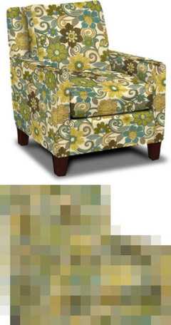
Jeannie, here's your pic and what you had to say about it:
I have 2 chairs similiar to this style and w/this fabric. Fabric has yellows, citrine, greens, turquise, browns and beiges. My couch is a soft yellow/lines color transitional style. My trim is cream and my floors are very dark hardwood/hazelnut. I have a teal tone on tone area rug which can also look like a dirty turquise.
I have been looking at many samples of paints, but still can't decide. What color would you be looking at? This is a north facing room. Should I be looking at gold undertones, green, blue. Please don't suggest gray, I have gray now and HATE it.
THanks
I mostly lurk and don't have a suggestion right now, but I thought having everything in one place might get you more responses. Good luck!Here is a link that might be useful: Original thread
dakota01
Original Author14 years agoThanks Woodsy1 for posting the chair. Here is a link to my rug which is 9X13. the chair and couch front legs sit on the rug. I guess I should also add that I have another chair that is a lite turquise with brown leather trim.
I have been crazed enough to think about an accent wall (fireplace wall) being citrine. But, then what do I do w/the other walls?
Here is a link that might be useful: Rug
- 14 years ago
Have you tried pulling a yellow or green from the chair for the walls. A grasscloth or rye might add the life to the walls that you desire. I do not trust monitors for color ideas but maybe also look at wasabi green by BM. Also try some blues swatches too.
- 14 years ago
I personally would not use Maria Killam. I used to follow her blog but found her to be too opinionated re white kitchens,subway tile and careira marble being the only way to go. Its like if you can't afford a new white kitchen you have to paint your cabinets white cause after all wood, especially oak is dated according to her. To me she seems to have a bit of tunnel vision. I enjoyed learning about colour on her blog before but it is't the same. She also has her 'go to' colours but maybe that is common amongst consultants. I think some of her makeovers are beautiful though. Hopefully you'll get more help here this time....
- 14 years ago
oooh. Pretty, pretty chairs. Nice rug too. I would go straight to a warm blue for this room, with maybe a citrine accent wall like you mentioned.
It just happens my living room is warm blue. The undercoat is tinted with thalo green and lamp black, the glaze with thalo green, lamp black and yellow oxide. It probably wouldn't be the right warm blue for your room, but the point is, there's no actual blue pigment in it, which is a very cool pigment. So maybe you can talk formulas with the people at the paint counter - a color might look good on a chip or even a sample board, but when you get it on all four walls it takes on previously hidden character.
Everyone seems to be talking about BM Wythe Blue and its paler sister Palladian Blue - they look warm in pictures but kind of grey on the chip. But maybe they're a starting point to look at for warm blues? (My paint is Home Depot Glidden, cheap and holding up very nicely after 11 years - BM is an expensive common tongue to talk about color in!)
- 14 years ago
I put your chair fabric thru my photo program and came up with this color chart. Maybe it will help.
Here is a link that might be useful: color chart
- 14 years ago
Sorry to butt in here... Kathy77, what is the photo program that you mentioned? That is so cool!
Jeannie, I love your chair!
- 14 years ago
jeannie01-
If you're lucky amysrq, a poster here who is a certified color consultant will weigh in, her work is just brilliant.
But in the meantime, what about a strong green? Below is a pic of our hallway painted in BM Medieval Times (Aura Matte finish). This faces NE, and has only a couple of windows in the stairwell, so doesn't get much direct light. Medieval Times is a clear yellow green (at least to my eye, I am no expert) and play well with blues of all stripes.
Here's a pic:

Our LR is also green, but a more muted, muddy color, BM Pine Grove. Our LR faces NW. I don't know the names of any blues, but in both our entry way and LR, there is a lot of blue and they all work. I would get a BM fandeck and look at the rich turquoise blues (you can use any paint manufacturer, of course, but I'm a BM woman).
Here is the LR:

Good luck-
sandyponder
- 14 years ago
My photo program is very old software, called "Paint Shop Pro", version 7. I believe it's a cheaper version of Photoshop. The company has since been bought out by Corel, and I can't say if the current version is any good or not.
- 14 years ago
Just wanted to add that I sometimes read Maria's blog. Used to read it more than I do now. Now it just seems to be a way for her to advertise her services.
But, wanted to say that it looks to me given your chair and your description of your couch, that you have a similar style to Maria. It might be worth emailing or calling her and explain your past experiences and ask her what she would do differently, and of course what her charge would be. I would think that a color pro that has a similar style to yours would be able to help. Of course, if amy or funcolors chime in here, you may not need that at all!
- 14 years ago
The color I'm seeing with that chair - that would also work with the turquoise one and probably the rug, is a soft yellow. Something slightly on the green side, but not "yellow-green".
That would also warm up the north light.
- 14 years ago
Since this is a north facing room, you could use a warm color. I tried your chair and rug against several backgrounds, picking out a color from your chair. One that looks good with your chair and rug is Sherwin Williams 6637 Organza

- 14 years ago
Just curious, I was one of your responses from your original post. Did you try BM Natural Bamboo. It has both yellow and green undertones but it's mild. It goes with all your colors. It doesn't hurt to give it a try.
- 14 years ago
I think you should choose a bold, clear and clean, saturated color. I think that's why the other shades/colors looked blah to you, maybe? The colors in that fabric are not muddy.
Monitors aren't good for getting a true idea of color. BUT, that rug that you call Teal and dirty Turquoise (the dirty suggests a muddy muted shade, no matter the actual color) is called Jade at the website where you got it...and it doesn't look, at all, like Teal or Turquoise, muddy or otherwise and the color Jade doesn't either. And, it is muddy and muted. I think that will throw things off, too.To me... the Turquoise color in the fabric looks bold and so do most of the large flowers and swirls. I would choose anyone of the bold, deep colors....stay away from the light background color (yellowish), it will just end up making the low light room even more washed out. I would try a green... a clear, saturated yellowish green (the green flowers look to appear so?) The 1st green color Sandyponder showed you is on the right track..it works. If it were my room, I'd go for a deeper green..I love, love, love Behr's Retro Avocado...which, btw, looks fabulous with Teal or Turquoise!
I like the fabric and the style of the chair!
Sea
- 14 years ago
To follow up on what seashells said - I was surprised when the specs for the rug said it was jade because on my monitor it looks gray (And 9'x13' is a large rug) and I'm wondering if it might be deadening the vibrant colours of the chair. There is a silvery gray green leaf in the chair and that might be what is getting pulled out. *IF* this is the case somehow that needs to be counteracted colour wise and throwing more green into the room might get confusing. I like the idea of the accent wall and then the other walls a colour similar to what suero has suggested.
- 14 years ago
Take a look at Central Park color, actually several of these colors would work but I think it has the right energy.
Here is a link that might be useful: Central park paint
- 14 years ago
I have no idea what the color people that came were thinking, but I will tell you that both your chair and your rug colors are muddy, not clear. Perhaps they were concerned that putting a clear, bright color on the walls was going to make the upholstered pieces look "dirty" by comparison.
I have a north-facing LR. I have a red accent wall opposite the front bow window(no window coverings on the 130" window, so as much natural light as I can bring in), and the rest of the walls are a warm coffee-with-cream color, my carpeting is a light beige. But the room still has a grey undertone to it, because you can't change the natural light, no matter the wall color.
Without seeing the room, it is hard to judge the 'feel' of the space. But I would first think about what color you WANT on the walls? Do you want blue, or green or yellow? It isn't just about what colors would work, but what YOU want to live with.
I think I would be inclined to pull the background color from the chair, and do a shade of that. If the configuration of your room allows an accent wall, and that appeals to you, perhaps the teal of the flowers in the chair fabric, or a shade or two lighter.
Then I would be sure you have great art on the walls, and lots of good, warm lighting. Lamps everywhere, not overhead light or a ceiling fan with lighting attached. That overhead lighting will cast shadows and also create glare which will wash out the room colors, and not warm up the corners or eye level lighting when people are seated.
A mirror opposite a window will bounce around more light. Metallic accents in things like lamps and art pieces and vases will help in the same way, and add sparkle to combat the grey undertones in the space.
- 14 years ago
Hi Jeannie,
Saw your title and couldn't help but jump in. Sandyponder....you're very sweet! :-) Nice to "see" you here!
I love your chair and your rug. But I am not immediately in love with the idea of blue or green walls. That much color -- rug + chair + wall -- feels like it is pretty taste specific. I just have a hunch that it would be a lot for all those spaces. I also worry that a strong blue, while it seems like a natural choice, will compete with the rug, running the risk of making it look washed out.
What you already know about your north-facing room is that colors tend to die and feel cold. The solution to that is to literally bring in some warmth. I like the idea of looking at the background neutral in the chair and I would suggest that level of saturation. Kind of a light creamy neutral.
However, I would lean it toward orange/peach to warm up the room. Not a ton of orange, mind you. Just enough warmth to cheer up the space. Kind of like a soft, warm-leaning neutral ivory. I would start with a fairly soft color and then ramp it up to where the color no longer feels washed out. But don't go so far that you feel like you have too much color on the walls and the chair and rug are no longer the focal points.
Because orange and blue live on opposite sides of the color wheel, they bring each other out in nice ways. This means that your blues will be beautiful, but also that you don't need too much orange to make it work. Right now, I am auditioning F&B Ringwold Ground for my LR. I would describe it as a grayed-down off-white with a hint of peach in it for warmth. My LR faces south, so a little goes a long way. My hunch is you'll need something more saturated.
In general, Full Spectrum colors are a good idea in low-light situation. You might take a look at Ellen's colors again with this advice in mind and see if something like Buttercream, Classic Marc or Honeysuckle could work. Sherwin Williams Impressive Ivory or Ben Moore Coronado Cream both seem to embody that orange quality I am talking about. They look really orange here in my studio, but in your lower-light situation, they will be knocked back and might be tame enough. This is not advice on which specific colors to use, btw...more like how to think about what you need and places to start looking.
As for a 5min color diagnosis, I think that is unconscionable. Don't get me started. Selecting colors should be a collaborative effort, IMO. And it takes time and many iterations in that first visit to narrow the possibilities down. Everyone does it differently, of course. I have my way....other people have their own. But the important thing is that the client is satisfied...and I am really sorry you aren't there yet.
dakota01
Original Author14 years agoWow - you all have given me many ways to think about what color range I should be looking at.
Jerseygirl - I could not find on BM site - Natural Bamboo.
Maybe it's discontinued.
Seashell - I don't know why they named the color Jade - because it definately isn't like the gem color Jade. Since it's tonal - you see a muted not grayed though, turquise and then a lighter shade of it.
Kathy77- thanks for the link of the colors in my chairs maybe that will help me at the paint store.
Les - my chairs really are not muted - they are quite bright and w/the cream background the citrine and turquise pop nicely. When I do the "squint test" I see citrine.
I do have some mirrored furniture pieces and my main tv console has mirrors and a touch of gold on washed finsh.
Suero - I looked at Organza - and I cant imagine it working. But, since a few agree I will get a sample and see what it does to my room. You may have picked the winner.
Yaya - Thanks for the chart - I do like a few of the colors Sweet Pear looks nice.
Amy - THanks for your post. As for a light creamy color - all my woodwork is a creamy color. Chalk Grey. I have a wall w/my fireplace and builtin bookcase that is all Chalk Grey. Actually, that's the wall I was thinking to be an accent wall.
I am shocked at your and Suero's suggestion of creamy peachy orange color, but maybe that's what I need to give the space the warmth it needs. The room is large and just feels COLD and too big. My kitchen granite does have a peachy color in it. Which I thought peach and blue didn't go well together.
Since I have EK swatches - I pull your suggstions and put them up for a few days and see if I get inspired by them. And also get a sample of Organza.
My dining room wall paper that I love and just had put up is a turquoise/teal with large goldish/bronzish almost feathered/fans details.
SInce you can see the DR,Kichen and FR would an orangey/peachy tone still work?Ladies you have given me way more to think about than my last color consult that was all of 5 min.
If nothing else, I'm glad that I just don't agree w/what a decorator suggests, if it doesn't feel right I hold back.- 14 years ago
Chalk Gray, from the swatches and photos I just saw on Google, is not really a creamy light color. It is a light tan with a bit of a peachy undertone to it. Maybe that's why it works in the room for you, in keeping with the suggestion of going to a peachy tone in the wall color.
I am surprised to read about the chair colors - certainly the pix you posted here is all muted tones. Must be very different in real life! That illustrates the hard part of color advice in this format - how things read in real life versus what the pix show.
I hope you find your dream color! You have gotten lots of great advice.
- 14 years ago
Yes, I've used Maria for a colour consultation. After weeks and maybe months of bringing home paint swatches and obsessing over colours she came in and sorted it out in 2 hours. A huge stress reliever. Kind of a colour therapist of sorts. I'm very happy with the results, but won't be ready to post pics for a couple of months yet. What was really useful was that she has very large samples (maybe 18" by 32"?) of a large number of Benjamin Moore colours, which was invaluable in deciding. She really does have a keen eye for undertones, which was super useful in picking the creams/off-whites, and of course, a lot of experience with the BM palette which moved things along quickly. She has informed opinions, but I certainly wouldn't call her "bossy"! She listened to what I wanted and worked with that, rather than imposing her own vision. I've used a colour consultant before (12 years ago) and didn't find it nearly as useful. So, bottom line, I'd recommend her without reservation. Good luck!
dakota01
Original Author14 years agoles - I googled it too and my trim is definately not what is showing up on google. The first paint consultant picked this color for all my trim and interior doors. It really has not beige or pink in it.
She did have me buy it directly from her store as they make it up for her based on her formula.
It really is just a very creamy off white. I didn't want white white trim and this is what she came up with. Your right, it's so hard to actually see true colors on-line. I was shocked when I googled it.- 14 years ago
Blue and orange are a classic color combo. Yes, they work. But, I am ony suggesting a hint of orange, okay?
Bronze is actually "orange" so it should theoretically work with the DR wallpaper.
It would be incredibly helpful if you could post pics of your home here. Any possibility?
- 14 years ago
I had a color consultation with Maria Killum just this past week.
I would highly recommend her services!
My kitchen renovation was done almost 1 year ago and I couldn't find the right color for the walls. I have a travertine style porcelain tile floor and my cabinets are off-white (at least that's what I thought I was getting) and my counters are granite with lots of warm undertones.
Well, my cabinets were looking yellow and my floors were looking pink; I was devastated and hated my renovated kitchen. I spent so much money and time on this renovation and I absolutely hated the room. Something was wrong; it didn't look good.
I painted the entire room 3 times as well as numerous other paint samples that didn't make the cut. I spent a few hundred dollars on paint. But worse was all the time and angst about it.
I felt desperate because I was loosing my mind and simply couldn't figure out what to do. That's what lead me to Maria Killum at Color Me Happy. She was awesome.
She told me we'd only need a 1/2 hour consultation and sent me instructions for taking photos etc. I opted to hire her for 1 full hour because I wanted advice on backsplash and paint colors for the adjoining rooms.
I wish I had known Maria Killum and GardenWeb BEFORE I did my renovation. I would do so many things differently.
However, Maria came up with the PERFECT color. I've been painting for 2 days and I'm almost done. The change is dramatic!!! Seriously, I had my doubts while painting. It looked awful at first because I was so used to a deeper color. This morning I woke up and for the very first time I liked what I saw when I walked into my kitchen.
My husband said, "So, do you feel like you have a kitchen like the ones in the magazines?"
YES! OH YES!!!
I won't hesitate to hire her again. In fact, I will!
Worth every penny to me.
dakota01
Original Author14 years agoAmy - I am going to work on figuring out how to get photo's from my camera to my computer, to this site. I am soooo photo/computer ditzy!
Yes, I understand by a tint of orange, since I saw the photo of organza. Per your suggestions, I did put up my little samples of EK colors.
So far, I'm not crazy about Classic Marc or Buttercream only because I want more "color".
I like the brightness of Luminaire and your suggested Honeysuckle is just a bit darker. But, they both are way better than Summer Suede or the gray that is up now. I think the gray is the decorators mock up of Reverve Pewter. Which so many on here love it, but it does nothing for me.
I will have to get out this week and get a sample of the organza and see how it looks compared to the EK samples.Gwen - THanks for your post can you post pics of your re-do ?
- 14 years ago
gwnewbie123 What was the color and can we see the kitchen? You've peaked my interest.
- 14 years ago
Took a break from painting today.
It's a fairly large kitchen and there are 7 door openings and 1 window so it was a lot of cutting. Everything needed 2 coats AND I painted the ceiling as well.
I can post photos when I'm done if you'd like.
Wish me luck.
dakota01
Original Author14 years agoThe decorator just called and asked if I liked the color - I said NO...it looked (PPG Summer Suede) as dead as the gray that I have now. He said once the walls and ceiling were all painted it would make the room warm.
I have attached a link to the color - the sample I recieved is actually a bit lighter than what my monitor is showing.
I still think it's too dead. He said, he will find me another color to try.
I also didn't like the Chocolate Truffle for my kitchen. I don't have alot of wall space, but I have very dark HW floors, cream cabinets, saddle colored island and peninsula and my granite is dark. I'd be afraid to use a dark, dark brown. I think rather than warm the kitchen would end up just looking dark and the contrast might be "too much".
Are you all starting to think that maybe I'm just not thinking clearly?Here is a link that might be useful: Paint Color
 14 years ago
So how does that work? Do you fly her in to your city? Pay for her consultation plus travel expenses?
- 14 years ago
Ha! I needed help, but wouldn't have gone so far as to fly her in.
No, I'm lucky enough to live in the Vancouver area so she just drove over one day. She does on-line consultations as well.Finally saw the chair fabric that started this thread.
The decorators suggestion looks very pinkish in undertone (at least on my monitor). Your chairs are in the yellow/green family, so can't see them working together.
Have you thought of a yellow-green?. BM Dijon and Vellum are both very nice. Some of the deeper Farrow and Ball yellows might also work if you're really looking for a hit of colour. Maybe F&B Cord? Or String? Cat's Paw if you're really bold. I believe they are all lively yellows with a greenish undertone. - 14 years ago
I have no suggestions but no one has mentioned how any of these colors will look with your "soft yellow" sofa that you said you had. It seems to me that the sofa is an important part of the picture and just hope to hear more about how any of these wall colors would work with it as well as the floral and turquoise chairs.
- 14 years ago
You have alot of color and pattern in your furniture and rug, imo, the walls should be a neutral. A taupe color with green/gold undertones would be my suggestion. Take a look at Behr Harvest Brown or something similar to that. It would warm up your room and be a beautiful backdrop for your furnishings.
- 14 years ago
I did the virtual consultation. There was no WOW color selection during the call which I had hoped for so I was disappointed at first. The colors in my home do not show well in pictures so I will not do an online consult again. If you take pictures based on her directions and think they are close to your homes true colors then it may work out well for you.
I tried it and decided a virtual designer was not a good match for this house/lighting. However, I learned a lot during the call so even though it was not the experience I had expected I am glad I tried it.
dakota01
Original Author14 years agoWith my chairs both the floral and the solid turquise - my couch really seems to blend out of the picture. Since the color is so neutral yellow/linen shade I think it would work with almost any paint color. That's why I bought this color, though I think that certain paint colors will bring it out of "neutral" and make it more attractive.
I really was leaning towards a yellow/green paint. But, till I get a few samples and put some on the walls I'm still unsure of the direction I need to go.
Organza may work to soften all the wood and lines in the room. I just truly feel the decorators "beige" just wouldn't give me the look I want. I want a bright room - with color - drama - wow.....what's a girl have to do to get that????? LOL- 14 years ago
Funny, I posted this on another thread earlier today. Wanted to share with you as well because it directly answers your question....
I paid a lot of money for a consultation and it was such a waste. I ended up using one color she recommended. The others didn't suit me. She didn't really listen to what I was saying about my preferences. I think she had some canned colors she probably offers to everyone. The whole process was painful and I was exhausted by the end of the call. I felt pretty stupid thinking it was good idea in the first place, but at the time I was enjoying her site. I don't go to her site at all now. Another thing, I had just moved into my house and when I did, my movers added a dresser mirror back to my dresser. I knew immediately I wanted it down, but just hadn't gotten to it before I gave her my pictures. I told her that and she agreed that it should come down. Later on her site, she mentioned how she had impressively and boldly told me to take it to the curb. Like that was daring new advice.
 PRO14 years ago
I just truly feel the decorators "beige" just wouldn't give me the look I want. I want a bright room - with color - drama - wow.....what's a girl have to do to get that????? LOL
Well, that was the first step. First time I've seen in both threads where you were clear about what you want. (or maybe I missed it, which is entirely possible)
Here's the chair with a batch of relative, viable wall colors. North light is manageable especially since you are wanting a bright room with color and drama. Color is about relationships. Don't feel limited by anything. Instead, choose your hue and then adjust the color to meet the quality of light.
What hue family or specific color, brand of paint?
dakota01
Original Author14 years agoFuncolors - THanks for reading thru my post and reply.
Your comment: What hue family or specific color, brand of paint?I do not have a preference on the brand - I don't know what you are saying about Hue Family? Are you asking, greens, yellow or about the vibrance of a color I pick?
I did pick up Organza and Ecru - both by SW.
Is it best to paint directly on the wall or did I read on prior posts about painting on a white posterboard and hanging that up?
Anyway, right now I just have the swatches up - and I'm thinking that I like the EK buttercream and lumminaire. THey both are light and bright shades (hue?) I know that I read that a light color isn't going to make the room brighter, but those colors sure look better than the beiges I have hung up.
- 14 years ago
Yes, paint a large piece of paper or foam core board instead of directly on the walls. Then move that piece of paper around to different spots in your room to see how the color reads next to different objects, and, times of day. EK has beautiful paint and IMO a full spectrum paint may really help blend your color story.
- PRO14 years ago
Yep, you got it. Hue is the root dimension of color. Take red and pink. Red is the hue family, pink is the color. Or green and olive. Green is the hue and olive is the color.
Can go one step deeper and use parent/child analogy. Red is the parent hue, pink is the child color. Green is the parent hue, olive is the child color.
The terms hue and color are often interchanged. And in many cases it doesn't matter but when you're talking color palettes relative to paint, it's helpful to differentiate between hue and color. I can give you one example for this reasoning. Every color display is first organized by hue family, red, orange, yellow, green, blue, violet and then the derivations of each -- the specific paint colors -- are the subcategories. Here's more info: http://www.colorbudz.com/2010/03/hue-vs-color/
Regarding Organza and Ecru - Organza is from the orange hue family and Ecru is a complex color but its root hue is green. Buttercream and lumminaire are yellows.
Reconciling hue family is important because it's the fundamental dimension of color and it is at this most basic dimension where color relationships are born - it's how you make pleasing color combinations, create color schemes simple or elaborate.
If you paint directly on a wall, ideally you paint out the whole wall. If not, you risk the edges of any spots you paint telegraphing thru your final coats, sometimes unavoidable no matter how well you feather the edges.
Or find something to use as a sample board. I'm fully underwhelmed by all the products that are sold as paint sample boards and I don't recommend any of them. You've probably heard (read) me talk about circles that I have custom made but aren't sold. So, whatever material you like to use to sample paint is fine.
I know that I read that a light color isn't going to make the room brighter
This whole bit started with Donald Kaufman - that's his gig. It's his gig because he sells full spectrum paint... so it needs to be his thing.
Here's what, a paint color is not a lamp. Painting walls a lighter color is not going to ILLUMINATE the space because paint color doesn't EMIT light.
Paint color just REFLECTS light.
But the basic premise remains that lighter colors reflect more light than darker colors.
- 14 years ago
Hi all,
This is all so very interesting.
When I lived in Key West, there was a designer/color consultant who told me that a paint color differs depending where you live. She said she was from Kentucky and would never use the colors chose for me. They were typical "Key West colors", blue, green, yellow and coral,all in various shades depending on where the room was locatrd (West vs. East, etc.) and the cabinets or furniture or bathroom tiles.
It seemed to work out great. Now I'm back in Boston and wanting to use those beautiful colors up here. Is that a no-no?
Thanks. dakota01
Original Author14 years agoI wonder if the colorist was meaning more of a "regional color selection" than due to the light differences?
Key West is a lively/bold/artsy type of area, where as, Boston may be quite different traditionally.But, I could be all WET about this too.
BTW - Ladies I did try the Organza and it didn't work either. Tried another SW greeny/gold and it was wrong too.
So, I am STILL looking for paint color.
I have to get snappin and order Honeysuckle & Luminaire from EK. The tiny swatches are still hanging up and I think one or both of them is what my space needs.
Are those warm or cool colors?
- 14 years ago
Just wanted to say that I have used Ellen Kennon's paint in two of my rooms and love it! Both of my rooms get very little natural light. She is so nice and patient ! The honeysuckle color is a warm pretty color and seems to have a slight peach undertone, more so than the luminaire. Good luck!
- 14 years ago
I think EK Honeysuckle could look nice in your room and would make your chairs pop. However, if you would like a yellow-green, EK Chartreuse may also work well and is more of a wow color.
- 14 years ago
I agree that seeing all your furniture and the rug together would really help. Then we could see how bright the turquoise chairs are and how subtle a yellow the sofa is. Maybe something else is off color wise making it difficult for you to choose a paint. A wall color can just do so much.








mom270