Software
Houzz Logo Print
sbm321

If you lived in a condo complex...

17 years ago

What color would you love to see in the common areas (hallways and foyer)? I have an opportunity to help w/ interior work w/ an architect on a condo complex. There are 3 buildings, each with 2-3 floors, with the condos' doorways off a long, common hallway. Currently it's '80s mauve -- walls, trim, and doors! (Various shades of mauve. And, of course, shiny brass light fixtures... also being replaced.) The common hallways are fairly dark, so clearly a light hue is needed. What would you like to see every day if you lived there?

Comments (14)

  • 17 years ago

    Many of my older relatives live/lived in condo complexes in Florida, and I used to live near them down there, so I've seen a lot of good ones and a lot of tacky ones, too!
    White, cream and very pale colored walls always looked banged up, dirty and/or tired looking very quickly.
    Pale gray looked depressing to everyone (they used to comment on them to me because they knew how much I love interior design).
    Pale green, they told me, reminded them of doctor's offices or their old school cafeterias (I'm serious!).
    Very dark walls started out being very popular with them, but after a while they started referring to them as "cave-like".
    Every once in a while they'd do a rebound "Bright Cheery Yellow" which just ended up looking flat-out tacky and garish!

    I'd like a creamy medium to light taupe or tan with darker brown wood trim and maybe turquoise accents (but not BRIGHT turquoise!) . . . and greenery if it didn't look cheap or would end up looking dusty in a month. Although that color combo is IN right now, I think of it as a classic color combo that won't look dated too soon if done with restraint. Another possibility would be the same tan walls with crisp white wood trim and black and a darker green for accents. Just make sure that they use a paint that they can wash occasionally!
    Classic fixtures in an ORB would work nicely with these colors.
    For me, the bottom line is quality. I'd rather see quality paint that can clean up nicely, quality trim, good quality fixtures and a few inexpensive big prints framed nicely with good matting and frames than a lot of cheap decorations that will look tired and cheap right off the bat.
    Lynn

  • 17 years ago

    I live in a condo and it was beige when I moved in. The same color was on the walls and ceiling and the areas that didn't get natural light were cave-like. Be careful with beige...I'd keep it creamy. I'd do the trim in white...I think brown trim is a regional thing, so maybe you have to go with what's popular in your area. To me, brown baseboards and trim around doors/windows looks dated.

    I also think ORB is a trend that is on it's way out. One design mag mentioned that polished chrome is coming back in a big way.

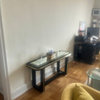
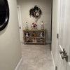
    Even with natural light, it was dark:
    {{!gwi}}

    {{!gwi}}

    The same rooms after painting (a yellow-cream in the bedroom and a blue-gray in the common area):


  • 17 years ago

    What color is the woodwork? Are they going with energy saving flourescent lighting in the halls? Is there carpeting? What is the age of the building? Is it historic? Are you just painting or putting down wall covering? What is the climate in the area?

    Offhand I am thinking of a Terrecotta or a browned out Orange. Something warm. Since you say the hall is dark you would not want a color that would reflect seem Gray. You want something bright and energizing, that is not a loud color that you would get sick of. Then there are maintenance issue. Something that hides dirt and scuffs. You want a color that transcends all decor types so there isn't a big clash when people enter and leave their units. Terrecotta would go with anyone's Tuscan/Retro/Zen/Contemporary/Southwest/Country Charm. A color that is found in nature and seems natural is always a good bet. Greens are a good color for hallways but you have to be careful with them with flourescent lighting. If it is a historic building, use a historic color palette or it will look "off".

  • 17 years ago

    DD -- The woodwork is painted (currently mauve!). The lighting in the hall right now is only sconces -- they are on the wall between each door. Yes, there is carpeting (or tile on the first floor) and that will be replaced. The buildings were built in the 1980s; not historical. Some of the walls now are painted and some have wallcovering. The buildings are in New England but they don't have New England "character" -- they're just 3 big square brick buildings sitting in a big parking lot! We don't know if we'll even be doing this job yet, but I've been daydreaming about the colors we might use and thought I'd poll for some favorites or for some objections I haven't thought of. For instance, I always thing of greens as a safe bet -- it's a welcoming color, reflects nature, etc. -- but I'm often surprised at how many people say they don't like green at all.

  • 17 years ago

    Many of the condo and apartment complexes around Dallas have been re-painted.

    Most have used "Tuscan" colors -- think of pale golds, oregano green, dark wine reds -- even dark pumpkin oranges. Other complexes have been repainted in the beiges, creams and tans -- very neutral colors.

    Yes -- do paint the woodwork in white -- what a massive transformation that will be! And perhaps the hallways in a pale gold (light but warm color) -- check out Laura Ashley Gold #2 or #3.

    Another color might be "Philadelphia Cream" by Benjamin Moore or their "Devon Cream" Check out Benjamin Moore's Historical Collection -- might be some colors there that might work well in these buildings.

  • 17 years ago

    Currently it's '80s mauve -- walls, trim, and doors! (Various shades of mauve. And, of course, shiny brass light fixtures...

    I suddenly have a hankering to watch Miami Vice and Moonlighting...

    (Sorry, no advice.)

  • 17 years ago

    I owned a unit in a 1907 4-plex. I painted the back common area myself to keep costs down. Pleasing everyone wasn't easy. I'm a traditionalist. At the other end of the spectrum are the folks with the screaming (I'm not exagerating here.) orange dining room, green living room and blue hall. We managed to agree on BM Manchester Tan walls and New London Burgundy trim. We used BM Gilford Green for the laundry room, which doesn't get much light.

    I really dislike gray, but BM Edgecomb Gray isn't bad.

  • 17 years ago

    As a Bostonian, I have to beg you not to use the Tuscan color theme...it just isn't the style, but I'm sure you know that.

    I know the kind of buildings about which you're talking...my brother lived in a place in such a complex back when he finished grad school.

    I think a creamy-tan would work well with white baseboard and trim. Check the light refraction numbers on the paint chips you select. That might factor into the equation if you need to make those dark hallways a little more sunny.

  • 17 years ago

    I lived in a condo, and before it was SW Chop Sticks(nice warm tan),it was an ivory~I liked both! The late afternoon sun in the LR made the room glow, with both colors. Since I only used ambient lighting in most of the rooms, they felt cozy and comforting. I did have a fireplace wall which was 14', and painted it a brick red, as well as the top portion of the DR(overlooking the LR), and a powder room.

    I think color depends on sun exposure as well as lay-out. If it's bright almost all day, any color will work. If it tends to be dreary without a lot of windows, you may not want to use a color with a lot of blue/green undertones. Something with pink or red undertones would add warmth, if needed. ;o)

  • 17 years ago

    I worked on two common area projects with very different looks. One was pale grey walls, shade darker trim & doors, with a sophisticated patterned carpet and textured paper at the elevator bank. The owners tended to be young urbans. The other was a light peachy tan with a dark green diamond patterned carpet for the main part but a colorful floral insert at the elevator bank. Art at either end of the hall. Those owners were older. Both looks were good, but appropriate for the owners. Neither was my particular taste but I think you have to focus on what's appropriate for the clients. If it's a conversion, who is the targeted market? If I were the client, I'd like to see a warm cream wall, darker cream trim & doors, a heavy vinyl grasscloth paper at elevator bank (the maintenance workers will thank you), satin stainless lever doorknobs, a medium toned patterned carpet (think maintenance) with a lovely oriental insert at the elevator bank, a round mirror opposite the elevators, no console as tends to collect waste (again think maintenance), art @ ends of hallway if there aren't any unit entrances, and (faux) alabaster sconces.

  • 17 years ago

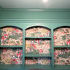
    Since our kids are moving on and out, we downsized to a condo two years ago. Our building was new and much smaller than the complex you're working on--commercial on the first floor, six units on each of the next two floors, and only two units on the top floor, where we are. So, the shared spaces are much more intimate. Our builder hired a faux painter who did a nice job on the walls, but it would probably be too much work for a job your size. The pale gold/brown color warms up the spaces, though, and makes them seem "homier".

    For some reason, the second photo won't rotate for me! You'll just have to look at it sideways.

    {{!gwi}}

    {{!gwi}}

  • 17 years ago

    abundantblessings, it's a "facelift" of already-occupied buildings and the population is definitely mixed. I'd find it easier if it was all older folks, or all younger professionals, but there is a real mix.

    jbolimg, love the unit number plaque! I have the same one on my house. That is another thing that will be changed on these condos, which will be fun.

    Okay, so far it looks like a creamy color, perhaps with a hint of gold, might appeal to the masses. Thanks everyone!

  • 17 years ago

    I neglected to mention that whatever look you go for needs to be classic. Be mindful that owners pay for the decorating, and their monthly assessments include a portion for reserve funding will not be based on redecorating when whims and trends change. While I love white trim in my home, it is not the most practical for common elements which need to take a beating and need to be easily maintained by association janitorial employees or contract workers for best value.

  • 17 years ago

    Would a wallcovering be in the budget? There is a much longer life cycle with wallcoverings than paint. I am not a huge "chair rail" fan, but in a hallway a wallcovering below a rail could make sense for durability. Our hallways have a vinyl wallcovering that is 44(!) years old and while it is far from perfect, it looks less shabby than the painted areas after just a year or two. (If it were all Washed, like we did in our particular hallway, it would look even less shabby)