Software
Houzz Logo Print
malhgold_gw

New Layout -My Practical Side is Taking Over

18 years ago

So...after considering my previous layout(s), I realized/admitted to myself what I already knew, that it was going to be quite an expense to move everything the way I had wanted. Basically, I was moving all plumbing, removing a bay window and closing up that space, moving an existing slider and whatever other "assorted items came up."

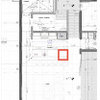
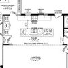
Based on my practical twin rearing her ugly head, I've decided to go back to a version of my 2 island layout that seemed to be pretty well received on my previous threads. Sink/DW stay in the existing location and I only have to swap out my current picture window for sliders. I have added a snack/breakfast area in the "hallway" that leads to my Great Room. That is approximately a 5'X6' space that was empty. I will have to reduce the opening to the Great Room, but I think it will be worth it.

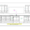
Let me know what you think. Also am looking for some help with the layout of the windows over the sink and pretty much the "designing" of that entire sink/range wall. I am open to any and all suggestions. Thanks!!!


Comments (31)

  • 18 years ago
    last modified: 11 years ago

    I think it looks GREAT!
    Great traffic flow, counter-usage space, accessibility to appliances...

    Question: how would you use the smaller island? What do you intend to do on it? Is it attached or is it portable?

    Now don't take this question wrong: what would consider to the be main (or 2) focus point(s) of the kitchen? What is the wow factor when someone walks in?
    Or is that not one of your priorities, as long as the kitchen functions perfectly?
    This is one of my problem for my layout. I think I can get the kitchen to function well for me, but I am having trouble getting that wow factor.

    Are you planning to put up that Starry Night? That really gives me an idea. We purchased an oil Starry Night painting by an art student in Paris and haven't found a place for it.

  • 18 years ago
    last modified: 11 years ago

    Oh, yeah! This is a good plan. I like the snack center in that little passage. It works for what you need it to do without tossing the kitchen in the air :) It looks like the door to the FR is still plenty wide, like 4' or so, right?

    I don't understand the bump out in the first two elevations. I know it incorporates your plumbing zone, and I like the extended counter, but if you're going to do that can you make a big panty pullout that pulls into the window bay or something? To use that space? Or maybe put more open shelves there?

    So you have a snack area, open shelves, a straight flow for food prep, and it looks cool.

    Do you have enough storage? Food, cooking pots & utensils, baking supplies, dishes?

  • 18 years ago
    last modified: 11 years ago

    The wall where Starry Night is hanging is in one picture but not the overhead - looks like a cabinet? Why not skip cabinets on this wall (looks like it bumps out into the room - first picture - and put a piece of furniture there instead.

    What is the purpose of the smaller island?

    Flow is good. Great work spaces.

  • 18 years ago
    last modified: 11 years ago

    Overall, I like it. Personally, I think I would make the island a foot or so longer and forego the second island -- possibly have something mobile that could move about, but it doesn't look like you have a place to move it to.

    I would still like to do something with that bumpout -- a half depth pullout, a niche, little cubbies. Something other than the butt end of a wall where you don't expect it or want it to be.

    Something seems not quite right about the fridge wall, but I can't put my finger on what it is. I think it has to do with those narrow cabinets across the top --- and then how they just run into the wall. I'd also try to have some continuity on the range wall -- maybe carry the tile around the window or have something wrap that corner.

    The snack center where it is seems to make sense and the opening looks like it is still 4 ft wide or so -- and only for the depth of the fridge. You could get some bottlenecking there, but you also have room to move around it.

  • 18 years ago
    last modified: 11 years ago

    I personally like the layout except for a few things:
    1. Where is the microwave?
    2. I think the second sink is in a difficult place for use when someone is cooking at the stove.
    3. What is the purpose of the two islands? I would prefer one longer island.
    4. What is the tall cabinet next to the range?

    It looks good though!!

    Good luck!

  • 18 years ago
    last modified: 11 years ago

    Thanks!!! Hopefully some version of this will be THE ONE!!

    2nd Island - not really sure of the exact end use, but I like the way it looks, felt that I needed something to fill the empty space between kitchen and eating area, was concerned about the "walk around" factor of 1 big island and it does provide some nice storage. Hoepfully it won't become the clutter zone.

    I'm hoping that the range wall becomes the WOW factor. Right now I think it needs some work aesthetically. I'm just not there yet.

    I think I have more than enough storage. This is so much more space than I have now it's unbelievable.

    Bump out/flat wall at the end of the run is up for grabs as well. Any design ideas? Would I be better off with 1 tall cabinet like I had planned in my other layout? Maybe some version like the pantry in the link below? Without the clear glass panes!!

    Here is a link that might be useful: Pantry Closet

  • 18 years ago
    last modified: 11 years ago

    I'm not sure I've ever asked...Where will you use your mixer? I think that little island, at a slightly lowered height, would be great for baking projects. Separated like that it can also work as a serving surface for the table area without feeling it's part of the kitchen work island. You could put it on legs or casters so it could butt up against the longer island or stand away, as shown...Whichever worked better when you get there.

  • 18 years ago
    last modified: 11 years ago

    OK...I cross posted.

    Seems like most don't like/get the 2nd island. I could just make the island longer. This was my inspiration photo(kind of hard to tell)


    Layout in upper left corner:

    The overhead is slightly different. I could just do a piece of furniture there. I have a 6" wide by 12" deep plumbing bump out that I need to hide. I could just go back to an earlier idea of making an identical bump out on the opposite side and framing out the room with a fake header. Visually it would somewhat "separate" the spaces.

    The cabs on top of the frig wall may or may not stay. Here's a version without the cabs.

    Tile on the range wall is not complete. I am planning on doing the entire wall, including the windows.

    Snack center could get a "little" tight and you're right, it's only for the UC frig that it has to be 24" deep. Maybe if the frig is centered, I could make the cabs on either side 20" instead of 24". Do you think that would help.

    Micro - not in the layout, but may put our old one in the snack area and then do an undercounter drawer in the main area.

    I am planning the 2nd sink to be centered on the island, not in front of the range like in the overhead.

  • 18 years ago
    last modified: 11 years ago

    I like it much better. The dining area in front of the fireplace and bump out is much nicer.

    Agree with perhaps making one island and longer, away from the fridge a little more so that is a roomier area. You certainly have the room to do it!

  • 18 years ago
    last modified: 11 years ago

    I think the difference is the second island (with butcher block top) is between the large island and the cooktop in your magazine layout where it has a function. In your plan, it's between the large island and the table/chairs and looks lost.

  • 18 years ago
    last modified: 11 years ago

    Yup, this one is a lot easier to swallow! And, just when I had decided I liked where you were going with the last plan! :>)

    I totally get the two islands. I think having a shorter one for baking, rolling dough, etc is a great idea (but would you want marble or a smooth surface for that, though I agree that there's something appealing about the butcherblock. Do you anticipate kids working on kitchen table? Or do they have another spot for homework, projects, etc? Island could hold wrapping paper/tape craft supplies, you name it...

    Could range wall be covered with a different brick or ledgestone rather than tile, and forgo the tall unit? I like the openness of the bumpout with art in your first pic.

    So, I guess all your dishes/glasses are going into drawers? You're sure going to have a lot of drawers! Lucky you!

  • 18 years ago
    last modified: 11 years ago

    The second island doesn't bother me as it does for some, but you should determine a function for it before you do it. I like it as a baking island :) Plus it's a good staging area for the table.

    Your pantry link looks great. Build up that whole side of the plumbing thingie out toward the eating area, and take it up to the ceiling. Or you could combine ideas and do the shallow pantry up and continue the counter with deeper cabinets below. I don't like the look of the freestanding cabinet--hiding the bump is better. If you're doing the fridge stainless, you might consider doing the upper doors in stainless too :)

    If you want the range to be the star, don't put art on that wall :) Get a really wow range hood, and dazzling backsplash and you should be all set. In fact, you'll probably find that you have to hold back not to overdo it :) BTW, have you looked at Redrange's kitchen in the FKB?

    Can you steal a few inches from the wall behind the UC fridge to recess it?

    I'm probably way in the minority, but I actually like the brow cabinets over the fridge and open shelves. It's interesting looking and creates visual tension. It also balances the weight of the height of the fridge.

  • 18 years ago
    last modified: 11 years ago

    Oy - just lost my post. @#$@#$ computers. I like this a lot. Love the snack zone in the hallway -- excellent use of space. I like the hidden bump better than the free-standing tall cabinet. I like the eyebrow cabs over the fridge, but not over the open shelves. I would prefer a longer single island, but I've never been a fan of the archipelago kitchen.

  • 18 years ago
    last modified: 11 years ago

    I too initally questioned the two islands. My thought is that four feet really isn't very much space at the far end of the island with the refrig door opened. This path also appears to be the main route into the working area of the kitchen. How about pushing the island towards the table 6-12 inches and making it a little longer?

    After seeing your pictures, I understand the desire for the two islands but wonder about form vs. function? JMHO!

  • 18 years ago
    last modified: 11 years ago

    Just checking in on your post before bed. I think your fridge aisle is OK, but you could easily make it 6" wider if you wanted. I think your little island has at least as much function as the magazine kitchen... Just as a staging/serving area for the table is enough function to warrant it for me, and it doesn't take away any function from your main work areas that I can see. So, in other words, does it hurt to have it there? Your main island is already 8 1/2 ft, which is plenty long, I'd think.

    The one thing I noticed while gazing at the floor plan, though, is the space between the snack counter and your main island...You'll have to weave around the island corner when coming from the great room to the foyer, fireplace room, or whatever. You have 2 ft of overhang on the island, though, so could probably do with 6" less, which would improve that situation and give a better traffic aisle behind the seating. I actually think maybe you'd wanted the island to be 42" way back when, but it got changed somewhere along the line, and never changed back?

  • 18 years ago
    last modified: 11 years ago

    I'm not sure I get the two islands, either, in your plan, but I think the original magazine layout is fairly poor. The clients say they entertain a lot in the kitchen, and you can certainly fit a group in there, but how many times do you say "excuse me" as you go among the major appliances. I see a lot of hip crushers--2 islands and the corner by the sink.

    I think the small cabinets work over their open shelves because they continue around the entire space, though sometimes as open boxes. Yours don't, so they looked out of place.

    I do like this layout better than your previous one. Is there a way to cut more windows into the sink wall? If there are no uppers or shelves, it might be pretty to have a bank of 2-3 windows over the sink.

  • 18 years ago
    last modified: 11 years ago

    You know I like this one.

    I'd be voting for the starry night bump out or the pantry closet, the triple window and the open shelving version. Great style and more the feel in your inspiration pics.

    I'm not sure about the snack counter. Something about the door circus there. Perhaps complete the wall on the kitchen side? Keep the snack counter within the "anteroom" to the great room... Ditch the doors to the great room with a plain opening or reverse them so they open into the greatroom. Looking at a pair of openings with no doors - or a single opening with perhaps a 36" single glass door leading to the great room makes more sense to me then shoehorning a pair of doors.

    The sense of division and changing "places" is better than a little extra counter for me.

  • 18 years ago
    last modified: 11 years ago

    Ok, I missed round 1 of this, so apologies if I'm hashing over old territory and/or if I've tried something you specifically stated earlier you DON'T want, ie a peninsula.

    This is not a precise layout, more a concept, ie making the large island a peninsula, and retaining a smaller island in the middle. I just tweaked it in paintshop, so haven't been able to redraw it accurately (dimensions and exact placement would need adjustments of course), but it gives you an idea. No harm no foul if I'm barking way up the wrong tree (we're iced in and since I've finished my own design, I feel a terrible urge to flex my "kitchen sudoku" muscles SOMEWHERE! lol)

  • 18 years ago
    last modified: 11 years ago

    I like the idea of the two islands, but I'm thinking for the way I work the two would be great if they were switched. The prep area would be closer to the stove and better aligned with the larger island there and then the smaller closer to the fridge as a landing space and another work area for baking etc. and also good for a staging area to both greatroom and dining area. It would also work good to divide people getting to the DW sink from a couple of different directions.

    The snack center there I think is great too. As for the depth could you angle the side closer to the kitchen or make just that side a little narrower to sort of lead the eye in and provide more passage space? I don't think making it narrower on the great room end will do much as I don't think you'll ever really be looking at that side so having it continous would probably work best from counter space too and less corners to bump into.

  • 18 years ago
    last modified: 11 years ago

    Could you do open shelving above the snack center, to tie in with the open shelving along the fridge wall?

    This layout looks wonderful!

  • 18 years ago
    last modified: 11 years ago

    i don't know about your other layout, but i like this one. especially the art! that's something that i forgot in my kitchen and i miss it. i like the two islands. we roll out dough on our butcherblock and it's smooth, atlhough not cold like marble. the one thing that i don't like is the snack center. it seems to close off the kitchen from the great room and sits in a spot where the maximum mixing of cooks and guests is likely to occur. can you make the short end of the bigger island into a snack center instead? i prefer my kitchen closed off, but either closed or open, i wouldn't want people stopping to open a cupboard in the middle of the traffic lane... good luck kren

  • 18 years ago
    last modified: 11 years ago

    Hi mahlgold - I like the new layout but have some suggestions:

    - consider swapping the two islands; your inspiration pic layout works because the smaller island is in the work zone. Plus, with your layout, having the small island on the other side would make it the perfect place for prepping things out of the refrig, etc. Also, I agree that in its current form the prep sink could be a problem but if you swap the two islands then the prep sink would stay as is and would have great function being close to the table (thinking of filling up water glasses, etc).

    - an alternative to swapping the islands would be to scoot the larger one down slightly and then have the island top drop down to a lower height and bring the sides in (so it'd look like a smaller island is attached to the larger one) - I'd use a different material for that end too - you could do this at either end (one or the other, not both ends) and either use it for baking/staging for the table OR use it for prep/work for the meal and things out of the refrig.

    - consider getting rid of the doors from the GR to the snack zone/kitchen. Even with the side cabs of the snack area set back if you put the UC frig in the center (but I don't think you have to setback those ends), those doors are going to become a problem. If you don't want an open walkway, either make that opening with a pocket door(s) or doors that open into the GR.

    - As for the plumbing bumpout, I think you could do something cool with that space but I'm not sure I like the open pantry closet - if you want something with that open look, consier doing a tall cab that incorporates the bump-out - such as a cab that goes ceiling to floor w/ the top set-back where the middle section of the upper part is glass doors/shelves and the sides of the uppper part are solid narrow doors but with the left being functional and the right (the actual plumbing bump) being faux.

    - as much as I think divamum's done a great job, my thought immediately went to you having kids coming from the GR into the kitchen to eat/hang out with you and having to walk all the way over to the counter stools - I prefer your placement of the sitting island to avoid them having to walk through your work area or linger at the smaller island (which I think they could end up doing).

    - as for the refrig wall, would you consider having a cabinet surround go to the ceiling with funky, open lighted display shelves above running from the wall to the far side of the refrig cab? You'd have that cabinet surround essentially run up the wall from the counter, along the ceiling line and then down the right side of the frig with a shelf running along at the height of the frig and open cubbies/display cubes being between that shelf and the cab surround at the ceiling; then have the open shelves continue below (as you have drawn) (I hope that makes sense) - it just seems to give some unity to that whole area, gives the frig more of a built-in feel, creates some cool visual interest and balances the opposite wall which has the brick to the ceiling.

    - what are you thinking for your tile/backsplash around the range and window wall? It might be funky if you're still considering a contemporary feel to do some sort of brick OR a brick-style slate (picking up some of the pewters/etc in your FP wall). Whatever you do, I agree that it should continue around the window.

    That's all for now - I have two sick boys home from school but I'll check in later!

  • 18 years ago
    last modified: 11 years ago

    The two islands might make sense if you plan on using the little one A LOT. But I think that even so, you stand to lose more than you gain by having two of them. It looks like an obstacle course if you think about multiple people in that kitchen...even one person weaving in and around the islands. I can't see the point. What is wrong with some open space in which people stand and talk or move around?

  • 18 years ago
    last modified: 11 years ago

    I was just noticing that your fridge end is essentially a mirror image of my kitchen, and wanted to show a possible different solution from the open shelves.

    I have a tall pantry cabinet next to the fridge, and an appliance garage in the corner at counter height, and another pantry cabinet above it in the corner.

    Just food for thought since some people aren't loving the high cabinets (which do seem too high to be very useful) and others aren't loving the look of the fridge with out something there.

    {{gwi:1670969}}

  • 18 years ago
    last modified: 11 years ago

    I agree with many of the previous posters in that the two island concept works if you switch their positions. That would also alleviate some of the narrowness between the snack center and the island because it would be a smaller one with no stools.

    Also, have you given any thought to putting some china cabinets/buffet space on the fireplace wall? You could keep your china/platters/etc there and have a place for putting serving dishes that don't have room on your table.

    Other than these things, I love this design! It makes much more sense than moving everything around. Give a pat on the back to your practical side.

  • 18 years ago
    last modified: 11 years ago

    Just to speak for Malhgold again, she already decided to get rid of the French doors, but I hadn't given her a rendering that showed it that way when she posted these.

    Malhgold, we talked separately about my feeling that it'd be nice to have a wall section on the kitchen end of the snack area and bmore's suggestion that it be confined to that little great room vestibule has me thinking about that again. If you could consider going back to a drywall-framed fridge, it might look more natural to put up the wall on the end of the snack counter and create the doorway to the kitchen there.

    histokitch, are you saying the windows should be different than the bank of 3 shown in the top 2 renderings above, or is were you saying you preferred that? The windows are something she asked for particular suggestions. I'm feeling like everything looks wide and long on that wall, with no vertical elements for balance. Maybe breaking up the windows might help?

    BTW, I agree that the magazine kitchen has a TERRIBLE work layout. We here at the kitchen forum would never let someone build that with the headaches it must cause! ;-) Talk about weaving around two islands...How do you get from fridge to sink to prep to stove, then back to the fridge for sauces, etc. while cooking? Messy and a long walk.

    With this plan I see no weaving around the islands, since the little one is really out of the way. If they were switched, I would then be concerned about that. Also, I see a staging need for the often used table more than for the great room or the dining room? Maybe because it's butcherblock, people are only seeing it as a place to chop so think it needs to be near the fridge? Think of a party (grown ups' cocktail party or kids' pizza bash)...People milling around and visiting in the living room and fireplace areas. The smaller island would be a great place for the appetizers or pizza so that the table is left free for sitting and the kitchen is free for working...and nice traffic pattern all the way around it, again without being in the hostess' way as she works, because that path through the islands isn't one she needs.

  • 18 years ago
    last modified: 11 years ago

    I meant a bank of windows over the sink just like in the top two pics, but not on the plan, where it's single. I'd tile them in the wall just like the inspiration kitchen.

    I don't have a problem with the layout, other than feeling that the second island is just that--a little floating island on it's own. It's not a bad thing, I just don't know how functional it is. I do like the appliance placement and the art wall.

  • 18 years ago
    last modified: 11 years ago

    First I want to say THANKS for all the comments and suggestions. It seems that overall people are pretty positive about the plan which is a great relief. Couple of things:

    1) If island goes to 42" deep from 48", that will help with the flow from Great Room around the snack area and into the kitchen.

    2) Frig area: I'm thinking those cabs at the top are making that section look very squat, as it's not a very long stretch of wall space. What if I drywalled around the frig to the ceiling and left the 3 shelves. The cabs and counters on that wall could be stainless as well to tie it all together. My other thought was to create a "soffit"(shudder at the thought, we took them down already) that extends from on top of the frig to the outside wall. Could cover it in stainless??

    3) Snack area: what if I put a return wall that lines up with the front of the frig on the kitchen side? It would push the snack area slightly out of the kitchen. I actually like it partly in the kitchen. Makes it feel like I don't have to turn a corner to get there. Other option is to further reduce that frig wall by what looks to be about 6 inches so the openings to the Great Room line up.

    4) For now I'm leaning towards keeping that 2nd island. What if I reduced the length of the big island by 12" and scooted the smaller island to the left about 6".

    My only other concern with the layout is that all the frig/freezer appliances are at the far end of the kitchen away from the dining table and the access to the outdoors. Unfortunately, I don't see any way around this other than to put the frig to the left of the plumbing bump out. Just not sure I like the way that looks and I sort of like the main frig being near the UC frig for functionality.

    Here is the layout without the french doors.

    Would also consider a 24" Liebherr in the corner of the snack area as pictured below. Much more functionality for not that much more money than frig drawers(I think!)

  • 18 years ago
    last modified: 11 years ago

    The liebherr looks good built in like that. I like the main fridge where it is, but it does leave traffic going through the main work zones to get to it from the outside. I think the second island adds to that but really directing traffic toward the range aisle. Is there access to the backyard from the great room? That might encourage access from the great room to the snack zone, making this more of a secondary traffic zone, and less of a concern.

  • 18 years ago
    last modified: 11 years ago

    I don't know how it translates from computer to reality, but I still like the brow cabinets and the way they make a frame around the open shelves. It looks polished and interesting.

    Re fridges and traffic, I think Kren is right about the snack center becoming a bottleneck, but I still like that better than so many of the alternatives. Perhaps when you have flocks of kids in the great room, or a party, it'll be worthwhile to set up a beverage service area elsewhere (like in the great room). The UC looks a lot better than a full height fridge would, but while I think you could keep up to a dozen kids hydrated and fed after school with the small one, if your packs tend to run larger or longer you might actually want the greater space.

    Something to think about for outside is a good ice chest now, for the flocks during Summer, and eventually an outdoor kitchen area (if you barbecue) with its own fridge :) Depending on the layout of your outside you might consider a pass through window in the kitchen area with a service/landing counter outside as well. That way you can easily get platters, ice, etc., out to the ravening hordes. :)

    Re distance from the dining table to the fridge, you're not wrong, but it's not that big a problem either. I have a similar distance between my dining table and fridge. Though the island counter is a better place for make your own sandwich lunches. I wouldn't want the toaster to be that far from the table (as any fan of Mr. Shipman would know), but it's really not too far to go for drinks and pickles. And there's always something that has to give. This layout makes so much sense otherwise.

    With a lot of what we're talking about now, we're down to looks/function trade offs. I like your little island too. It's just funky :) And gives you some extra storage you probably need. And routes people into the door side of the kitchen away from the cook. And it's cute :)

    For the snack area, just taking out the door markings opened it up :) I like it the way it is.

    Can you tell I really like this plan? I'll shut up now...

  • 18 years ago
    last modified: 11 years ago

    There's nothing ugly about your practical twin - that's what planning is all about and luckily you can make these changes without it costing lots of money.

    That has happened to a lot of us - we design our dream kitchen and then smack ourselves on the head and wonder what we were thinking - we can't spend $300,000 on a new kitchen. Then we get a sensible design that we love and can afford and never look back.

    Enjoy your kitchen.