Software
Houzz Logo Print
geogirl1

Is Baby Turtle ssssoooooo 2009?

14 years ago
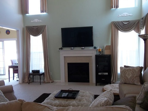
I am desperately looking for a paint color for my family room and adjacent kitchen. I am struggling with very nice green and gold curtains left by the previous owner and my new golden tan and beige couches. Turns out baby turtle is in the curtains and would compliment the curtains and couches. However, I was set to paint my cherry kitchen Saybrook Sage (a blue green) and now that won't work. So, I could paint both rooms baby turtle or baby turtle and flowering herb. However, it seems BT was an "in" color in 2009. Is it now an "out" color? Most of my house is done in blue greys and greys and yellows. Saybrook Sage would have been very nice, but now I'm leaning toward Baby turtle.

What do you think? Anyone with photoshop skills would be very appreciated!

Comments (36)

  • 14 years ago

    I can't speak as to whether it's in or out, however I believe you should use the colors that you love. If not, we would all be changing our paint colors every year. I have Ellen Kennon's Edgewood Green in one of my rooms which is very similar to the Baby Turtle and I just painted it a few months ago. I say go for it if you like the color and it ties in with your other elements in the room.

  • 14 years ago

    Seriously? Girl!! You have been participating in this forum way too long to know that if you have been fortunate enough to find a color that works perfectly you should not be worrying about whether it was popular in 2009! Besides that was only 2 years ago! Just because it hasn't been mentioned in the forum for a while doesn't mean it's no longer a great color.

  • 14 years ago

    Well,I agree with sis2two. You should do what you like and what makes you happy. I think too that what makes a color seem dated is sometimes due more to how it's styled and what colors, fabrics, furniture etc. is around it. Your new furniture looks very up-to-date. That ottomon is beautiful. I think the warm greens can look very nice with putty and stone and even darker slate colors. I paged through the other pix of the house and saw the red-yellow-green combo. Sounds like your switching all that. I do associate that palette with 2009 (and earlier) but I think you can mix the green with other colors and it'll be okay. A decorator once told me that you can't go wrong with green, the eye never tires of it.

  • 14 years ago

    So all the people that painted Baby Turtle living rooms in 2009 should change it?? No. It is still a lovely color and will look lovely in your room. Go for it!!

  • 14 years ago

    While I agree about not following trends, I've been watching your other thread and it seems like you are going too yellow in your colors. That could be moonitor or it could be your thoughts of light and airy keeping the colors sunny and yellow. The grey/beiges in your furniture and the semi-muted look of the curtains (again, could be the way I am seeing them and not the way you do at home) is going to go better with a more muted color. I can see green if you go to a softer sage or a deeper tone.

    I would even say you could go to a bluer tone, but the colors in those curtains are probably going to keep you trying to not go too far in either direction (yellow or blue).

    I also wouldn't be afraid of putting a bit more color on those walls, the curtains read light and so do your furniture, your floor, the trim -- everything else. If you are going to only do one or two walls, don't be afraid of some color. I think the contrast will make your furniture and curtains seem lighter and you might like the result as much or more than lighter walls. I'm not saying dark, but a midtone rather than a pastel.

  • 14 years ago

    Ok, ok, ok! Hanging head in shame.....Sometimes this paint stuff just gets the best of me. Most of my colors I just see and "know", oh that's it. Mostly I'm looking for a feeling, not a look or a color. Painting the master bath in Comfort Grey and sea salt. It's just right and I am very excited to see that done. The bedroom is done in glass slipper and santorini blue - I love it and every time I go into my bedroom it just feels right. It's the ones that I want to work, but feel uneasy about that I know it's just not working. Like the Twilight Gold, which is very pretty and so not helping my room not look like a beige blob. Heading off to go buy samples of BT and Flowering herb.

    And thank you for your comments about the ottoman. I fell in love with that fabric and knew I wanted it for my ottoman. The rest of the furniture and rug was selected based on the ottoman. I love it!

  • 14 years ago

    I agree with everything lascatx said.

  • 14 years ago

    Thank you for your comments lascatx - I posted while you were posting. I think you are right - too yellow. However, Baby turtle is a yellow green. We'll see how it looks once I get the sample paint.

    I also agree with blues being ok with this color. I would like to add blue tones in the accents. A poster here showed BT with blue hydranga's and it looked lovely.

  • 14 years ago

    The ottoman is the fabric I keep looking at and wanting to play off of too. If you haven;t, take on of the matching pillows with you to a paint store and find several possibilities, then look at those with the curtains. Whatever you pick has to go with the stripe and the valance if you plan to keep those.

    Don't be discouraged. You have a lot you are trying to tie in with and a lot of light in there too so that colors are defnitley going to look different when you look at them in the paint store. When you find something close, use it as a reference. If it looked more green or blue, pink or whatever at home, know that other colors may sway that direction too. I knew exactly what I wanted for my half bath, but they didn't look right in that tiny room. I wound up tweaking the gallon of paint to something custom. My bedroom color came from the computer telling me the powder room paint was closest to BM's Wish. Backed into finding Wish for the bedroom and love it.

    I was looking at the BM website last night and it quit working. I am much better looking at the chips than on the computer anyway, but I was thinking about you and trying to make a suggestion. Hope you find a winner.

  • 14 years ago

    I put up an exact match for BM Palladian Blue ten years ago.

    Fashion forward! Trendsetter! The only time in my life.

    In two years it's going to be so 2011.

    Dated! So over! I don't care!

    Just pick the color you love, that works in your home. It will be beautiful.

  • 14 years ago

    I don't think a color can ever be out . If you use those you don't really care for because they are in , that's when you get into trouble. I prefer warmer tones and really don't like cool greens for my spaces. I haven't jumped on the grey bandwagon, yet, but do love the ones that lean warmer. Could never have one that has a purple or blue cast. I happen to love Baby Turtle and am still going to use it someday, somewhere. If I were to suddenly paint my rooms in cool colors, it just wouldn't be me. Other people love the cooler range and it looks especially super with contemporary decor.

    Use what you like.

  • 14 years ago

    I agree with what everyone else has said about not worrying about a color being dated. However, I'm going to give you my two cents about something else and obviously, you can ignore me completely. If you're worried about "datedness" (is that a word?), if I were you I would take down those little scrolly wood things over the windows, remove the --oh no, what's the word for those half-circle curtain pieces? jabots? -- remove those, so you just have regular drapes, and hem up the drapes so they're not "puddling." I'm sure I'll get disagreements, but to me, puddling drapes is dated. Sorry, you didn't ask, but I guess I'm feeling bossy today. Everything else in the room looks nice but those curtains are distracting.

  • 14 years ago

    Didn't read responses but I say go for it if you like it and it works! I'm seeing BM Agave a lot. And liking it very much. First poster I saw mention it here was Aunt Jen (don't recall if that's what she did her living room in or one of her other choices close to it.)

    My local bank has what looks like Agave and I was in a medical clinic and they had just done everything (via a designer) in BM Agave with BM Vintage Wine on small accent walls & low partitions. Stunning combo! To my eye Agave has more "pop" (yep, I used the "P" word, lol) than the more subtle hint of earthy BT or FH. And maybe more yellow or what I'd call lemon/lime, but it's not terribly far removed IMHO. Point is (if it matters) those somewhat similar greens are hot right now, just tweaked brigher from recent years. Perhaps the 80's resurgence influence. Personally always did love Baby Turtle & Flowering Herb. (If you search google images for BT, redbazel's living room with black armoire is in first or second row of results. Love that combination.

  • 14 years ago

    LOL Sueb20 - boss away all you want Sueb, my neurotic and indecisive behavior deserves it! I am not normally like this IRL. So, the scrolls are coming down when the new paint goes up. The Jabos (?) cannot be taken off as these curtains are hung on a board. The previous owner tried to sell these curtains to me for $5,000. Yeah, really. I told him I liked them and we'd be happy if they left them with the home, but if they wanted to take them then they should. These are very well made, high end curtains and I would never in a million years pay that kind of money for them, although I really admire homes that have professional curtains. My husband also hates the balloon look; he doesn't know from fades or styles, he just thinks that they are too long. We have thought about switching the longer curtains to hang at the top and the shorter ones at the bottom. We are just not sure if they would look right, or what we would have to pay to have them all hemmed if they ended up being a bit short or a bit long. The curtains in the upper left window are already two inches too short (shorter than the upper right window :o ). We will have that hemmed correctly while the curtains are down for the painting.
    I currently have sample boards of Baby turtle, Flowering herbs and Dry sage drying on my kitchen counter. I will post a picture when they are dry. In my kitchen while the boards lay horizontal, the baby turtle looks more kaki than green.

    Thank you for your opinions and help everyone! Go ahead, boss away, I can take it!

  • 14 years ago

    I think I am going to have to live with these in different lights to see how they look, but here is starting on the left, Flowering Herbs, Baby Turtle and Dry Sage.

    Thank you moonshadow for the Agave suggestion. I like the color, it just doesn't work with these curtains. That's the problem, finding something that I like, that goes well with the couch and ottoman AND looks ok with the curtains!

  • 14 years ago

    Dry Sage looks like an "almost match but not" next to the valance. On my screen BT looks best. How does it look with your pretty ottoman?

    I'll bet you could take those curtains off the boards and hang them from rods without the valances...

    Java

  • 14 years ago

    Light changes everything with all these paint colors. We'll have to see what it looks like tomorrow with the sun out. This is early evening:

    I know the picture is not the right scale. Again, I'll change it after the new paint.

  • 14 years ago

    My LR used to be Baby turtle. Several family members/friends freaked out when I got ready to repaint 2 years ago. But I need change. I loved the BT and would do it again in a different mood or house. I also have the Dry Sage which was Ben Moore's color of the year in like 2000 or something. I waited till 2010 to paint that one.

    Red


    Baby Turtle in one side of living room,

    And a not so good shot of the Dry Sage in entry. Sometimes it looks more green like here, sometimes more gray, and sometimes, almost blue/green.

  • 14 years ago

    Thank you Redbazel! I have been looking at your beautiful pictures a lot recently! I love your entry and I love the BT in your LV room. Right now it is looking the green I like (it's dusk outside) and that is the color in your pics, as well. Early this afternoon, it was looking very khaki. It was the khaki shade that was not working for me in the living room, but mostly in the kitchen, where I would carry the color. So, what color did you paint your LV recently? I'd love to see it!

  • 14 years ago

    martha stewart mourning dove, kind of a green gray.

    red

  • 14 years ago

    Sea Salt is very light and reflects glare, so keep that in mind if you have a lot of natural light. We painted over it with the Comfort Gray, it's the same color as Sea Salt but darker and is FABULOUS!! I haven't met anyone yet who's been unhappy with it.

  • 14 years ago

    I was never a fan of BT, i like clearer greens, but I don't think it looks dated at this point. Whatever color you select, I would remove those wood appliques from the wall.

  • 14 years ago

    flowering herbs is my choice

  • 14 years ago

    How long are you planning to keep the curtains? I ask, because if they are a temporary thing, and you will be replacing them reasonably soon, I wouldn't let them limit the paint choice.

    Honestly, they are too skimpy for the proportions of the windows, the ones on the upper windows look too short, the sheers on the lower windows are too short as well. You could take off the striped panels, and just use the swag valances, using clip rings or adding a rod pocket to use them on a rod.

    Or, you could make cornices out of insulation foam panels(cheap and easy) or wood, cover them in the stripe from the drapery panels, run sideways (railroaded). Use plain panels underneath in a neutral color, but have them fuller and coming out wider on each side of the windows. Or do the same valances, but get blinds or woven woods underneath.

    Or use the swag, then use the striped panels to make into roman shades for the windows.

    I would rather see you start with the ottoman fabric that you love and build the room colors around that.

    Dd you look at Revere Pewter, by the way? Of the swatches you have, I would go with the Dry Sage.

  • 14 years ago

    I don't think so but it wouldn't matter to me - love the BT in my powder room and laundry room and not planning on repainting anytime soon. It's the one paint color in my house that receives the most compliments. It's also the color I used to paint huge hutch last year and that's definitely not getting a makeover anytime soon!

    It's hard to tell if it works in your space. Based on the first picture, I was going to say FH because it looked better against the curtain fabric, but in the lower picture it looks too light.

  • 14 years ago

    Baby Turtle is a classic and will never go "out of style".
    Looking at your pretty new furniture, it looks like the sage is a perfect match?? The otto and pillows are darling, BTW.
    Just an after thought...could you maybe remove the top curtains and use them on the bottom? (panels only... carefully cutting off the swag part??)

  • 14 years ago

    Thank you all for your suggestions. I think what I am hearing is that I've been trying too hard to make those curtains work, and they just don't. I will have to think about this. I have a seamstress that might be able to come over and figure out what we can do. Not sure the price though.

    Red- I hope you like your new color as much as you did BT!

    Lukkiirish- Thank your your suggestons about sea salt. I have painted each wall in our bathroom with a little bit, and on some walls SW sea salt is very reflective. For this reason, we will use sea salt on the front half of the room and Comfort gray on the back walls that recieve more light. I am very excited to see how it turns out!

    kswl - we will be taking those down. :)

    juddgirl2 - thanks for your input. I think the flowering herbs will not work in the main room, but I might use it in the small mudroom connecting to the kitchen.

    Loribee- I love the ottoman too! I picked that and built the rest around it.

    Les917- Thank you so much for weighing in on my family room. Your advice is always so spot on and I really appreciate what you are saying. I guess this was my first time having professional curtains that I thought I should keep them! I like your ideas of using the fabric to make something more modern. I don't want roman shades though, because I really like the light. I want something that offers a bit of privacy on the bottom, but does not block the light/window.

    I have looked at Revere Pewter, I think, but it is too light. We are only painting the two main walls, the others will stay BM barely beige. The problem I have with Barely Beige is that it is almost not there, except at night. I think Revere Pewter would be similar - almost a non color.

    Again, thank you all! It is now morning and bright out. The BT is almost the same color as the strip in the curtain. The sage is almost the same as the jabot.

  • 14 years ago

    That's sounds really nice, I hope you show pics when it's done!

  • 14 years ago

    I would take the jabot down and trim out the board that is left, so the panels hang out of the trim. I raelly like the color on the left with the panels, but not the jabot.

    Love the ottoman, too!

  • 14 years ago

    If you need to shorten them anyway, why not leave the hem, take them off the board and put a new finish on the top for a rod, rings or something fresher.

    And bottom line -- don't let free curtains rule the room if they wind up not working with everything else. Then they are no longer free.

  • 14 years ago

    geogirl1-

    I agree with the posters who said the curtains are the problem, honestly, I don't think they work in the room, they are too formal for your furniture and the room itself. My guess is the PO put the little scrolly things on the walls to try to make the room formal enough for the curtains, but, umm, fail. I would ditch the curtains totally, but if you need privacy coverage get something cheap like drop cloths for the bottom ones and leave the uppers nekkid until you are ready to make a big investment in something that works with your style.

    Good luck-

    sandyponder

  • 14 years ago

    But wait, if I ditch the curtains, I could paint ANY COLOR, and then I'd be starting over, and I have no idea where I'd go with it since I've been focused on the curtains working and the painters are coming in two weeks and, and, and I think my head might explode.

    Beach glass, quiet moments, Revere pewter........

    I love the nekkid - made me laugh.

  • 14 years ago

    Do you have a PPG store in your area? I think you should look at a color called Toasted Almond.

  • 14 years ago

    Haven't been around too much to post lately but when I saw Baby Turtle I was hooked!

    Was my LR BT in 2009? Possibly.

    Is my house all white and grey and stuff now? Yep. It started headed in that direction a long time before it was so popular.

    There's still a part of me that totally pines away for my BT LR. Really. I only changed it because I wanted my gallery walls to be the main focal point, I wanted pretty much all one color on the walls downstairs and I wanted each room in my home to act and relate as one not each as a separate individual room. I personally couldn't achieve that w/ 1 BT room and I couldn't live in a house w/ all green walls if I painted every room a shade of green.

    If I had a secreted little tureted reading room I'd paint it BT in a heartbeat and do it exactly as my LR was before.


  • 14 years ago

    Thank you ttodd for your pics; your room is beautiful. Your pictures convinced me that I could add blue to a BT turtle room. I love the hydrangas in your room!

    I think I have decided what I will do for now, anyway. I have 2 weeks to change my mind! I decided that I just didn't like baby turtle in my light about 1/2 the time. It was beautiful a lot of the time, but other times it was kinda of murky. I also think the dry sage is too dark for my family room as I am trying to keep a light and airy feel to it.

    For the living room I will paint the window wall and one sofa wall Gray Mirage, which is the lighter version of dry sage. It is not an exact match, but the curtains work well with it. It looks nice over the sofa too. My kitchen (which flows into the FM visually and has dark cherry cabinets) I will paint dry sage. That room can handle a darker color and the dry sage will look lovely near the dark cherry cabinets.

    The little back entry mudroom behind the kitchen (it is located on the other side of the kitchen from the Family room) I will likely paint Gray mirage or perhaps November rain (one shade lighter than gray mirage). I am looking for a complementary color for the dry sage, but I think gray mirage will look pretty and it will make the space flow better. I still have barely beige in the family room and a bright yellow sunroom - all open. So, I think I need some gentle flow to contrast the bright yellow and the sage.

    I like the gray mirage/dry sage combo whether I decide to keep the curtains or not. I think it will compliment the sofa/ottoman/rug regardless of whether I keep or change the curtains. That takes some of the pressure off.

    Thank you all for your help! I really appreciate your veiws and comments on this journey. I ordered the side tables today and the painters come in 2 weeks. I am still trying to figure out how to get some blue in the room ( the dinning room is a gray blue and the library is gray as well). I did consider painting the kitchen Beach Glass (which BM says is a nice combo with gray mirage), but I didn't think I would love a blue kitchen for years, but a green one I could. I'll have to get the blue/gray in with some accents or art!

    Thank you again- any comment are welcome and appreciated!

  • 14 years ago

    FWIW I think soft blue is the most perfect, relaxing, cozy color combo w/ BT. Good luck!