Software
Houzz Logo Print
noellabelle

Kitchen window help

15 years ago

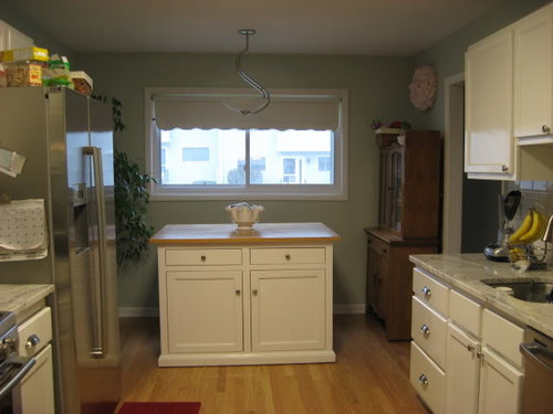
We're getting close to finished on our kitchen remodel, but I'm having a hard time deciding on the window treatment. The kitchen decor I'm going for is mostly white with aqua and red accents. I don't really know what style it falls into, maybe vintage/cottage/classic?

There's one giant south facing window in our kitchen. It lets in a ton of light, but not a very good view (the parking lot for our condo townhouses, and today has a snowy view ugh!)

I was first thinking a bamboo roller shade, but I need more privacy than a standard one, and I haven't had much luck with the privacy liners staying nice and functional.

Then I thought either white or mid toned wood blinds with a valance, either in the red or aqua family.

Then I decided to make a faux roman blind and either leave the roller shade behind (removing the ruffle) or putting in a wood blind. I spent hours looking for fabric, and eventually bought this one. I was drawn to lattice type geometric prints, but there were none in the aqua or red families. And the aqua ones I found seemed much brighter than my walls, which are a more subtle aqua/gray color.

Now I think the fabric would be overpowering, and I'm now back to the possibility of a bamboo roman shade, but leaving the roller blind underneath so I could have light filtered or blacked out. I'm also worried with the fabric, that it might get dirty even with scotch guarding. I have 3 small kids that like to eat at the island, and they like to test the cleanability of every facet of our home (my 3 yr old colored on the kitchen wall this morning!!!)

Any opinions or ideas?

Comments (24)

  • 15 years ago

    I agree, the red damask is not the right fabric, but I really like the idea you were going for. Why not just try to go with a more subtle print in regards to color?

    Something more like this:

    http://www.joann.com/joann/catalog/productdetail.jsp?CATID=cat2143&PRODID=xprd944190

    Or this which has hints of reds and the aqua in it but won't over power the space:

    http://www.joann.com/joann/catalog/productdetail.jsp?CATID=cat2143&PRODID=xprd581639

  • 15 years ago

    I agree with lukkiirish. That's not the right fabric. I do love the 1st one lukkiirish linked to. I think that would be perfect.

    I don't really see any red in your kitchen? Maybe a red rug on the floor (can just see the edge in one picture). Is there more red around?

  • 15 years ago

    I also like the first fabric lukkiirish posted, it brings the blue/grwall color together with the wood hutch.

  • 15 years ago

    Thanks for the suggestions. I do really like that first fabric, but I am hesitant that the main accent color in it is beige, and I have been trying to avoid that color....I think at least in part b/c there's a lot of gray in my countertops.

    I have a few red accent pieces planned, which mostly aren't up yet. There are also dark red spots in my granite.

    Here are some towels I serged to use instead of paper towels (i.e., unpaper towels). So these sort of show the general colors I'm going for; fun, but not overpowering maybe?

    my coffee filter wreath with red painted edges

    I'm going to line the 2nd shelf and maybe the top one in red paper or fabric (the top shelf will hopefully be my herb garden).

    Two woodprint cards I am going to frame, and helped me pick the color of the room

    I'm going to hang this plate on the wall. I fell in love with it at pier 1, and I sort of matched that red damask fabric I bought to it.

    I've noticed I have a current obsession with birds!

    I'm still leaning toward a bamboo roman shade...I thought picking out the fabric would be the fun part after painting and tiling! LOL

  • 15 years ago

    I like the red print. As long as it's paid for, why not try it out? How about a band of a solid color down each side of the roman about 6 inches in, to cut the repetitiveness of the print? Even a double line of solid color on each side? Or divide the roman into two if thermal qualities don't matter--this allows you to cut the left-right continuity of pattern in half since the light will hit each shade differently. You can also run a trim across the bottom, pompoms or fringe or something.

    Big problem will be the assertiveness of the print, so it will also need some companions to even out the effect.

    I really like that plate. Three in a row on a wall would be a real statement. Are there more in the shop? Do you have red dishes? hand towels? rug? tablecloths and napkins? My family has a lot of Swedish textiles with red bands woven into the linen so I've had a lot of experience with this palette. Look into Scandinavian shops for many decorating ideas and objects. Ikea often carries yard goods in red prints and checks. I also suggest picking up on pewter look of hardware and grays--serving pieces, vases, etc. Wood items also, ones with definite silhouettes so they show up against the backsplash.

    Consider red geraniums in pots or greenplants in red pots.

    Your kitchen will have a definite personality, a happy one. Family and guests will remember it fondly.

  • 15 years ago

    I don't know if this appeals to you, but it's red, turquoise and a cheerful print for a young family. It would also make cute shades.

    http://www.amazon.com/Michael-Miller-Bandana-Borders-Fabric/dp/B004JKF7KA

  • 15 years ago

    Here's a room with a fabric on a scale which might match your print.

    Here is a link that might be useful: scroll to roman shades photo

  • 15 years ago

    i think the red and white fabric could work if you do incorporate alot more red into your room... otherwise, it's too strong, imo.

    i would prefer something with some aqua in it too, but that is certainly a different look than you're envisioning it seems.
    i don't care for the print you have up on the bookshelf-almost think solid red would look better than that print-could even be paint. or if you don't use the red and white fabric on your windows, bring in some aqua too...

    the coffee filter wreath comes across as pink in the pics and probably irl unless very close up...red and white together from afar often looks pink if the print is small-doesn't provide a good red accent in that corner.

  • 15 years ago

    Okay, I'm taking the plunge and sewing up the fabric I currently have. It is take a risk day, according to the nester anyway!


    Thanks for everyone's suggestions! Hopefully once the rest of the red gets in the room, it won't look too bad. I'm just really ready to move on to another room, as we started this reno in August.

  • 15 years ago

    Seeing all your accessories and that red plate, I do think it could work.

    Your granite is beautiful. Do you remember what it is called?

  • 15 years ago

    Thanks Jill...it's valley white, which seems the same as river white. The colors are similar to kashmir white, but it has a lot of movement. I was going to go with dark (jet mist), but I fell in love with this slab at the stone yard!

    I finished the valance; it's definitely not perfect (I really need to stop doing important parts of sewing when my dh is on a business trip and all 3 kids are yelling!) but I think it's going to work in the space. I just painted the trim tonight, so I'll have to wait to hang it. This puppy is huge! I was planning on the ribbon even before it was suggested on here, bc the fabric was 60" wide and my window is 69", so I needed to cover my seam.

  • 15 years ago

    Looks nice, you did a good job. I think because it's so wide, I would try a wider ribbon.

  • 15 years ago

    I love the fabric and think it'll pull together once more of your accessories are in. I might incorporate something that mimics the design of the valance and the plate, but in another color, maybe a pitcher on your shelves, etc.

  • 15 years ago

    Thanks for the granite names.

    Wow, you are fast! Oh how I wish I could do that so fast!
    It looks beautiful. I think it is going to be perfect. Don't forget to post pictures when it's hung and accesories are in place.

  • 15 years ago

    Whew, got it hung! I am really happy with how it turned out, and I think it's the feel that I was going for; bright, fairly classic, happy, and maybe a bit unexpected. I'm going to just leave the roller shade behind it (it's fake & doesn't go up or down), since it's just closed at night.

    Thanks for all the hand holding and suggestions!

    I am expecting a clock in the mail soon (linked below), and I wanted to get the feel of how the shade would look in the room before adding some of my accessories.

    I really wanted to get these prints in either aqua or red, but the etsy shop seems closed. I emailed the artist, and hopefully she'll be able to do them.

    http://ny-image1.etsy.com/il_430xN.104540977.jpg

    Here is a link that might be useful: my new clock

  • 15 years ago

    noell
    WOW good for you! So impressed with how you whipped that up - although I suspect you have been making that in your mind for some time....Jealous of how nicely it turned out & testament to your skilled hands at the machine. I feel paralyzed frequently before, during my sewing endeavors

    Love what you have done and give you credit for going out of your comfort zone.

    I like the idea of more red pops in there - I would rec purchasing more of the red bird plates from pier 1 & hang as a grouping rather than a lonely only. I would caution aqua pops as the tones may get somewhat difficult

  • 15 years ago

    I like it a lot. I liked the fabric from the beginning.

  • 15 years ago

    It looks great! I am amazed at such talent!

  • 15 years ago

    Thanks! You're all so kind and helpful!!! My husband has been away this week, so I've been spending more time on my projects, staying up late working on stuff.

    It wasn't that hard to sew, but it did take awhile. I used a tutorial from censational girl, who used one from another site but it was all no-sew.

    I like the idea of adding more plates, but I don't know if I would have room to do a larger grouping. The wall space is pretty limited between the big window and cabinets. So I'll have to figure how much room I have to add decorations.

    I just saw this a few minutes ago, and I think that red & aqua herb pots with my own chalkboard paint could look really cute.

    http://www.centsationalgirl.com/2011/03/make-your-own-colored-chalkboard-paint/

    Dh just needs to add crown molding to the cabinets and finish the baseboard, and hopefully soon I'll be able to share my finished room on the kitchen forum!

    Here is a link that might be useful: faux roman shade tutorial

  • 15 years ago

    Glad that this decor scheme is working out. You go, girl!

  • 15 years ago

    Great job! You may consider hanging the shade a little higher since it's a "faux" shade and you have one behind it that you will actually pull down at night. I have done this and it brings the window up and lets in a little more light and view. Again, it's beautiful!

  • 15 years ago

    Absolutely love it, all of it. The color scheme is fresh and hip . . . You must be, too!

  • 15 years ago

    Thanks! It's a relief to have it done and up, and thankfully dh likes it too!

    I made it just as long as to cover up the roller blind behind it, and unfortunately, the view isn't very nice. So those factors led me to mount it where it's at. But that suggestion might work in a different room if I make more; thanks!

    kswl - then fresh and hip I shall be! LOL

  • 15 years ago

    Looks great!

    I used that same tutorial to make faux romans for my kitchen window and french doors. I have very (VERY!) limited sewing skills and was able to make them, but it took me a lot longer than it took you!