Software
Houzz Logo Print
momtotwins_gw

painted my girls' room

18 years ago
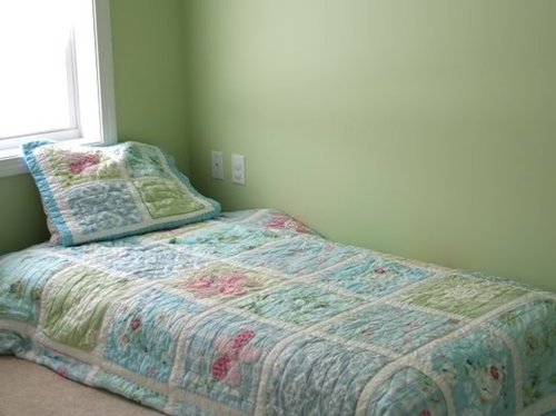
and I hate it. It is way too bright. It looked like a pale, soft green on the chip. You need sunglasses to walk in their room now. I wanted a soft soothing green.

my DH will never repaint it. I could never even tell him how much I hate it. Here it is:

Comments (31)

  • 18 years ago

    As it's coming through on my screen it looks quite pretty. I am so sorry you hate it. What do your girls think?

    Do you have any artwork you're planning on putting up? I wonder if that might help mitigate the brightness you're seeing.

    Good luck!

  • 18 years ago

    It looks really pretty on my screen too. Are you in "color shock" maybe?

  • 18 years ago

    I think it looks really great too.

    Kelly

  • 18 years ago

    Do you think it will look less bright once I have all of their antique ivory furniture in there? It should arrive in a week or so.
    Maybe, I am in color shock. I need someone to see it in real life!
    Kelly, I think you live near me! I am in NH. Want to come check it out! LOL

  • 18 years ago

    Mom - I pretty much hate every wall I paint until my eyes adjust to it. I think it is just the change. I don't know if you have window treatments yet and you say you don't have furniture, so you are only looking at blank walls. It comes across quite pretty on my monitor. I am still looking at the drapery panels I just hung thinking they are too high. I about freaked when they first went up - now they are growing on me. Give it a chance. It looks like a nice, cheerful color.

  • 18 years ago

    I also really like it. Once you get more furniture in the room, that will break up the color a bit. Also, don't forget art/decorations on the wall.

  • 18 years ago

    Don't judge the walls in an empty room! Give it time. It looks very soft from my angle. Not bright at all!

  • 18 years ago

    Looks very pretty on my screen, as well. Once you get the furniture, window treatments and artwork on the walls, it will feel different. And, there is always a period of adjustment to seeing color after having white or pale walls. Truly, it doesn't look bright at all.

    Seeing the green with the bedding, you made the right choice to do that and not pink. It really is a pretty space already!

  • 18 years ago

    Once you get the furniture in it will make a huge difference. It looks very similar to a green we painted our nursery and I felt the exact same way. Almost repainted it, but decided to wait until we got the white furniture etc. in and it helped a lot. I think it will turn out really pretty.

  • 18 years ago

    Looks great on my monitor also - I also think you can never go "too bright" with little girls. It looks like the beginning of a very pretty room - what do your girls think?

  • 18 years ago

    Thanks for all your nice comments. Hopefully, window treatments, artwork, furniture, etc... will tone it down. it looks a little brighter in real life. I think it may be that I am just so used to white walls in my entire upstairs. This is the only room with color so far upstairs.
    My girls have no opinion since they are only 2 years old! They just wanted their toys back in their room.

  • 18 years ago

    I don't know if this just so happens to be an amazingly flattering pic of this color, but it looks great on my monitor.

    I think it works really well with the bedding in this photo as well.

    Might just be color shock as others have said, and hopefully it'll feel better for you in a day or so.

  • 18 years ago

    I love the color. goes great with the bedding.

    Color shock--I think that's what it must be, becasue I have it, too...

  • 18 years ago

    The color looks lovely on my monitor, as well, and seems to compliment the bedding nicely. Give yourself some time to adjust -- and like everyone else said: with window treatments, furniture and artwork, it will look even better. What color is it, if you don't mind?

  • 18 years ago

    It is BM Country Green.

  • 18 years ago

    ((AWWW)) I know how hard you struggled with this paint decision. I really think it looks great but wonder why you didn't go with the Pale Vista. I thought that's where you were leaning. Either way...I think everyone is right. You just need the other "stuff" in the room and it'll all come together. Realy, it looks great on my monitor!

    Lindy

  • 18 years ago

    Yep, looks great to me, too. But I can see where you were going for something a bit softer.
    Like someone else mentioned, I too hated almost every room we painted over the summer for at least a week. My bedroom/bath is BM Misted Green, and I wanted to cry every time I walked in the bathroom (first room we did) It was so bad, it took me wks to get to the bedroom, because I was so upset about it. It's now my very favorite color in my house :)
    So, as everyone always says with paint..live with it for a bit.
    I am sorry it's not what you wanted, though. Trust me, I know that feeling.

  • 18 years ago

    Lindy - The pale vista was lighter in depth but brighter to the eyes. it was almost "lemon" looking. Hard to explain. I think it would have been even harder on the eyes. I wish I had chosen something more subdued like sweet Caroline green by BM. I will live with this for a month or so and change it later if I can talk DH into re-painting.

  • 18 years ago

    FWIW, I think you made the right choice between country green and pale vista. I think the deeper green looks so beautiful and rich on your walls. (But I love rich colors!) Sweet Caroline is also a very pretty green, but every room has different lighting,etc., to make colors differ. I do hope you don't have to go through the work of repainting. Take the time to look at the walls in different lighting throughout the day, and definitely get the furnishings, etc., in before you make a commitment to change. You may end up loving it as is!

  • 18 years ago

    I can't believe the room is painted already. I'd have obsessed for at least another month. I'm impressed! On the monitor, the green looks really nice and goes so well with your lovely comforter. But, I know how these colors can grow from the chip to the wall. I hope you like it better when all the furniture is in.

  • 18 years ago

    I totally feel your pain. I painted my laundry room on Friday. I had a full can left over from when I painted the kids play room. It was gorgeous up there - how could I go wrong???

    I hated it.

    I spent all day today re-painting it olive 3 like my living room and kitchen.

    Greens can be tough - it's so easy to go minty or neon with them.

  • 18 years ago

    It looks like a beautiful color. It really depends on how much color you like on your walls. If the white furniture and window treatments don't subdue it enough for you, maybe place some artwork in wide, soft colored or white mats also.

  • 18 years ago

    I think it looks great!

    I thought of you yesterday - there were some darling girly curtains in the Target add that might be cute in the room if the greens match up. I can't find them on line though - did you receive a Target add?

  • 18 years ago

    Showing some lighter shades, in case one is more what you were after. Are any of these close? Did you want an even fainter green?

    {{!gwi}}

  • 18 years ago

    I think it looks beautiful and very refreshing! I honestly think that you will love it once you have everything back in and up on the walls. :)

  • 18 years ago

    Thanks squirrelhaven. I think I actually am starting to like the color on my walls better. I am getting used to them. I had actually tried having the color mixed at 75% intensity and it was way too minty looking.
    justnotmartha- thanks for the info about the curtains. I actually have to put up Roman Shades b/c there will be a bed in front of each window in the room. I have no choice for bed placement. There will also be a dresser in between the windows.

  • 18 years ago

    I love that color-just asked you on another thread what it was!

  • 18 years ago

    Hi momtotwins,
    I have the BM paint fan deck here and just looked at country green. It's very pretty, and probably will soften up to your eye after things are back in place. But I wanted to share an idea with you in case that doesn't happen. I once painted my daughter's room yellow, and as often happens with this color it came out wayyyyy too bright!!! So I got a quart of the color that was two shades lighter on the paint strip, cut it with some glaze and sponge painted the walls with it. It was so subtle that you could not tell it had been sponge painted, but it was much, much less intense to the eye. Your BM store can help you with the details if you decide to try this.
    Lynn

  • 18 years ago

    I love it. You should see the pink that went on my dd's walls! yikes! I didn't repaint, she loved it, but I put up curtains and it muted her color.

    I love that green!

  • 18 years ago

    The green looks nice! It's very similar to the green we used. I thought it was too bright as well, but with all the furnishings in place and art work up, it actually looks nice. Here's what her room looked like right after it was painted.

    Chrissay

  • 18 years ago

    Did you choose the color based only on the little paint chip? It's so hard to judge a color that way. Next time (or if you ever decide to repaint this room), get a piece of foam core or other board and paint it with the color, and place it in the room, in different positions, over the course of a few days. Having said that, I don't think it looks bad. You'll probably feel a lot better about it when the furniture is in. Every color looks a little stronger in an empty room!