Software
Houzz Logo Print
funkyart_gw

Update: Walls are Painted!

13 years ago
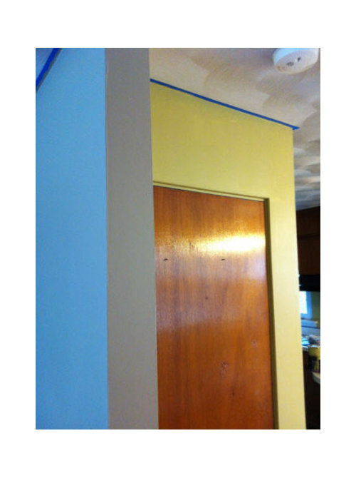
I wanted to come back and give an update on the colors I chose and to share some photos.

I selected BM Elemental for the main living area-- was to be LR, Dining Area, Kitchen (except for an accent wall) and hall. I ended using it for just the living room and hall. This was the color that sampled the best and that seemed to work best with all my other colors. It was the one that made me go "ahhh". Truth is-- it's fine, it's livable but I don't love it in my space. I am going to give it a few days but it strikes me as a green you'd find in anyone's house. Neither bad nor great. Unfortunately it didn't photograph anything like it appears in person so I am not going to share a photo yet.

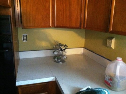
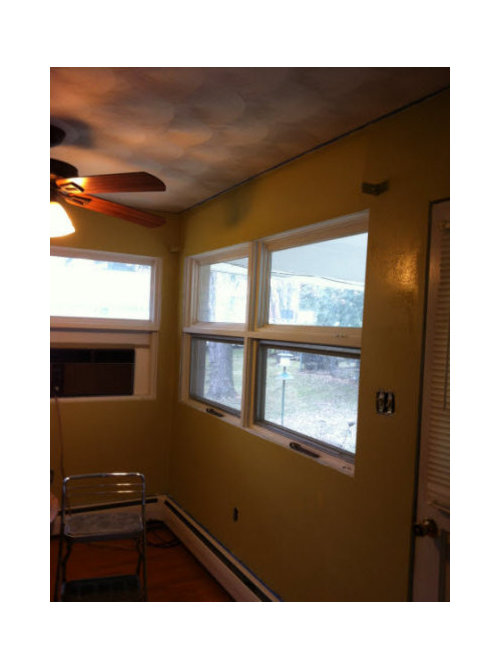
The real surprise was the BM Anjou Pear. I tried Anjou Pear after the Wasabi turned to bile on my wall. Beekeeperswife said she'd tried the AP and that it was much less intense so on a whim, I gave it a try. She's absolutely right-- it's *this* side of an acid color-- leaning towards a retro mustard with a hint of bright green. I LOOOOOVED it-- I loved it so much so that I decided to do the entire kitchen/dining area in it. I was nervous all morning fearing it would "grow" on the wall and become obnoxious. Quite the opposite, I think it actually brings the space together. It works with the orange oak-- and as I've said to a few friends, it actually *almost* makes the swirled ceilings and 1960s kitchen work! It definitely makes them much less offensive.

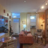
The Anjou Pear reads a little more yellow in these photos than it appears IRL.. plus, as you can tell, the paint is still wet. :) The first photo is the most true to color.

At first the painter didn't like it-- he kept reminding me that I had plenty of the other paint left haha-- but as he got it on more walls and it started drying, he fessed up that he liked it more than the Elemental. I do too! In fact, I am seriously considering putting it on the LR walls too.

I know that yellows aren't everyone's thing-- in fact, they aren't usually my thing. I am blondish so yellows can be tricky.. plus, I hate hate hate colors that are too cheery and sweet. This really works for me.. it's just muddy and quirky enough to skip that cheery vibe. In fact, after I painted on the sample swatches, I realized that it is an exact match with a couple of serving pieces I have (Calvin Klein Cargo Sunflower) and a fabric tote bag. Definitely a "me" color.. and I think it very much suits the house.

Now my only remaining challenge is-- do I repaint the LR? And if so, do I use Anjou Pear or find another color? I am definitely leaning towards repainting.

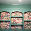
Again, this photo isnt true to color -- it's much more green-- but here is BM Elemental for reference.

Comments (38)

  • 13 years ago
    last modified: 11 years ago

    Whoops! I thought I posted a response, but must not have gone past the preview!

    Anyway, the AP looks wonderful and I am so glad you had such a good surprise. However, pleeeease post a pic of the Elemental even if you aren't going to keep it. I have been waiting to see it in your space since you first mentioned it which got me thinking about using it, too.

    The AP has so much more depth than most yellows-must be the green! :) I am so glad it worked so well for you, Funky.

  • 13 years ago
    last modified: 11 years ago

    Thanks, Cyn-- and no, you aren't going crazy! You did post.. I accidentally put the first message on the conversations side. I added this one along with the photo of Elemental!

  • 13 years ago
    last modified: 11 years ago

    Haha-just realized I did answer on the other side. Thanks for posting the Elemental. It does look very grey. Not at all waht I expected, so I see what you mean. I am not sure I could take the AP all through the house, but if you love it, go for it. As you say, you can always repaint if it doesn't work!

    :)

  • 13 years ago
    last modified: 11 years ago

    I tend to agree with you-- more is not always more. I think I do need another color for the living space though-- something that flows better with the AP and I think maybe even something that has a slight retro vibe?

  • 13 years ago
    last modified: 11 years ago

    I fear I've worked myself into a hole.. the colors I am seeing paired with with anjou pear are grays, blues and deep dark purples. All lovely colors but not ones that will work so well in my house w/orange oak floors.

    I start work today so I can't go back over to the house until the evening. I guess i'll take the affinity fan deck with me and see what I come up with. Suggestions welcome.

  • 13 years ago
    last modified: 11 years ago

    Blue WILL work; you just have to get the right one(s).

  • 13 years ago
    last modified: 11 years ago

    I am wondering about a color like this.. keeping in the warm range but lighter. I struggled with these light colors when sampling but I think this may be the direction to go.

  • 13 years ago
    last modified: 11 years ago

    The Anjou Pear walls look terrific!

    No suggestions for colors to go with it though. :(

  • 13 years ago
    last modified: 11 years ago

    Thanks, cat_mom! I was thinking no one liked it and had nothing to say. I know it's not for everyone but it seems to work for me here.

  • 13 years ago
    last modified: 11 years ago

    I love the Anjou Pear! The other seems a little dead...is that what's bothering you about it? I agree with another poster that a blue would work & also look good with your floors. Maybe more of a teal, green blue? I also think it would compliment the Anjou beautifully. Also, maybe a rusty color..? Post any new samples you try....

  • 13 years ago
    last modified: 11 years ago

    You're right. The elemental doesn't go with the AP. And if AP is a keeper, what about this palette?

    This post was edited by geokid on Mon, Mar 4, 13 at 20:48

  • 13 years ago
    last modified: 11 years ago

    Lizzie, it isn't so much dead as ordinary, uninspired, flat. Ok lol dead... But green dead. I do love green blues but all those I tried nursery blue. I was sticking to the neutral end of the spectrum because of the small scale

    Geokid I like the green but it doesn't have a or feel to me. No reds on my walls. I don't wear reds or like them in my home. Not even red lipstick.

    Bee I love that first set BM recommends but I think they'd be too much for my small home. A purple wall belongs in a grand space, don't you think?

    I didn't like the warm neutrals I'd tried ( sw ecru and sw netsuke) but I wonder if I should keep trying in that range.

  • 13 years ago
    last modified: 11 years ago

    deep dark purple.....mmmhmmm I find it delicious. You might not be able to use a lot of it, but I bet somewhere that color would look lovely. A little bit goes a long way.

    And really the purple with the green is fab. This is why I ended up going with the wasabi in this house to work with the Velvet Cloak in the dining room. (which is hardly "grand" I'd like to add)

  • 13 years ago
    last modified: 11 years ago

    I have a purple (eggplant) accent wall in my DR and I really like the statement that it makes. I know, I know, I know that accent walls are passe but like bee said - a little goes a long way.

    My LR and the other DR colours are florentine plaster (BM - CC520) and the purple is Raphael (BM- CC-2).

  • 13 years ago
    last modified: 11 years ago

    If you wanted to stay with a neutral then the nimbus would be the best choice. If you want to say with the warm, how about using the same paint but at 50%. It might keep that warm feeling you want. You can make a teeny bit in a bowl and try it.

  • 13 years ago
    last modified: 11 years ago

    Hi all.. thanks for your replies and sorry for the delay, today was my first day back to work.

    I really love the dark purples-- in fact, I have one in the palette I created a few weeks ago. However, with a 1100 sq ft house, low ceilings, and small rooms, I think I am very limited on where I can use it. My original (and persisting) plan was to do the walkout basement in purple & green.. I'd considered it for one of the bathrooms but I am going to use a softer color there.

    Truly, I love the idea of a deep purple-- but I just don't see it working anywhere but in the basement.

    It is clear to me now that I need to lose all my preconceived ideas of what I like and let the house dictate the colors it wants to be. I love my funky yellow Anjou Pear but if you'd told me a week ago that I'd use it in my entire kitchen/dining area, I'd have said no way... and here I am giddy over it!

  • 13 years ago
    last modified: 11 years ago

    Oh, definitely, no red on the walls. :)

    I really like the AP. It's fun and funky.

    Have you considered the AP on all the walls? You could accent with purple. I even see the purple on the wall down the hallway. I know you said you don't think it will work, but you didn't think you'd like the AP either. You just never know.

  • 13 years ago
    last modified: 11 years ago

    The anjou pear is delicious in your space. I redid my entire home (except dining room) in BM Affinity palette. I included the deep purple powder room next to a "Wish" entry hall and living room in BMCotswald and BM Metropolitan. I am now toying with dining room walls in BMPashmina and ceiling (that extends to open kitchen) in either citrine or amulet (soft yellow with grey walls).
    My lesson in all the selections is that it is true Affinity colors never clash. It is just a matter of how much you like the energy of the colors.

  • 13 years ago
    last modified: 11 years ago

    I would try a lighter version of the AP. I have had really good luck doing that with colors for adjoining rooms. Either off the same paint strip (sometimes doesn't work) or fifty percent as suggested above. Such a fun color!

  • 13 years ago
    last modified: 11 years ago

    I have totally thought about doing Anjou Pear throughout the first floor living areas! It was the first thing I said when I saw the freshly painted kitchen/dining area. I am very tempted... but I am concerned that it will be too much high energy throughout. Yaya's suggestion to cut down the AP may be all I need to cut the energy and keep the flow.

    deretutz, you've selected some lovely colors! I have considered amulet but havent tried a swatch yet. I also like Splendor.

  • 13 years ago
    last modified: 11 years ago

    The AP is Fun! With a capital "F"! Can you show us some more pics now that the walls are dried and accessories are put back in and maybe that will help with recommendations for complementary colors. Or the suggestion to lighten it up is a good one too!

  • 13 years ago
    last modified: 11 years ago

    Kellienoelle, I am not living there yet so no accessories or styling as yet. I don't even have a table/chairs!

    I'll walk you through what I have though-- dishes and some serving pieces are Sophie Conran white. I also have a mix of pottery in blues and greens.

    For the living room area-- who knows? I am downsizing and paring things down but most of my "stuff" is ivory, blues and greens with a little orange thrown in. Currently my furniture is dark brown leather with bright green throws (solid and patterned) but I will be changing out the leather the near future. This is my rug which I'd also like to replace but not until I have the rest of the room done... unless I pick up a sisal for the spring/summer.

  • 13 years ago
    last modified: 11 years ago

    Actually, it sounds like your things that you have will blend nicely! Are you planning on keeping the counters white? If so, the Anjou Pear definitely adds a nice pop of color!

    And based on your description of your living room furniture and your rug, I really like the idea of repeated the AP but at 50%. Look forward to seeing how this all turns out!

  • 13 years ago
    last modified: 11 years ago

    Thanks, Kellienoelle! I think there's some real potential too. A lot of my things work with the bright funky yellow/greens because I've always brought them into my rooms in small ways.

    The counters will stay as they are for now-- will remodel the kitchen in 2014. I've toyed with replacing just the countertop for now but it just doesnt make sense. I've also toyed with painting them but have decided it isnt worth the effort. The only thing that will be replaced in the kitchen is the flooring (and that's only because I spilled paint on the ugly 25 yr on carpet).

    I think a lighter-but-not-pastel version of AP will work. I don't think I'll repaint before I move-- the extra expense will mean putting off painting the bedrooms and/or replacing window treatments. We'll see. I may get very motivated when I find the perfect color!

    Thank you all! And good night! (I am pretty sure I am going to dream of paint strips!)

  • 13 years ago
    last modified: 11 years ago

    First of all, I keep meaning to say CONGRATS on your job!!!! Woo hoo!

    Second, I totally love AP with the blue in your first pic. The blue is what brings out its "fun"-K (ha, ha!). Living up to your screen name!

    Third, love the idea of AP in lighter tones in the rest of the house. Yes!

    I like to play around with the color palette designer . . .here is a list of 20 of them!

    Here is a link that might be useful: 20 Color Scheme Generators

  • 13 years ago
    last modified: 11 years ago

    Congratulations on your new job! I hope your day went well.

    I really like the AP. I like the idea of cutting the formula down for the other walls.

    The color of the wall in your inspiration photos REALLY looks like the color I have in my hallway which is Vista Mushroom Cream (a poster here sent me a sample years ago). I couldn't find the color on colorcharts.org or easyrgb for comparision. I can run through my fan deck maybe later tomorrow and see what matches though.

  • 13 years ago
    last modified: 11 years ago

    Thanks, guys! Heading off for another day today!

    I agree.. I woke up thinking about the flow of colors with the AP and a lighter version and it me happy. Yellows-- especially yellow greens are tough. I don't want easter egg yellow or celery heart green.. I need a slightly muddy lighter color. It could be AP at 50% or 25% is it.

    Anele, you made me laugh-- yup, gotta have some "fun"k! The blue you see in the photo is the poorly photographing elemental. No blue at all-- its green all the way. I'll try to take new photos later today.

    Gotta run!

  • 13 years ago
    last modified: 11 years ago

    dretutz could you post pics of your rooms with the infinity colors if you get a chance. I'm thinking of doing my whole house in them too and I would love to see!!!

  • 13 years ago
    last modified: 11 years ago

    Anele, I have to admit, I scoffed at the bf who always wants to pull up his scheme designer to help me with paint colors. "How is that going to help? Your scheme designer will say "green".. and then I'll have 3000 greens to choose from".. but the truth is, it has helped. I dont know the color wheel as well when i am off the primary colors so it is definitely a help.. the one I used let's you choose tonal, 2, 3 or 4 colors and while it doesn't pump out a paint color and number, it surely did help focus me.

    Thanks for the link!

  • 13 years ago
    last modified: 11 years ago

    By the time I read through the first few posts, I was ready to recommend trying the AP at 50% or so. So, I'll add my vote along with the others.

    Congrats on the new job!

  • 13 years ago
    last modified: 11 years ago

    Hey Funky!

    Sorry I forgot about this. Did you want me to check out my fan decks (BM & SW) to try and match a color? It's no problem. I just was curious if you decided on anything before I start looking.

  • 13 years ago
    last modified: 11 years ago

    Shee.. you are such a sweetheart! Sure- but please don't spend a lot of time on it. I was going through the affinity fan deck this morning and have a couple of possibilities (Splendor and Hush). The anjou pear is odd enough that I think the 50% mix may be best.. I looked at some grays and blue greens but I think the lighter, tonal color scheme will work better with my layout and floors.

    I won't repaint right away-- I'd like to know where I am going with color but there's so much to do and the walls are fine-- just not great.

    Of course, this is subject to change-- once I decide on a new color, I may just want to go for it. Unfortunately, the budget is going to bring me back to reality... I would paint it myself but I have a shoulder injury and removing the wallpaper really messed it up.

  • 13 years ago
    last modified: 11 years ago

    Funkyart, just read the last post--have you considered using a paint sprayer? I just primed my living room in 30 minutes (shock) and my right arm is in a cast past the elbow. I bought my sprayer on sale along with a respirator (to avoid inhaling paint fumes) and calculate I'll be able to do the whole house including BM paint for less than half of the cheapest quote.

    Something to consider if you're even slightly handy...

  • 13 years ago
    last modified: 11 years ago

    Thanks for the tip, Baroo! I've never sprayed.. but if you can do it in a cast, I should be able to handle it too heh. I've never seen a wall that had been sprayed-- how's the finish?

  • 13 years ago
    last modified: 11 years ago

    Hi, I'm back!

    It's the closest to BM Dunmore Cream HC-29. My paint is a smidge darker. SW Ecru 6135 is the closest on the SW deck. My walls are a color between those! Hope that helps! Let us know what you decide.

    How's the new job?

  • 13 years ago
    last modified: 11 years ago

    Thanks so much! I actually did try ecru in the same room but it turned a peachy yellow on me. I was so disappointed because I was sure it was going to be the *right* warm neutral. I'll check out Dunmore Cream.. I think something creamy with some weight would work well. I'll still try the AP at 50% too.. I didnt get to it this weekend.

    New job is going well.. it was a slow start but I am in full swing now. Just trying to get used to the routine and structure-- even when I was working, the culture and environment were MUCH different! It's all good though. Thanks for asking!

  • 13 years ago
    last modified: 11 years ago

    Hee, hee, Funky, that is funny about your bf!

    I agree-- definitely not a help for choosing actual paint color, but more of a springboard for new color combos. :)