Software
Houzz Logo Print
dorry2

trying again - help with fabrics

14 years ago

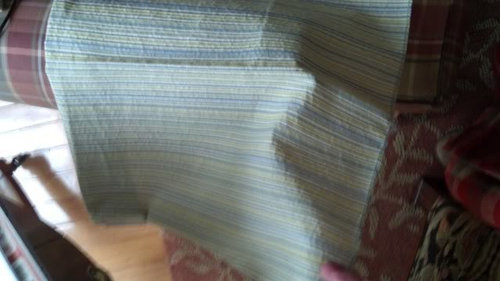
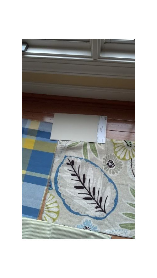
OK, I am trying again to post these pictures that were in my post yesterday, but disappeared this morning. Please let me know which fabrics you like for a summer home. I am fairly certain a stripe will go on a large sofa, and the other pattern(s) on two chairs that may or may not be the same style. I will have pillows made in whichever fabrics I have on the chairs.

The paint sample is McCormick's Cool Platinum, which we will probably change in the next year, so it is not crucial that the fabrics match the paint.

Thanks for your help!

Comments (13)

  • 14 years ago

    My favorites are the blue/green stripe -just looks like it would be cool and crisp, and very summer-housy for a sofa. And I love the large floral print for chairs!

  • 14 years ago

    Thanks, Bestyears! I, too, am gravitating to the striped, seersucker fabric. I agree, it is cool and summery looking. In fact, I have a pair of capris very similar to the fabric! Guess I will blend well with the sofa!! I also like the large floral, which is a fun print.

  • 14 years ago

    I love the floral and really like the blue/green stripe as well. The other stripe is nice but it's so similar to the neutral paint color that it doesn't feel as fresh as the blue/green. Although I'm not much of a plaid person, it's a fun fabric for a summer place. It might be nice to have one larger upholstered chair in the floral and use the plaid on an accent chair, maybe something like this McGuire chair (which I just found by googling -- holy cow, this hotel liquidating website has some amazing deals):

    Here is a link that might be useful: McGuire chair

  • 14 years ago

    I think the one stripe is too much like your wall color as was already mentioned. I like your other choices, but I'm not sure they go together. If I used the plaid I can see a sofa in the darker blue from the plaid. I think the plaid and the floral fabric will be too busy together. The other stripe doesn't look like it will go with the floral. It's reading too cool in tone to me. I saw this other stripe on Fabric guru that has the colors that I think will go with the floral print better. Unfortunately, it looks like the 12 yards they have wouldn't be enough for a sofa. Maybe they have more. I didn't look very hard on their website. They do have your floral fabric. At least I think it's your fabric. Look in the tropical drapery section for that. If you click on one of the fabrics, it will keep the fabric you looked at previously in a small box to the right. Then when you look at another fabric, it will do the same thing so you can see your floral fabric next to the stripe. That red basket weave fabric is showing up because I was looking to see if it came in a blue.
    Here's the other stripe.

    Here is a link that might be useful: Seaglass stripe

  • 14 years ago

    I would do the more neutral stripe for the couch - that way, if you later want to change accent colors, you are not stuck.

    I don't think we can suggest fabric for the chairs without knowing what the chairs look like. All fabrics don't work on every chair.

    That said, my inclination would be to do the chairs in a blue solid linen-like fabric, the darker blue that is outlining the leaf on the print, and then pipe them in the green and blue stripe fabric.

    Use the bold print for pillows, or potentially back and outside of the sides of an upholstered chair, if that is a style you are considering.

    The plaid itself is nice, but I don't see it with the other fabrics. It is a very strong blue and yellow, whereas the colors in the other fabric are a bit more muted, and the blue in the print is a bit greener than the blue in the plaid.

    I think a plaid could be nice, but it needs to be a bit softer.

  • 14 years ago

    sarah richardson used very similar colours in her cottage she did years ago. it was lovely.

    She did another cottage that I liked even more, in the same tones, but I can't seem to find images.

    Here is a link that might be useful: sarah's cottage

  • 14 years ago

    i like the gray and cream stripe and the large floral!!

  • 14 years ago

    Thank you, everyone! I agree that the lighter tan striped blends too much with the paint color and might be boring for a beach place, though it does work well with the large floral. Because this paint (builder won't customize) won't be changed until probably next year, the tan stripe is not the look I am trying to achieve. I want something summery, crisp and feel good!

    I am still liking the thin blue, green, taupe, yellow stripe on the sofa. The plaid is definitely out. The more I look, the less I like it with these fabrics. The stripe and the large floral are from the same furniture line and are designed to be compatible.

    Les, I hear you about going solid with the sofa, but my year-round residence is exactly that - every sofa is solid, one damask, and I have done patterns on chairs and ottomans. I want this place to have more of a happy, summery feel. The stripe is so subtle I think of it more as a neutral.

  • 14 years ago

    That stripe feels like a textured neutral to me, too. Great choice!

  • 14 years ago

    I love the stripes and the floral. I like the idea of a large-scale plaid mixed in, but I think the yellow in the plaid you've shown is too jarring with the other fabrics.

  • 14 years ago

    Hmmm, it wasn't me that suggested a solid for the couch, though I did suggest the neutral stripe. But if you like the other stripe better, I think it would be nice.

    I did suggest a textured solid for the chairs, with patterned piping, but in part because we have no idea what those chairs might look like.

    I think you have made a good decision to eliminate the plaid. A plaid or check would be nice, just something not so large and strong, imo. The floral is a large scale pattern, so a medium check or plaid would be a nice compliment.

  • 14 years ago

    Have you ever watched a Sarah Richardson design show? She does the most amazing job mixing a multitude of fabrics in one room and they all look great together. Sister Parish did this also and she was even a little less matchy matchy with her designs and the results were stellar. Click through the pics at the link and maybe it will provide inspiration.I personally like the idea of a bold color for the sofa...a green velvet or cotton and then adding everything in. But, I'm not a neutral girl and I love my blue sofa and my green sofa. :-)

    Here is a link that might be useful: Sarah Richardson cottage

  • 14 years ago

    Yes, Andrea, I have seen her shows and love her style. She is not afraid to mix fabrics and use bold colors, which I love. I will try to post the picture of the chair and sofa. I know how to post from photobucket, not sure how to from a website. Be back shortly.