Software
Houzz Logo Print
minemine

Help With Picking Backsplash

13 years ago
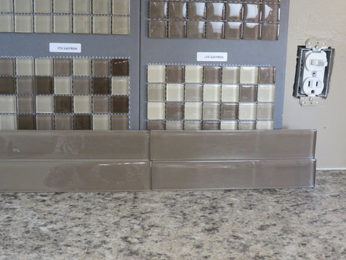
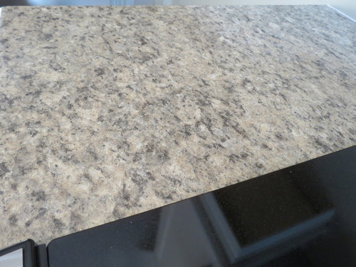
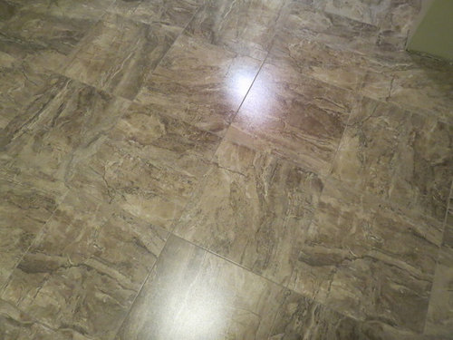
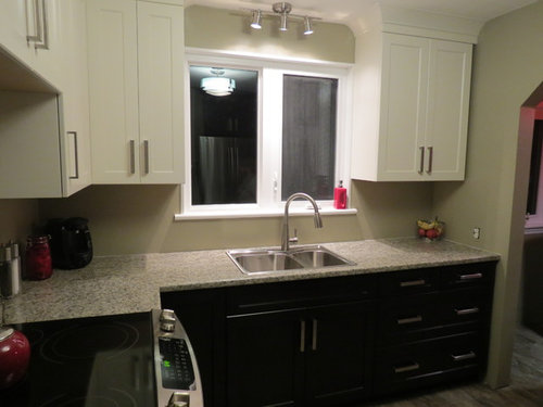
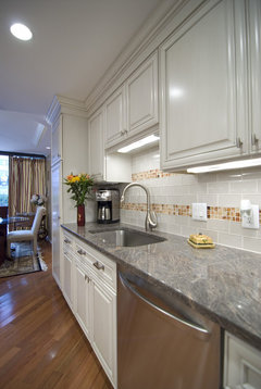
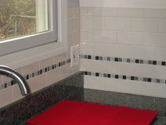
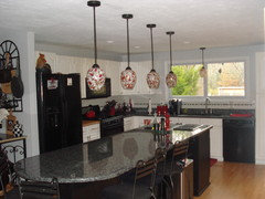
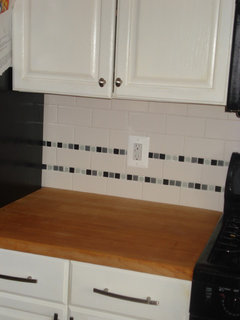
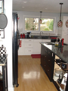
We are at the stage in our kitchen reno where we are picking our backsplash. I have narrowed it down to a glass subway tile, but I would like to run a strip of mosaics (three rows) through it for visual interest. I have included pictures of the subway tiles, plus the two choices for the mosaics. One is a darker combo that would pull up the dark color from the lower cabinets. The other is a more neutral combo which would tie in with the creamy white upper cabinets. I have included pictures of the backsplash areas to be covered, which also show the colors of the upper and lower cabinets. I've included a picture of the countertop as well as a picture of the floor so that you can get a feel for the color scheme of the room. I would love to get some opinions on which mosaic combo to use with the subway. Or should I just use the subway tile on it's own? Thanking you in advance for your great advice Houzzers :)

Comments (53)

  • 13 years ago
    Thank you Natalie for your kind words and your advice. This is my first reno attempt, so I am a little unsure of myself.
  • 13 years ago
    Hi manon13. You don't think it would be too boring without the mosaics? I've kept the colors so neutral that I thought I needed to jazz it up a bit. Not sure???
  • 13 years ago
    I think either could work, but I like the darker one better, at least from the photos. Have you considered doing a thin strip mosaic tile? How are you planning on laying the tile? Play with different options. Stacking the subway tile with a small strip of randomly arranged strip tile may give you a nice balance.
  • 13 years ago
    I think the darker one would look better. I totally agree with it bringing out the dark bottom cabinets. Have fun!
  • 13 years ago
    Hi Chandani. I was thinking of using the long subway tiles as the main background, laid in a brick pattern, not stacked. Two rows of those, then three rows of the mosaics and then the rest in the subway tiles. So the mosaics would be an accent strip. I did look at the long random arranged strips, but for some reason I liked the square mosaics better. Just a preferrence I guess. Thank you for your suggestions. I appreciate getting input from others.
  • 13 years ago
    Hi tucmeyer. My hubby and I were both leaning toward the darker combo as well, but I want to keep an open mind as far as the suggestions are concerned. Thanks for your comments.
  • 13 years ago
    https://www.buyitbuildit.com/materials/glass_tile/Teak/447;https://www.buyitbuildit.com/materials/glass_tile/Pearl/444 - found these ones, seems so cool and different , can be made as mix, seems the dark is like the floor, and with the white will mix the granite.. found these guys they have cool new different things just as to see and decide-:) like the darker from the above- have fun!!!
  • PRO
    13 years ago
    I personally like the lighter ones on the right. Seems to flow better with the kitchen and counter top. Makes a better transition between lower cabinets, counter, and upper cabinets. You don't want it too choppy.
  • 13 years ago
    It looks like you could use a little hint of color. Your countertop is a very nice neutral to give you a little creative flexibility with your backsplash.
  • 13 years ago
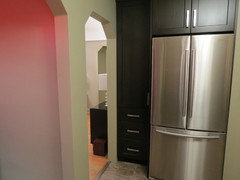
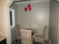
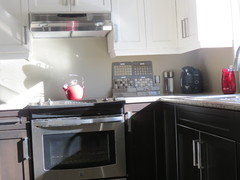
    So many great suggestions. I appreciate them all. Thank you. I guess the reason I was leaning toward the dark combo with the mosaics was that I was trying to tie in the darker colored cabinets. The cabinets around the fridge are dark as well. I've included a picture. Plus the light valances and rangehood are now up, so there is a bit of black on the stainless hood. The sun was so bright when I took the one picture that things look a little washed out, but it shows the chocolate color of the lower cabinets, which I thought related to the darker mosaic. There is also a little breakfast nook where I have introduced red (my accent color). I want to put a little fun in the room, not keep it too serious. Any other thoughts or suggestions before I make a decision??? Next will be the window coverings....oh boy!
  • 13 years ago
    last modified: 13 years ago
    Hi there... I just put in a tile backsplash, I kept it very neutral where it connected to the granite (I did tumbled travertine subway) then behind the cooktop I did vertical piano mosaic tiles to keep the busy tile away from the granite and give the kitchen a real focal point... i love tyour cabinets on top and dark on the bottom!!!!! I attached a pic to show you what I did
  • 13 years ago
    Oooh vailey, very nice. That is one way of having a mosaic focal point without getting too busy. It looks really nice with the undermount lighting reflecting on it, and I love that you ran the tiles vertically. Those colors look like they could go in my kitchen.
  • 13 years ago
    Personally, I think the darker one adds a bit of "pop" without being too busy overall. Some people are really happy with extreme neutrality. (I'm not one of them, however!) While it can look beautiful, I find it rather boring....Yawn! So, I'm for the darker one! Best of luck! It's looking really good!
  • 13 years ago
    What kind of flooring are you using?
  • 13 years ago
    Thanks reolee. I'm all for a little "pop" too. There is a picture of the floor at the top. It is actually a vinyl tile made by Mannington called Adura. The pattern is Oasis and the color is called Earth. The tiles are grouted in with a special grout and they look amazing with all the beautiful veining. The plus is that they are not as cold or hard to stand on as a stone tile and less chance of shattering something if you drop a dish. I have had a lot of compliments on it.
  • 13 years ago
    dark tiles look richer, more expensive
  • 13 years ago
    I would use the darker subway tile and run them vertically...
  • 13 years ago
    I like the bottom left darker mosaic. I think it ties all your colors in together.
  • 13 years ago
    Hi studio2285. Are you saying to use just the subway tiles, no mosaics and run them vertically?
  • 13 years ago
    Yes... keep it clean and simple...less is more...you will be over the mosaics as soon as they get installed.
    You will be able to update the look of your space over time with out being locked into the tones in the mosaics...
  • 13 years ago
    Everyone seems to be real divided on this one. I will have to give this alot of thought. I never thought picking a backsplash would be so difficult. Here's another idea. What about the subways and a strip of mosaics in just one complimentary color, to create a stripe? Any thoughts?
  • PRO
    13 years ago
    I love the subway tile idea. I had a customer order 1/2 pieces of mosaic subway tile I created. This gave her kitchen the added pop of color she needed. I create custom art glass accent tiles for backsplashes and more. You can see my work in my website at http://uneekglassfusions.com
    My best, Joan
  • 13 years ago
    Another vote for simplicity - let the countertop sing! I think a light tone - either in a subway or single color mosaic - is the way to go, as it gives brightness to what can be a dark area of the kitchen.
  • 13 years ago
    I agree with those that vote for simplicity. It might look dull empty but consider how much color and detail you will add with appliances and accessories. And you can change it whilst you won't be able to correct a busy backdrop
  • 13 years ago
    Still sticking with my first suggestion---it will not look busy-interesting, but not busy. The entire room is monchromatic-it needs something... :) Love the pop of red. :)
  • 13 years ago
    One of my favorites---some inspiration for you. :)
  • 13 years ago
    I agree, less is more. Either go with the all glass subway or all mosaic. Otherwise it looks like you are trying to add too much to one space. The reno looks wonderful.
  • 13 years ago
    Those tiles are lovely, Natalie, but the bench looks plain which makes a big difference compared to the bench here.

    I prefer plain myself, especially with things like tiles that can date so quickly. I also like a clean simple look in a kitchen, it seems to make the kitchen always look sparkling clean, as yours does now, and to me that is important. I think your bench is pattern enough, keep the rest simple and you can then add accessories on your bench top for colour and interest that can be changed to suit your moods. I hear what you are saying about bringing in the darker colour of the lower cupboards, but that can also give a very fractured look. As it is now, your bench top is what brings the lower cupboards and upper cupboards together, put the darker feature tiles above it and it will mess it up.

    As for your windows, I will get in early and suggest a simple roller blind - something easy to wipe over to match the colour of your upper cupboards so you don't break up the wall.
  • 13 years ago
    last modified: 13 years ago
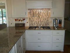
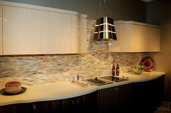
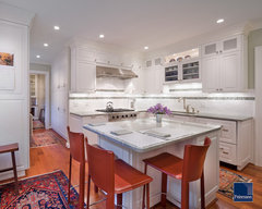
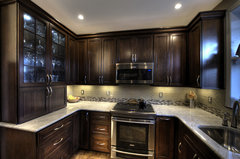
    Busy counter? [houzz=
    Case Design/Remodeling, Inc. · More Info
    ][houzz=
    Classic Kitchen · More Info
    ][houzz=
    DC Row Home Kitchen - Range · More Info
    ]
  • 13 years ago
    Thanks for posting those Natalie, they should help minemine a lot. Personally, the third one isn't bad but all the cupboards are the same colour, so they do add interest. Sadly as for the other two, they have definitely put me off.
  • 13 years ago
    The first two are colorful inlays paired with soft white tile so they definitely stand out. The decorative tile in the last pic does pic up the hue in the solid tile, but is not as color coordinated as your selection(s) are. Any which way you go-you're safe---it's all monochromatic.
  • 13 years ago
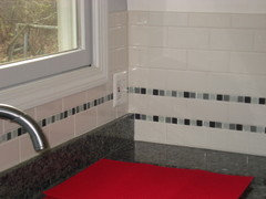
    Here is subway with glass tile. It ties in my granite and brings together the white and black kitchen. Either of your choices would be beautiful. Which way are you leaning?
  • 13 years ago
    Here is subway with glass tile. It ties in my granite and brings together the white and black kitchen. Either of your choices would be beautiful. Which way are you leaning?
  • 13 years ago
    I like the one with the darker. Then get bright red canisters, toaster etc!
  • 13 years ago
    This is why I love Houzz. So many wonderful suggestions and I really appreciate that you folks have taken the time to give me your advice. The photos are great...it helps me to visualize the space. I feel really torn in my decision. On the one hand I can see the point of keeping it simple, but on the other hand I like a little bit of variety. Rio Brewster, I like how you kept your mosaic lines thin so they don't overwhelm the space. Have you got another picture taken farther back, so I can get an idea of the overall effect? Thanks.
  • 13 years ago
    Here is the overall kitchen. Where there is no granite back ledge, I added a second row of the mosaic to get the "feel" of it continuing. The pictures weren't meant to highlight the backsplach, so let me know if you'd like to see more up close detail.
  • 13 years ago
    Oooops, I meant bdennison. The pictures are great. I can see what you are saying about the second row at the end of the counters and in the space between the range and fridge. The thin lines of mosaic pull the two colors together without overwhelming the space. By the way, I love your pendants. Red accessories seem to be everywhere right now.
  • PRO
    13 years ago
    Hi minemine!
    If you are having trouble choosing a backsplash that fits perfectly in your kitchen, why not design your own? On our website we have a custom tile designer program that allows you to create your very own glass tile mosaic; it's really fun and really inspiring! Here's a link to the designer: http://www.susanjablon.com/designer/mosaic-designer.html
  • 13 years ago
    @minemine,
    Whether you feel you need it at the moment or not, do try out Susan Jablon Mosaic's tile design program. I discovered it a few weeks ago and it is absolutely the greatest little design toy ever. I'm not in the midst of doing anything with tile at the moment, and I think I spent at least an hour playing with it. ;-)
  • PRO
    13 years ago
    Really nice so far! For what its worth I LOVE the bottom right mosaic with the light accent in it. Good Luck!
  • 13 years ago
    Hi - your cabinets are beautiful! Really nice choices for counter and floor as well. I'm with the people who say use the subway tiles without the mosaics.
    I recently retiled my counters and backsplash...used square tlles with random mosaics, and realized later that the mosaics really limit my options for bringing in additional patterns and colors in accessories, and also make the backsplash visually busier than is necessary.
  • 13 years ago
    The tile installer is coming on Wednesday morning to measure the space and write up the order based on my choice. Sooo, I have a decision to make. Thank you to each and every one of you who contributed your opinions, pictures, links and experienced advice. I will post an after picture to let you know which way I decided to go.
  • 13 years ago
    I like both the dark and light....either will work.Just a point to consider is the tile size...how many tiles will you fit under the window without making cuts?If you want to do 2 subways and 3 mosiacs will you have enough space without cutting, you might end up with a sliver of another subway to fill the space and the finished look won't be so professional looking then. Personally I would do the area behind the cooker entirely in mosiac and leave the rest of the walls with subway only...use the dark mosaic :-)
  • 13 years ago
    Hi oaklands. The subways are 1 3/4" x 9 3/4". The mosaics are 5/8" square. The space under the window is 8" to the countertop. I will have to see when the installer comes and we do a dry layout. That will determine how many lines of mosaic I could run, if I decide to use them. I like the picture that bdennison sent me earlier showing a single line of mosaics under the window. It is just enough to break up the field of all white. Thanks for your input.
  • 13 years ago
    I would not add mosaics, since the subway tiles look great and adding mosaics would dilute the effect of the tiles. But I am not an expert, so maybe you should hear what the proffessionals might say.
  • PRO
    13 years ago
    I know it's really tempting to add pizazz to your tile combo with color or pattern, but in visiting with clients, I am always struck by the fact that 5 years down the road we are trying to camouflage dated tile :) So my advice is to stick with the ultra simple & beautiful subway tile and add colorful accents in other ways. Good luck!
  • 13 years ago
    Mine mine - the reason there doesn't seem to be agreement is because any of your choices would work fine. There is no right or wrong answer! So don't second guess yourself.
  • 13 years ago
    Well said Rio, but at least with all the different perspectives, even photos, and the reasons people have for their choices minemine hopefully can look at the problem more objectively and make her choice more confidently. Chosing something because you know other people will like it or it photographs well, or looks trendy is not a recipe for lasting contentment. Decorate for you, minemine, for what suits your space, your mood and your personality and for what you can live with. Be true to you.
  • 13 years ago
    Okay fellow Houzzers, I started a new design dilemma under Where To End Backsplash. No responses so far, so I will tag on here and see if I can get some more advice from you knowlegeable folks who helped before. When the end of a backsplash is open do you end it at the edge of the countertop or the edge of the upper cabinet? There is a 3/4" difference. The upper and lower cabinets are aligned, but the counter overhangs by 3/4". At the other end where the cabinets are up against the wall, I am bringing the tile around the corner onto the end wall, because the plaster is not in great shape and we don't want to have to parge it (lots of plaster dust). My question for that area is, do we bring the tile out even with the outer edge of the countertop, or do we end it an inch or so in from the edge? What say you? Thanks.
Sponsored
Peabody Landscape Group
Average rating: 3.5 out of 5 stars8 Reviews
Franklin County's Reliable Landscape Design & Contracting