Software
Houzz Logo Print
petalpatsy

Arrrrrggghhhhh-Paducah

17 years ago

I'd never been before, but I grabbed my camera--got there, and the battery was dead. I actually got tears in my eyes.

The offered catalog absolutely sucks compared to the quilts. The colors are sooooo off, my personal two favorites in the show look like mud crap in the catalog--none of the lavenders/purples came out with any vibrancy, and the energetic spring greens look like dull olive. Half the golden yellows looks sour chartreuse.

The best of show went to an Australian lady. It did not look like something humans made, but some magical Queen of the Fairies work. All quilted to 1/4 inch, and absolutely covered with appliqued 1/4 inch bias tube designs and half of them corded. Some of the small open space was then quilted in 1/4 square grid which balanced the curving bias very nicely. It ended up looking like a woven tapestry-- "Royal Renaissance"--very rich green, burgundy, gold and cream. It had been purchased, and she was clearly ambivalent about letting it go--she was taking it home for now. Unbelievably, I had to agree....yeah, that's probably worth more than $20,000. No crystals here.

There were several quilts with modest heat applied Swarovski crystals that ribboned. I loved them, and got myself a starter kit on sale in the last hour of the show. Hoot! There's a special little heat tool that sets the crystal in about three seconds, and she said you could throw it in the wash. I will definitely use some.

Of note, the Mettler second place quilt showed clear pencil marks where the design was drawn many places. I was surprised a bit, and heartened at the same time. It was so minor, compared to the immense artistry and skill of the quilt.

The close stippled quilting was still around, but most of the quilts had other tiny geometric designs done as background, again mostly to a scant 1/4 inch by machine, and only 1/4 to scant 1/2 for hand quilting.

Overall, it was a level of quilting design and skill that left my mouth hanging open. Over and over again.

Comments (8)

  • 17 years ago

    Sorry about your camera batteries, Patsy. I found a picture of the Renaissance quilt through Google. It is indeed a work of art:
    http://www.quiltersguildnsw.blogspot.com/

    Here is a link that might be useful: scroll down a bit

  • 17 years ago

    Thanks Diane! I comforted myself by thinking about all the other (smart organized) people there, all taking pictures. Surely, I thought, some of them will post these pics on a blog somewhere.

    The pics are just a jog to memory, though. I'm still reeling over seeing the quilts in person (my very first quilt show, ever.) Pictures don't capture a tenth of the color, detail, and texture.

    Sorry, my dears, to be going on and on.

  • 17 years ago

    Patsy, sorry about the camera, I had problems with mine last year but it turned out to be my own fault. Didn't understand it as well I should have. It truly is a great experience as the quilts are always amazing. I hope you went to the AMQ. One of my favorite places. Expect to see pic of the starter kit when it is finished. Jayne

  • 17 years ago

    Patsy thanks for the news about Paducah. I'm sorry your batteries died, but you gave a good description of what it was like to be there.

    And Diane thank you so much for the link to see this fabulous quilt!! I continued on and read the link to her name...oh my gosh!! It took her 4 years to do this quilt and she has a diary of sorts explaining (with pictures) how she completed it, step by step. She also tells how she was inspired to make the quilt. Anyway I enjoyed reading everything about it.

    Again, thanks for the link, it was truly an eye-opener to see what a professional quilt maker goes through.

    Susan

  • 17 years ago

    Thanks for the wonderful insight and sharing with all of us who can't go. A first hand account means a lot. The link is great.

    Our guild sells disposable cameras at our show for just such occasions. Sorry you didn't get your photos.

  • 17 years ago

    If you follow Diane's link to the AQS gallery, I'd like to add some comments.

    A Rose Garden in a Blue Fence--The fence is all applique. I thought bias tubing, but after reading about the technique used for Royal Renaissance I guess it is some kind of applique I don't understand. There was no evidence of stitching holding that fence on there. It was a dark royal blue batik, brighter and richer than my screen shows and with more shading. The pic makes the fence look secondary to the flowers but in person they were quite equal.

    Flower Power--I *think* this is a whole cloth quilt. At first I thought it was white voile over neon fabric with trapunto to get white raised motifs--I've got a book on that technique. But the same effect was achieved here with thread painting. The gentle green is actually a closely stippled neon (almost acid) green. The way the quilting sinks into the batting, I had to get about six inches away to really get a take on the thread color. All the colors of achieved this way, and it was hung freely so you could see how this technique gave an almost reveresible quilt. At first, I walked around it a couple of times to decide which side was the front.

    Glory Hallelujah-home sewing machine--The apparent borders of each little medallion is a gathered lacy voile inset. It was pressed flat, perhaps from packing/shipping. It was not a visually stunning quilt, even in person, but an interesting technique.

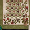
    Oriental Flower-hand quilting--Was stunning in person. You have to imaging the flowers quite a bit brighter and richer. The little applique berries were a true deep cranberry red, and the greens were not olive, but a a few tones brighter and truer.

    Lalapalooza--Black and white and gold. The apparent biege fabric was metallic, and gold it was quilted with gold metallic thread. The binding was edged with a solid line of clear crystals.

    Spring with Delight -- stunning. You have to know the grape like flowers were rich aubergine, and some of the gray looking flowers, and the bits in the border that look only dark biege were actually shades of muted lavenders.

    I wanted to say all thing for any newbies like me that might be taking inspiration or direction from online pics.

  • 17 years ago

    I enjoyed seeing the quilts very much, in spite of knowing nothing of all these special techniques. Thanks for the explanation of the true colors. I always find it disconcerting to look at a picture in a home decoration magazine and find something described as a "lovely pale-blue wall," when it looks like a shade of gray.

    With pictures on the Internet, does the problem lie with the digital camera, or the site, maybe? You see how little I know! Can we tweak the colors in our pictures so that they are closer to the reality when posted? If so, I'm wondering what sort of tweaking is best? Brilliance? Hue? Saturation?...Silver and gold will probably always elude accurate depiction, I imagine, as they are too close to gray and beige.

  • 17 years ago

    If you follow Diane's link to the AQS gallery, I'd like to add some comments.

    A Rose Garden in a Blue Fence--The fence is all applique. I thought bias tubing, but after reading about the technique used for Royal Renaissance I guess it is some kind of applique I don't understand. There was no evidence of stitching holding that fence on there. It was a dark royal blue batik, brighter and richer than my screen shows and with more shading. The pic makes the fence look secondary to the flowers but in person they were quite equal.

    Flower Power--I *think* this is a whole cloth quilt. At first I thought it was white voile over neon fabric with trapunto to get white raised motifs--I've got a book on that technique. But the same effect was achieved here with thread painting. The gentle green is actually a closely stippled neon (almost acid) green. The way the quilting sinks into the batting, I had to get about six inches away to really get a take on the thread color. All the colors of achieved this way, and it was hung freely so you could see how this technique gave an almost reveresible quilt. At first, I walked around it a couple of times to decide which side was the front.

    Glory Hallelujah-home sewing machine--The apparent borders of each little medallion is a gathered lacy voile inset. It was pressed flat, perhaps from packing/shipping. It was not a visually stunning quilt, even in person, but an interesting technique.

    Oriental Flower-hand quilting--Was stunning in person. You have to imaging the flowers quite a bit brighter and richer. The little applique berries were a true deep cranberry red, and the greens were not olive, but a a few tones brighter and truer.

    Lalapalooza--Black and white and gold. The apparent biege fabric was metallic, and gold it was quilted with gold metallic thread. The binding was edged with a solid line of clear crystals.

    Spring with Delight -- stunning. You have to know the grape like flowers were rich aubergine, and some of the gray looking flowers, and the bits in the border that look only dark biege were actually shades of muted lavenders.

    I wanted to say all thing for any newbies like me that might be taking inspiration or direction from online pics.

0