Software
Houzz Logo Print
cjmany

Still trying to choose a backsplash!

13 years ago
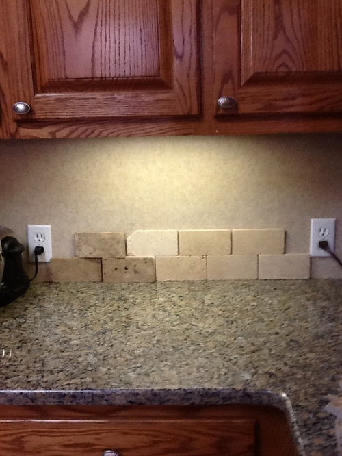
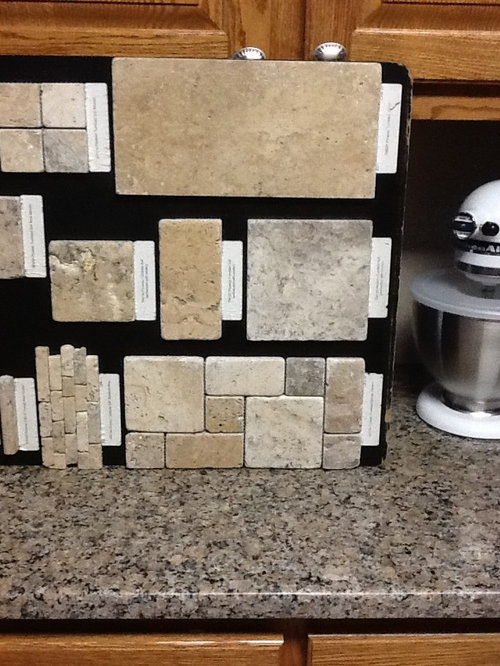
Chocolate tumbled travertine on left, and Durango on right. The chocolate matches well, but it seems too dark for my kitchen. The Durango looks cleaner, but is about the same color as my floor and the old laminate backsplash. I've looked at some porcelain tiles as well, but they don't look as stylish as the tumbled stone. I have gotten very confused! One store suggested Picasso. (Second picture, pattern on the bottom right.) It matched well, but the Roman pattern seemed too busy. Thanks for any input you may have for me! You can see pictures of my kitchen on my previous post.

Comments (27)

  • PRO
    13 years ago
    I like the one the store suggested. It picks up all the tones and colors from your countertop. It will be slightly busier, but best option so far.
  • PRO
    13 years ago
    Is your heart set on the stone for the backsplash or are you open to another materials such as glass?
  • PRO
    13 years ago
    i like the travertine on the right, simple and you won't tire of it!
  • 13 years ago
    I'm afraid that the glass tiles would be too busy with my kitchen.

    Does anyone have a preference on tile size/shape? What about the subway size/shape in my picture?
  • 13 years ago
    glass is actually less busy than stone, and the stone pattern can compete with the counter. I like your counter on its own, and think glass would be a great option. Glass subway tiles give a clean look and are available glass or ceramic. I have an ideabook on it if you want to see some options: http://www.houzz.com/ideabooks/5280003/thumbs/Kitchen-backsplash I got really frustrated picking a backsplash too. :)
  • 13 years ago
    i think glass tiles would look really great
  • PRO
    13 years ago
    I think neither of the one's you suggested, but I like the glass/stone combos above, especially the ones with some grey in it. The glass will brighten up the darker colors - also make sure you have good UC lighting installed.
  • 13 years ago
    For some good reason, in the picture you posted, I like the pattern in the second picture on the bottom on the right. Seems like you need a tile with a little more shine to it also.
  • 13 years ago
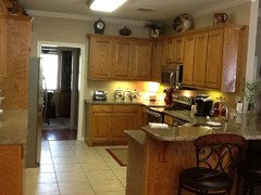
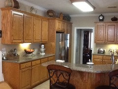
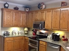
    Pictures of my kitchen.
  • 13 years ago
    I like the one the store suggested too. It gives some texture to the wall and the size is right
  • 13 years ago
    Hi cjmany. Your countertop looks almost identical to mine. I have a dilemma on here too called Help Picking a Backsplash. I have some pictures on there of some glass subway tiles that might go with your counter. I have received alot of helpful advice and photos from others. You might want to check it out. I love your red accents.
  • 13 years ago
    Under your kitchen ideas, you have a picture of, it looks like square tumbled stone on the diagonal. That looks really nice, take a look at it again!
  • 13 years ago
    Try to choose a simple travertine with a uniform colour that matches your counter with varied shapes to give it interest without being too busy. The glass/stone combination is very busy, I just installed some in my bathroom and it would definately be too much with your counters.
  • 13 years ago
    Try to choose a simple travertine with a uniform colour that matches your counter with varied shapes to give it interest without being too busy. The glass/stone combination is very busy, I just installed some in my bathroom and it would definately be too much with your counters.
  • 13 years ago
    I would choose glass. I think you need a little sparkle. Glass is particularly good in a darker space such as under a cabinet. But before you choose, select you under-cabinet lighting and assess how that will go with your backsplash.
  • 13 years ago
    I would choose glass. I think you need a little sparkle. Glass is particularly good in a darker space such as under a cabinet. But before you choose, select you under-cabinet lighting and assess how that will go with your backsplash.
  • 13 years ago
    I would choose glass. I think you need a little sparkle. Glass is particularly good in a darker space such as under a cabinet. But before you choose, select you under-cabinet lighting and assess how that will go with your backsplash.
  • PRO
    13 years ago
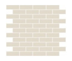
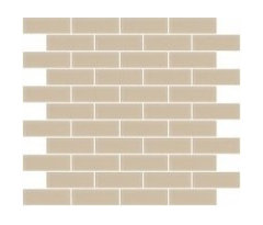
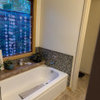
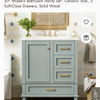
    Don't be so quick to write off glass tile! As others here have said, it can add a lot of light to your kitchen because it is reflective, but if you don't like that idea you can always choose a matte glass tile for a more subtle look. Glass doesn't have to be busy, either! Just because the tiles may be smaller, doesn't mean they'll detract from your gorgeous granite! Below are images of the tile, one with a glossy finish, the other a matte, or frosted finish.
  • 13 years ago
    last modified: 13 years ago
    Hi. close your eyes.

    when you open them, find what tiles are soothing to your eyes. that is the tile you should choose. It may sound really weird but the backsplash is what you will be looking at when standing or sitting anywhere near your kitchen. It ends up being a focal point on its own.

    If you like a more soothing and streamlined look find the material that appeals to those natural choices, your senses... If you need something more snazzy, start experimenting again.

    Take all but one example off your counter. Look at it for a while. Then, take that one down and try the next one. If your samples aren't cutting it for you, ask for more. ;+)

    Your samples (given to by the dealer) may not be enough to show you what it would really look like. Ask for more of the ones you think you still like. I'll send you a link or two with granite and cabinets similar to yours and I'll work at making things easier to see.

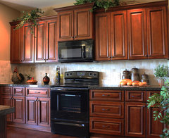
    one similar to yours with a bit darker counter. double click on link to get a visual on the backsplash.
    Brindleton Maple kitchen cabinets · More Info
  • 13 years ago
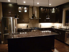
    this one is more contemporary/modern and the cabinets are chocolate. they used glass:
    Contemporary · More Info
  • 13 years ago
    Your kitchen looks really great! The backsplash will finish it off. Once you finish it I hope you'll post photos.
  • 13 years ago
    last modified: 13 years ago
    What if you get the Durango in a 3x3 square and turn and install it to a triangle, then about 3/4 of the way up from counter run a 3-4 inch band of either the Picasso or you could use a subway glass tile (that has three rows of color and then finish up to the top of your cabinet with the diamond Durango. tiles would have to be cut to 1/2 diamond so decorative band would fit up against it flush). Gives it a very custom look and breaks up all of the linear lines in the kitchen.
  • 13 years ago
    last modified: 13 years ago
    PS - Obviously I can't tell how much space is between your counter top and bottom of upper cabinets, so you would have to measure and figure out the dimensions, but don't center the banding . . . it's need to be a little higher! Chocolate is too dark for an overall look.
  • 13 years ago
    Thanks to everyone for your ideas! I think maybe I should keep it simple with Durango 4 x 4's turned to a diamond pattern. Maybe I could insert some small decorative tiles in some way. I think the Durango looks clean and restful. What do you think?
  • 13 years ago
    Do you think a larger tile would look better? Thanks!
  • 13 years ago
    I think the Durango looks pretty. I also like the four by four ideas.

    See if you can assemble the four bys in a large pattern blank. take picture, then make one up with inserts. Unless you see your kitchen is quite bland, you may not need to accent the diagonal pattern or four by fours. :=) diagonal anything adds movement to a space. sometimes it works well. do a mock up of your ideas first. A large one though so you can really see it. I'd venture to say you can even do a real time example. If it costs you $25.00-$30.00 it may be worth it. If you decide against it, the practice section can make for a great hot pot stand. :=) want you to be happy and secure in the choice.

    patience here. Best of luck in your kitchen splash, cjmany.