Software
Houzz Logo Print
jaymielo_gw

Desperate, Last Minute, Paint Help

18 years ago
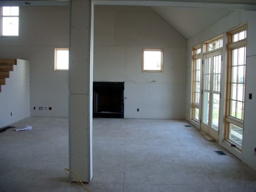
I'm desperately searching for some last minute paint color help for the main space in our new home. This will primarily be for the vaulted great room, but will continue into the kitchen, foyer, small hall on the main floor and the large upstairs hall. I had planned on painting everything the same shade of yellow that we had in our old home, but when I painted some samples on the wall yesterday, it was like "Welcome to the Fiesta!" The space is so light drenched and large that it looked completely different in the new house.

A couple of important notes.

1. We like color, but shy away from pastels.

2. The stairs and beams in the ceiling will be stained a warm color. The cabinetry in the kitchen will be QS white oak and match. The baseboards and casings will be painted white. The doors and windows will be stained.

3. The tile for the kitchen basksplash and fireplace surround has already been purchased and is predominately a matte green color.

Here are some snapshots of the space.

This is an old picture looking out of the nook into the great room, but it gives you an idea of the space.

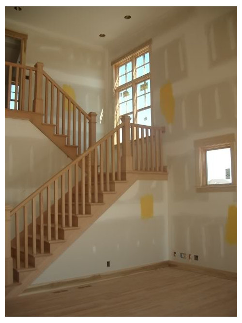
This one is looking up the stairs. The wall at the top of the stairs runs down a spacious hallway upstairs. You can see some of the vetoed yellow on the wall.

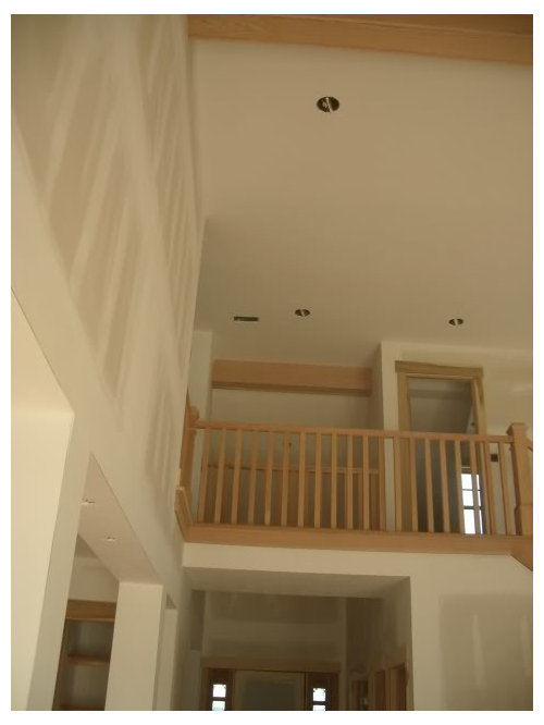
This is the catwalk over the foyer that leads to the rooms in the upper level.

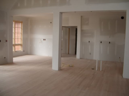
This is looking the other direction, into the nook. The kitchen is to the right of the pillar.

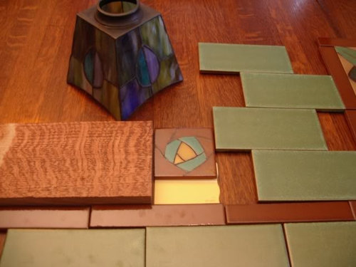
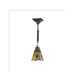
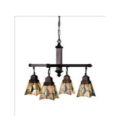
Finally, here are the coordinating items for the space. The tile is for the backsplash and fireplace surround. The light shades are for over the island and in the nook. The yellow paint swatch is the vetoed color. Finally, the wood sample is the color of the cabinetry and stained woodwork.

Please! Any suggestions. I need to make a decision ASAP because the painter start today (although they won't get to the walls for a bit)! My thoughts were a more mellow yellow, a light green (SW Recycled Glass?) or a neutral color (SW Kilim Beige?) Sorry for the long post, but I really need some advice! TIA. Jaymie

Comments (33)

  • 18 years ago

    I have no color advice, sorry, but your light shades would be very happy in my house. They are grrrrrrrreat!!!

  • 18 years ago

    There are two color sticks on the old Sherwin Williams deck that I love (my neighbor borrowed my sticks so I dont know the number). One stick has Croissant, Raffia Basket and Sesame. All pretty. Raffia is the medium shade and goes well with many colors. Its a light brown gold. If that makes sense. The other stick has more golden tones to it......Autumn Blonde, Dromedary Camel and Praline. Dromedary Camel is a brighter golden brown....its my favorite color. If its too bright, I would go with Raffia Basket, which is very neutral. Check them out. Dromedary Camel is not on the sample cards that they have at SW. Another color which is brigher is Blonde, its on the newer SW deck. Tinker painted it in her great room, she had a post yesterday.

    Here are some pics, this is dromedary camel.


    This is sesame.

    I tried to upload a raffia pic but my photobucket account is not showing me the download area, so I cant upload another pic.

  • 18 years ago

    I think I'd go neutral. There have been some nice pics on the forum of Natural Linen and Rich Creme.

    Natural Linen is further down the thread:

    http://ths.gardenweb.com/forums/load/decor/msg062307052376.html

    Pale yellows (including Rich Creme):

    http://ths.gardenweb.com/forums/load/decor/msg0423310715877.html

  • 18 years ago

    sheilaaus122 Thanks for the compliments on the light. They have been hidden in a box so long, I often forget what they look like. I can't wait to see them hung from the ceiling.

    gk5040 and organic_smallhome Thanks for the pictures and suggestions. gk5040, that is a beautiful great room. organic_smallhome, I just went through those threads but you pointed out pictures I had skimmed over. Definitely food for thought.

    Does everyone else agree I need to go brown or neutral in this space? I'm trying to keep an open mind, but truly, this makes my heart sink a little. I don't think I've ever had a beige wall in my life. However, with the high ceilings this isn't something I want to repaint soon, so I'm working on wrapping my brain around it.

    I've been pouring over the color wheel this morning. How about SW Butter Up (which seems like a very light yellow) or a very pale green of some sort?

    Here is a picture of our furniture and our old living room. I loved the cheeriness of this room.

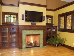
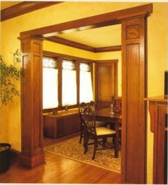
    Here are some pictures I have in my inspiration files that really appeal to me.

    And this picture gives you an idea of how much light we get into this area of the new house.

    Has anyone used SW Butter Up?

  • 18 years ago

    Your new space is fabulous -- but then again, so is your old! Butter Up looks like a delicious color, and I definitely don't think you need to go brown or neutral. I just might tone down Butter Up ever-so-slightly (as depicted in your second inspiration pic with the green fireplace tiles) because your space is so large. I'm sorry I don't have a specific color suggestion for you, but just wanted to say that I don't think you should nix the thought of yellow. I think it would be lovely in the space - maybe just dialed down a half notch or so from Butter Up.

  • 18 years ago

    Is that evening or morning light through those windows? I have the same set up in my new house and had to go with a lighter color than I thought I wanted due to afternoon light. A friend of mine is finishing a build; she is a yellow lover and went with SW Compatible Cream which has more tan/gold in it.

  • 18 years ago

    auntjen, thanks for the compliments and encouragement on the possibility of using a yellow in the space. I'm looking up the paint swatch and there is Full Moon at the top and Friendly Yellow below it. Probably time to make another trip to the paint store for the 100th sample...

    txgal06, that is evening light through the windows. I believe I underestimated the affect of natural light on the color. In our old home, our rooms were very dark, so when we painted them with SW Sundance, it was refreshing, but in the new space, it is a crazy bright. I've looked many times at the Compatible Cream swatch. I've also considered Dover White at the top of the strip for the trim. I'm always thrown when I look down the strip to the browns to think that color will come off yellow on the walls, but in some of the yellow threads, I've seen that is true. I might pick up a sample of that today also

    Thank you for your suggestions!

  • 18 years ago

    I also think a very toned down yellow would look lovely. Once the light comes in, it wouldn't be so "toned down".
    I love the second inspiration picture. I think you should try and match those walls. You're going to have a wonderful house when you're done.

    I had the same bright yellow walls you had in my familyroom/kitchen and just painted them BM Baby Turtle. I would normally recommend that color but it would match your tiles too much. I don't think you want your tiles to blend in. You could go a little lighter but I stick by the light yellow.

    Also take a look at BM Golden Lab (there are pictures on this forum) and EK Cognac (gold not yellow but very nice).

  • 18 years ago

    Oh Jaymie, I'm sorry you're having to make such a decision in the eleventh hour. I love gk's colors so much. I think the Dromedary Camel would look very nice in your space. I also like the color on your second inspiration pic (the one with the green fireplace) Do you know what color that is??

    Good Luck today and let us know how it comes out. I'm getting excited that your house is almost finished!

  • 18 years ago

    mlraff53, The second inspiration picture is also my favorite, and very close to what I hope our room will look like, except or the high ceiling. The subways for the fireplace are 2x4 and the windows on the sides of the fireplace will have leaded glass inserts which were salvaged from a Craftsman house circa 1920.

    I love the BM Baby Turtle color. I was planning on using SW Recycled Glass in some of the upstairs space (the boys computer nook and a spare BR and bath). I know soonermagic used it in a secondary bath and I thought it was lovely. I think I'll pull up Baby Turtle again and see how close they are.

    Hi Lindy! Glad to hear from you. I can't believe you have been in your house already a year. The last minute paint dilemma isn't really so tragic. At least I figured it out now, BEFORE they painted that huge room. They are starting with all the stain, so I have a bit of time to hammer out these details. I'm also not happy with the dining room color and possibly the boys's bedroom, but those are easier to repaint, so I'm not so freaked out... I don't know what color is in that lovely second picture. I honestly can't remember where I even got that picture. I initially saved it as tile inspiration, but love the entire room.

    We are still waiting on cabinetry, but hopefully it will be completed around the 4th of July, so we are getting there. The house still feels like a bit of a "shell" so it will be nice to see all the finishing touches added. I'll be sure and post when I get more samples on the wall, and the finished product, IF it turns out! lol.

  • 18 years ago

    tracey_b, Thanks, I'll look at SW blonde also. I have some pictures save on my computer of rooms done in that color.

    The light is by Meyda Tiffany. I was really surprised when they came because they looked a lot different in the picture I ordered them based on. When I put them over a bulb, they look more like the picture, but still retain a lot of the purple/green/teal colors. I found the fixture at 1stoplighting. Here is a link to it.

    I'll be sure and post when everything is completed. Thanks! Jaymie

  • 18 years ago

    My immediate thought was also to test the SW Blond range of colors & those color strips next to it. I mention that range because for some it can take on lovely golden tones, or lovely green tones or a really rich, rich tan. It all depends on the light you get. Could work out quite well for you.

    Currently I am looking at a sample of SW Restrained Gold (1 down from Blond) on my wall w/ deep olive curtains a bit darker than your tile, & I think that it looks lovely.

  • 18 years ago

    Well guess who found the paint color on that fireplace pic... LOL!

    It's from this website Castle Building and Remodeling and I emailed the designer. She was nice enough to respond immediately. ;c)

    Her response:
    That is funny, the color on the lower portion? If so, that is Sherwin Williams, Mannered Gold SW 6130
    Katie Jaydan, ASID

  • 18 years ago

    OMG! YOU ARE THE BEST LINDY! You know, I did the same thing with the exterior of our home. We found a picture we liked and I emailed the builder. The home had been on a "Street of Dreams" and he was kind enough to mail me the brochure from the event with all the info. I don't know why I never thought of doing the same here. I can't believe she responded so quickly. I'm also amazed that it is that color! On the SW blonde strip which so many, included Todd (Thank you!) have recommended above. Guess that is a sample that I should definitely be adding to my list to pick up this evening. I believe the SW store here might be able to be profitable JUST off the samples I've picked up in the past few weeks. ;-) I wonder if I started with Blonde, if they could turn it into Restrained Gold and then Mannered Gold by adding a bit more color.

    BTW, I'm not surprised you found it. You resourcefulness is amazing yet consistent. Thanks so much for your help Lindy! It's rainy and dark today, so I don't really want to try the samples today, but hopefully tomorrow will clear up.

    Thanks again! Jaymie

  • 18 years ago

    Keep in mind that you can do one shade in the hallway and family room, then go a shade darker or lighter on the same color stick in the kitchen. I think you are on the right color scheme...its just what has the right tone up close...its hard to tell on the computer. The Butter up looks pretty. Blonde and Restrained Gold are very pretty, a little more bold & brigher than Dromedary Camel.

  • 18 years ago

    I tried Restrained Gold, Blonde, Ivoire and Mannered Gold and all of them had an orange cast in my south and southwest facing rooms. And Jaymie, you probably know this, but the painter told me to let him get an entire wall painted before I veteod the color. With that much drywall/white, it affects the color and a small swatch on the wall is often not enough to judge. Although I knew immediately that Restrained Gold was not working in my bedroom! Thank goodness my painter was very patient.

  • 18 years ago

    You all have all been great with helping me!

    gk5040, I've given some thought to using a shade darker color in the kitchen. Since it is a more "confined" space and will have so much cabinetry, I think it could handle it. Right now, pending actually trying them, I'm leaning towards Blonde in the great room/foyer and halls and then possibly a shade or two darker in the kitchen (Mannered or Retrained Gold).

    txgal06 I really hope they don't turn orange in my rooms, but we also face west and get a lot of light, so it is definate possibility. I know I should paint a whole wall. These are just such BIG walls! I have to at least narrow it down and make a preliminary choice. Then I'll plan on being onsite when they start to paint so I can rend a final verdict.

    Now, on to the dining room... I think my initial choice is too orange. Egads!

  • 18 years ago

    Thanks for the info on the light shades.

    What are you trying for in your DR that turned too orange? When I was choosing colors (which included Blonde), I found SW Svelte Sage (green) and BM Audubon Russet (a dusty brick red) to complement Blonde....at least in my home.

  • 18 years ago

    tracey_b, I don't even want to go there! ;-) But since you asked...

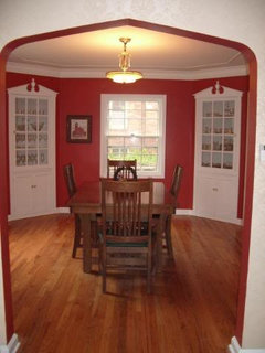
    I'm basically the most boring person in the world. I had finally picked a color palette in our last home that I liked. However, it DOESN'T work in this house. Here is our old dining room.

    It was done with SW Peppery. It was dark, but with the white trim and cabinetry, I thought it worked well. In the new house, like I said, Grab a "Corona and join the party!" I'm now thinking exactly what you mention above, a terra cotta or brick color. I like colors found in nature. One SW color I was considering was Reddened Earth, but it might come off too pink, or possibly something from the Flower Pot strip. Maybe Bravado Red or Baked Clay. I'm not sure. The space is right off the foyer (which will probably be Blonde) and connected to the kitchen (also Blonde). The other room in the public space is my office, on the other side of the foyer with French doors, and I'm thinking a soft green in here.

    It's still pouring here. Not good weather to looking at colors in a house without electricity, so today, I'm left to pour over my paint wheel.

  • 18 years ago

    Jaymielo--I think I tried all the SW terra cotta / brick reds and hubby and I couldn't agree on any of them--either too "pink" or too orange. I'd heard of BM Audubon Russet from a post either here or HGTV forum and went to get a paint chip from Ace Hardware--then went and had it matched by SW because I like their $5 sample quarts and their Harmony line of paints. Anyway, it got both our votes for that "line" of color. If you're having a hard time finding the right SW color, do check out the BM paint chips.

    Good luck. Can't wait to see the end result.

  • 18 years ago

    Thanks Tracy, I tried the "Baked Clay" color last night and my thought was orange, but your right, the others make me think pink. I'll run down to Ace today and pick up a BM paint chip. Did SW match that color in a sample for you? That would be awesome if they did. I want to use a Glidden green in my office and I'm having the same problem with not being able to get a $5 sample. Thanks so much for the pointer! Jaymie

  • 18 years ago

    Hi Jaymie:

    Just take any paint chip into SW and they'll match that color in a test quart. I've heard since, though, that not all their matches are perfectly exact, but with all those I had them do, it was spot on. All-in-all, I bought about 30-35 quarts of test paint with about 1/4th being non-SW colors.

    Funny about the "orange" for us.....we didn't intend on an orange, nor did we like any of the SW colors that were "too orange" (such as Baked Clay), but I found one I loved at Lowes--it was Laura Ashley's 'Spice' (like a dusty pumpkin). I had it matched at SW and we fell in love with it. I love the way dark wrought iron looks against it (which is what I was putting on the walls).

    Tracey

  • 18 years ago

    Ellen kennon's Light TerraCotta is wonderously changable, and great for big spaces with lights and shadows. Citron and EK both have fascinating full spectrum paints that glow. You home is going to be magnificant what ever you sellect! Love you wood, cabinets, retaining walls, lake, mailbox, setting, just love it all!

  • 18 years ago

    Ellen kennon's Light TerraCotta is wonderously changable, and great for big spaces with lights and shadows. Citron and EK both have fascinating full spectrum paints that glow. You home is going to be magnificant what ever you sellect! Love you wood, cabinets, retaining walls, lake, mailbox, setting, just love it all!

  • 18 years ago

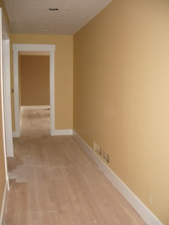
    Thanks so much Bodica, We've put so much thought into all the little things in our house, so your kind words are very much appreciated. We are at the stage of worrying about everything coming together, but we are finally getting there. In the main public spaces, we ended up going with SW Humble Gold which is VERY close to Blonde, but just a little more yellow and a little less beige. So far, I've only seen it in the upstairs halls, but I'm anticipating color in the great room on Monday or Tuesday. Can't come soon enough! Here is it is in the upstairs hall...

  • 18 years ago

    Beautiful, that color is yummy! Your attention to detail shows and makes such a huge difference in the final look. You are doing everything fabulously! Hope you remember to pause, look around and enjoy all you have done! Sounds like it has been a long journey so relax, have fun pulling it all together and pat your self and hubby on the back for a major project very well done.

  • 18 years ago

    Jaymielo. How wonderful to find someone who is at the same point we are in buidling our new home. This week is paint week and I'm making the same decisions and second guessing myself all the time. I have settled on the color strip that includes SW Blonde, using the Ivorie and Restrained Gold, along with the darker shade in one room and one room only--because I'm just not sure about that dark color.

    Best wishes to you as you paint!

  • 18 years ago

    bodica, Very good advice. It is hard to remember to pause and enjoy the experience. I assume we will never do this again. This is supposed to the the "forever" house. :) Days when we make a lot of progress, we are on cloud nine. Days when we don't it hits us hard, but, we will get there and I know it will all be worth it. Analogous to having a baby...

    sdionnemoore, I love talking to people who are at the same point as us. I really love the SW Blonde strip and all the colors on it. Please post pictures as your paint goes up! I'd love to see them. Humble gold will be the main color in our house, but there are a lot of different colors as well. Here is a link to our blog if you are at all interested in seeing some of them. Good luck with your painting also!

    Jaymie

  • 18 years ago

    Oh Jaymie, that looks perfect in the hall. I think the Great room is going to look fabulous! ;c)

  • 18 years ago

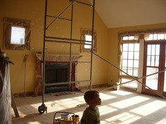
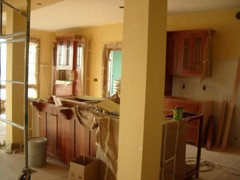
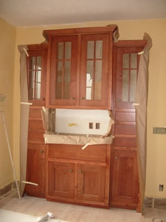
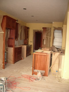
    The GR and kitchen are FINALLY painted (so my desperate and last minute request was not so dire, but that is a whole 'nother story). This needs one more coat, but I'm very happy with it. THANK YOU SO MUCH to everyone who chimed in. I would never have picked this color without your help and I'm very happy with it! Excuse the masking tape and clutter, but I just had to share.

  • 18 years ago

    Love your wood with the paint color, it's so warm and complimentary.......and there is a Most Beautiful Face filled with wonder in your Great Room! He looks very impressed, so precious!

  • 11 years ago

    Hello everyone. I stumbled upon a color that I dont see much of on the boards. Its SW "Stonebrier (SW 7693). If I hadn't already purchased 3 gallons of SW Blonde I would have went with it instead. Dont get me wrong, I love, love, love SW Blonde, however, SW's Stonebrier is a beautiful light to medium Golden Carmel color. The online pics do not do it justice in my opinion. Thought I might chime in on the conversation and share this color discovery with everyone in hopes that it helps someone out. Have a great day all and thank you all for sharing your color opinions. It really helps and saves one from pulling out every last bit of their hair trying to find a flow color. (: