Software
Houzz Logo Print
rtorgy1

Please help with my backsplash!

16 years ago
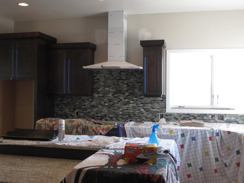
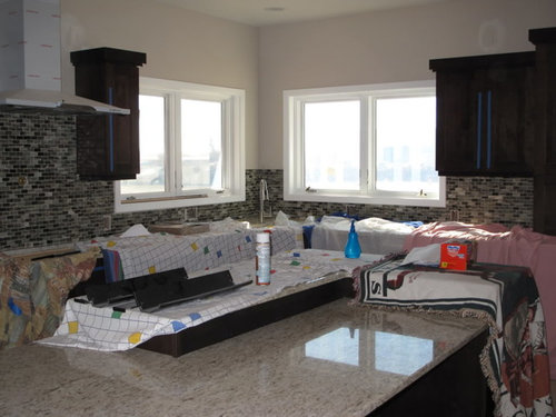
A while back, I posted on where to take my backsplash in my kitchen, and the majority thought up to the hood, to the bottom of the cabinets, and do the same distance as the bottom of the cabs between the two windows. I think it all looks great- but the area of the hood is bugging me. I don't know if it is just the ceiling being 9', but it seems like too much wall behind the hood. So I was thinking going further and taking the tile all the way behind the hood to the ceiling, that it might look better there. I've had more snags in this kitchen than I'd like already, I'd like to get this right- so I'd appreciate all of your expertise! I am also wishing I had photoshop right about now... :)

Here are a couple of different views:


Comments (23)

  • 16 years ago

    Looks beautiful! Great choice. I wonder if you would feel better about the height of the hood tile if the tile between the 2 windows was taken up to the same height as the hood. I think I was one who suggested the same height as the cabs for between the windows.

    I don't think I'd like it to the ceiling behind the hood. Might like it to the top of the upper cabinet behind the hood. Can you tape any of it up there as a trial?

  • 16 years ago

    I didn't think to tape some up there, I'll have to have my tile guy try that. I do like the tile between the windows, I think it looks great. When I walk into the kitchen, the hood wall is the first one I see, I think that may be why it is bugging me so much.
    That was what I had originally thought of doing, is going to the top of the cabinets-
    Malhgold, would you to even with the top of the moulding, or to the top of the cabinets, under the moulding?

  • 16 years ago

    If you do go all the way up to the cabinet molding height, how are you going to finish of the last row of tiles?

  • 16 years ago

    First: love the cabinets and the backsplash. Really nice.

    In terms of the tile: it seems to me that there is a strong horizontal line created by the tops of the windows and if you take the tile above that it will look odd. You have all these horizontals: the stairstepping tops of the cabs, hood, tops of windows. It seems like connecting the line of the windows with the tile (which looks like it would have it stopping just below the molding on the cabs) would tie everything together.

  • 16 years ago

    Hope you don't mind, I was bored waiting for my Waterlox to dry, so I did a quick mock up similiar to what malhgold suggested.

    Your backsplash choice is beautiful!

    {{!gwi}}

    {{!gwi}}

  • 16 years ago

    I really like how it looks in the mock up that dawn t did for you. Very clean lines. Easy on the eye. That gets my vote-take it up to to top of the windows on all the walls. It all ties together very nicely.

  • 16 years ago

    dawn t! Thank you so much! I think it looks so much better that way, but was so hard to visualize. That was so nice of you, thank you for the help!

  • 16 years ago

    Tile height to bottom of range hood:

    {{!gwi}}

    {{!gwi}}

  • 16 years ago

    I think the second set of pictures is closer to what Malhgold was suggesting...
    You have a beautiful kitchen!

    Dawn

  • 16 years ago

    Thanks, Dawn- the kitchen has been alot of work, but I am glad it is finally coming together- quite a few issues came up, and some outcomes did not turn out to my liking, where others came out okay (I am sure many have asked yourselves, what is up with that narrow cabinet to the right of the hood? :)

    Now I just have to decide which way to go with the tile. I have enough left over to do the second set of mock-ups that Dawn did for me, but if I take everything up, I will have to order more, but it wouldn't take too long to get in, so I would be okay there. But both of the mock-ups look much better now than what I have there right now, I think.

  • 16 years ago

    anyone else have any thoughts please?

  • 16 years ago

    I would vote for the first set dawn did - to the top of the windows, but I am not sure you can go wrong- it is gorgeous in all three options.

  • 16 years ago

    What about a different paint color on the walls with cabinets (and hood) pick up a light grey from the tile? A lot less expensive and easy to change if you don't care for it.

  • 16 years ago

    Are you going to paint? I wonder if painting the walls one of the pretty colors from your tile might make the horizontal line of the top of the cabs less noticable.

  • 16 years ago

    I would actually look for a thick pencil liner in that color and put above area at window. I think leaving it as low as backsplash of cabients is high enough. BJMO!!

  • 16 years ago

    I think it looks beautiful! Id probably take the tile up to the top of the cabs (below the CM) in the hood area only and call it a day. Like The others have said already, you cant go wrong here!

  • 16 years ago

    I actually did paint already, but I must have not picked a good color? The tile is not grouted yet, and the color will be a lighter off white color, so that might go with the wall color. I chose this color because my kitchen is open to the living/dining area, and this was a couple of steps lighter on the same paint strip that I did in the living.

    I am also figuring getting that protective cover off of the hood might help things be in better perspective- I think it throws things off a bit too-

  • 16 years ago

    I vote for Dawn's second picture, and perhaps a stronger paint colour up top? All options look good, however, I just prefer a little less tile I guess. I don't think you should increase the height of the tile at all in the corner area between the two windows - the tile is the perfect height there now I think.

  • 16 years ago

    i think a color paint that blends more w/the tile would do the trick. a medium grey/taupe.

  • 16 years ago

    I also like the tile higher in the hood area but don't feel the window corner need any more attention.. you have to stop the tile somewhere, it's easy to do too much.

  • 16 years ago

    I'm hesitant to jump in here, I've been lurking here since January as I get ready to start on my own kitchen redo.

    I love your kitchen and when I opened this thread, my first reaction to your question was, go to a deeper paint color. I can see that the contrast might be throwing you off. The light color comes forward, where a deeper tone would make the painted areas recede, letting your beautiful tile take center stage. I like the back splash going to the bottom of the hood.

    I love your colors and would love to know about your counter. Is it quartz? Nice...

    You might try a color like BM Pismo Dunes or at least a shade in about that depth. I just did two bedrooms and bath in it. The tile in the bath is a porcelain travertine and a very dark brown like your cabinets looks great with any of the putty colors. You have good light so I think a deeper color would really be pleasing.

  • 16 years ago

    Thanks, wizardnm, and you're lucky to have found this forum before you start- I didn't until most of my decisions were made, and there are so many great ideas to be found here. some of my not so favorite parts about how mine has turned out would probably have been caught if I had found this forum sooner! :)

    My cabinets are java stained maple from Crestwood cabinets, and my counters are actually granite, Giallo Ornamental.

    I'll look into that paint color you suggested- I don't have a BM dealer near me, but there is one an hour or so away that I can go look at samples in the near future.

  • 16 years ago

    thanks for all of your help. What I decided to do was put more tile in behind the hood to the top of the cabs (bottom of CM) and leave the area between windows as is. I will post pictures when it is done!