Software
Houzz Logo Print
molly_phillips5546059

Help! Can't be an ABB member for long!

13 years ago
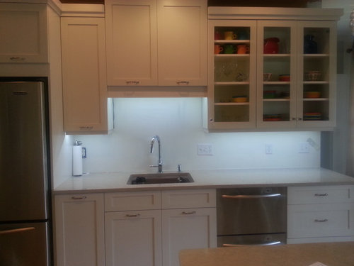
Okay, so we're not completely done yet, so I'm not officially ABB, but either way, I can't be a member for long. As a mostly DIY project, I made a tactical error for not painting our kitchen before we put in our cabinets, so now I have a hodgepodge of primer, old paint, even older paint, and some leftover samples I had from another project on the walls. I cannot stare at this for 16+ months while I wallow in indecision over backsplash ideas.

So, what would you do? I'm thinking under $30 budget (tiles only, as we'll install them ourselves) but of course would love to go cheaper. I am ALL.OVER.THE.PLACE with ideas - MOP, something calming, a splash of color, penny tiles...heck, I even found the cutest website (not in my budget) that fed my love of circles and a splash of color.

The one thing I think won't work (which actually works best) is a grayish backsplash because the great room adjacent is painted a shimmery brown that won't be repainted anytime soon (still detoxing DH from this reno project).

Pictures in subsequent posts...I left the lights on and have cool UCL but warm recessed lights. Also have noticed that I need to find a drawer home for my knives because that corner is cluttered!

Here is a link that might be useful: awesomely fun backsplash

Comments (27)

  • 13 years ago

    Other side:

  • 13 years ago

    Uh, oh....did I choose a poor subject line? Everyone tired of backsplash discussions? Or are you all busily researching the best choice for me?

    Bumping....

  • 13 years ago

    OK, I'm usually the last person to weigh in on backsplash threads, but I wanted to say that your kitchen looks great! Love the stove U with the little corner prep sink a la circuspeanut! If you like circles, I think penny tiles are wonderful, and a little bit of color might be just the thing!

  • 13 years ago

    You love Fiestaware, so how would you feel about a multicolored bs scheme, in several different colors of tiles that are of the same format (subways, squares) and size? There are examples of these on GW from the thread below. I like the DC kitchens green/blue/grey as well as the painfully subtle Gonyea homes pale yellow/grey mixes. You could use some of the colors of your dishware.

    Fireclay Tile in Aubergine, Turquoise, Granny Smith, Sherbert, Tangerine, Claret, Santorini Blue ,
    {{!gwi}}{{!gwi}}{{!gwi}}{{!gwi}}{{!gwi}}{{!gwi}}{{!gwi}}

    I hesitate to mention it because yours is a classic kitchen, but the color, the Fiestaware, they both bring to mind the gorgeous Mexican mosaic tile from Tierra y Fuego that another GWer used in her kitchen

    Here is a link that might be useful: GW Multicolor

  • 13 years ago

    those Mercury tiles are fantastic! Do you have any idea of how much they cost? do they sell directly to the public? And now another potentially pricey tile to covet along with Trikeenan, McIntryre, and Fireclay!

  • 13 years ago

    Thanks, EAM44...I was hoping you'd weigh in. I've thought about some color, but I'm a little afraid to go all out. I wonder if other people that embraced color were chicken or if you just go for it from the beginning? Still, something to think about. I looked IRL today and the aqua colors looked surprisingly good with the quartz.

    I think I'm taking the plunge and at least calling Mercury tiles today. I saw their price list, though, and they start at $36 sq foot and go up into the $100s. Maybe I can find some fun at the lower end of the spectrum.

    I think my larger question is....would adding a muted backsplash (like a mushroom color, or I saw some Ann Sachs penny rounds that were white with gray at the very edge, so not totally white) make my kitchen boring and washed out, or classic and lovely? Based on the previous responses, it sounds like maybe so.

  • 13 years ago

    You've really got two issues, staying true to your classic motif, and adding life to a fairly monochromatic scheme. You can absolutely accomplish both. The way to do this is to either choose a classic shape (again, subway, 2"x 2" or 4"x 4") with some surprising color, or a surprising shape in a more classic color (whites, beiges).

    Which of the Mercury tiles do you like?

  • 13 years ago

    My favorite Mercury ones are the kitchens that have bubbles at the bottom and blending into regular tiles - so not too over-the-top but something unexpected and fun. However, I'm betting that you have to use all of their tiles (even the basic ones) to achieve that look, so it's not like I could splurge on the bubbles and use less expensive tile for the rest and get the same look.

    And I think that's my personality - a pop of unexpected mixed with some classic.

    Here is a link that might be useful: Organic bubbles

  • 13 years ago

    I would not add a bright backsplash to your kitchen. I would agree to that if it played off a bright colored counter.
    My favorite muti colored backsplash is Sas's. Hers is green, beige and cream. She also has green cabinets on her lowers and cream on the uppers. It all ties in beautifully.
    There is a backsplash thread where many have posted their backsplashes. The Finished Kitchen Blog is a good place to look too.
    There are solid tiles but with variations to give a more interesting look. Look at Ann Sachs for ideas.
    You can do a beveled or to use two or three different lengths of tile to create a pattern
    No,no, no to a bright colored backsplash in your kitchen.

  • 13 years ago

    We just did our backsplash - I was going to use a strip of fruit platter with white subway tiles, but our kitchen was just too modern and it didn't go. I think it might look nice with your kitchen, especially with the fiestaware. I have lots left - if interested, let me know.

    Also, Susan Jablon has lots of nice colorful tiles - just do a google, and you'll find lots of images.

    Here is a GW kitchen that was my inspiration for the look:

    http://ths.gardenweb.com/forums/load/kitchbath/msg0712493717899.html

    Here is a link that might be useful: fruit platter mosaic

  • 13 years ago

    I may be putting out the idea that I WANT a mosaic, but honestly that was the one idea that I had pretty much ruled out before I started this thread. EAM44 has me thinking, but typically multi-colored backsplashes don't make my heart sing.

    I think that's where I'm struggling - while I'd like to do some color, I think all over is probably too much but pencil lines, framed mosaics behind stoves, and using multiple shapes of tiles for one kitchen don't really appeal to me. I can't find *the* inspiration that makes me do double flips, so I go back to classic with maybe a twist on the shape (arabesque, penny, hexagon, etc). Then I'm afraid that will be too boring.

  • 13 years ago

    Can't really help - but I know where you're coming from - that's why we ended up with white subway. I decided in the end that I loved the contrast between our lower cabs and our uppers (brown vs. white), and our pulls, so I just put a really plain backsplash so that would pop. I went through all sorts of coniptions and plans before we landed there.

    Not really helpful...but I can empathize with your thinking...

  • 13 years ago

    Thanks for the suggestions...and empathy. I had a great conversation today with the Mercury Mosaics owner. We'll see where that goes. Definitely above my If I had to do this over again, I think I'd choose the backsplash first, THEN the countertop.

  • 13 years ago

    I love penny tiles! Was just looking at some by Waterworks (link below) and fell for the Haze color scheme, which might work in your space (but maybe too gray?). Vanilla would be a warm neutral, or you could go bolder and do the green or robin's egg blue.

    Here is a link that might be useful: Waterworks penny tiles

  • 13 years ago

    It's interesting when people say they don't want a boring kitchen, as if you can compare a kitchen to a dull lecture.
    When you are in the middle of reno each element is so important that we obsess over it. No matter what you pick, I don't think anyone will look at it and say it is boring!
    I agree with your idea of a classic color in an interesting shape. There is a kitchen or two on here with round tiles in a muted colors. I wish I could remember whose.
    The other suggestion is that when you do narrow down your choices, think of how the tile will have to end. Sometimes people have to come up with creative ideas of where and how to end the tile, so thinking ahead might be a good idea.

  • 13 years ago

    LOL elendi....thanks for the perspective. I think part of it is that everyone who knows me knows I've been working on my kitchen, so you naturally don't want people to walk in and think "really? THIS is what you came up with?!?" But yeah....definitely not a big deal in the scheme of life.

    OTOH, flying_c...thanks for that link! Loved that first penny tile that came up. Need to figure out how to get a sample. The robin's egg could add some drama too, but maybe too much. Still, I liked those choices. Thanks!

  • 13 years ago

    Oh gosh your kitchen is SO lovely and with those multi colored dishes in your glass cabinets they seem to be aching for company.

    I can totally see something fun/colorful - or something muted but in a fun shape or pattern. You can easily pop color with towels, ceramics, etc.

    I sympathize because I thought i wanted white BS but couldn't find the right white, so I ended up with greige and just love it.

    What about rows of thin subway in alternating shapes? Like 2x5s and 2x8s? Unless you like herringbone.

    Here is a link that might be useful: Herringbone backsplash

  • 13 years ago

    You do know that bubbles aren't new. You can find different versions all over the place (HD even sells one for $15 a sheet), although admittedly, Mercury makes a nice one. The only thing original about this bs is that the first row of field tiles is curved to caress the bubbles. Is it cool? Absolutely. Can you cut a curve into a standard field tile without paying a fortune for custom tile? Absolutely. You need an installer who knows how to use a spiral cutting saw to get this look. The bubbles below are made of Thassos and other marbles and cost about $33.


  • 13 years ago

    Yeah, I've seen those bubbles before (thanks for the tile saw comment - I didn't know there was such a blade like that). Definitely less expensive but far more limited in colors. I don't know if those whites will be the right white for my kitchen.

    For your opinions....whenever I've seen samples of those bubbles, they are 1) all in bathrooms and 2) often in kids' bathrooms. Are circles that big more appropriate for a bath? Too childish? Are penny tiles more elegant? Because if I'm anything, it's elegant (hahahahahahaha).

    (not really. But I am definitely on the older end of being a child)

    And, as I kill this thread with too many questions....on average, how many samples did most of you buy before finding your match? I can see myself busting my budget just spending $200 on samples as I wallow in indecision.

  • 13 years ago

    i didn't buy any samples, just dozens and dozens of trips to and from tile stores with sample boards. I ended up buying one box of tile which was returnable, to see the actual lot, which I ended up returning.

    In thinking about your circles, pennies or bubbles - as much as I love them, I think I would tire of them. Are you going to get a sample of WZ Pipe Smoke? That's stunning. Red Rock, Pratt & Larson, and California Art and Heath make lovely handmade hand glazed tiles, in many different shapes. Maybe try to find the color first then the shape.

    Here is a link that might be useful: Tile companies

  • 13 years ago

    Just checking in to see how your decision making is progressing. In answer to some of your questions, bubbles in marble are elegant to my eye. The ones you're looking at from Mercury look to me like they belong in a kids lavatory, but that shouldn't deter you. Consider your range height though, and optimal bubble placement. Of the two images below I think the top looks sloppy and the bottom much better. Why? Surface heights (and color choice). If you are going to use pierced tile, make sure the onlooker can appreciate that it's pierced.

    {{!gwi}}
    {{!gwi}}

    In the top image they try to overcome the range bs heigh by pulling the counter bs up to meet it, and using the bubbles in a straight line from that height up with no pierced field tile surround. The bottom image looks cleaner because there is a solid horizon line from counter surface up, and they play on that line with the pierced tile.

    Your range has an extensive bs of its own high above counter level. If you try to tile bubbles behind it that's fine - it'll look more like the image below. It is pierced, but I don't really see that because there is no surprise popping out of a straight edge - know what I mean? If you're going to pay a fortune, make sure you display the element of all of this that you most enjoy.

    {{!gwi}}

  • 13 years ago

    Hey, EAM - thanks for checking in. Nothing new to post, really. I'm getting samples from Mercury and she drew up a fun drawing - the pierced tile focal point is actually behind the sink (first photo) rather than the stove because of that tall backsplash you mentioned. I, too, thought it would be too much (it's also not the first wall you see when you walk into the kitchen).

    Her drawing then included subway field tiles with some bubbles in a few of them smattered around, except over at the corner sink, where she added another set of bubbles. I liked that best because that's at the end of my upper cabinet run, so they'd stick out into the peninsula area (where I plan to have counter chairs and people will sit), rather than just abruptly ending in a vertical run where the cabinets end.

    Still, though, her prices are high, high, HIGH, and I'm sort of wimping out on the originality of it (mainly because I'm afraid it will look like a kids' lavatory when I'm done). I look forward to seeing her samples. Her field tile suggestion was a lovely gray tile. I'm trying to decide if doing muted colors with the bubbles would still give me a wow factor that makes the price I'd pay worth it. I'm so visual; it's hard seeing it in my head only.

    In the meantime, I'm considering Ann Sacks penny tile, or the Waterworks posted above. I don't know, though....I feel that backsplashes are HARD because they actually say more visually than a horizontal counter does.

  • 13 years ago

    They are only hard for people who want something extraordinary. Hang in there - and keep looking!

  • 13 years ago

    Nice! What are your countertops and cab paint color? Thanks.

  • 13 years ago

    EAM - What do you think about mother of pearl in my space? Cool or too blingy? Or geomeg's blue green Walker Zanger? It's a softer color than my bright plates, but maybe still look happy without looking too matchy-matchy.

    Island, counters are LG Viatera in Natural Limestone (a deal at $50/sq ft) and cabinets are painted Aesthetic White by SW.

    Here is a link that might be useful: geomeg's backsplash idea

  • 13 years ago

    I love your kitchen and I love your choices so far. I personally would go sedate with the backsplash and use your accessories for the punches of color. And by sedate I don't mean boring. I consider my ming green sunflower mosaic on the sedate side, but it's certainly not usual or boring. I stole my backsplash from Sarah Richardson (of Sarah's House on HGTV) and I generally love her backsplashes. Here are a couple more in the hopes they will inspire you. Everything she uses is from Saltillo Tile in Canada, and their tile is available in the US through Caledonia Tile in Indianapolis. They ship anywhere, and their prices are reasonable. My mosaic was less than $20 a square foot, but it is a little thinner than some tile mosaics. I don't think that matters once it's up on the wall.

    Here is a penny round (I love penny round, too!) that I think might look better in your kitchen than it does here:

    I love this combination of marble tile sizes, too:

    {{!gwi}}

    Good luck! I know you'll come up with something great.

    By the way, AKDO also makes a lot of bubble mosaics in stone, glass and stone/glass combinations. I think they are more like $40/sq ft.

  • 13 years ago

    I love your counter choice - in fact, all of your choices. You've made a beautiful space.

    MOP is great. It has a tendency to look "fancy" so in my mind's eye I see it in kitchens with chandeliers but I'm sure it can look pretty anywhere. But I would like to see some color in your space, wouldn't you?

    I like Geomeg's choice for her kitchen - and I like WZ field tiles in general. I don't think Loire looks like it looks in the images she posted, but I haven't held it in my hands either. Based on the images I can find it is more grey than I would find tolerable on a cloudy day.

    Loire

    I tend toward more joyful colors but that's me. I don't want to choose anything that is going to look drab in my darkest hours personally, or in God's homage to clouds, the city we call Cleveland, my new home. I also don't see a window/direct sunlight in your kitchen.

    WZ does have a Contessa collection with really pretty field tiles. The arabesque they show in Contessa is also lovely. See how the grey in Silver Leaf is more uplifting than in the Loire? The grey undertones in these tiles will look fantastic with your LG Natural Limestone.

    WZ Contessa in Provence Blue

    WZ Contessa Arabesco Cielo Blend or Silver Leaf