Software
Houzz Logo Print
janice5_gw

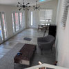
room with northern light

17 years ago

I'm trying to pick a paint color for my dark, north facing living room. So far, I have quite the selection of samples that don't work.

I'm not trying to match anything. I'm just trying to find a color that feels right for the room.

I like the BM color Golden Straw but that looked way too yellow. Then I tried BM Baby Turtle, which looked way too gloomy.

I think when you try to make this room bright, it doesn't work but I haven't found the right color that will make it cozy and warm without feeling like a dungeon.

I'd like the room to feel comfortable and sophisticated.

Does anyone have an idea for a color that might work?

Thank you.

Comments (12)

  • 17 years ago
    last modified: 11 years ago

    How about a cream or a pale yellow?

  • 17 years ago
    last modified: 11 years ago

    I've seen contradicting advice for northern & low light rooms. Some say you can't make them brighter using light or warm colors, others say the opposite.

    Now I haven't tried this myself, but I read about one decorator who likes to use pink in a northern room. It can shift warm or cool, but adjusts well to northern light, she thought. There are a whole range of pinks, so maybe you can find one that's sophisticated & subtle enough for a living room.

  • 17 years ago
    last modified: 11 years ago

    I had a beautiful yellow in an east facing room in our old house that I loved! So I put it in our office again in our new house which is north facing and it looked terrible. I mixed it with white paint and rag rolled over the top thinking it would lighten it up and that looked really bad. lol
    So I did some research and found that grey and/or purple is supposed to be inspiring so I found a pretty purplish grey in a really light hue and we love it.
    Not sure I am able to find a color name but do some looking and see what you think about that route.

  • 17 years ago
    last modified: 11 years ago

    I had a north facing living room in my last house however it was not all that dark. My woodwork was stained . I used a fairly dark salmon color that was beautiful with the woodwork and it really was wonderful in that cool north facing room.

  • 17 years ago
    last modified: 11 years ago

    How about a pale gold -- Laura Ashley Gold #2 -- light but warm!

    Of course -- add lots of lighting and lamps for lighting options at all times of the day!

  • 17 years ago
    last modified: 11 years ago

    I used BM Monroe Bisque in a north facing room in our previous home and really liked it.

  • 17 years ago

    Another vote for Monroe Bisque. It's throughout my main floor and looks great in every light.

  • 17 years ago
    last modified: 11 years ago

    Just checked and our grey/purple color is Violet Wing from Columbia Paint. I do love it :)

  • 17 years ago
    last modified: 11 years ago

    I have three rooms in my house that only get northern light. Actually two of these rooms don't even get that, as their windows and doors lead to a sunroom - so they get no direct sunlight.

    I did what teacats suggested - warm light golds. My kitchen is SW Ivoire, the office and family room (both rooms that lead to the sunroom) are SW Blonde and SW Restrained Gold, which are darker than Ivoire and on the same paint strip. The colors really are perfect as they give me warmth and light!

    When you go with too light of a color in a low-light room the colors just look dingy.

    Nicole

  • 17 years ago
    last modified: 11 years ago

    Another vote for Monroe Bisque, we used it a lot when we were selling our previous house, where all except two rooms was very dark. It's not the most exciting color on the planet IMO, but very versatile and functional without being dull (I'm just more of a color person rather than a neutrals person). Just about everything we had went with it with minimum fuss. I would never have thought of it on my own because the paint chip is kind of blah but a very sweet GWebber gave me a few gallons and we liked the result.

    I'm not a gold person at all, it drags me kicking and screaming back to the "antique gold" of the 70s. The closest I've gotten to that was a midtone golden-olive color (the color of those huge green olives from California), which I used with cranberry and several shades of brown in a bedroom that got absolutely NO natural light ever - north facing and surrounded with very thick woods to boot. So yes, it was a cave, but it was a warm, cuddly, happy cave that I usually had to be pried out of with a crowbar. :-) The POs had painted the room cream and it was incredibly depressing, shadowy and drab.

    IME yellow has been most successful in the rooms that are bright to begin with, especially when combined with plenty of white and strong accent colors (navy blue, leaf green, clear red). I had it in the guest room of my last house, which got quite a bit of sunlight, but I had to make sure I had especially good lighting (color-corrected aka full-spectrum aka neodymium light bulbs) because the color just died at night. If you do ever decide to use yellow for a wall color, pick a shade that is much lighter than you think you want, because yellow tends to get very strong on the wall and you'll end up with a schoolbus before you know it. :-) The yellow I chose was extremely pale on the chip and in the can but dried a definite lemony yellow on the wall.

    I still have a twinge for the BM Wet Concrete (midtone greyed lavender with a tiny hint of tan) in my previous house's living room, which got actual sunlight about 3 hours a day in the spring and fall when the sunlight fell at juuuust the right angle. It didn't get garish when the sun did come in, as can happen sometimes with stronger colors, and it didn't drab out when it was dim - it just became richer. I adored that color and I will probably use it in the the spare bedroom we use as a library here, which gets absolutely no light ever. (I love the idea of the solartubes but strongly dislike the plastic bubbles on the roof - totally wrong on a ca.1900 house - and they'd be buried in snow in the winter anyway.)

    Someone who used to post here ages ago (ColorMeConfused, maybe?) had a gorgeous low-light living room that was painted in a warm chocolate-milk color. She really embraced the idea of "darker colors for dim rooms, light colors for bright rooms" and it worked out beautifully for her. IIRC the upholstery, carpet, etc. were creams and beiges with sparks of brighter colors for accents. I remember she used bright white for the trim, while I would have gone with something creamier, but it still looked amazing. Very elegant and cozy at the same time, especially in the winter.

    The only off-white I've ever gotten to work at all satisfactorily in low light is SW Navajo White, although it still got shadowy. (Although almost every paint company has a "Navajo White" they can differ quite significantly between brands.) Two houses ago we were renting a house with the most horrible pale ice blue throughout - it was particularly awful in winter because it made the house feel so cold even with the heat cranked up. The landlord okayed painting as long as we chose some kind of off-white, cleared it with him first, and used the same color throughout the house. We had big posterboards of several contenders in every room and the only one that worked in all of them was the SW Navajo White. In my current house the PO used SW Antique White throughout and in the dimmer rooms it looks dingy, almost like the walls are nicotine-stained. (I used to smoke rather heavily, so I know from nicotine stains. *wry grin*)

    Since you live way up north with those long, drab winters, I wonder if a terracotta or rust color might work for you. I'd stick to colors with warmer undertones, since north light tends toward cool anyway and then with winter graying everything down to boot, yikes. I assume you must be decorating from scratch, since you say there's nothing you need to match to. It IS easier if you have an inspiration object like a fabric, rug, even artwork, rather than going the other way around and trying to coordinate furniture, window treatments and artwork to a paint color (I don't care what Christopher Lowell says!).

  • 17 years ago
    last modified: 11 years ago

    Janice,

    I feel your pain as I also have a north facing room and have found it really difficult to find a paint color that looks good in that light, whether it be day or night or in the different seasons. For me, none of the colors that seem to be popular on this website worked for me. I have finally found a Behr paint color that looks good in this room, whether it be summer or winter light (even though north facing rooms have no direct light, there is still a difference in light between these two seasons). The color is Castle Stone, you can always have it made up in another brand if you don't like Behr. We have not yet painted the room due to remodeling, but the large painted samples I have had up look good. The color is sort of a gold tan that I think provides a nice neutral background for many other color options, but still has life about it. I am not a yellow person and this does not come across as yellow, or gray or muddy. You may want to check it out.

    I also had the same problem when I was trying to find a backsplash for my kitchen as it too suffers from NLS (northern light syndrome). It took me quite a while to find tiles that did not go muddy once brought home for viewing. Good luck in your search.

  • 17 years ago
    last modified: 11 years ago

    I have SW Nomadic Desert in a north facing room and I love it.