Software
Houzz Logo Print
cottonpenny_gw

White cabinets that aren't white

14 years ago

Anyone have white cabinets that aren't pure white? Anyone have something that's significantly creamy or grey?

I like a cabinet color that's extremely similar to BM Edgecomb Gray. It's on the same strip as Revere Pewter, just a shade darker. It's significantly darker than White Dove. I would probably use Revere Pewter as the wall color and White Dove as the trim.

My concern is will it look dingy or will it look like I made a mistake and didn't get white? I'm doing Cambria Torquay for the counter and I don't want the whole wall to be WHITE, KWIM?

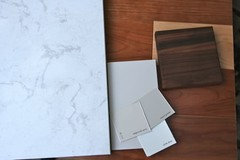
I tried to take a photo but it's coming out weird under my incandescent lights tonight. The background is the flooring and the dark wood is a sample of craft art walnut that I'm using in the butler's pantry area with the same color cabinets.

Comments (12)

  • 14 years ago

    Mine are SW Dover White-- they look creamy but not like a mistake. I don't know how dark the color you're planning is, but gray cabinets seem to be "coming into style."

  • 14 years ago

    I think that looks very nice together, cottonpenny. Many designers are showing non-white painted cabinets with contrasting ones either mixed in or as island tops. Your colors are warm, which tends to make people feel comfortable, content in a kitchen. I see too just a hint of the butler pantry's lighter wood cabinets in the walnut too. Your Torquey selection is beautifully matched with your other selections.

    White dove is white, but warmly so. It's not pink in hue. I have it as my trim and crown white throughout my house. You could always further warm it by mixing in some Edgecomb Gray. The Revere Pewter is a classy color.

    I think your selections are elegant. Well done.

  • 14 years ago

    Here's a better picture in the daylight.
    (I can't figure out if I'm not getting responses because it's all fine, or because it's ugly and no one wants to tell me)

  • 14 years ago

    No, it's not ugly. These are just hard colors to get to photograph well and the differences are subtle. Your first photo is more beige than real life and second too blue. The real question here is when you look at the these colors in your kitchen space with your lighting/natural light, do you like them? I'm assuming you meant that he Edgecomb Gray is lighter than the Revere Pewter. The Torquay is beautiful, the White Dove is a classic, and the Revere Pewter is a good choice for a wall. Even if you got tired of the Pewter, changing a wall color is easy. The big question is the cabinet color. It just has to be something you won't look at in 5 years and say, "What was I thinking?" We've just done a bunch of grays/blue-grays in our house, and gray is a lot trickier than you'd ever imagine. I think you might want to get a largish piece of scrap wood or plywood, paint it the Edgecomb Gray, park it in your kitchen and see what you think. I think I like it, but would I like it for all the cabinets? Not sure. Try it out.

    P.S. When we were choosing a trim color, we chose BM Bavarian Cream, which I've never seen on here as someone else's trim color. It was just right next to our Kashmir Gold counter, and the blues in the kitchen plus the blue-grays elsewhere. Despite the "cream" name, it has no yellow-y undertones and looks softly, but definitely white. Go figure.

  • 14 years ago

    It's a new build, so right now my kitchen is just studs and plywood floors with no lighting, etc. That's why I'm doing all these mental gymnastics ;-)

  • 14 years ago

    I like the colors too. I think I would do large sample pieces to see which colors I liked the best. I found when I did my kitchen that the light made a huge difference. I had to go a couple of shades darker (and it's not dark) to get the color saturation that I was looking for. We painted a couple of walls the first color and although I liked it, it wasn't dark enough. Once I went darker it was perfect. I found I couldn't really tell if I liked a color from the little paint samples, and a larger sample makes all the difference.

  • 14 years ago

    I like that combination. If you want to see a similar combo in person, go to Home Depot and check out Martha Stewart's Seal Harbor Vanity. The top is pure white, but it will give you a real life idea of how it looks. Her "Sharkey Gray" color is very similar to Revere Pewter.

    Here is a link that might be useful: Seal Harbor Vanity

  • 14 years ago

    I like these grays together. I feel like that that dingy "off" feel happens most often when the gray or cream is so light that it's almost-but-not-quite a match for other whites in the room. That's when it seems like a match attempt that failed. I think the edgecomb gray is different enough that it would read clearly as a gray.

    Of course, as others have pointed out, your lighting will be a key determinant of how it looks. I have a medium gray on my family room walls - BM's silver fox - and it looks dramatically different in sunlight vs. different types of artificial light.

  • 14 years ago

    I love the look of gray cabinets, we only did not do them b/c it would not fit in our circumstance. I think it is hard to see color that is photographed on a monitor but I am a fan of gray.

  • 14 years ago

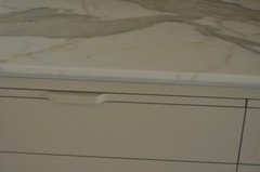
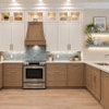
    My cabinets are BM Natural Cream, which is described as Edgecomb Gray without the purple undertones. I think my color looks exactly like unpainted drywall. My kitchen does not get a lot of natural light, and I wish I had gone a bit lighter. I am thinking of doing a white glaze on top, but haven't seen any samples of that. Good luck with your decision. I hate to admit, I spent a thousand times more time and effort choosing a white paint than I did choosing names for my children.


    Here is a closeup

  • 14 years ago

    I love the choices.. always keep in mind from what I am learning.. if you get tons of sun, light in that room streaming in you can do just about anything grey.. if its no light pick a more punch of grey.. LOL.. look at me talking like I know what I am talking about and I know nadah...

    Just want to say.. Love your color combinations, is the goal to do the walls the darker grey and the cabinets the lighter grey or was it vice a versa.. is their a design rule with that?
    I forgot someone please clarify for me so I dont end up doing a greyish green island with cream cabinets and have too light of a back wall or too dark???
    huggles