Software
Houzz Logo Print
kcremodeler_gw

Walnut countertops - back looking for BS help

14 years ago
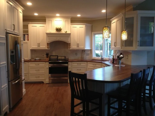
I posted a while back ago...and unfortunately I'm still paralyzed on which route to go with backsplash. Looking for some opinions!! Here's my modest-budget reno -

Cabinets are SW Dover white (a bit more yellow thanks to paint match at BM)

Countertops are craft art walnut

and wall color is BM bleeker beige

(and yes, the horrible corbels have yet to be painted...I'm not happy with these)

Right now I've been contemplating crema marfil toned subways but concerned its too bleh...thoughts? And if I do a more subdued marble subway, I want something for above the range but I haven't found anything for a focus piece! Emperador Dark is a bit too dark coffee colored compared to the lighter walnut with some honey tones.

Looking for some advice from my GW experts....help me get this project done!!! Thank you!!

Comments (19)

  • 14 years ago

    I found a gorgeous stacked mosaic in crema marfil that would look amazing in your kitchen. Wish I could remember the name since it would be a bit more lively yet still classic looking.

  • 14 years ago

    Thanks...I'll do a search for stacked mosaic crema marfil and see if I can find anything! Appreciate any more suggestions!

  • 14 years ago

    Can't help with BS but your kitchen is beautiful! I LOVE the counters.

  • 14 years ago

    Two words that I would not use for your kitchen are modest or budget. This kitchen looks top notch!
    With the walnut counter and the white cabinets, you can really go in any direction. But, I don't see crema marfil with your counter.
    You can certainly do a muticolored BS, a tile with color variation,or choose a color like an apple green.
    You first need to figure out what drection you want to go in, then we can help further.

  • 14 years ago

    Direction - classic contemporary? Most of what's been done in my area is tumbled travertine. More modern kitchens are doing glass mosaic. I see neither of these, as the tumbled travertine is a bit too "expected" and I think all glass is just too contemporary for the look.

    I'm starting to feel that given the linear wood grain, i need to opppose this and do either a vertical tile or on a diagonal. I want to introduce color or texture, but looking for opinions if a busy mosaic backsplash would would detract from the wood, or if the wood even needs to be the focal?

    Modest budget - a lot of DIY here. craft art DIY countertops, value sourcing from overstock and costco, and local built cabinets for $10k.

    Only three months in use, but the walnut and waterlox has been AMAZING. I will recommend these countertops all day.

  • 14 years ago

    I still love the idea of marble.

  • 14 years ago

    I also have no real design input (I tend to run in the clueless department) but YIKES if you call this modest or budget. Makes me feel like i live in a pit.
    I ADORE your counters...ADORE them. I would have sold my first born, if I had one, to get counters like that!!! OUT of our price range...modest budget?? me thinks not.
    I WANT YOUR KITCHEN!!

  • 14 years ago

    The countertops were like $35/sq ft. that's cheaper than granite. Granted it requires DIY install, but even if you hire a carpenter for that, still less than what they charge you at the design stores for wood tops! We were quoted $24k for same cabinets, no pulls or frills, through design store but all MDF lesser quality boxes. We pulled the whole thing in under $25k and although that's A LOT of money for us to invest in home reno, it was a fraction of what we were getting from general contractor quotes. Lots of savings thanks to the help of those on GW and some handy family members we didn't have to contract electrical, tear out, and we did final trim work (baseboards, crown, and shoe). Maybe I should restate, as my view of "modest budget" has been skewed by the fantastic kitchens I see posted here. :) It wasn't modest in our eyes, but it seemed modest compared to what I was being told to budget for all my "must haves".

  • 14 years ago

    Considering how stunning the counters are, I would use a sedate (if any) backsplash. Personally if it were my kitchen (in my dreams) I'd paint a very light tint of turquoise and no backsplash and let the cabinets and walnut be the co-stars.

  • 14 years ago

    Your kitchen is beautiful and I love your counters!! Was it Craft Art's Walnut or Rustic Walnut? Also, what do you have on them? Waterlox?

  • 14 years ago

    Love this kitchen! My pick would be hammered copper.

  • 14 years ago

    I think something like this one would be amazing. Here is the description for it:

    Mixed Media- Copper, Stone, and Hand Molded Ceramic Backsplash Tile
    This beautiful kitchen mixes the beauty of several styles and products. Shown below is a kitchen featuring Fleece Crackle Subway Tile on the field. It is accented with a Copper Rail Liner, and features a mosaic of Calacatta Mini Mesh mosaic. I love the mini mesh mosaic because it captures and reflects light, giving it the right amount of sparkle�without overdoing it.

    Here is a link that might be useful:

  • 14 years ago

    Oooh that mini mesh is pretty. Calacatta is too white and grey for the creme and warm tones in my kitchen, but I've found a similar marble blend mini mesh that I think I'll check out. Thanks!

    The countertops are walnut, not rustic. They have about 4 coats of Waterlox and a waterlox orig/satin mix, and so far are completely impervious to stain (I'm not exactly clean). My husband dropped a screwdriver while hanging the pendants and nicked the counter, and I was able to rub a bit with sand paper and touch up waterlox...you can't tell a difference in any light. I think the key will probably be keeping up with the reapplication of waterlox BEFORE the original coat wears and damage starts to occur. As easy as applying the first coats were, this doesn't scare me. I'm sold on the stuff...wish I had it on my floors as the waterborne Minwax we used was a poor choice with a dog and a toddler.

  • 14 years ago

    I have really similar colors! My cabinets are Manchester Tan and the walls are Greenbrier Beige --- these are the colors one up and one down on the color chart next to Bleeker Beige! I also have a walnut island! Anyway, I did a subway of Crema Marfil. I love it --- but I wanted a backsplash to recede and not compete with other elements in the room. It is not the focal point, so it is not for everyone, but I am so happy with it! Here is a pic....

    I love your kitchen, can't wait to see what you choose!

  • 14 years ago

    Check out the HGTV 2012 Green Home kitchen. It has an interesting BS that might look great in your kitchen.
    Can I ask what you used to apply the Waterlox. We have a DIY walnut counter top for our island and I had trouble with the final application of the satin/original mix (lots of bubbles and streaks), so I gave up and put on the original as the final coat. It's a bit too shiney for me and I want to try again but am not sure whether it's best to use a paint brush or pad or rag...
    Thanks for any advice.

  • 14 years ago

    JMHO:I don't see marfil as your answer.
    Are those samples you have leaning on your stove? What are they? I like the idea of the brown color that would pick up your wood tone counter.
    Have you looked at the Backsplash Slide Show? Also,do you see shine in the backsplash? Pipdog has an amazing backsplash. If you want color Sas has one with green, but of course you can do any color.
    To move forward, you think to decide on if you want monochromatic or a lively backsplash.
    When you looked at inspiration pictures, what were those backsplashes like?

  • 14 years ago

    Because the unpainted wallboard (?) that is there now highlights the beauty of the counters and the cabinets, I think you should go for something that is handsome in a self-effacing way.

    This Calacatta marble mini mosaic adds interesting texture with out dominating. Marthavila's counters are soapstone, but I think the effect would be much the same with walnut.

    Anyway, best of luck. Don't feel pressured to make a quick decision. Your kitchen looks great as is.

    Cheers. hbk

  • 14 years ago

    I like your pendant lights alot and think you should find a tile that subtley plays off the pattern of interlockong circles. Maybe not this, exactly, but just to give you the jist... click on concepts for better views.

    Here is a link that might be useful: The interlace circle 6x6 in hint or ming crackle, etc.

  • 14 years ago

    KC-
    Can I ask what kind of cabinets they are?
    They are beautiful!!
    Thanks!!

Sponsored
High Point Cabinets
Average rating: 5 out of 5 stars21 Reviews
Columbus' Experienced Custom Cabinet Builder | 4x Best of Houzz Winner