Software
Houzz Logo Print
laurience

What does this kitchen need cont... more pics

18 years ago

Hello ladies,

First of all, I want to sincerely thank you for all your advice. I feel really inspired.

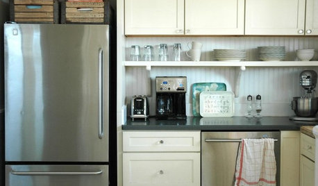
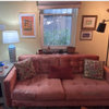
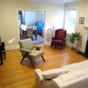
I will show you 2 pics. One of the kitchen again and the adjoining living room. The dining room is beside the living room.

Here are the two pics

{{!gwi}}

{{!gwi}}

Now, I decided to paint both rooms, dining room and entrance BM Spanish olive. I want to paint the fireplace wall a different color to add some ooumff. I am thinking maybe SW Dutch Cocoa. I could add some purples to both rooms.

Actually, my first thought was to accent kitchen red and living room purple but then I thought maybe it would be better to do both the same. Oh!! Lots of greens too.

My husband is from France and we visited last June. I took some pics of a little village. Do you think some of these pics might work for over the desk in the kitchen? If so, what color of frame. Thanks again

{{!gwi}}

{{!gwi}}

{{!gwi}}

I could either pick one pic above and enlarge it or do a 4 smaller ones. Thanks again.. this group is really a decorating disaster saver.

Comments (29)

  • 18 years ago

    Your photos are tres jolies!

    I am a sucker for purple accents -- I think many rooms benefit from a jolt or purple / fuschia. An orchid, a woven throw, purple matting in a frame ....

    And so speaking of matts, looking at your charming photos my initial thought was (is) a simple dark wood frame, pulling a color out of the individual photos which calls to you for the matt board. Certain colors are calling to me from your photos, but that's because my eye is already attracted to them.

    Because I think you are planning on having other things hang in your desk area as well (like a clock and shelf and maybe a mirror?) I'm concerned it could just get too busy if you hung all the photos. Luckily that's the kind of thing which can wait until you've painted and decided on what else you want to hang there.

    I'm not trying to be noncommittal, only there are a few variables of which I'm unsure which would influence my decision.

    That caveat out of the way, I am drawn to the first photo you shared -- I think the composition is lovely and could benefit from being 5" x 7" or 8" x 10". (although since pink is my favorite color I also love the second photo and the walking woman's pink jacket!)

  • 18 years ago

    The second photo has more of a focal point. The eye is drawn to the pink jacket and then the eye moves along the orange awning. There is also activity shown (walking) in the photo. You can even catch the whimsical look on the guy sitting in the chair with the white sweater. It has a real *French* feel to it. The others look sort of generic. The architecture of the buildings in the second one looks quaint. In the other two the buildings seem depressing. I am more drawn to photos with people in them, but that is just me. I would do one large photo. Could this photo be your inspiration for you kitchen colors?

  • 18 years ago

    Rm, thanks for your response. My thoughts were to eliminate the clock idea and put a larger photos of the above over the desk. Just that photo.. or a series of these photos. I cannot put shelves in at this time because there is so much else that needs to be done at this time in the house.

    Joanne

  • 18 years ago

    Dilly Dally,

    I would like to use the photo as a main focal point however my tinges of purple would be out the door??

    Joanne

  • 18 years ago

    I think the pictures are all wonderful, but if your going to paint your kitchen, you may want to consider having the photo printed in black and white, framed in a black or silver frame. The first photo would be my first pick.

  • 18 years ago

    I know there are a lot of colors to draw from with the lady in the pink jacket pick. Why couldn't she be wearing a purply jacket. lol..

    I still would like to paint the fireplace wall SW Dutch cocoa with the BM spanish olive for the rest of the rooms on the first floor. Would this combo look nice together? Would it look nice with that picture?

    I also love black and white but I am really trying to step out of my comfort zone and add color.

  • 18 years ago

    I don't want to sound critial because choosing paint colors is hard especially if your trying to get out of your comfort zone. But I found the Spanish Olive on the computer and pulled out the Dutch Cocoa in my SW fan deck, both those colors are very dark and won't provide any contrast to your cabinets. Maybe just lighten them up a few shades if you want to stay in the same color families. I actually expected the Spanish Olive to have more green in it. If you did something with more of a green base, it could look really nice with the dutch cocoa, but you may want to ask the consultant at BM to help you to get the look you want so you can get the most out of the colors you choose.

  • 18 years ago

    You know, I'm glad the lady in the photo isn't wearing purple because if she were and if you used that photo it would appear a bit twee, too precious, too matchy-matchy.

    Unfortunately, I'm only able to see SW colors on line (don't have one of their fan decks), so based on what I can see of Dutch Cocoa and also based on your space (which appears to receive good natural light?) I'm concerned Spanish Olive will be one shade too light and appeared washed-out. I might bump it up to Dried Basil 1510 -- remember, paint in a room is twice as light and twice as bright as it appears on a little chip. Online, Dutch Cocoa appears to have a mauve undertone -- does it?

    However, rereading your last post about stepping out of your comfort zone and adding color, maybe Spanish Olive is a better fit for you; maybe just a subtle wash of color is a good way for you to get your feet colorfully wet. It would be horrible to be overwhelmed (or under-)!

    Hmm indeed!

    Wish I could be more help ....

  • 18 years ago

    lukiirish,

    Actually, my friend has this color on her walls and there is a lot of green in the color. It is hard to tell on line eh!!

    rmKitchen,

    Yeah! Maybe I shouldn't do an accent wall and just add decoration. With all this color, I might go into a cardiac arrest mode. It is funny actually, if you look at both rooms, all you see is brown, beige and black. I have another big room with high ceilings on my second floor and again there are a lot of browns and beige. I did manage to squeeze some other colors lol.. Enough with the browns and beiges. At least I added some reds to my entrance. inch by inch..

    Thanks again..

  • 18 years ago

    Must be hard to see, I couldn't see any of it. How nice that you have a sample to see before spending a lot of time and effort.

  • 18 years ago

    Laurience - Were those pics taken in Honfleur?

  • 18 years ago

    What I have seen of your home in these pictures is v. serene, elegant and tasteful. I'd imagine with two little boys you have a lot of color in your home! (I have two sons as well, four and two years-old.)

    How does the red make you feel? You know, there is no rule that you have to have b-i-g color. There's an interior designer whose personality I find odious but whose interiors are so restful and lovely, and the palette he uses is similar to yours -- restrained. Beautiful!

    Is red or purple your favorite color(s)? Pink, almost every shade of pink, is my favorite, so I try and have some in every room (save the boys' beds and baths, of course!). I just want to make sure that if you're going to use one of those colors (as you've already used the red) that it makes you smile.

    So I know I am Ms. Presumptuous in this note, but while I love the idea of a Dutch Brown accent wall, I do wonder if it mightn't be better to ease into it. Like, painting that whole space your Spanish Olive and living with it awhile. Then you might think "you know, I could really use a pop of color over on that fireplace" and paint it the Dutch Cocoa, or you might think "phew! I just love having the whole space unified in this beautiful subtle green." But it will certainly be much easier to paint the Dutch Cocoa over the Spanish Olive than it will be to paint the Spanish Olive over the Dutch Cocoa.

    I have to say that in theory I really do like the idea of the Dutch Cocoa on the fireplace wall because it mirrors the kitchen's pretty brown cabinetry. But it's not my house .... And I also want to tell you you could've been writing for me when you wrote about the shelves in the kitchen having to wait because of other house projects -- ditto! Someday we'll get to our laundry list of projects!

  • 18 years ago

    Yes, I was very happy to find a color that I liked already painted on walls. At least I know what to expect.

    Homersmom

    yes they were taken in Honfleur, small world.. Have you been?

  • 18 years ago

    rm kitchen, what are your boys names? How many months are they apart? I saw your homepage with your BEAUTIFUL REDONE KITCHEN.. WOW!! When was it redone?

    Re: the dutch cocoa, yes it does have a purple undertone. I love red and right now I am really liking purple and lilac colors. I will look at the designer's website. Thank you

    Well I am excited that I have picked a picture. I will try and find a matching frame to my cabinets and voila!!

    I will also get some brighter carpets for kitchen. Not under the table though because hubby has this crumb fetish so I rather save myself the headache.

    I am starting to have fun again thanks to all the ladies helpful advice. This really is a forum that gets you inspired.

  • 18 years ago

    Posted by laurience; "Dilly Dally, I would like to use the photo as a main focal point however my tinges of purple would be out the door?"

    I don't want to ignore your question, but I know nothing about color. In the 'color threads' here, I sit back and read what the talented have to say.

    Since I gather that you would really like purple color in the space, I am wondering if when you have that photo enlarged if they could do like a Photoshop with the pink jacket to make it Violette? A purple jacket on the woman would still stand out as the first thing the eye is drawn too and would look better with the predominate orange awning in the photo.

    I am in awe as to how beautiful that living room is. I can see that room with some royal purple accents. Maybe a clear art glass, purple vase in the window by the FP, a tiny satin purple pillow on the seating, ect.

    Now me, I would do the walls in an historic purple. :) Not deep and bright like 'Barney purple' but not pale pastel either. I once did my LR and DR in a purple because it had w2w gold carpeting that I could not replace. It balanced it. No one would believe it was really purple until I held the paint chip next to a piece of white paper. Going purple is not for the timid.

    I wouldn't do purple for anything permanent, like a purple backsplash. Just paint and accessories.

    I'm so happy to see someone inspired by what they read here and having fun. Do please keep us posted on the results of the rooms. You have a gorgeous space.

  • 18 years ago

    Laurience- Yes, we were there in July. We took a river cruise from Normandy to Paris and boarded ship in Honfleur. What a lovely town!

  • 18 years ago

    I think matching the frame to the cabs would be a big mistake. You have a huge stretch of those lovely cabs and what you need is to break it up a bit. Stick with a black simple frame (and this will also allow you to move the picture to another spot if you ever choose to).

    I haven't been following this thread so whip me if I'm mis-stepping here, but the two things I see that would improve your kitchen are 1) a backsplash with some contrast and 2)painting the table and chairs black.

    For the backsplash there are plenty of examples in the FKB backsplash slideshow of kitchens very similar to yours. Spend an hour or two perusing and bookmarking.

    For the table and chairs, I'd paint the base of the table and chairs black and leave the top of the table as is. Right now, the table is so light on a light floor, it just fades away. Black would anchor everything and give the whole kitchen a bit of ooomph.

  • 18 years ago

    Here is the link to the finished kitchens blog (FKB)

    Here is a link that might be useful: fkb

  • 18 years ago

    You have a gorgeous home and I really like the idea of using one of your own photos as an accent piece over the desk. I did a 20 X 30 collage of pictures that I had taken in my kitchen and I love the way it turned out. I agree with the previous poster not to match the cabinets since there is so much of that wood. I would go metal for the frame. Your paint colors sound nice and I would use the same accent color in both rooms. Adding some color to your backsplash is another suggestion that I agree with.

  • 18 years ago

    Dilly Dally, Thank you for the nice compliment. I like the brightness of my new home because it as a nice bow window in the living room and the kitchen has an eight feet wide patio door. My older house was sooo dark that I am loving the light and feel that much happier.

    Your so helpful with your advice, thank you and I look forward to sharing some pics when I start decorating.

    There is actually a little window on both sides of the fireplace. I have a pillow covering the one because the sun was glaring that day. lol.. Yes, I could put a nice vase in both those windows. Maybe clear purples so it can ketch the light.

    Joanne

  • 18 years ago

    Homersmom,

    How did you like Paris? wow.. That must of been a beautiful cruise.

    Joanne

  • 18 years ago

    Budge,

    Your right the table needs to change and it will be going to the garbage bin in the New Year. First I have to focus on getting a dining room table and such.

    Thank you for the link, I will look at it and get some back splash ideas.

    Also, I think your right about the frame. I need to break it up and not add more brown.

    Joanne

  • 18 years ago

    yes, I will use the same accent colors of purple/turquoise in both rooms. Thanks for your advice. Your collage will be a beautiful souvenir. It must be really cool looking.

    Joanne

  • 18 years ago

    First impression; Love your cabinets! Love your island sink! Love your dark wood floors! Love your Chaise and livingroom furniture set, I've never seen a sofa/table to match the chaise, and now I want one too, lol! Fabulous! Love the defining posts and ceiling detail, they are great fun to paint/play with color too. Maybe some of our photoshop artists would enjoy showing your favorite color options. I hope so, I'd love to see them too.
    Your photographs are PERFECT for your space and a way to play with the colors. Is there any chance you have more shots? I see the boats over the desk, another one cropped tall and narrow on the kitchen post, all three are excellent and I can't see your other wall options. I would not frame but border the prints in reverse or solid dark to print on canvas and wrap around the frame. Often I print/resize or have paper prints, 3m photo stick to the wall, and play with ribbon of wonderful rich colors to see what moves me the most. Also, cheap remnants of silk, velvet, damask, satin, etc. tossed like pillows help refine likes and dislikes. Rejects make nice dust/polish, protective cloths. Do you sew? Nothing need go to waste after trying. Are there more photo's of your home already posted? Love your regal, elegant, serene & peaceful style.

  • 18 years ago

    I would first get rid of that odd round column by the kitchen(and the one across the room), and replace them with a square post so that it matches the one by the island and on the other side. It looks odd, like the builder couldn't get the square one and so just stuck it there.

    I like the Spanish Olive, tho it reads very grey on my monitor. But I don't see the Dutch Cocoa as the oomph. A very pink brown, and I think it will just fight with the dark floors and all the dark cabinets in the kitchen. If you love purple, consider doing a very rich purple, perhaps SW Soulmate. Then do a greener olive tone for the kitchen, to offset the wood cabinetry.

    I would love to see the second pix cropped so that everything to the left of the person in the ski jacket disappears. Then hang that vertical photo above the desk. Bring in some orange accents to the kitchen, which also work well with purple and olive tones. The cropped pix will bring focus to the brasserie and the buildings, and the orange accents will make the art pop from the wall.

    The area with the chaise, couch and coffeetable seems very crowded together. You ideally should have 14-18 inches between the seating and the table, and you don't appear to have that, at least not between the chaise and the table.

    I wonder if you would consider trying a rearrangement? I would like to see the couch placed where the chaise is now, with the sofa table behind it. Run the coffeetable parallel to the couch.

    Then place the chaise at a right angle to that, facing the fireplace and tv, with it's 'back' to the kitchen. Because you are using the chaise there, it shouldn't feel like you are isolating the LR from the kitchen, because the chaise has the low back.

    Move the low console at the left of the fireplace to the right side, so it doesn't feel crowded in with the couch there. I would love to see the first pix you posted hung where the mirror is now, on the left wall by the fireplace. The mirror doesn't really seem to fit there - it doesn't reflect anything but the opposite corner, and I don't think I see a table or anything below to anchor it. Could it find a new home in your entry or in the DR?

  • 18 years ago

    Bodica,

    I love the idea of a long picture on the post. You sound very crafty. I do not have that crafty or a sewing bone in my body. I will post some more photos in the following days. This forum makes you feel so good about your home. You really are a wonderful bunch of ladies.
    Joanne

  • 18 years ago

    Les,
    Thanks for the advice. Can you believe I went and moved furniture on my own tonight. See, I have no patience and when I want to try something new it cannot wait.

    I wanted some changes in that room so I moved the couch and chaise like you suggested. I put the sofa table on the right side of the fireplace because it seemed too squished behind the sofa. I have to leave the little cabinet table where it is because it is a temporary solution for hiding the wiring.

    I eventually want to get some sort of shelf assembly on both sides of the fireplace. I will try and post a pic tomorrow of the great room. It does seem to open up the living room. I also like the idea of moving things around so my hardwood doesn't fade in the same spaces.

    My only dilemma is I am getting tired of the victorian look and want to jazz things up without changing furniture. I am thinking new pillows, a carpet underneath my coffee table. I don't know what to do about my sofa table. It is beautiful, very victorian and matches that mirror that you were talking about. I don't like the mirror in that spot either.

    I took a long nap today and now I am not tired. It is 1a.m. yikess.

    Thank you

    Joanne

  • 18 years ago

    I found this beautiful carpet for living room and kitchen. It has purple and red in it and looks beautiful with the rest. Also, the red and black vase that I bought last week matches perfectly. Bye bye browns... yippee..

  • 18 years ago

    Joanne -

    Paris was nice, but I really loved all the little towns along the Seine. Each one was more charming than the last.