Software
Houzz Logo Print
ceezeecz

Front door color advice needed

15 years ago
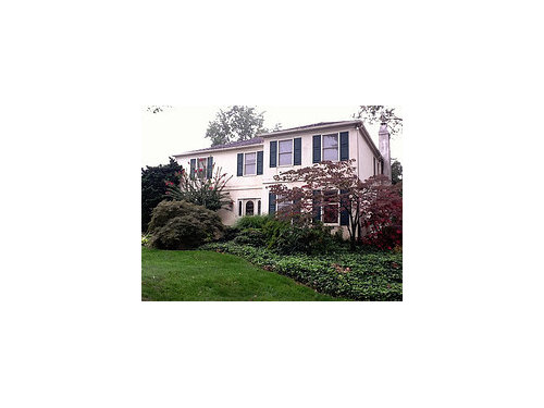
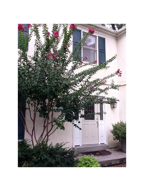
Trying to figure out what color to paint my front door. New white windows and trim are going in and the door trim plus side lights will be painted white to match. The shutters are a dark green so I was thinking of maybe a soft plum or the BM Townsend Harbor Brown HC-64.The door faces south but there are many tall tres so it doesn't get tons of direct light. I'm afraid the brownish rust color will just be too dark. I'd like something that sets off the brass and is welcoming. The crape Myrtle has been trimmed back so it isn't so overwhelming by the door. And in late winter I'm going to thin out the red Japanese maple that is right in front of the door.

Comments (33)

  • 15 years ago

    Would you be willing to paint your shutters??? What color is the roof??? In the stained glass???

    Beautiful landscaping.

    ~Jeana

  • 15 years ago

    I think you should use the color of the flower on the crepe myrtle. It will give the front door that "pop" and work well with the japanese maple.

  • 15 years ago

    Pretty house!!

    Let's see:

    a)white house, green shutters, bright lipstick red door

    b)white house, green shutters, bright yellow door (BM Morning Sunshine 2018-50)

    c)white house, green shutters, plum (BM Plum Raisin 2082-20) door

    d)white hourse green shutters, cranberry (BM Cranberry Cocktail 2083-20) door

    e)white house, green shutters, high gloss black door

    f)white house, green shutters, dark orange (BM Pumpkin Spice #126)

  • 15 years ago

    I thought the same thing as lionors. The crape myrtle flower is stunning against the mostly white backdrop.

    I too vote for a different color on the shutters if possible.

  • 15 years ago

    Thanks for the help! And thanks for the liking the landscaping (did it all myself - sore back and all).

    The roof is not coming out very well in these photos. It is a multi-color one that changes to look 3 dimensional. It has flecks of the green of the shutters in it plus flecks of the cream stucco, some teal as well as the Benjamin Moore red/brown I was considering. And the house itself is a pale cream stucco. The green shutters are pretty close to BM Tarrytown Green HC-134 and I'm stuck with them. But they look great with the roof, cream house, and all my green vegetation.

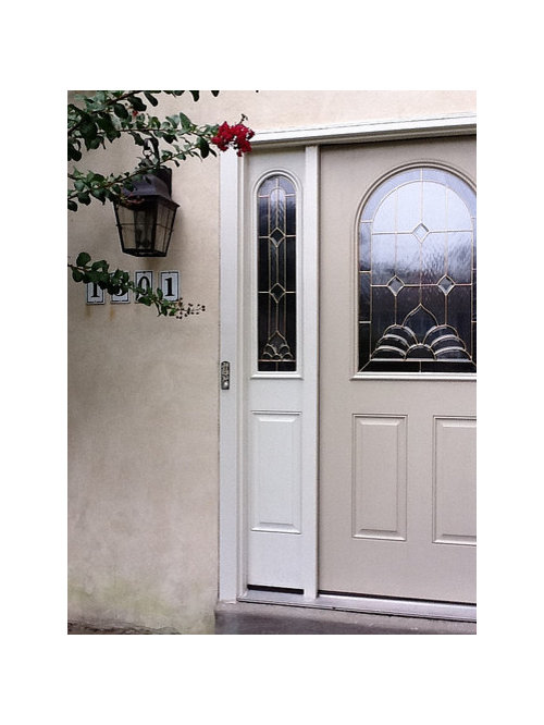
    The stained glass and door hardware are brass.

    I like the idea of using the crape myrtle color. Also on the far right is an Oak Leaf Hydrangea that turns this screaming red and is beautiful. Just matched the crape myrtle exactly to BM Royal Flush 2076-20. That's very pinky. What do you think? The darkest color on the strip is BM Crushed Velvet 2076-40. I'm afraid it is actually too cool a color and won't look good with the roof. But the roof color really does just read as a brown so maybe the cooler red on the would work??

    Years ago I had a terra cotta orangish color on the door and got tired of it. But some variation of red would read totally different.

  • 15 years ago

    Your crepe myrtle is in fashion! See link below.

    I dont like Sherwin Williams Paint, but they have a good tool to look at shades a little lighter or darker then a given color. I think they are the ones that also allow you to download a photo of your house and paint it with their colors ... i did that with my old house.

    see this:
    http://www.sherwin-williams.com/do_it_yourself/paint_colors/ideas/color/SW6841_dynamo/

    Here is a link that might be useful: Royal Flush is a 2011 color

  • 15 years ago

    Yes- you can upload a pic of your house on their Color Visualizer. I was kinda hoping you could have charcoal gray shutters (Sealskin), but still think that SW Borscht (7578)would look nice.

    ~Jeana

  • 15 years ago

    Shutters and door BOTH in Charleston Green --- a color made of six parts black and one part green. I love the house, it's beautiful! If you were going tp paint it I would do it in a lightish taupe.

  • 15 years ago

    Great house! I say make it pop and go bold (not red, more orangy...) I like teacats suggestion of pumpkin spice.

    This pic reminded me of your place - so you can see how it would look.
    https://www.houzz.com/photos/my-houzz-updated-federal-style-in-massachusetts-traditional-exterior-boston-phvw-vp~101173-front-entry-traditional-exterior-other-metros

    Definitely try the BM color visualizer - so helpful!I just played with it for my house :)

  • 15 years ago

    The color of the crepe myrtle is possible, but I also like the idea of a plum if you want a color.

  • 15 years ago

    i think a deepish plum would look nice!!

  • 15 years ago

    I wanted to give an update of how it all turned out.

    Well, new windows are in and I've painted the front door. Ended up staying pretty conservative. Went with BM Copley Gray HC-104 for the door and Decorator's White (which matches the windows and trim) for the sidelights. These photos were taken at dusk which makes the door look a little darker than it reads at day.

    Basically, I'm pleased. But I'm wondering if I should paint the sidelights the same color as the door. What do you think? I do like the way the door stands out now and that might not happen with it all being the Copley Gray.

    As you can see, my Crape Myrtle has already quit blooming! Fall is definitely here.

  • 15 years ago

    I think a burgundy door would look gorgeous, and I would paint the side panels also as your home commands a large entrance.

    Here is the burgundy door with the trim between door and panels left white:

    Here is the burgundy door with the trim between door and panels a dark grey (I like this one best):

  • 15 years ago

    Whatever your final door color, I would paint the sidelights the same. Currently your door looks kind of lost and/or smaller than the weight of the windows w/shutter on the sides, if that makes sense! I think your entrance will look larger and more inviting.

  • 15 years ago

    I would definitely paint the sidelights. The door looks nice and you can always bring in your bright pink/red via a wreath or other other front door decor!

  • 15 years ago

    Thanks everyone for your thoughts!

    I'm going to stick with the Copley Gray for now and definitely paint the sidelights the same color.

    Next time maybe I'll actually make it to choosing a red/burgundy :) But for now I'll start looking for a pretty wreath in red! Still looking for the "perfect" red. Reds are tough for me to pick, don't want it to look too Christmas.

  • 15 years ago

    i love the copley gray...looks elegant! i would definitely paint the sidelights gray too---and i personally like to paint the strips of molding the same color as the door and sidelights so there aren't white stripes between the door and the sidelights-for some reason, those stripes really bother me--i think it looks much better with that particular molding painted too, but i do sometimes see people who leave them white, so i guess it doesn't bug everyone!!!

  • 15 years ago

    I am usually against painting the sidelights the color of the door but I think it might be OK on your house. I like Copley Grey! My exterior is painted that color.

  • 15 years ago

    First coat on. Looking better, for sure. Undecided now about the trim color but want to give the white a chance. Hoping it will tie the door and windows together somehow. Maybe some accents around it that have some white in them would help.

    I do love the Copley Gray!

    You can see from this photo (just taken at 10 a.m.) how much lighter the color looks during daylight. Couldn't get a good shot from a distance - too much glare right now. Have to wait until later in the day and it's shadier. Need to use a better camera, and not an iPhone!

  • 15 years ago

    Have you considered adding an arch or fan type decorative panel over the entire door section? It looks a little "boxy" or flat to me. I'd try one in white, which can be painted if you decide to make it gray.

  • 15 years ago

    The door area used to consist of a flat double-door, both opening from the middle with no windows. Very boring and flat. So when we replaced it with this one it was a huge improvement. But, you're right, it still looks boxy. The trim above is very plain. But there probably isn't enough room to put a decorative panel over it. The distance between the top of the door and the bottom of that raised section that goes across the whole from of the house is pretty small. I'm afraid it would just looked cramped. Even so, I'm going to do some research on a decorative panel though - never thought of that.

    I kept thinking that if it was a window inside, I'd love to see a valance over it but couldn't figure out how to translate that to the door. That's the effect that a decorative panel would give.

  • 15 years ago

    Just my opinion, but I'm with busybee. I've never liked the vertical peices b/t the door and the sidelights to be white when both the door and sidelights are the same color. To me it sort of defeats the purpose of having it all look like one impressive unit...chops it up. AGain, just my opinion but I like either EVERYTHING all the door color for one impressive unit, or, the door the "pop" color and then the trim b/t the sidelights to be the color of the sidelights so the sidelights ARE the trim to the door. Hope that makes sense!
    But I do like what you've done so far, just doing the sidelights as given the front entrance more weight.

  • 15 years ago

    dtchgrl, that's exactly what I was hoping would work in my first attempt - that the sidelights would become part of the trim and make the door "pop". But it looked so flimsy. My trim is just too plain and thin to make that happen.

    So a few more choices: paint out the trim with the door color or paint the trim a darker color (oil-bronze to match the exterior lights??) or maybe another color altogether???? One reason I hate to do either is that I just last week had the trim re-clad to match the new window cladding. But if it could be better by being painted then I'll do it.

    And mainly, I still want it to look not too dark. Really, just welcoming, interesting and with the door looking "grounded". Hard to explain.

    Don't know if it helps but here's a photo of the room the door opens into on the right - my living room. It's fairly light with medium tone wood furniture.

  • 15 years ago

    After seeing your very pretty living room, I understand your hesitance to go red on the front door. If the room is an example of your taste, you go for more muted tones. Don't think I'm crazy for suggesting a "purple", but there are two really lovely Sherwin Williams muted plum colors that might give the feeling of your gray but be a bit more interesting.
    My friends has the same color shutters that you do with SW Expressive Plum on her front door and its soft and lovely. I also really, really like the one shade darker on the color card but I can't find my card or remember the name. But this is just a suggestion, you may hate plum!
    I have door that is one color (in my case wood) but sidelights and transom are white like the trim around my windows, etc. However I think it works on my house b/c I have the transom, flagstone steps leading up to a portico with a copper roof. All of those things give the entrance more weight/importance. Since your entrance is more flat, I think your next best bet (and cheapest!) is to give the entrance more weight by making it look bigger/more important...ie, painting it as though it is all one unit. And maybe going with a slightly more interesting color (but still muted they way you like.) But I do think you went a step in the right direction painting the sidelights like the door! I don't know that painting those vertical trim pieces a third color would help...that would still break up the "unit". (And just to clarify, just the vertical white trim b/t the door and sidelights. The trim around the entire thing is good the way it is.) Its a pretty nice color but have you thought about going a shade or so darker? As you mentioned, outside in the sun things can look very light.

  • 15 years ago

    Thanks, dtchgrl. What I really like in a room is texture. For example, my kitchen has cork floors and butcher block countertops.The walls in the LR are a tone-on-tone moire wallpaper. I like a mix of metal surfaces and fabric textures. I guess it is a little muted but the oriental rug is large and a busy red pattern (which I love) so I kept the rest of the room not so busy. But I did add a red chair!

    That's what irritates me with the front door. It has no texture. We're on the south side with no overhang so a wood door is out but an old wood door would've been my ideal. That's why I like the stucco I think. If there was some way I could introduce texture in the front door I wish I could think of it. I'm fairly "crafty", maybe there is some kind of wash in a darker stain like I've seen done on kitchen cabinets that I could try to make it more dimensional?? I don't want it to look too "I guess she made a project out of this" though:)

    I'm going to live with this for a bit at least and then maybe painting the trim in between the sidelights and door in the door color :)

  • 15 years ago

    Yes, def live with it for awhile (except I'm still pulling for painting the trim b/t the door and sidelight!)
    In the meantime do some investigating on the decorative panel...probably some options out there other than the "fan" shape which might not fit. I know with synthetic stucco they can literally make any thing, any shape.
    I would not recommend wood in your situation. We are getting a new fiberglass door and the better quality ones look amazingly like real wood. Who would ever guess the below is no real wood?!

  • 15 years ago

    That's a beautiful door! Ours is also fiberglass but over 10 years old and the wood-look ones were not so well done then so I just went with paintable.

    Working all day today so tomorrow I'll paint out the trim between the sidelights and the door. Then I'll hit Home Goods for an accent of some sort.

  • 15 years ago

    Final paint job. I now love it. Going to look for accents. Needs some color for sure . But hopefully all painting is done for now. Huge improvement with painting out the trim between the sidelights and the door. Just looks right and like it belongs there.
    Thanks for all the help, could not have done it alone!

  • 15 years ago

    Yay! When you get a chance, post a pic from further away, along with the one when you only had the door painted gray. I bet the entry looks a lot more welcoming now.

  • 15 years ago

    Wow, what a difference. Looks perfect. Just think how pretty red or green or yellow will be on that door, whatever you choose for accessories - wreaths, etc.

  • 15 years ago

    very, very nice!!

  • 15 years ago

    Tada!

    First:

    Now:

  • 15 years ago

    Painting the whole thing was def the way to go in this case. I don't think the sideligts always have to be the same, for example when the door is solid (no glass). But in your case the sidelights and door have matching glass so it looks much better treated as one unit. Also gives more impact to your entrance. Bet you are sick of painting for awhile!