Software
Houzz Logo Print
jaschu_gw

Need color advice

13 years ago
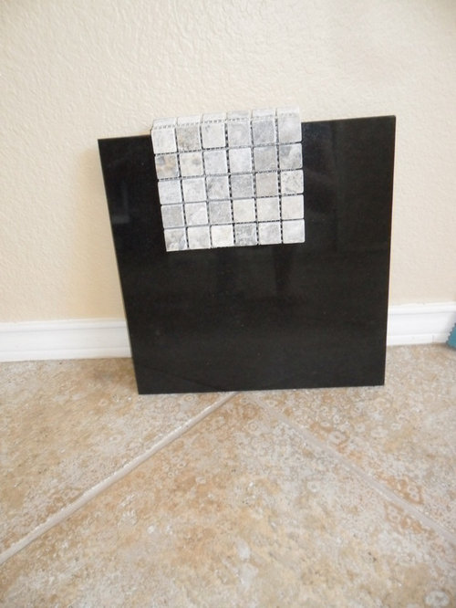
I'm in need of some wall color advice after several failed color samples. We are in the middle of renovating our mid nineties kitchen to: white shaker style cabinets, black countertops and silver honed travertine for the backsplash. We're not changing the floors at this time only because they are throughout the house. The floors are proving to be difficult to work with our cooler color scheme.
We were set on gray or "greige" and tried the following colors but they haven't really spoken to us yet:

BM Revere Pewter
Edgecomb Gray
Nimbus Gray
Stonington Gray
Smoke Embers but not at full strength.

We have an open plan kitchen, living and dining so the wall color has to work throughout the house. We just recently purchased a charcoal couch with teal pillows. How do I tie in a warm floor with cool furnishings in rooms that have little natural light? Do I go with a light but warm beige even though I'm trying to get away from beige or do I choose a cool color based on my furnishings?

Comments (17)

  • 13 years ago

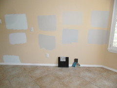
    Color swatches with a better view of the floor.

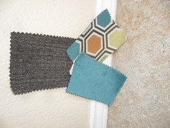
  • 13 years ago

    Couch color with pillow samples. The couch color is charcoal. Looking at the picture it seems the couch sample has lighter flecks in it, but it doesn't. It's the same color but just a different material.

  • 13 years ago

    Of the samples you have on the wall I like the second row from the left, the second one down above the outlet. It looks like a warmer gray in the picture compared to the others.

  • 13 years ago

    Thank you, MarinaGal and Joanie. Joanie, your choice was Revere Pewter as well.

    I think my main concern with the RP was that it looked so dark in my living room. I have one small window in the living room so I don't get a lot of natural light and the lighting in the house is pretty poor to begin with. I was also afraid it wasn't pulling enough of the gray and off white that are in the floor tiles to make everything "go". I tried Edgecomb Gray (third from left, top row in prev pic) but when I painted a large swatch in the living room it just looked so dull. I don't doubt that the orange walls are hindering my decision and, at the rate I'm going, it won't be long before it's covered with paint samples!
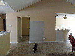
    Is it possible the orange on the walls are causing the floor to look more orange than it really is? I'll attach a couple more pics for reference. This one is Revere Pewter in the living room. Taken with no flash and the one small living room window closed but large dining room window is open. This picture was taken while sunny outside, midday so it won't get any brighter than this picture. And yes, that is lawn furniture in our living room. :)

    This post was edited by jaschu on Mon, Sep 2, 13 at 17:43

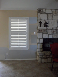
  • 13 years ago

    Here's another pic. From top:

    random BM blue. I can't remember the name but it was a no go for us.
    Edgecomb Gray
    Revere Pewter
    Nimbus Gray

  • 13 years ago

    I have gone through almost your exact same experience. We moved into a house with very, very little natural light. The whole house was painted a dark brown and I definitely wanted to lighten it up. I also wanted to end up in the gray or greige family. I tried Revere Pewter (as well as every other color you mentioned) and I also thought it would be too dark so I decided to go with edge comb gray. Once it was on the wall it was just too light and didn't feel warm and inviting to me. I ended up painting the whole house BM Shale. Our floor plan is very open. I love it! I will admit that at times I wish it was just a shade lighter, but 99% of the time, it's perfect. It's definitely in the greige family, it's still a pretty light color, and it is very warm and welcoming. We also just installed solid wood floors and stained them very dark. It looks great together. Our next step is the kitchen cabinets, which we want to do white shaker style cabinets, just as you described. Good luck. Grays are so hard.

  • 13 years ago

    I think that Edgecomb Gray works best in a room with natural light and lots of white moulding, so I can understand why it would be sort of lifeless in a darker room. I think the Revere Pewter neutralizes the orange in your floor somewhat (whereas a blue gray is going to make the floor look more orange). I like the Revere Pewter in the photo you just posted, and when I isolate it + the floor in my field of vision I think it goes in the right direction for what you are after. If it feels too dark for you and you aren't sure you are going to be able to create enough light in the room, perhaps you could try 50% or 75% Revere Pewter. I have a room with Revere Pewter on the walls and 50% on the ceiling and it stays true to the color in my opinion...

  • 13 years ago

    How about having Revere Pewter mixed at 50% if it seems dark? I agree it looks a bit dark in that pic with the big swatch. I've seen it used in several types of rooms and it's never looked quite that dark to me (I have it in our master bedroom and love it). I wonder if it might be "just right" if you just tweaked it a bit by lightening it.

  • 13 years ago

    Great advice, thank you all so much! My husband likes RP the best as well so he and the rest of you are seeing something I just can't visualize yet.

    I know this is probably going to be a dumb question but I'll ask anyway. If I lighten RP would it then become Edgecomb Gray?

  • 13 years ago

    If you have time, pick up a sample of Shale before you make a decision. I think it would look great with your room! I get so many compliments on it. And to answer your above questions, if revere pewter and edgecomb gray are on the same color strip then yes, edgecomb gray should be a lighter version of revere pewter so if you lightened RP enough, it would eventually become EG. (At least this is what the guys at BM told me). You would have to lighten it by more than 50% to jump to another color on the strip. I've lighted and darkened colors by 50% before and the difference can sometimes be barely noticeable.

  • 13 years ago

    No, even though they are on the same BM paint swatch card, they are different colors with different pigment mixes. To me, Edgecomb Gray is more beige than Revere Pewter which has more green undertones.

  • 13 years ago

    No the colors would be different since on a color swatch they are just similar colors with different values, not the same color at different values.

    I tried a lot of those same colors in my house, even with big windows and newly painted white trim, we still get very little natural light due to the big trees out our windows. I didn't like the pink hue BM Edgecomb gray/Alaskan skies/Baby Fawn (all the same color) became at certain times of the day or how dark it was. I actually had another color mixed (accidentally) by BM when I first decided on doing Edgecomb gray, turns out I loved the oops color much more as it's lighter, and is more neutral green/linen tan/gray color (doesn't turn salmon pink). I painted the oops color (color matched) in my master bedroom, it's so soft and relaxing.

    I have an open concept living/dining room/entry and decided to go with BM Morning Dew, it looks fantastic in my house, refreshing, light green/gray. I have a charcoal gray/dark brown couch, and am covering my pillows in navy blue and white ticking fabric, it looks great with warm mid tones of my oak floors/baskets, and with white trim/curtains.

  • 13 years ago

    I feel your pain. My daughter just went through this but didn't obsess as much as I did. I am presently looking to repaint my home so I know how confusing it can be. I literally feel paralyzed to make a final decision. However, my daughter has exactly your kitchen. In fact, I will show her your backsplash because she is currently looking for one. She went with Revere Pewter, as I actually think it's too light in her small condo. She's content with it however. On some walls, it looks beige or off white.It really isn't dark at all, even in very low light.It does have a green undertone, which is why I can't use it in my home. And no, if lightened it wouldn't be the same color as Edgecomb. When I showed pictures to an interior decorator on Houzz, she told me to have her paint the room BM Balboa Mist. She has an exposed brick wall and I think the designer felt she would have less light, but that turned out to not be the case. We just thought it would be too light. YOu might want to look at it, but I think the color suggestions above are good. In your second photo, is Revere Pewter the second color down? Also, Nimbus is another warm grey, not to be confused with the very blue Nimbus Gray.

  • 13 years ago

    I found it interesting that my most difficult decision has been choosing a paint color. I really thought it would be the easiest decision in this entire process.
    Yes, you are correct, scanmike. That is RP in the second photo. The one just above the outlet.
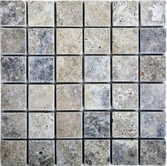
    The backsplash is tumbled (I think) silver travertine. It actually has some tan in it that blends with the floor nicely.
    I've looked at Balboa Mist and it looks to have a bit of a pink undertone to it so I'm not sure it would work. I really want to tone down that beige/tan floor as much as possible.
    I'm going to head back to the paint store to get a lighter version of Revere Pewter. I'll take a look at Shale as well but I'm thinking it may be a touch too dark.
    Anyone have an opinion of BM Horizon (BM 1478)?

  • 13 years ago

    Scanmike, here is a better pic of the travertine for you. We opted to get 2"x4" tile but I couldn't find a decent image.

    Nimbus Gray was actually a contender but I think it was a bit too blue. Beautiful but not quite what we were looking for. You can see it in the picture with the fireplace to the right, just below the window.

  • 13 years ago

    I live the revere pewter with your floor - try covering the orange in your photo and look. I just painted my bathroom which has no windows at all this color with travertine look floors, and it looks fabulous.