Software
Houzz Logo Print
singerslew

Do you remember this acid green kitchen?

15 years ago

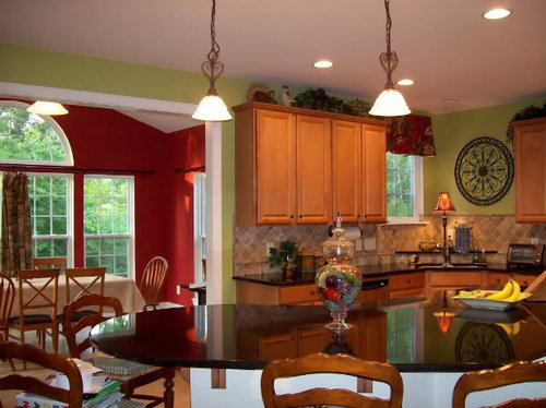
A few months ago I painted my kitchen an apple green color -BM sweet daphne:

I wasn't feeling the color and received some mixed reviews here on the forum. The green, while very cheerful, was turning my newly installed backsplash pink. So I hired a color consultant to help me choose a more appropriate color, and she suggested BM ladyfinger:

I should mention tht my breakfast room is painted BM currant red:

Any way, I do like the BM ladyfinger - it seems to work well with the backsplash and my fabric valance. My one concern is that it's almost identical to the color of the kitchen floor:

Would that be weird in a french country kitchen?

Comments (24)

  • 15 years ago

    I think the wall color your consultant chose is very bland, and will blend all the surfaces and colors of your kitchen---cabs, floor, backsplash--- into one amorphous blob.

    I love the green and red combo--- very fresh and a particular favorite of mine. Have you tried other shades of green? Lighting is key for greens, and I can't tell if one with more blue or more yellow is what you need to stop it bouncing pink off your tile. If you buy samples and try them next to the tile you will surely find one that helps your tile look its best.

  • 15 years ago

    I agree with kswl. I love your space, and I do think a shade of green would look fabulous. I don't think the current shade is that far off either. Maybe a green that's slightly more olive toned.

  • 15 years ago

    No. I feel that color would be more fitting actually. My kitchen/hearth room are "American" French Country, and I have spent hours upon hours perusing design mags and home furnishing websites like Pierre Deux (which has filed bankruptcy).

    Are your stools from Ballard perchance?

  • 15 years ago

    kswl and jan, blandness is my concern. I do have a tendency to go over the top with color though. I have looked at BM dry parsley (too bright) and BM rosemary sprig (too dark),

    tinycastles, my stools are indeed the Avignon stools from Ballard : ) They have the green check fabric cushions on them. I too loved perusing the Perre Deux catalog and was hoping to get to their store in Charleston someday, but alas! Another favorite of mine is the Country French magazine I sometimes pick up at Lowe's.

    The color consultant did suggest a green for the family room walls - BM Moonshadow. To make this easier to understand, I'm including a copy of our lower level floorplan as well as the color palette she came up with:

    Main level:

    For the foyer, stairwell, kitchen, butler's pantry, hallway to the laundry room - BM Lady Finger

    For the dining Room walls - BM Hillsborough Beige

    For the office and main floor guest room - BM Wilmington Tan

    For the family room walls and ceiling - BM Moon Shadow and BM at home with nature

    Again my breakfast room - BM currant red

    Here is my kitchen valance fabric:

    And my breakfast room fabric:

    Forgive me if I'm throwing too much stuff at you - your input is greatly appreciated!

  • 15 years ago

    I love beige so maybe I am not the one to ask! I like the idea of the Lady Finger because you do get the pop of color from he adjoining breakfst room. Nothing wrong with having a place for your eyes to rest. That said, I do like green, just not the green you have. I have BM Guilford Green in my bedroom. Has a yellow undertone and is easy on the eyes. There is a green thread on GW you might want to find it. Lots of examples of greens in people's rooms.

  • 15 years ago

    I think the color consultant should be called a color remover. If you used all her colors, you would have a very bland look. That beige, beige and more beige look is very popular now, but will be dated fairly soon. I guess that is how she will sell more paint in a few years ;)

    I like the green you have. If you must tweak, stay with another green. You may be overthinking things though....

  • 15 years ago

    I think the Ladyfinger color looks like flesh. Maybe it is my iPad, but I just would not paint a wall a skin color. Agree that the house will be a study in brown tones... If that's what you like, do it. But it sounds as though you like COLOR, all caps :)

    If French Country is your style, a palette of reds, greens, blues and yellow/golds couldn't be more appropriate. In fact, the more colors you pull out of that distressed toile, the better! There is a light green in that fabric that looks similar to the light green in the floral.... Try it. It is not a yellowish apple like you have now, but it is a beautiful, softer green that will be a killer color with your green check and both fabrics you posted.

    Green, red, French Country.... You are talking my language:

    And here is the same table with French armchairs and red toile cushions:

  • 15 years ago

    I don't like the color consultant's choice either -but I do like your green and red look. I used the same fabric (as your kitchen valence) in my family room and the walls were painted BM Saybrook Sage -looked beautiful together.

    If you scroll down to the BR on this site, you'll get an idea of what Saybrook Sage looks like on the walls.

    Here is a link that might be useful: Saybrook Sage

  • 15 years ago

    I understand where your color consultant was going....she was trying to neutralize the strong reds in the fabrics & the breakfast room. But I think she was off a little. Sweet Daphne is a cool green that has blue undertones, which is why it turned your tiles pinkish. But Lady Finger has a cool base too, which is probably why you think it's blah. If you want to calm down the reds with a neutral, the "beige" you want should be warmer, like Fennel Seed (1101) or even Mansfield Tan (248) which has a hint of green in it. But if you want to stay with a color that says "green", you might want to try Timothy Straw(2149-40), or even greener Spring Dust (2150-40). Henderson Buff (HC-15) might work as well. Of course, this is all based on how it looks on my monitor....to be more exact you can pull any of those nice yellow greens out of the valance fabric -- that gold-green in the upper right corner looks nice too. Just beware of too much gold with the gold tones of the cabinets. And put samples everywhere til you get it right! =D

    For the record, it seems like all the colors your consultant chose are "safe" and very neutral....which seems like the opposite of your personality, just based on the colors and accesories you chose for your home. Which says to me that either she didn't listen carefully, or she heard you say you sometimes go overboard with color, and ran to the opposite extreme. I happen to think your colors are great (LOVE the Currant Red!), and if it's what makes you happy you should go with it. jmho.....

    Leigh

  • 15 years ago

    ellendi- I do believe that the consultant was trying to do what you said - let the red in the breakfast room be my pop of color. I did look at the guilford green paint chip. I loved the color, but it did terrible things with my backsplash.

    dianalo - color remover, ha! That's what I thought too at first. I know everything looks beige but the powder room will actually be BM rosemary sprig, and my master bedroom will be BM magic potion - a lovely purple : )

    kswl - You've got my number. I do love COLOR. I had the exact same thoughts about lady finger looking like flesh. The paint sample is actually a very pale muted gold. I painted up a poster board and the color did look like skin. Ew.

    I love the pictures you posted BTW. Is that your dining area? It's gorgeous! I tried to do exactly what you said as far picking that coordinating green from both fabrics and came up with BM rosemary sprig. While I love that color, we were concerned about it being too dark in the kitchen. This kitchen has one small window above the sink and gets no direct sunlight. That side of the house is also about 20 ft away from the forest. I pretty much have the lights on in the kitchen all day.

    bestyears - I can't get that page to load all the way. I did do a search for saybrook sage though - pretty color.

    hudsonleigh - On some level, I think you're right - she did balk at that red. I told her absolutely this color stays. But I also know that she chose those colors based how open this floorplan is. When I stand in front of my master bedroom, I can see my foyer, dining room, family room (ceiling too), kitchen, morning room and hallway leading to the laundry. Honestly, I think she was afraid of chopping up my space. She pulled most of the colors from a piece of artwork in the family room, while lady finger came from the backsplash in the kitchen. When you look at the colors she chose, they all do occur in the fabrics more or less.

    The sweet daphne did wreak havoc on the backsplash. Thanks for explaining why. I will take a look at those other greens you suggested : )

  • 15 years ago

    Would a goldish yellow work? From the pictures it's hard to tell what color your backsplash is, but w/your valance I think a goldish or yellow green might be best. But, I'm not color expert and the one I hired I wasn't happy w/either..

  • 15 years ago

    hi Southernfrenchie,
    Can you get some of the larger SW squares of color samples and hang them around the kitchen with removable tape, especially right next to the backsplash and cabinets so we can get a better sense of the color change?

    that generally helps me come up with one answer that is right for me.

  • 15 years ago

    Southernfrenchie, that is our kitchen table. :)

    If there is a "real" paint store in your town you should be able to take that paint swatch and have them lighten to a lighter hue, but the same color.

    We had a short term Florida rental that had walls, counters, cabinets and floors in that flesh color---- in the kitchen, if you can imagine. I couldn't get out of there fast enough!

    Good luck, I know you can find something fabulous. We went through at least 14 or 15 shades of green, one quart at a time, no samples six years ago, and finally found the perfect one. :)

  • 15 years ago

    I love your FP and the pic! :) IMO the color consultant went a little crazy taking out color to balance one breakfast room - if it's color you like you should have it!

    I agree with PPs that a green with more yellow might be nice...BM Baby Turtle, Soft Fern, and one that has always read more green on a wall than I think it will is Beacon Hill Damask. I once did a kitchen with light maple cabs, tumbled marble backsplash, wood floor and used RH Sycamore Green on the walls with good results.

    Good luck and I can't wait to see what you decide!

  • 15 years ago

    kswl, beautiful!!! I have to ask though, because I'm not anywhere near being an expert on french country, just from kitchens I've seen in mags and online.

    But aren't the kitchen cabs supposed to be a creamy color in french country kitchens? If so, then I too can see where your consultant was going.

    Your kitchen looks Mediterranean to me, but I do like the green that's already there!

    Is it Allison who has the french country kitchen?

  • 15 years ago

    Since you like color, I would probably stay clear of going with something too similar in color to your backsplash.

    Do you have a sample of Rosemary Sprig? It's not in my paint deck. Looking at the color online, I don't think it would be too dark. Do you know the LRV of the color you currently have and the Rosemary Sprig? Here's a pic I found online of RS with cabinets similar to yours. (see link. You can enlarge the pic by clicking on it.) I do see they have more light but.... I think it could be the winner. If it is too dark I think they can mix samples of the formula strength cut.

    Side tracking your thread for a min. Would you mind telling me about the bedding in your DDs room? You posted a pic a while back. I think the thread was about pink rooms. The bedding was so pretty with blues, pinks, and yellows. I was wondering if you bought it somewhere or if you had it custom done. Thanks!

    Here is a link that might be useful: reinventingspace.blogspot - rosemary sprig kitchen

  • 15 years ago

    Here's a pic side by side to make it easier for viewing.
    {{!gwi}}

    The BM Rosemary Sprig kitchen from the link.
    {{!gwi}}

    I think the RS looks like a nice toned down version of the current green.

  • 15 years ago

    One more time.... :)
    You only have one window in your kitchen but it looks like it still gets a decent amount of light from the large windows in the dining area. ?

  • 15 years ago

    Okay guys - we took the plunge and painted the kitchen lady finger. It is actually a very pale gold - no skin tone whatsoever. Do I love it? No. It looks very similar to my floors. On the upside, the backsplash is no longer pink... We still have to put on a second coat and remount the valance and medallion - I'll post photos of it in the next few days...

    clubcracker - thanks for your sweet comments. I'll have to take a look at baby turtle. Soft fern I believe is on the same chip as rosemary sprig - it actually is very similar to the moon shadow on the consultant's palette. I'll be looking at those more closely.

    kswl - your kitchen table is just lovely. If this lady finger doesn't work then I may be going the 14 to 15 greens route.

    oakleyoak - I think french country can be white, brown ...etc It just depends which countryside in France you're talking about : ) I agree my kitchen is more mediterranean. Wouldn't Provence be considered both FC and Mediterranean? What do you think?

    Hi shee! Does LRV mean light reflective value? I'm not sure how to use that in making my color choice... Anyway, I looked these LRV's up, but I have no idea what they mean:

    sweet daphne 50.9
    lady finger 64.2
    rosemary sprig 34.8

    You would think that the kitchen would get more light because of the morning room, but check out this photo from when the house was still being built:

    As far as my daughter's bedding, I actually bought that from linensource about 3.5 years ago. It was called the "Iris" bedding collection. It's been discontinued for a while though.

    Again, I'll sit with this lady finger for a few days and post pictures soon. We may end up painting this kitchen a 3rd time.

  • PRO
    15 years ago

    LRV speaks to the lightness/darkness value of a color.

    Not the same as grayscale value - grayscale value speaks to tone. For example, vivid vs. dull, pure color vs. muted color.

    The LRV numbers are given for every paint color because to meet color spec's for business, commercial, industry there are visual ergonomic standards that must be met for public spaces.

    However, homeowners can also use that info in a benchmark kinda way. As I state in the article, by paying attention to the LRV of colors that work and/or don't work, it helps you zoom in faster on the colors that work best in the space.

    Here is a link that might be useful: LRV Explained

  • 15 years ago

    Provence country kitchens have a lot of hand painted wood in them, not just the kitchen cabinets.

    Rustic french country has the darker cabinets but usually with cream colored walls and accessories.

    Classic french country has mostly cream colored cabinets. I wish Allison would pop in and show you her kitchen.

    Have you ever looked at the kitchen and dining room linens from Williams-Sonoma? Their Provence linens would go great in your kitchen! I have one of their provence table cloths on my DR table.

  • 15 years ago

    funcolors - thanks for the article - very educational. Maybe I should have checked the LRV of the currant red before putting it up - 11.3.

    I'm guessing the rosemary sprig would not be a good option with an LRV of 34.8.

    oakley, wow - I didn't know there were so many categories of french country. Would it be terrible if I combined elements of all 3? : )

  • 15 years ago

    Maybe I need to change my profile name to BeigeCastles, but I love the color palette that designer chose:) In fact, I think I may try to use one (At Home With Nature but reduced down) for my Kitchen to make my cream cabinets stand out a little more. Your fabrics are very lovely too. I tend to do more color introduction via drapes, pillows, art, and furniture and stick with neutral for walls. I just think a room has more versatility that way since its much easier to change these things than it is to repaint. I think you should live with the new kitchen color for at least a week and see how it feels.

  • 15 years ago

    tinycastles, thanks for your input. Your decorating approach makes a lot of sense to me! Both Moon Shadow and At Home With Nature are on the same chip - Mosaic Tile is what's in between. Let me know how it looks with your cabinetry!