Software
Houzz Logo Print
booper717

I really need advice!

18 years ago
On my kitchen!

We started redoing my kitchen, it's a total mess! The fridge is in the small dining room and stuff is everywhere! We've come to a hault because I can not, for the life of me decide on my counter.

We don't have a very large budget. About $1,000 or so. However, the kitchen needed done now, the wallpaper was falling off, there was mold under the wallpaper (taken care of with help from a professional) and the stick on tiles where coming off and every time I'd clean them the glue would seep out! It was a nightmare.

So here we are now. We have bought the ceramic floor tile and the backsplash. We have decided on a paint color, but I'm totally at a loss for the countertop choice.

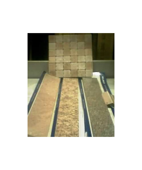
The walls are going to be a tan/brown color, the floor tile looks like the lightest tile on the back splash (will attatch pic) the cabinets and trim of the room will be white. The fixturs brused nickel. All my asserocies are red. I had these red ones already. (plates, silverware, cups, oven mitts, garbage can etc.)

I don't have alot of counterspace. Just one row. I will attach a pic showing the three counter choices I have to make.

At first I was dead set against the first one. I though it would be too plain on the counters since everything is going to be so neutral. I'm also worried that it would show stains more becasue it's so light. However, I got some advice that it is the best out of the three because with the backsplash I shouldn't but something very "busy" on the counters. Also, I was told the white in the counter will go good w/ the cabinets being white.

The middle one is the one I orgainlly was set on until I heard it would make the area too busy. I liked the darker browns in it and thought it would add some contrast and texture to the room, but now, having thought about it, I see what ppl mean that it may be too busy with the back splash.

The third is my least favorite. I've heard that the pattern would go better with my backsplash because of the smaller scale, but there is alot of black and gray in it that can in some lights look blue, and I think with the red it may not look the best!

I'm attatching a pic of the three I'm talking about with the backsplash behind them. The paint sample is on the right of the pic.

Please give me some advice as in what to chose, I'm at a total loss!


Comments (21)

  • 18 years ago

    My first thought was the middle one, but after looking at them for a bit, I think I'd go with the first one. It seems to be very rich looking with the tile. It will also make a great background for your red accessories. Good luck! I'm also one of those people who has trouble making decisions. It definetly helps to get other opinions, but in the end, you have to go with your gut feeling.

  • 18 years ago

    Go with your first instinct!
    It's not going to be too busy LOL
    not at all. I think you are right.. that the darker flecks add *just* the right amount of contrast and interest.
    Still has the beige and lighter flecks too.
    Either the first one or the second one will be Great but I think I personally would choose number 2!
    I would want something with at least a little extra oooompphh! yk?
    which is what I year ya saying?
    I really really don't think it's too busy. Especially both being the same colors.. the counters being flat.
    How can it be too busy LOL
    number 2!~ number 2! go for it .. it's beautiful!

  • 18 years ago

    Even though I like No. 2 best when it's by itself, with the different colors in the backsplash I believe the two will always be fighting it out. My choice would definitely be no. 1. If the backsplash were just one color, the same as the background color of the counter (which is what I would choose for my own kitchen), then no. 2 would be a great choice.

  • 18 years ago

    Ok, I'm the odd man out, (as usual) but I like the third option because it offers some contrast and I think it will give some pop to the room.

    BTW, did you know that Lowes or HD (one of them for sure) has a new laminate that looks just like soapstone? Now that would look wonderful with your white cabinets and red accessories!

  • 18 years ago

    Your backsplash tile looks a lot like what I have. The middle countertop choice looks a lot like my granite. So, I like the middle countertop choice!!!

    Here is a picture of my kitchen.

  • 18 years ago

    I'm the other oddball... I like the 3rd one! Love the contrast as it adds visual interest without being too busy. Too much of the same might be the safest choice but more boring, maybe.

  • 18 years ago

    Third one. Adds contrast. Looks sharper with white cabinets and defines them

  • 18 years ago

    I like the dark one the most. Or How about the new soapstone laminate counter a PP suggested? that would be cool with your cabs and red accessories. It is going to be pretty.

  • 18 years ago

    Wow! Thanks for all the great opinions! I would like to see what the soapstone looks like, but I havn't ran into it yet, at Lowes or Home Depo. I'm looking at the stuff they just have in stock, it may be in the speical order section though. I'd like to have a chance to check it out!

    Laura, I love your kitchen, that is the look I'm going for. Even you wall color is perfect to what I'm trying to achieve. What color is it? If you don't mind me asking!

    I still havn't made a choice. I'm going to look around a tad more, see if I find anything else worth thinking about then make the final jump! Thank you all so much again, I appricate it!!

  • 18 years ago

    I vote for the third one....like the contrast. Good Luck.

  • 18 years ago

    I like the darker one also. It reminds me of our kitchen. The middle one is pretty busy, and will appear even busier in a larger sample.


    {{!gwi}}

  • 18 years ago

    Thank you! I know this is overkill, but I pulled up stock photos of all my choices. I thought this would give a better idea of what they really look like!

  • 18 years ago

    Thanks for those great pics, love your kitchen!!

  • 18 years ago

    Booper, I think I have your first selection with your tile in my laundry room. The cabinets are actually a dark green/brown. I just put such a high gloss on them that they look almost black in the pictures. But you should get some idea of the match.

    This is my first picture link. So it may not work.

  • 18 years ago

    Okay it didn't work.

    Help photobucket people. What do I put in the optional link url or name of the link?

  • 18 years ago

    Now it is rejecting my reattempts to respond to your "I really need advice" post. Hopefully I just need to put the links in the actual message box?

    [IMG]http://i396.photobucket.com/albums/pp44/housefairy/Novemer12008005.jpg[/IMG]
    [IMG]http://i396.photobucket.com/albums/pp44/housefairy/Novemer12008007.jpg[/IMG]

  • 18 years ago

    I'm going to throw this out there... What about concrete counter tops?

    I saw some this week in a store and the owner had poured it himself on his counter---wow did it look cool! He left it natural in a buff/gray color and it looked like limestone. I think what I saw would look awesome with your splash! Wish I had pics....

  • 18 years ago

    Booper,
    Could you post a photo of the intended area for the counter.
    So far, I would I say the middle choice of the three you posted. I think it will be good and not too busy with backsplash. Your floor seems very light and your cabinets all white so you do want a bit of pattern.

  • 18 years ago

    Housefairy--
    To post a link, simply copy the link, then paste it into the "optional link url" box below the message box.
    Then type a name for the link (whatever you want to call it) in the "name of the link" box below the url link box. When you hit preview, you'll see it as it will appear. If not, repeat and make sure you've got it right. Hope that helps---it makes it so much easier for everyone to see your pictures (and we love seeing pictures).

    To post a picture directly into the message (even easier for all of us), just click on the words 'HTML code' below your photo in your photobucket account. A yellow "copied" small icon will appear. Then go to your message and paste that link into your message wherever you'd like it to be. To paste another photo, just hit return, and repeat. When you preview, you'll see your photos as they will appear for us. If not, try again. HTH

    Here is a link that might be useful: {{!gwi}}

  • 18 years ago

    Thanks sujafr. I tried the codes in the optional url, then tried the img code in the message body. One time I had it appearing on my preview, but it disappeared when I did the post message. Obviously, operator error.

    I just redid the area because I am planning to purchase a new washer/dryer with pedestals. No more water running off the counter and down the side of the washer. The shelf will be removed. That's why it wasn't painted to match.

    {{!gwi}}

    {{!gwi}}