Software
Houzz Logo Print
lwerner_gw

Final layout advice ? (long...)

14 years ago
Hi guys,

The structural engineer is almost done with my house plans, so I need to have a finalized kitchen plan to include in the submission to the city. I got some advice here a month or two ago and moved things around, but I thought I'd get one more round of feedback. Especially I keep doing more research and finding more toys, er, I mean essential equipment, that I might want. The "Will I have to walk too far" thread started by lavender_lass also made me think a bit.

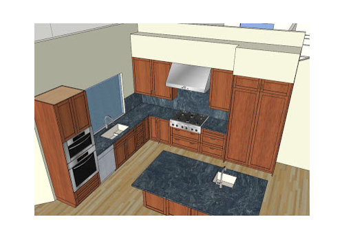
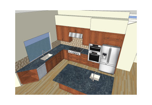
There are two layouts that are my favorites. Here's the final one my architect proposed, after I got some feedback here on the forum and steered him away from his original proposal:

From Kitchen plans

(a2gemini: I admit it, I stole your countertops! They didn't come out as nice in SketchUp as in your photos, though.)

The things I like about the plan above are:

1) All the prep and cooking stuff is at one end of the kitchen: cooktop, ovens, prep sink, fridge, and pantry (the door you can see the edge of at the far right).

1.5) That means I can take things out of the fridge or pantry and pop them right into the speed oven.

2) From the dining area (off to the left) there's a clean view of the kitchen, with nothing on that left wall blocking the view.

But the things I don't like are:

1) The big stainless steel box of a refrigerator will be highly visible from the main living area, which is basically everything to the right of the island. Using a counter-depth fridge will minimize its impact a bit, but it's still quite a lot of stainless steel, especially with the ovens right next to it.

2) There's no separate baking area. That doesn't matter right now since I live by myself, but hopefully I'll find a S.O. one of these days and then it may be a bit crowded on the right-hand end of the kitchen.

The other layout I like, which was mostly suggested by buehl here on the forum, is:

From Kitchen plans

The pros of this one are:

1) Moving the ovens creates a separate baking area on the left end of the island.

2) Moving the oven also frees up enough space on that wall for an integrated fridge with panels to match the cabinets, getting rid of the giant stainless steel box.

3) Even with a wider fridge, this layout has about 9" of extra space on either side of the cooktop, or even more if I go with an 18" freezer column instead of a 24".

4) It looks a bit more balanced visually, with one of the tall appliances on each end of the L.

The cons are:

1) If the oven is on that left wall it sticks out into the dining area a bit. The dining area is at a 45 degree angle on that side. Here's an overhead view. Yes, I like weird, modern floor plans.

2) The speed oven / microwave is no longer right next to the fridge, so popping leftovers into the nuker requires walking 10 whole steps. I'm not sure if this would bother me. My current kitchen is so small that this sort of thing is a non-issue, so I'm not sure if it would really bother me or not. I suppose I could also put a drawer microwave in the island, but that feels like serious overkill. (Then again, this whole house is serious overkill for a single person.)

Does anyone have suggestions, feedback, catcalls, or anything else to offer?

Thanks!

Laura

Comments (15)

  • 14 years ago
    last modified: 11 years ago

    The second layout is more balanced. The first layout my first impression was that is a lot of stainless in one area. The appliances are dominate visually. I also think the second layout is more functional. There is not so much going on in the same space. Most of the time when I reheat something I take it out of the fridge and transfer it to the plate/dish and then reheat. I don't think the ovens being away from the fridge will bother you. The plan looks like you still have sufficient space for a dinning table.

  • 14 years ago
    last modified: 11 years ago

    i like the first plan. As drawn, it doesn't show the fridge surrounded by empty space. You need another inch. Btw the hood is not the same in the two plans. The big hood is an attractive force. Also the backsplash. It too is different. This changes perceptions. The upper cabinets too are different.

    I saw the overhead view. Your island could be more curvy and less rectangular. Both plans are "close but not quite."

  • 14 years ago
    last modified: 11 years ago

    I am a big proponent of the flow of light. I would hate to see all the light from that lovely big window trapped behind the ovens. So, I guess I like plan 1. However I also really liked more space to the right of the range, I was wondering what is in the island. Could the oven/speed oven be separated and one go in the island and the other go elsewhere, perhaps still next to fridge, under cabinet?

  • 14 years ago
    last modified: 11 years ago

    Agree with Davidrol and Localeater. To me the ovens sticking out into the dining area, and blocking the flow of light in that design, is a fatal flow in #2; just wouldn't do. But if it were mine, I also wouldn't care for their mass in #1 closing the stove in and making that area feel "unspacious." I think that'd mean I'd have to find other places for the ovens, as suggested, or even rethink the need for two. Or two taking up valuable space in the kitchen if one were seldom used? (My son and DIL keep their "extra" oven in their party room kitchenette.)

  • 14 years ago
    last modified: 11 years ago

    I do agree the ovens eat a lot of light but I just don't like the way all the appliances together look. It seems clustered to me. What about changing the cooktop to a 36" range with a speed oven in the island?

  • 14 years ago
    last modified: 11 years ago

    I don't really think the "mass" of items-frig and 2 ovens is an issue in plan 1. The furniture arrangement in the liv rm part would normally be to face the wall of windows down near the dining table. Therefore,anyone at the table would shift their visual line to the people and activity over in the liv rm-not stare at the appliances. This will make the whole space dynamic-once you get the furniture alignment and flow of people figured out.I wouldn't worry about the ovens and frig issue if that's what you wish. The range with under counter convection mwave or the like, in the island, would work as well[probably what I would do].

  • 14 years ago
    last modified: 11 years ago

    #2 but move the ovens to the outside of the ref (take another 30" of that wall) so the rangetop wasn't crowded.

    Dish storage is something that needs some more noodling in either plan - actually I have more concern about where dishes end up and not so much about other issues.

  • 14 years ago
    last modified: 11 years ago

    Thanks for all the feedback! Here are some responses:

    @SunnyAlberta: I'm kind of leaning toward #2 also because of the visual balance and extra room on the range wall. I expect to be spending more time in the big living area than in the dining area, so the blocked light won't matter as much. And the walls of the dining area are going to be mostly window -- two big corner windows -- so there will be plenty of light in there, plus a view of lots of trees and a small pond.

    One downside is that my architect will be annoyed with me if I go this route, because we had it drawn this way at one point and I let him talk me into plan #1. Fortunately it isn't a structural change; I think all it requires is moving the electrical stuff around. And that's what I'm paying him for. :-)

    I think you're right about the flow from fridge -> plate -> oven. The plates will probably be in an upper cabinet toward the left hand side of that wall, or maybe in a deep drawer in the island, so that flow works fairly well. And the aisles are wide enough that there shouldn't be a collision if anyone else is in there.

    @bmorepanic: Do you mean putting both the ovens and the refrigerator on the left wall? Hmm. My architect had it drawn that way originally, but I didn't like it much. It was a big "wall of tall" that I think would look even worse than plan #1 above because it just kind of hangs out there. (Someone on the forum pointed that out, maybe buehl.) Or maybe you meant leave the oven on the same wall as in plan #1, but move it out into the living area to the right of the fridge, between the fridge and the pantry door. I don't think I like that because it puts some of the stainless steel out there. But I could slide both the oven and the fridge to the right (if it's a full overlay and integrated) into that area without it looking too weird. And that area is more or less unused in the current plan. Hmmm.

    @davidro: Yeah, the hoods are different. I've been playing with different styles in my drawings: big pro hood, shorter metal one, insert in a fairly flat wood enclosure, etc. I'll try to post some drawings that have consistent hoods in them.

    What kind do you think would look best? :-) I've also been drawing them at different widths, but I'll probably go with 36" to maximize upper cabinet space. The island definitely needs work: curvy or multiple heights, or something like that. That stuff can change later, but right now I need to finalize the floor plan and gas/electrical stuff for the city. The colors in the drawings are also a mess. I'm rather color-blind, so I just picked some things I liked in isolation with no thought for how they'll fit together. I'm going to need to hire a designer to help with all the colors and other decoration. :-(

    @localeater: "I was wondering what is in the island." Not much so far. The prep sink, plus a trash pullout at the end nearest the cleanup sink. Otherwise it's a blank slate.

    On the oven comments from multiple folks.... I'm torn there. Putting them under the counters would definitely solve the layout problems. Or using a range instead of a rangetop, plus a microwave drawer or a speed oven mounted in the island. But I'm almost 6' tall and have a messed up back, so I've more or less discarded those ideas. (I wish I could trade a couple inches of height with my friends who think they're too short. :-) But you guys have made me reconsider a bit, because it would certainly help with layout. Too many choices!

    @herbflavor: You're right that the furniture arrangement in the big area looks bizarre and arbitrary. I love having lots of windows and light, but it makes the furniture layout a challenge because I also want to use that room as a home theatre, with the TV and audio gear on that long wall. I'll come up with some sort of compromise eventually.

    I think I'd be fairly happy with either of the designs above, with some minor tweaks for looks. But I want to get it *perfect*! Curse you for giving me so many more choices and ideas! Kitchen design is way harder than the software design I do for a living. :-)

    Random aside on the "lots of windows" front... My current house is similar to the "Eichler" houses built all over the Bay Area in the 50's. They're basically lower-budget, mass-produced designs inspired by Frank Lloyd Wright: lots of windows, flat roofs, outdoor atriums that integrate into the living space with big windows or sliding doors, etc. I love the current house and am trying to replicate some of the parts I like in the new one. The reason for the move is a much bigger lot, slightly bigger house, and much nicer location within walking distance to lots of shops and restaurants. (Downtown Mountain View, CA for anyone who lives around here.)

    Thanks! Keep the feedback coming!

    Laura, on my lunch break

  • 14 years ago
    last modified: 11 years ago

    Laura, I think your house will be spectacular, especially in your location! In layout #2, I would feel like there wasn't enough "elbow room" next to the sink. My kitchen has a similar layout and I love having the sink wall with a long continuous countertop for serious cleanup or for serving.

  • 14 years ago
    last modified: 11 years ago

    Major problem with # 1 is no landing area next to the fridge. Imagine making a pb&j, or pouring milk on your cereal...the ovens are in the way.

  • 14 years ago
    last modified: 11 years ago

    The most convenient landing space for a side by side or a french door refrigerator is opposite the refrigerator - in this case, on the island. When the doors are open, its too far to reach landing space to the sides.

  • 14 years ago
    last modified: 11 years ago

    @juliekcmo: I'd been thinking of the island behind the fridge as the landing zone for it. I have to work that way in my current galley kitchen because there's 9" of counter next to the fridge. But it's a bit less convenient than I'd like, and will be more so in the new kitchen with the island ~4 feet away. Plan #2 does have the advantage of having counters next to both the fridge and oven, plus additional landing space on the island behind them.

    I'm still fairly torn. I'm thinking more about putting one or both ovens below a counter. I think I need to mock that up and see how it would be on my back. I'm not too hopeful, but it's worth trying.

    @cindaintx: Yeah, the 2' to the left of the sink in plan #2 would be slightly small, though having that 6' wide window right in front of me might make up for it. :-) If I put the oven on that wall I might make the top of the oven cabinet lower than the wall cabinets on the other side so it doesn't box things in quite as much, at least for someone tall like me. (Unless that would look weird.)

    I could also think about moving the sink to the right a bit, though keeping it centered on the window would probably require making the window narrower. (I don't think sliding the window to the right is an option for structural reasons involving shear walls.)

    Decisions, decisions.... But I'm realizing that these two plans have the window, island, and plumbing in the same places. All that's different is the electrical, and that's probably something that can be changed up until it's time for the rough electrical work after the framing and plumbing are done.

    Which is both good and bad: I get more time to decide, but I also get more time to stress about it! :-)

    Thanks, everyone!

    Laura

  • 14 years ago
    last modified: 11 years ago

    More likely you'll find yourself leaning one way more than another, pass on through the need-it-all bargaining stage to serene acceptance, and make your final decision happily. :)

    Reading so far has certainly simplified initial wide-open assumptions from this side of the screen. Your back rules! Of course no undercounter ovens. I have one and it does require real bending over to tend (at 5'2"), plus lifting weights upward. Obviously they have to be on the wall.

    With that in mind and back to the original question, my preference is unquestionably for #1 to continue the lines of the house, specifically that left counter run. It just feels right, and it's quite nice.

    BTW, if 48" is too far from the fridge, why not massage that a little bit? If you made the stove counter a bit deeper you'd benefit that way, visually and with higher quality workspace, and/or you could move/enlarge the island slightly. I have 42" between fridge and island and it's fine for me, so I suspect something between that and 48" would be nicely workable for longer limbs.

  • 14 years ago
    last modified: 11 years ago

    Thanks for all the feedback on this, everyone. I've done more playing with my drawings and ended up almost back where I started, which is probably a sign that it's a design I'll be happy with....

    As lots of you suggested, I decided I should keep the tall appliances together on the wall with the range, so they don't block off the dining room view, as many of you suggested. Here's a new drawing, with a higher view angle so it's easier to see the layout:

    From Kitchen plans

    I like almost everything about this one:
    - More open sight lines.
    - There's room to squeeze in integrated 18" freezer and 24" fridge columns, getting rid of one of the big hunks of stainless
    - There's still a fair amount of space on both sides of the rangetop. (Or induction cooktop if I go that way).
    - Deeper counters on the range wall will let me do 15" deep upper cabinets. Someone on the appliances forum suggested this if I remember right. The 15" deep cabinets and soffit will also give me a place to hide a silencer for the exhaust fan. And I'll have more room for dishes.

    Which brings me to the only real downside I see (which some of you pointed out):
    - Not much upper cabinet space. But I think I can make it work. The one to the right of the cooktop will be cooking stuff: spices, oils, etc. The two on the left will be the more frequently used plates, glasses, etc. Larger things like serving plates, salad bowls, etc. can go in deep drawers, which I plan to have lots of.
    - Related to that, I thought about putting a wall corner cabinet to the right of cleanup sink, for another foot or two of wall cabinet, but I couldn't get the sizes to work out. And I think I like the looks better this way anyway.

    I still need to talk to a kitchen designer to nail down details like exactly what kinds of base cabinets / drawers go where. I chatted with a designer today and he said I could set up a brief appointment with him to get a sanity check and a ballpark price estimate. Then we can do the details when I have a real construction schedule and know when all the stuff will be needed.

    I'm much happier (and less stressed) about this now. Thanks, for all the advice and encouragement, everyone! Now I can go be stressed about work, which has been crazy lately but has an end in sight because I'm leaving for a vacation next week. :-)

    Just for the heck of it, I did an overhead view of the whole floor plan in case anyone wanted to see where the kitchen fits in. This post is long enough already, so I'll just link to it here. The lower-left section is the existing house, which is going to become 2 bedrooms, a study, and the entry hall. The master suite is at the top right (ignore that vertical wall-looking thing there; it's actually part of the roof). And the kitchen / great room is of course at the lower right. The weird stuff in the garage is mostly woodworking tools. (I had the architect push the garage out to the setback limits so there's more room for those toys.) And the black boxes scattered around the great room are various audio and video equipment, mostly speakers.

    Thanks! And if anyone has more feedback or suggestions on the kitchen or anything else, I'd love to hear it. More is better!

    Laura

  • 14 years ago
    last modified: 11 years ago

    don't you still have 2 wall spots you could fit up later if need be?.. first-to the left of window along sink run-that looks like about 27 in...you could do a couple of open shelves-use 22 or 24 inches of width,and perhaps reduce depth if need be.That would be a handy spot in my opinion....there's always that bowl or jar/flask/dish or something that you want within reach,but not exactly on the counter all the time.2nd-to the right of frig,even if you used half that wall width-but have the same depth as frig,with roll outs, or the like, inside..could be a good storage area....or maybe even a small broom/cleaning closet. Drawers are good,but think hard now about all your storage needs since you can get it exactly the way you want.

Sponsored
Bella Casa LLC
Average rating: 5 out of 5 stars17 Reviews
The Leading Interior Design Studio in Franklin County