Software
Houzz Logo Print
denicast

Paint Colors

16 years ago
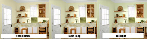
Originally, I was going to go with Celery Ice by Behr, but the color really didn't work on our walls. My husband eyes register yellow greens far better so I turned to a yellow green (Behr Feldspar), a green yellow (Behr Home Song), and a yellow (Behr Garlic Clove). Using Photoshop, I was able to insert my tile and countertop. Once I finish prepping the walls I am going to try out the testers I bought to see which one we like.

The tile and countertop should be arriving next week. By then, the walls will be ready for our contractor to fix what is wrong with our walls and paint. Then he can install the counters, cooktop, and the tile. We had inherited some bad patches on the walls that were covered badly by poorly put on wallpaper. We tried to fix it ourselves but wasn't happy with the results. We are going to do as much of the prep work we can ourselves, so he can just come in and finish up.

We are also contemplating getting commercial stainless steel shelves for our kitchen storage for bare walls that are 88 inches long. I want to break it down for 2 56 inch shelves and 2 36 inch shelves, because in the future if we want to put in a 36 inch refrigerator or double oven, we can take out and reuse the 36 inch shelves elsewhere more easily than 84 inch selves.

A lot of this work will involve organizing the entire house. Our house is cluttered and we need to find a way to simplify, declutter, and make our house work better for day-to-day living, but also to entertain kids and adults.

Comments (11)

  • 16 years ago

    Oh man!

    Painted all three on the wall and I am not sure I like any of them.

    What do you do when you have a mental block on wall paint and your DH is color blind?

    Please. Send. Help.

  • 16 years ago

    I like
    1. Feldspar
    2. Homesong
    3. Garlic clove

    I tried to picture each near stainless shelves and that helped my choices. I think the garlic clove is a little creamy for stainless. The Feldspar looks refreshing to me.
    HTH

  • 16 years ago

    {{!gwi}}
    Here is Caribbean Mist from Benjamin Moore -- the color I have in my livingroom.

  • 16 years ago

    The more I think about Caribbean Mist, the more I like it. Check out my latest blog. What am I missing?

    Here is a link that might be useful: Caribbean Mist to the Rescue?

  • 16 years ago

    At first, I was thinking of ultra bright white as the accent, but now that I am considering bringing in a color from the livingroom/dining room I guess I should use the accent color from those areas. So it will be Benjamin Moore's Swiss Coffee. What do you think?

    {{!gwi}}

    Here is a link that might be useful: life dithyrambic

  • 16 years ago

    Since you asked, my personal preferences are 1. Garlic Clove; 2. Home Song; 3. Feldspar, especially with the other colors you mention. However, given your husband's specifications, you may want to reverse that order. I'm not sure how he would perceive the colors that appeal most to me. Can you describe that?

  • 16 years ago

    I'm not sure any of your choices will go with your LR & DR colors. I would look for a light green with grey tones to go with your Swiss Coffee (it shows up somewhat grey on my monitor). If it's more beige than grey, than go with a green with beige undertones. If you decide to stick with your current choices, I think I like Garlic Clove best. HTH!

  • 16 years ago

    Of the three, I would say garlic clove, feldspar then hoem song, but I think they are all too yellow as they show up onmy computer. I would loot at the laminate sample in your posts. Onteh far left, there are two gold tone patches. Ignore them and move right a bit to the patches or vein of what appears to be green/sage tones. You need to find something that works with that and you aqua (Caribbean Mist).

    I have some swatches at home that I am looking at for a project. If you have a Lowe's, look at these and see if they work in person -- Valspar card 5008 with three shades of a sage green (1A, 1B or 1C -- Montpelier Madison White, Bay Sands and Lyndhurst Castle Sand). The work with everything on my monitor except possibly the swiss coffee which has too much brown.

    In the Martha Stewart Living colors, I have Bedford Gray and Bayou that look good with your choices. They may not look as good IRL as on my monitor, but perhaps they will give you a direction to consider.

    BTW, while walking through Home Depot yesterday, I saw the Seagrass laminate. I still liked it, but not as much. After that caught my eye, I looked for the other two but didn't find either of them.

  • 16 years ago

    I don't like the Caribbean Mist with your choices of backsplash and countertops. It's too blue IMO. If you want to tie in with the CM, then I would go to Benjamin Moore and see what other colors are on the color strip along with the CM. You may find a lighter shade that is a bit more green to go with your choices of countertop/backsplash.

    I also think the Swiss Coffee is too grey. I have a color in my living room and dining room that is more of a greeny-beige called Wool Skein by Sherwin Williams.

  • 16 years ago

    Benjamin Moore SILVER SAGE or SILVER MIST. Nice pale blue colors that would look nice with stainless shelves. You need to decide between the blue and the green. If you choose green, I would pick something safe like a plain old sage - always looks good with olive and yellow and would bring out the green in the backsplash you love.

    I like the countertop a lot!!! I do see silver in it.

  • 16 years ago

    It turns out that the blue isn't from Benjamin Moore, but some blue in KELLY MOORE. I have been able to narrow the match of the blue to Calypso Breeze or Dreamy Spaces (I kinda like this). The greens are too problematic for my husband and I want to tile to pop in the space.

    I have Kelly Moore Swiss Coffee, not Benjamin Moore Swiss Coffee as the ceiling color in the livingroom and dining room, can I go with something different for the ceiling in the kitchen if it borders those rooms?

    Here is a link that might be useful: Color Crisis of 2010