Software
Houzz Logo Print
aussies_gw

Please vote on breakfast bar shape!

18 years ago
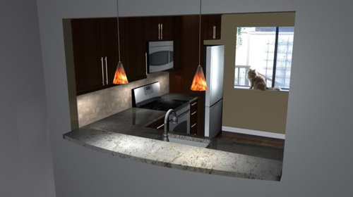
We will have a pass-through between the kitchen and dining area and plan to have a granite breakfast bar there with just a couple of stools. The width of the pass-through will be 75''. The breakfast bar height will be 42''. At its maximum point, the bar will be 18'' deep. We plan to have bullnose edges.

We are trying to decide what will be the best shape for the breakfast bar.

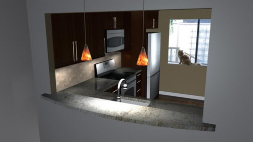
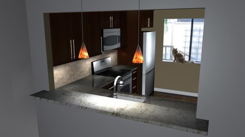
DH has done some 3D mockups. (I'm not sure why they have come out so dark). Don't pay too much attention to other features of the room -- not all of the features are representative of what we're actually doing. Also the bar would be a couple of inches deeper than shown in these pics, but I think you get the idea.

Version 1: Slight curve

Version 2: Same curve, extended slightly beyond sides

Version 3: Straight

Any other suggestions?

BTW I'm not sure if extending the granite at the sides would add to the fabrication cost.

What do you think would look best?

Comments (15)

  • 18 years ago

    I like the curve (#2 if I had to choose). What software did you husband use to make these mark-ups?

  • 18 years ago

    I like #2. Those are great-looking (albeit dark) mock-ups. Love the pendants and the cat!!

  • 18 years ago

    Definitely extended on both sides! That makes a huge difference. It will give it a much more polished look. It would be worth the extra expense, if it ends up costing more, in my opinion.

    The option without the extensions doesn't look bad, but looks a little bit like you didn't go through with your idea and rushed to finish...

    Now whether you want to have it curved or straight (they both look great, btw) depends on the rest of your space:
    How does the rest of the kitchen and adjancent room look like? Do you have a lot of curved edges or just straight ones? Are you going for an ultra modern look or a more classic timeless feel?

    Last but not least... If I had to absolutely pick one, I would ask you if you were going for the same OTR microwave with the top and bottom curves, as shown in the renderings. If the answer is yes, and it will be in the same location as now (visible from the openings) go for the curved edge in your bar. It might sound strange, but the shapes will start to resonate with each other and give it a more "professionaly designed" look.

    That was just my very long two cents, hope it helps you in your decision.

  • 18 years ago

    #2 looks fantastic! Go with that as it looks rich and modern and custom. The curve really makes it look welcoming. Good luck!

  • 18 years ago

    I'm with m_nk. I picked up on that re-representation of the microwave curve, too. The curved bar really makes it look unified. Though the the straight bar also has great aesthetic appeal, I think I still prefer your extended curve for practical reasons if I imagine a couple of people sitting at that bar. Even turning your chair an inch toward another person seems like a friendlier way to sit together.

  • 18 years ago

    I love #2 for looks and #3 for functionality. There's just a touch more usable space on that version. Best bet as always: try a RL mock-up to see which is more comfortable for you.

  • 18 years ago

    I like #1 best. It's more contemporary looking and seems more in tune with the plain drywall return on the pass-thru.

    However, if you plan to use trim around the pass-thru, I'd vote for #2.

  • 18 years ago

    i prefer #2.

  • 18 years ago

    Version 1: Slight curve - This one keeps it simple and doesn't compete with anything else you have going on the rooms/area, so I like it best. After all, the focus of any room should be YOU. Good luck with the project! - MB

  • 18 years ago

    I also vote #1 for my tastes, but if you like modern, #2 is very cool like that...

  • 18 years ago

    #2 or #3 for me. I like the looks of #2 best, but #3 is a very close 2nd.

  • 18 years ago

    I think I like the look of #1 best, with #2 a very close 2nd. But, while I do like #1 better, I think #2 would be better from a "hip bruiser" point of view! I think both #1 and #3 with their relatively sharp corners, will be the "perfect" place for bumping into! The tapered curve in #2 dramatically reduces the chances of bruises!

  • 18 years ago

    Like # 2 best
    Agree with Ci lantro:
    If you wanted to add moldings at some point it gives it a nice end like a window sill
    very nice with or without molding

  • 18 years ago

    I like #2 and #3 equally. I think the returns make the bar look so substantial. But I agree with buehl that the sharp corner return on #3 could be dangerous.

  • 18 years ago

    Thanks everyone!

    Seems like #2 is the clear frontrunner. Some great points to consider too. The bruising is a good point that I hadn't thought of! The OTR microwave will be in that location, and while not the exact same model, it is very similar and will have the curves. I agree that the curve of the bar would tie in nicely. Interesting point too about the curved one being more welcoming.

    Our cabinets will be shaker style, but there will be some other curves to soften it somewhat. The overall style of the kitchen and adjacent living areas will be a blend of craftsman, modern and ''organic''. Lots of wood, stone, plants, natural elements, earth tones, with a touch of modern. Hopefully it will come together alright!

    The software DH used is called Maya. It's professional software used for animation, so not really meant for kitchen design ... but it's definitely helpful nonetheless!

    The pendants are pretty close to the ones we plan to get. They are Tech Lighting Mini Melrose pendants in Tahoe Pine Amber. I hope they will look good, because they are probably the only decision we haven't agonized over and both knew we loved right away!