Software
Houzz Logo Print
pmartin_gw

A real challenge ...

17 years ago
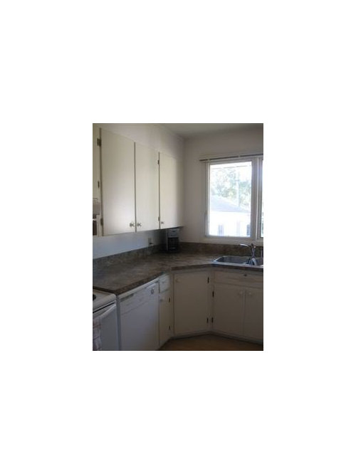
My sister, who is very challenged in the decorating department, has given me full reign as her "decorator" (which I may add I am not, but enjoy testing my abilities). They are long term renters (been there for 4 years and just signed for another 2) and the landlord is having the whole place painted in their choice of colors this coming monday. Their home has individual rooms with the exception of the living room and dining room that are together. They are starting with the kitchen.

The cupboards in the kitchen were painted by the previous tenants who obviously didn't know what they were doing. They are peeling bad (I'm pretty sure it is a latex over oil job or vice versa). He is going to strip them and repaint them. It is a very small u shaped kitchen. The cabinets, countertop and white appliances are staying. She is replacing the hardware and putting up proper window treatments too.

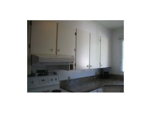
The kitchen (fridge is to the immediate right of the picture directly across from the stove:

***The cupboards are built-ins. Would you paint the upper portion of cabinets one color and beneath that the wall color?

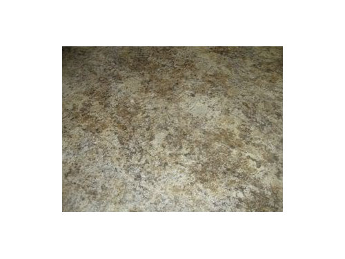
The countertop:

She has a mish mash of furniture colors from cherry wood, to oak to chocolate microfibre couches in the family room. She will have to make decisons on the furniture too. They would like one paint color throughout the house that is neutral, but not white. They are more traditional folks!

I was thinking of picking a taupe color that is on the light side. She loves red! I would like to use that as the accent color.

What specific colors in the BM line would you recommend for a) the cupboards b) walls c) trim?

Comments (19)

  • 16 years ago

    Any help out there Please?

  • 16 years ago

    Is there any black in the countertop? I once had a tiled fireplace that was mostly black, gray and white with some tan in it as well, and we painted the walls taupe and trim white and it really made the fireplace sing. So I would be inclined to try taupe walls with white trim and cabinets. Sorry I don't have any specific color recommendations.

  • 16 years ago

    Since this is still a rental the cabinets are still going to have to be white right? You can't do anything like this:


    I would find some fabric that you like for curtains and use colors from there to paint the walls. Try to get an idea if you want a vintage look or a modern look. The kitchen is small so a bold theme-y kitchen won't work.

    Any possibility the cabinet doors can just be replaced? Maybe use a couple upper cabinet doors with glass?

    Here is a link that might be useful: Colorful Kitchens

  • 16 years ago

    I wonder about furniture fabric colors. Chocolate fabric doesn't always go with taupe walls if one has warm tones and the other has grey tones so be careful.

    Take a look at Muslin and Wood Ash by Benjamin Moore for the walls; White Dove for the trim and Dry Sage for the cabinets. It's hard to see what colors are in the countertop, but maybe these might work.

    These are all "not in your face" colors that should be easy to work with.

    Hope this helps.

  • 16 years ago

    Yippee, some great advice and suggestions.

    Dilly Dally: the cabinets can be painted whatever color they choose however I am certain that the landlord would prefer to have a neutral color for the next tenants. I would prefer for them to have color so it doesn't look so pathetic. They most definetely are a traditional family and are looking for something more updated and modern. With that being said, it isn't an option to change out the cabinet doors. She also has to much "stuff" behind those doors to remove some of the upper doors and have them opened to the "eye". Yikes!

    Monablair: Thanks for advising me about the chocolate/taupe clash. I have never picked one that didn't work together so knowing this is very good. I think I will go over there tomorrow and take more photos of their living room/furniture and fireplace to ensure I don't make an oopsie in their home. Funny how it isn't so stressful to make an error in your own house cause it can be fixed, but the pressure I feel about hers is stressful.

    The window expands almost the entire space above the sink and faces south. I was thinking a box pleated valance? Privacy isn't really an issue so maybe blinds aren't really necessary. What kind of window treatments would you suggest?

  • 16 years ago

    Yes, please have more photos.

    I'm confused by your statements of them being traditional and wanting modern.

    Larger room shots, too. :)

  • 16 years ago

    I will post more photos tomorrow night.

    Parma42: I was trying to say that they aren't into country, vintage, ecletic or that sort. they are on the traditional side but like some of the more modern finishes of today. Make sense?

  • 16 years ago

    Gotcha.

  • 16 years ago

    Sounds like a good idea to use neutrals and add pops of color using accents...
    white dove for cabs and maybe something simple like standish white, lenox tan, or shelburne buff for walls?

  • 16 years ago

    Back with an update and more photos of the entire space. After being there it really will be a challenge to pull it all together. With your help I am hoping to pull it off. It just seems so "chaotic" in styles right now. The curtains have to stay in the DR and LR. The blinds are coming down. The trim will be painted all one color. Which one? Unfortunately, the floors are what they are. Money isn't flowing freely so the choices I make must be right the first time. From my research it appears that BM Shaker Biege is a safe wall color throughout. What do you think after viewing all the photos below?

    Here is the space I am working with:

    Upper Cupboards:

    Countertops:

    Office area: She DESPERATELY wants to have a RED accent wall. Could the wall with the teeny silver picture above water cooler be her red and then build a desk below?:

    Dining Room:

    View of living space:

    Fireplace in family room:

    TV armoire across from the fireplace:

    Flooring is laminate in the kitchen and real hardwood in the dining/living room.

    Really need your input on the kitchen cupboards! I'm baffled in where to even start? Color? Where to start and stop? Hardware will be changed out. If I go ahead and do that red accent wall in the little office, how about BM Raspberry Truffle?

    Moving onto the living room. How do you think the Shaker Biege would look with the fireplace brick? Can't touch the mantle or brick!

    Things I already know:
    * The furniture is a mish mash of styles.
    * she decorates with lots of little things
    * her pictures are all floating
    * I HATE that picture above the fireplace and although she won't admit it she does too. In an attempt to decorate they went out and bought it, paid a ridiculous amount for such a thing and now don't want to part with it. ugh!
    * They want an open airy feeling, but homey feeling! Does that make sense to anyone?

    Please remember that this is a rental they've lived in for a while and will continue living in. The landlord is allowing them (me!) to pick all the paint colors. Did I mention that I have to have all color selections by Saturday morning. YIKES! I WANT to hear ALL your thoughts, ideas and suggestions please.

  • 16 years ago

    Hmmmmm....I wish you could post larger pics of the kitchen. It's hard to get a real feel for the room with them being on the small side.

    My initial thought is I'd go with a bolder middle-tone earthy color (from the countertop) on the walls and stay with a crisp white on the cabinets. Then, I'd add some stainless pull bars (easily found inexpensively on Ebay) on the cabinets to dress them up.

    BTW, that fireplace is beautiful!

  • 16 years ago

    I think a rich cream colored cabinets with updated pulls either sleek brushed nickle or more traditional. Yes to the red wall and built in desk! That would be so great and space saving. You are a great sister!

  • 16 years ago

    OK, I'll weigh in here...I'd do the cabs a white (like BM's white dove, SW's Alabaster) for a couple of reasons: It appears that there is a dishwasher right next to the range. This looks like a modification that has resulted in the range not being centered under the hood. Is that the case? I think if you match the cabinet color with those fixed appliances, they sort of disappear, along with the awkwardness of that misalignment. The frige is white too, right? I think the kitchen will appear larger without any contrast between the cabs and appliances.

    I can soooo see Lenox Tan on the walls here (but maybe at 75% if full strength is too dark), black or ORB knobs on the cabs, and a red accent wall. Because of the earthy tones in the countertop, I'd be looking for an earthy red. If you are over at SW, check out both #7587 Antique Red and #6608 Rave Red. (I'm unfamiliar with Raspberry Truffle)

    I'd also do the kitchen ceiling in 25%-50% Lenox Tan (or whatever wall color you choose) to avoid a stark contrast. This will make the room feel larger too.

    I love your box-pleat idea for the kitchen window. Either that or a roman shade. Could the fabric be in red tones to match that accent wall? I'd leave the miniblinds in place, but would keep them pulled up all of the time if privacy is no big thing.

    I'd bring that Lenox Tan right into the LR/DR too. Maybe look into some chair pads to match your kitchen window treatment, add a runner to the table, some throw pillows in the same fabric would be nice too. What a fun project!

    Your sister is very lucky to have your help...but so is that landlord! To have tenants who care for the house is as much as anyone can ask for!

  • 16 years ago

    Okay, back from the Paint store and I bought the BM fan decks so I have the actual colors in front of me while I sit and figure this out with you all. I have never seen the Aura colors but picked 4 that I am really drawn to for this project. The colors are Hush (AF-95) for the walls, pomegranate (AF-295)for the accent wall, and frostine (AF-5) for the trim. I thought maybe the lower cabinets could be painted French Press (AF-170). If no go on the dark lower cabinets can the trim and cabinets be the same white? (The brown cabinet color would be repeated in her brown furniture).

    Charlieinnj: I resize all the photos to medium in photobucket b/c someone told me in a previous post if the photos are bigger people tend to skip the thread cause they take to long to load. Not sure if that's true. There are 2 larger photos at the bottom of this post.

    CooperBailey: I am a "great" sister in her eyes for spending time putting it together. We will see if she still thinks that way when it is done ;0).

    Tomorrowisanotherday: Thanks for the detailed response. I too think the lenox Tan would be great. I've never reduced the strength of the color...how does that work? They have the worst lighting in that house and their lighting options are NIL. Lamps in the room is limited to the 1 white one in the corner by the end table.

    The stove is lined up under the exhaust fan, just a bad angle that I took it at. I am thinking that white would be best too especially with the white appliances. However she really wants a darker lower cabinet. What do you think about the French Press AF-170 on the lowers?

    Love your suggestions about bringing in the red through the fabrics. I was thinking of sewing something like this but with red:

    Keep those comments and suggestions coming ... you are all helping me think this through.

  • 16 years ago

    Unfortunately I don't have an Affinity fan deck, wahhhh! All I could do was to check the BM website to check your colors. I just can't see doing the cabs really really dark like the French Press, not even just the lowers. In fact, if you do a colored cab, then I think that the uppers and lowers should all be the same color (maybe something like Huntinton Beige (HC 21) and then use a lighter color for the walls (maybe Monroe Bisque, HC 26). With a very light wall, I'd be a bit concerned about the contrast with the red on the accent wall. Speaking of the red...Pomegranate looks too purple for my taste, but Caliente looks good. But that may just be my monitor!

    Based on the computer fandeck, I could feel Rattan for the cabinets and Spa for the walls, with an accent of Caliente. Check those on your real fandeck and see what you think.

    IMO, dark lowers would chop up the space and contrast too much with the appliances. If they were stainless, that'd be different.

  • 16 years ago

    I too think the kitchen will appear larger without any contrast between the cabinets and appliances. I'd definitely put some nice cabinet pulls on the doors and then get a better fixture for overhead lighting in the same finish (see the fixture used in this bathroom makeover...).

    Here is a link that might be useful: Track lighting

  • 16 years ago

    AAAAHHHHHHH....stressed cause I've got to figure out these colors. The tobacco road color threads have got me crazy! Is that a color I could possibly use? How can I get the formula up here in Canada?

    I've come to the realization that she ain't getting dark cabinets. I will go with white, ugh, which white don't know yet. Tomorrowisanotherday: I will check those colors you suggested. Thanks.

    The lighting is horrible and I couldn't agree more that they need something different. It should be one of the FIRST things they do cause that is 75% of the problem. You can't see yourself in there cause of the 1 40 watt bulb. I will try and squeeze that into the end if money allows. Unfortunately, this is a rental so the landlord is only going to agree to pay for so much before he says "no more!" (he just put in a garburator)

  • 16 years ago

    Can't wait to see how things progress with this! I remember when I was in rentals, I'd put up lighting fixtures (and store away the landlords) and when the time came to leave, I'd put thier's back up and take my fixtures with me.

  • 16 years ago

    Running out the door... real quick, during my craze with Tobacco Road I've discovered it looks a lot like BM Shelburne Buff. (think i'm spelling that right..) Check it out. I'll check back in a bit.

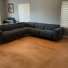
    Here's a photo of what it looks like in my LR. This is at night so it's a little darker here. It lightens up a bit during the day.
    {{!gwi}}

Sponsored
Buckeye Basements, Inc.
Average rating: 5 out of 5 stars40 Reviews
Central Ohio's Basement Finishing ExpertsBest Of Houzz '13-'21