Software
Houzz Logo Print
faith__gw

Review/Critique Kitchen Design?

14 years ago

Hi everyone! Long-time lurker, huge fan of um well, all of you. I was curious whether anyone had the inclination to offer feedback or advice on my kitchen plan.

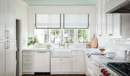
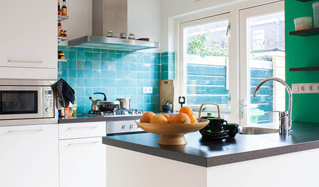
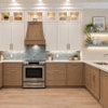
We're adding on to an old house and doing an open kitchen/dining space. Our tastes run to modern and clean-lined but we also want to respect the home and the neighborhood. I'm very inspired by some kitchens that did this:

- Ryan's SF kitchen

- Brooklyn kitchen

- Grey and white kitchen

- {{!gwi}}

So, on to our designs. We're doing an open kitchen with no upper cabinets ( I'm very short so this is practical as well as aesthetic). Lots of light. IKEA cabinets, with custom fronts from Semihandmade in LA.

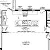
Very curious whether anyone has any general thoughts on layout -- especially those of you who have a similar layout or flow. Any issues to be aware of?

Also curious whether you have any thoughts on grey-blue island vs. perimeter. I'm kind of liking having the splash of color right in the middle of the room -- feels like it warms things up.

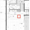
The layout, via IKEA, and two design options from our architect.

Comments (9)

  • 14 years ago

    I love the clean lines and pop of blueish color. Your IKEA layout shows and overhang... I'm assuming for eating. The architect's drawing does not. How much space will you have between the barstools and your table? will your table be rectangular as shown?

    You know... you are going to be asked if you can post a layout that shows the kitchens orientation to the rest of the house. It really helps with commenting on flow and traffic patterns.

  • 14 years ago

    @remodelfla thanks so much! That's actually a quirk of the IKEA diagram - we're not actually doing an overhang (those are just shallow cabinets filling out the 3-foot-wide island). With having such a big dining table so close, in the same room, I just don't see us eating at the island. (Huge dining table because I have a huge extended family, and we have large groups of people over to dinner all the time...)

    There are about 70 inches between the countertop and the dining table.

    Here's a diagram showing more of the existing house. (It's a little outdated - the island isn't positioned quite right, and it's too long.) The current kitchen is currently against the left wall, a space which will be turned into a powder room, laundry, and walk-in pantry, plus a recessed area for the fridge.

  • 14 years ago

    This layout is a little difficult to read, but I think it might have the changes I was going to suggest...

    I like the overall layout, but I would put the ovens on the other end, and have the windows and cooktop more centered in the room. The sink could move towards one end of the island, so it's not directly across from the cooktop.

    As for the color...it's a nice, bright color, but I think it looks better on the perimeter, with the wood island. Maybe it just blends well with the floor and makes the area seem larger?

  • 14 years ago

    For a contemporary design I like the ovens where they are. I wouldn't want to block all that glorious natural light and view with a full height cab. Your IKEA design shows 4' between the island and perimeter and the other shows 3 1/2'. Which is correct? You're fine with 70" between the island and table. Since it's your only sink and not a prep sink I feel you're good with it offset slightly from the cooktop. That would allow for the DW and dish storage in the island all easily accessible.

    I too used IKEA boxes and slab QS oak fronts from Scherrs. I think you'll be very happy with the outcome. My style is a mix of contemporary and vintage...actually... my style is a hodgepodge. We use a natural wood color with clear coat that is very similar in color to the floor. We have one accent piece in a greenish blue color. Our layouts are very different as mine was dictated by keeping the kitchen in pretty much the same location. I didn't have the option of all that wonderful natural light in the kitchen. The design feature of a hood flanked by windows with no uppers is one of my favorite looks. I look forward to seeing this come together.

  • 14 years ago

    The lay out looks good to me, as does the whole kitchen. I think it will be gorgeous. I too like the ovens where you have them currently. I much prefer the island in the blue grey and I like bringing the colour of the island up the side of the oven wall and around the window frames. I wondered if you could continue it up along the bulkhead over the fridge and around the pantry, but now I think not, the white works well.

    Can't wait to see the finished product.

  • 14 years ago

    It works better to me when the blues are massed together.

    I would make the windows near the cooktop a bit narrower (like 3-6"), but taller like an entire foot or more. Windows that reach up higher tend to let in more light and ones that reach down towards the counter improve the view and feeling of openness. I have windows on both sides of the range that start about 10 inches up from the counter top and its ok for me at my height (5'7"). If I was any shorter, I'd be unhappy.

    I wish I had left a bit more wall showing between the windows and the hood. It's because hoods are deeper than what's shown in a design program. To be effective, hoods should be 24"-27" deep and not the 18" drawn by ikea.

    As far as I can tell from the drawings, the dining area is about 10 feet wide - inclusive of the aisle that needs to run in front of the island. The table needs to be placed at least 32" off the sidewall and at least 54" from the island with 60" being preferred. A 54" aisle will maintain an ok walkthrough of 30" between occupied chairs and the island. A 60" aisle maintains a open distance of 36". I'd hesitate to go below 54", particularly if the back contains some sort of outdoor cooking or entertaining area.

    Using the measured width in your current layout of 128-5/8, to get a 54" aisle, you'd have to use a table not wider than 42". For 60", the table would need to be no wider than 36". I'm not seeing any way that you could have a 70" aisle without a banquette on the sidewall.

  • 14 years ago

    Glad to see someone else with an island although mine is 17ft long! My style is more traditional/ transitional than yours but I thought this pic might give help you. It modern like yours. I saved this pic becasue it was one of the few kitchens I have ever seen with an island as big as mine. I am not great at layout, but I think yours is nice.

    [Modern Kitchen design[(https://www.houzz.com/photos/modern-kitchen-ideas-phbr1-bp~t_709~s_2105) by San Francisco Architect J. Weiss Design

  • 14 years ago

    Meant to say Glad to see someone else with an BIG island

  • 14 years ago

    Thanks so much for all your feedback, everyone! Really helpful.

    @gaonmymind that's so funny! That photo is on my top 10 list of kitchen inspiration photos...!