Software
Houzz Logo Print
johnatemp

Whadda ya think?/

19 years ago

I ordered this oil from eBay - not very much $$- so I felt like it was worth the gamble. I'll need to get a big oversized frame for him.

Any thoughts on the rooster? I got the fruit at a local shop.

{{!gwi}}>

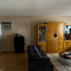
Here is a shot of the eat-in kitchen.

{{!gwi}}>

I know I have posted about this room b/4 but I can't find my post!! I hope you don't mind the repeat.

Any thoughts?

Les, if you see this....I am still considering putting up panels on the hearth room side. Either that, or just taking down the drapes and leaving the roman shades up & making seat cushions out of the drapery fabric. I hung the fruit prints with the thought that panels would be covering the light switches by the door.

Smiles:)

Comments (17)

  • 19 years ago

    Mat him up and frame him big. Make him look important. He's a sexy rooster.

  • 19 years ago

    I love that rooster! A simple subject done well. Post again when you have it framed.

  • 19 years ago

    I like the rooster, and agree he needs a big frame and matting.

    Weren't you originally going for a wine theme there, or am I confused (as usual)?

    I am thinking about the windows, and would love to see another face on shot of the window by the sideboard. Wondering if it will feel a bit 'hard' in the dining area if you get rid of the panels? Wondering about cutting them down and putting the stripe trim on the outsides, to make cafe curtains to sit on the lower half of the window to the floor. Then using the rest of the fabric for seat pads (one side) and the coordinating stripe on the other side.

  • 19 years ago

    Someday maybe I'll make a great score like that on e-bay! This is my 1st time seeing your DR & I really like it alot.

  • 19 years ago

    Nice find, plus can I ask where did you get your material for your curtains? I love it. Thanks in advance.

  • 19 years ago

    LOVE the rooster! I love the colors, his position....everything. Good find!

  • 19 years ago

    I've been looking at your posts - your rooms are really coming together! Look great. I like that rooster in your space, seems to fit well. Agree with the others on big frame and matting.

    I tried to look around to find your paint color in another post. You mentioned Wilmington Tan - is that the color in this room? It looks so much lighter to me - but I really like it, whatever it is! Please let me know. Thanks.

  • 19 years ago

    I agree with the rest- mat and frame him BIG. Patrica is so funny but I gotta agree, he's got the sexy thing going! Maybe a red mat to bring out the red in him and a beautiful large wood frame.

  • 19 years ago

    Great find on ebay! It blends so well with your room. I've bought a few inexpensive watercolors off ebay that I've matted & framed and they turned out beautiful. I like to support the self-representing artists. There's so much talent out there. You've inspired me to go for the larger oils now.

  • 19 years ago

    Very cute but I must emphasize the need to frame it very big. Large mat and large frame.

  • 19 years ago

    Love him, mat and frame him up and get us a photo soon. I'm thinking red mat also, but nothing too glaring, just one that will pull the red from the rest of the room over to him. Can you get a close shot of your toile drapes for me? I'm on a search for some toile with gold.

  • 19 years ago

    very nice

    now go to a place that has a lovely frame, cut out the painting and stick him in it. Cheaper than a new custom frame!

  • 19 years ago

    Pretty,

    I also like to support the self-representing artists.

  • 19 years ago

    Well, I took him (i'll have to come up with a sexy name for him - LOL, Patricia) to Hobby Lobby - ready made frames1/2 off. But she said you can't do a mat with an oil unless you want to put glass over it.

    I do have a wholesale frame resource so I will look for an "over the top" frame for him.

    I was very impressed with this eBay seller - paid on Fri and received him on Monday!!

    Brutuses & Cindy - click on the link below. It is a Waverly fabric. It was distributed by Magnolia Fabrics @16/yd. I got it from my local fabric guy.

    Yes, the paint is BM Wilmington Tan - my default color. I have used it in 2 houses now. On the ceilings, also.

    Les, you are such a sweetheart ( with a good memory). Here is a front shot. You are such help:)

    >

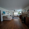
    Here is the other side of the room..
    {{!gwi}}>

    Les, I am such a symmetry gal...I like your idea of adding another panel to the hearth room side but would rather have 2 panels. I think if I just trim a little (about 2 inches) bit of the mantle off it would give more space for the stack on the right side. Does that make any sense??

    Smiles:)

    Here is a link that might be useful: Saison de Printemps-Saffron

  • 19 years ago

    johnatemp
    what a classy looking rooster! Love him... he will look great framed..can't wait to see.
    beautiful home!!
    Ree

  • 19 years ago

    I LOVE the Rooster and all the colors you have!! So pretty!! Here's what I'm seeing with the space...move the fruit pictures over the spot where you now have the rooster...frame the rooster in a substantial frame...you might even try hitting antique stores to see if you can find that size in an older gilded frame...atleast 6 inches in width...then put the rooster where the fruit were but try and find a tall narrow piece of furniture (pie safe...doubles as storage or even a tall planter with a fern in it and hang the rooster above that.....the two fruit pictures will balance well with the buffet piece and the rooster is such a stand out solo picture that he'll do better higher at eye view...you just need a tall piece of something to go under him...that's what I hate about decorating....always needing one extra piece! :) Love your room!!
    Tara

  • 19 years ago

    Please do not trim off the mantel! It will then look odd for the fireplace wall, and the drapery will still look like it is crowding the space. Having a single panel pulled to the left side is hard when you are 'symmetry-minded', but I think will be very pretty once it is hung. I think it will actually create a visual separation between the dining and hearth areas, and make that end of the wall feel less bare. Make the panel full enough that it looks like it would close over the whole window, and hang it outside the window space enough (yes, cover the switches) that it doesn't appear to crowd the window.

    Just for the heck of it, try using blue painter's tape to tape a bedsheet up on the one end of the window, as a panel might be hung, and leave it there for a couple of days. It isn't going to look the same as the drapery fabric, of course, but it will give your eye a chance to adjust to the 'unbalanced' look.

    FWIW, I would also move the panels on the other window up so that they aren't breaking at the floor, but are about 1/2 inch above it. I think they would look nicer if the tops of the panels and the rod were above the top of the shade underneath, rather than right on it - and it will then match what you hang on the big window/door.

    Oh, yeah, one other thing. Try hanging the fruit pix offset from one another - so that the one on the left is about 1/3 to 1/2 the height of the frames higher on the wall than the other one. You will probably need to move one up a bit and the other down a bit to split the difference. I think that will help the feeling of emptiness that lmhall2000 was addressing, as will having the curtain panel hanging there. I don't think you have enough room for a furniture piece on that wall if you want enough clearance for people to sit there comfortably.

    Then seat cushions for all the chairs out of the Provence Check- Bleu. A runner out of the Saison fabric, with banding in the check. Pillows for the hearth chairs in the stripe on one side, check on the other, pulled in at the middle with an oversized covered button in the Saison fabric, welted with that as well.

    Oh, and I love the lamp on the sideboard, but the shade is sitting up kind of high - can you try a shorter harp on there? It appears it is the correct shade for the lamp because the shade matches the body of the lamp. But the switch and base for the bulb shouldn't be visible - it looks odd. A shorter harp should cure that.

Sponsored
Snider & Metcalf Interior Design, LTD
Average rating: 5 out of 5 stars25 Reviews
Leading Interior Designers in Columbus, Ohio & Ponte Vedra, Florida