Software
Houzz Logo Print
61tinkerbell

Need Confirmation on my color choices!! PLEASE!!

15 years ago
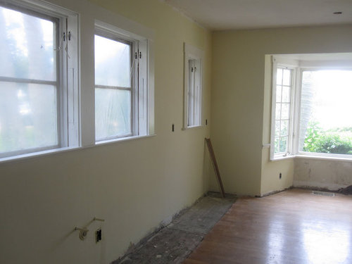
I struggle so much making decisions! I really need feedback.

** Cabinets, picking the white paint color has been by far the hardest! Everyone raved about BM White Dove, and I bought a can of the enamel, and liked it - but as the weeks went by, I found the color just way too yellow. I think I bought about 4 more colors, and just couldn't get that "yes" this is the one feeling! Long story short... as I stared at the paint and the chips, I realized that the BM White Dove on my trim didn't look at all like the chip! So, maybe it was mixed wrong, or the oil rapidly turned yellow... but I went and bought a gallon in the Aura, and it looks white, no yellow. (hope it doesn't look too white!)

** Next.. the wall color. At started with a green, and didn't care for it (but love green in general) switched to a yellow... another hard color to pick! I've tried SW's Lantern (too orange) BM candlelight (too bright yellow) BM Windham Cream.. I like it a lot... but maybe a tad to much color, so now I have BM Fresh Air on the walls. It's really a nice creamy yellow, but maybe a tad too light! ? I'm driving myself crazy!

I hope some of you paint experts can chime in. I just put a deposit on my soapstone counters... pictures below!

BM - Fresh Air on Walls

BM - White Dove Trim

Barocca Soapstone

From Sunrise - work in progress
{{!gwi}}From Sunrise - work in progress

Comments (12)

  • 15 years ago

    So which color are you thinking of changing? The walls? The trim? The cabinets? I understand your confusion. I think it comes from too much shying away from color rather than too much color. The current color is barely that. More of an off white than a light yellow. OK if you're going for one of the all white kitchen looks, but not enough color to stand up to a high contrast black and white kitchen. You need something with more oomph for that. If you like green, a pretty fresh green is Behr Ryegrass. It's not a whisper green, but it's not a shouty one either. I has slightly yellow undertones that work really well with warm colors.

  • 15 years ago

    I think the trim looks great & the soapstone pairs really well with that light creamy yellow. You can always bring in more/brighter colors with window treatments, seat cushions, art, etc. What color are your cabinets? (FWIW you definitely don't want SW Alabaster -- I think it looks great on my cabs & kitchen trim but my husband keeps saying "I didn't know we were going to have YELLOW cabinets.")

  • 15 years ago

    sweetandrew, I forgot to mention, SW Alabaster was one of the colors, and I thought that was actually "the one". I saw a pink tone in it.. isn't that weird? Cabinets are white - BM White Dove.

    GreenDesign, I think I feel confident with the BM White Dove. Seems like it is always a winner on this forum, and the finished kitchens always look great... I do think the current yellow is very light, and I guess that is my biggest struggle.. windham cream would be the next color up (or happy something on the fan deck). I like the green on the original old kitchen, but I do like how bright and happy the yellow makes the space feel.

  • 15 years ago

    This is what I learned about color coordination. What I would suggest is that you find a piece of fabric that you love. Ignore the pattern and instead just look out how the colors are combined.

    Take a few fabric swatches into the kitchen. Your fabric choices should, if possible, include the color of your soapstone as that is the only permanent color at this time. If you can't find a fabric that includes the soapstone color, I would suggest holding the fabric pieces up to the soapstone to see which ones look best with the soapstone. When you figure out which one you like the best in the kitchen- take your colors from that fabric and use them in various parts of that room. The fabric designer has already done all the work for you in coordinating the colors on the fabric. All you need to do is decide which of the colors will be dominant in the room and which you would like to use as accessories.

    Also, as a side note- a friend of mine hired a designer who told her that you should always have some small accessory in every room that is red and one that is black. She said it brings life to the room and avoids that "matchy" feeling.

  • 15 years ago

    Hi Tinker - I'm struggling with paint color choices as well. My cabinets are Dove White from KM (similair color to BM I'm told) and have the walls painted with some flavor of BM Sage Green. I'm thinking of going to yellow as well so please let us know what you decide.

    Not sure what overall look you're going for but for what it's worth, I really like the color combination you have now.

  • 15 years ago

    I have learned a lot about the color families at a blog called Colour Me Happy. Maria explains about the undertones of colors and how to choose colors that complement each other.

    An art teacher taught me a trick to isolate colors to better see the undertones and I have used it over and over to choose colors. Begin with a white piece of paper and fold it in half. Cut a hole in the paper in each half. Lay the paper on the two colors you are comparing so that only the color shows through the holes. It won't take long to learn how to see how the undertones of the colors relate to each other.

    The paper and the holes cut in the paper can be adjusted to the size of the color swatches you have. With color cards from the paint store, cut the holes a bit smaller than the color block. For colors on fabric or walls, cut larger holes.

    The trick is to isolate the colors from their surroundings.

    Here is a link that might be useful: Colour Me Happy: White Kitchen

  • 15 years ago

    Are you going to have any curtains or valances? Do you plan to have all neutrals, or is it a yellow and green scheme? Yellow/black and white? Yellow and blue? It makes a difference to know what other colors you're planning to use...to pick the right wall color.

    The soft yellow you have now is very neutral. If that's what you want, it's a good choice. I liked the green, too, but maybe in a softer, leaf green shade. It was a little dark, in the 'before' kitchen, but green looks so wonderful with wood floors, white cabinets and soapstone (IMHO).

    A soft, leafy green will look great with golds and oranges in the fall, red at Christmas and all the blues, lavenders, pinks, etc. will look lovely in the spring and summer. Can you tell my mom has a green kitchen...and likes to decorate for the holidays/seasons? :)

  • 15 years ago

    I like your choices and think you are on the right track. I think if you accessorize with some sort of silver, either chrome, ss or nickel, you will have a completed look. You can always add a accent of green, eggplant, lavender, blue or gray depending on the look you want....

  • 15 years ago

    Thanks for your input everyone.

    I do plan on having some type of window treatment, having gave it much thought as DH and I are tackling restoring the whole house, so my days are busy working!

    I do plan on chrome, just to stay with the period feel of the house.

    I think what I am going back and forth with is the tone of yellow... I really like this color, and it looks close to perfect in part of the room, and maybe too pale in another. Should I make it deeper, so it is a little stronger in color?

    These are my choices. I do want to stay with the yellow... just not sure BM Fresh Air, or go back to BM Windham Cream... or choose a completely different yellow!

    From Drop Box

  • 15 years ago

    I love the slight contrast with the trim and paint color. The paint color is beautiful. If it was me I would keep it but you are the one who has to live with it. I think it is hard right now for you to see everything together and you are only seeing it as one part of the whole picture so it stands out. The actual amount of wall color will be much less once everything is in the kitchen.

  • 15 years ago

    lynn, as I was standing in the kitchen today, I realize that very little will show! I think I will keep this color - as if I should not like it once it is all put together, it will be an easy change! I painted a small section Windham Cream - and it is so little difference, I think I'm over thinking things.. again!

  • 15 years ago

    Can't wait to see it finished! Good luck!