Software
Houzz Logo Print
maybeiloveyou

Our small budget kitchen is... done (mostly)!

15 years ago

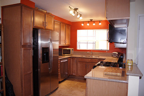
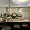
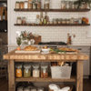
Windows, blinds, and lights need to be fixed, but it's done for the most part! We had a small budget so we couldn't do anything too extreme (Calcutta marble is sadly only in my dreams!). Also we live in a condo, so walls can't come down or anything. Kitchen is roughly 9x10'. It thankfully only took about a month to get everything done. Everything was done through Lowe's and they did a great job.

Cabinets are Shenandoah Dominion in Maple Spice

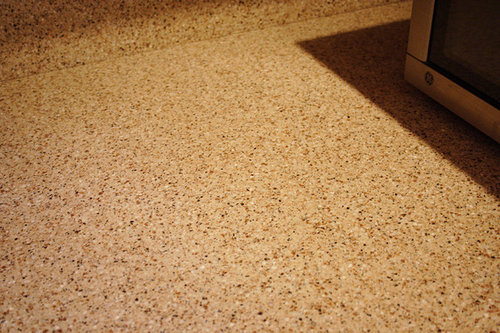
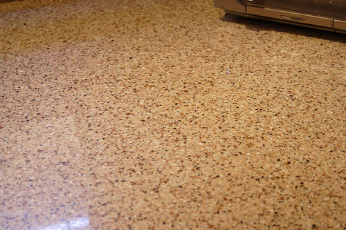
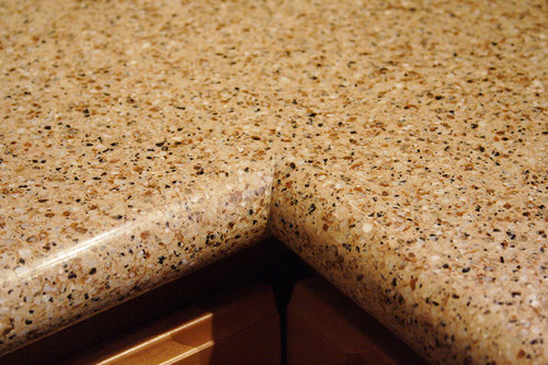
Countertops are LG Viatera Quartz in Cabo

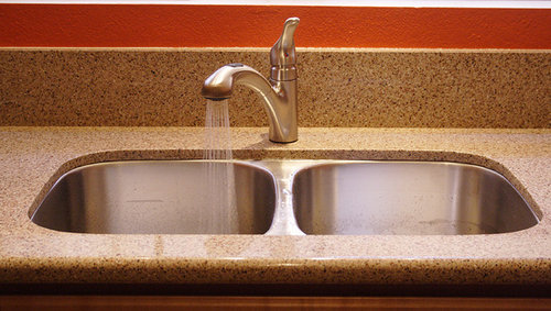
Sink was included for free (Lovello)

Faucet is Moen Renzo

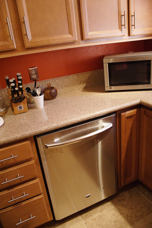
Dishwasher is Maytag

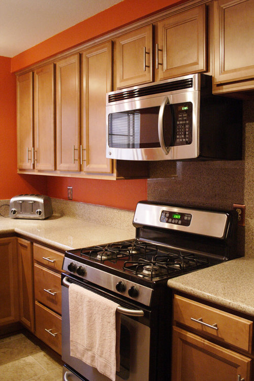
All other appliances are GE (only new one is the OTR microwave)

Floor is Del Conca Noce ceramic tiles


Our old 25yr old kitchen


Ignore the finger prints on the dishwasher and the utensils in cups! Left over from our no-sink days lol.


There's a seam in there... somewhere ;)


There's a seam in here too.


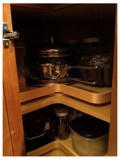
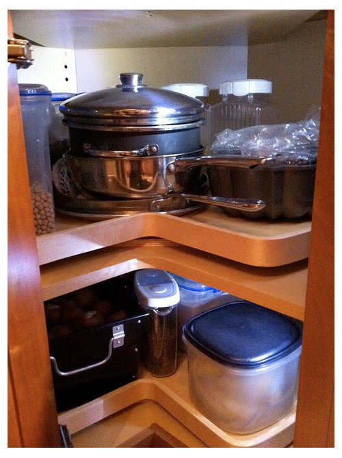
Super susans were really dark so I stuck some battery powered LEDs on the side (see bottom of: http://ths.gardenweb.com/forums/load/kitchbath/msg071333141518.html?6)


With the lights!

Comments (25)

  • 15 years ago

    congratulations! I love the orange, it is so warm and inviting. You have done a fabulous job.

  • 15 years ago

    Looks great! Good idea with the lights in the Super Susan. Really makes a difference.

  • 15 years ago

    What a transformation! You've really brought the kitchen to life and made it fun and inviting. Sure doesn't look like a budget makeover to me!

  • 15 years ago

    Very nice! :-)

  • 15 years ago

    I think that you were really smart to extend the cabinets out over the refrigerator. Beyond the additional storage space, that simple change makes the kitchen look much more cohesive. I also really like the color\pattern of your counter tops. That color combination is going to be very forgiving over time. Even if the counter gets stained, it will be very difficult to detect.

    I like the pulls your selected for the drawers and cabinets. They look a little architectural. They work well.

    You should be very happy with the way your kitchen turned out. It is very functional in terms of appliance layout and counter space. Plus, it looks good. :)

    Rob

  • 15 years ago

    it turned out great! love the colors. I don't usually like spots but you counter top is very nice. great job they did on the seams also!

    the lights in the LS sure do make a difference! I found the Sylvania online but couldn't bring up the energizer light. I'm gonna pick one up for my pantry if I find there isn't enough light in there.

    how do you like the light bar over your sink? I have a 2 bulb one picked out for over my sink and have been wondering if I'll like it ok... I have a cab on either side of my sink so 2 bulbs would be the max I need there.

  • 15 years ago

    Everything looks great together! Love the color palette--especially the orangey walls. They coordinate really well with the counters.

  • 15 years ago

    It's beautiful.....love the color palette! enjoy your new space :)

  • 15 years ago

    Hooray for you - enjoy!

  • 15 years ago

    Great Job!! Congratulations!

  • 15 years ago

    Thank you so much for all the positive comments!

    @lazydaisynot... Well, I suppose it's not "budget" in a sense, because we still hit the low 5 figures! However, it is definitely not as extravagant as some other kitchens - we just really could not afford to spend $20k, $40k, etc.!

    @miamirob... the countertop color/pattern has proven to be VERY forgiving! When we spill stuff we can barely see where it is. I kind of feel that we should've gone a little lighter because the kitchen is a little too blendy colorwise, I think, but it is what it is!

  • 15 years ago

    Love the transformation! The dramatic wall color, the warm maple cabs, and the quartz--lovely! Enjoy!

  • 15 years ago

    Very pretty! It somehow seems larger in the new pix despite using darker colors and adding cabs. You seem to have made the most of the space and should find it a pleasure to cook in....

  • 15 years ago

    I just had to come take another look at your kitchen. The combo of orange walls with the wood and your stone is great. I've been recalling two kitchens from my childhood, both with wood cabinetry. One had coral colored laminate counters with some sort of tiny textural looking design. The other had deep orange-red tiles. I've been wondering why nobody uses those kinds of colors, since they make the space so warm and vibrant. I'm very nostalgic for those kitchens, which may explain why I'm so drawn to yours. (My kitchen is white!)

    Re: my comment about budget, I didn't mean to quibble with your use of the word. Just meant to convey how much I liked the kitchen and didn't find anything lacking : )

  • 15 years ago

    You did a great job of remodeling your kitchen. I love to see those who can do it on a smaller budget and make it more personal. Enjoy!!!

  • 15 years ago

    You guys did a fantastic job! It all looks wonderful!

  • 15 years ago

    Wow, this is a beautiful kitchen. I love the cabinets, they're so rich looking, and the floors are fantastic.

    The whole kitchen looks so warm and inviting. Great job!

  • 15 years ago

    Love the quartz counter top with the wider b/s and slab behind the range. I guess the hunts back on, this time for lazy-susan lights which I gotta have to make that corner much more getatable. Did you know in addition to being a sensational color for your kitchen, it also stimulates the appetite, stimulates activity, and encourages socialization!

  • 15 years ago

    Thanks again everyone. I appreciate it so much!

    desertsteph: Sorry I missed your comment before! The Energizer ones are from Target although they aren't showing up on their website� hmm�

    As far as the light bar, that one works really well. The position is good and it gives plenty of light. The light bar in the center works less well because we are standing in our shadow at the stove and adjacent counter. So we need to fix that light / add lights.

    dianalo: I feel that way too. It's funny that even with the overall darker colors, it seems more spacious when I stand inside. I wonder why that is.

    lazydaisynot: Thank you so much! If I had it my way, honestly, the kitchen probably would've been white - it always looks so clean and bright! I think the current trend is towards a more modern, cleaner look which may be why these colors aren't used except for accents. Sometimes I look at my pictures and think that it could pass for the "before" pictures for some members LOL. I took no offense by your post, I just thought I'd clarify my wording. :)

    pamike1: Thanks! I was actually very hesitant about a 6inch backsplash, but it turned out ok! I do love the addition of the lazy susan lights because it's so much easier to see everything. I didn't know that about the colors� that must be why I'm so hungry lately! ;P

  • 15 years ago

    I'm usually a white kitchen fan but this is SO warm and inviting, as others have said - love those light fixtures. Cheers!

  • 15 years ago

    Very nice kitchen redo! :)

    I too think it looks bigger, and here's my theory (for what it's worth)...

    1 - You went from darker cabs and lighter walls, to lighter cabs and darker walls.
    The dark cabs were leaning forward in that space and hugging you.

    2 - The layered framed doors actually make the cab fronts visually recede.

    3 - Pulling the fridge cab forward keeps the fridge from looking as though it's pushing it's way out
    into the middle of the room. It now looks as though it fits, vs. it's too big for the space.

    4 - the skinny light fixture with more space on either side.

    You really made lots of great choices. :)

    Enjoy!

  • 15 years ago

    How much space do you have between your sink and dishwasher? I proposed a similar layout in my kitchen and my DH thinks there's not enough space. Like you're bumping into the dishwasher when you try and load it...

  • 15 years ago

    Very nice. I love how you extended the granite up the wall where the range is. I read that the in color for cabinets for 2011 is a reddish- brown stain with a smooth grain wood like your cabs. Looks like you are right on top of things!

  • 15 years ago

    biochem: nice analysis! I think I agree with all your points!

    chiefy: I have enough room to stand and load! My leg touches the edge of the dishwasher when the door is down, but it's not a huge deal and I'm not awkwardly standing. With the previous layout the dishwasher was right against the corner and there was barely any space to stand. The KD suggested moving the dishwasher all the way next to the fridge but we weren't 100% sold on that idea. With the susan in the corner the dishwasher ended up moving about 8 inches over and it works pretty well. I would say maybe 10-12 inches would be perfect. HTH!

    jlgc: Awesome! Glad to know we're doing it right lol :)

  • 15 years ago

    RE: your space appearing larger - Genevieve Gorder stated something like it's not whether the room is dark or light, but the contrast. In other words, if the colors are closely related, it matters not their intensity, the room will appear larger. So, because your choices are of similar intensity, you get the illusion of space. Great job! My kitchen is of a similar size, but different layout (doorways, windows, etc.) I'm still struggling with the "I don't want it to look smaller than it is" issue.