

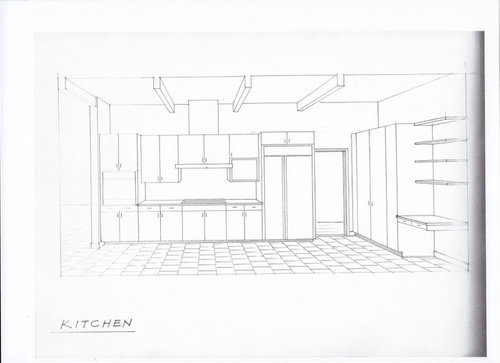
design aesthetics help needed
16 years ago
Sort by:Oldest
Comments (6)
Related Stories
GARDENING GUIDES4 Ways Gardens Can Go Beyond Aesthetic Beauty
Our landscapes can play an even more meaningful role if we rethink their purpose
Full Story
GARDENING GUIDESYou Don't Need Prairie to Help Pollinators
Woodlands, marshes, deserts — pollinators are everywhere
Full Story
HOUZZ TOURSHouzz Tour: Aesthetics on a Budget in Turin, Italy
A converted attic combines thoughtful design with innovative materials
Full Story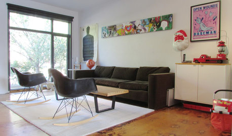
HOUZZ TOURSMy Houzz: Raw Aesthetics Rule in a Toronto Family Home
Exposed plywood and beams, rough concrete and unfinished walls give the interiors a unique look — and give the family more time together
Full Story
FURNITUREShow More Leg for an Airy Aesthetic
Banish bulk and give your rooms openness and balance with furniture that bares its legs
Full Story
HOUZZ TOURSHouzz Tour: Abbey's Aesthetic Outburst
Tour an 'Organized Eclectic' Home Full of Art, Collections and Kid-Friendly Color
Full Story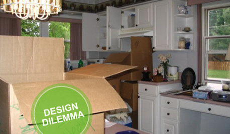
KITCHEN DESIGNDesign Dilemma: My Kitchen Needs Help!
See how you can update a kitchen with new countertops, light fixtures, paint and hardware
Full Story
DECORATING GUIDESSlow Design: Today's 'Wabi-Sabi' Helps Us Savor the Moment
Learn about the design movement that's aiming to satisfy our real needs, leaving materialism in the past
Full Story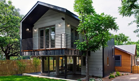
CONTRACTOR TIPSContractor Tips: 10 Home Areas That Likely Need a Pro
Safety, less cost and better aesthetics on a home improvement project may rest in the hands of an expert
Full Story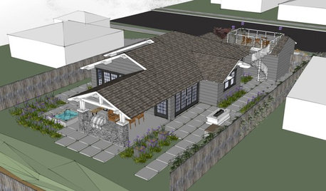
WORKING WITH AN ARCHITECTWho Needs 3D Design? 5 Reasons You Do
Whether you're remodeling or building new, 3D renderings can help you save money and get exactly what you want on your home project
Full Story

cienza
palimpsest
Related Professionals
Natchitoches Kitchen & Bathroom Designers · Oxford Kitchen & Bathroom Designers · Harrisonburg Kitchen & Bathroom Designers · Boston Kitchen & Bathroom Designers · North Platte Kitchen & Bathroom Designers · Logan Kitchen & Bathroom Designers · Memphis Kitchen Remodelers · Longview Kitchen Remodelers · Frisco Custom Countertops · Lima Custom Countertops · Chico Custom Countertops · Santa Barbara Custom Countertops · Santa Fe Custom Countertops · San Angelo Custom Countertops · Montréal Custom Countertopsbreezygirl
Gena Hooper
plumberryOriginal Author
bmorepanic