Software
Houzz Logo Print
clarettekim

Please help me select tile

12 years ago
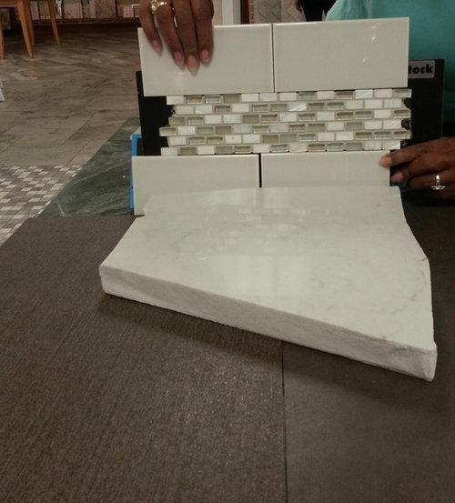
I would appreciate your input on kitchen floor/backsplash tile selection and design ideas. We will be doing white cabinets. First, we cannot decide on the floor tile. The left is browner/warmer and has a pretty linear texture, but maybe it would be too loud and detract from the countertop? (It might also better hide damage from our dog, who could probably manage to scratch up porcelain tile.) The right is grayer/cooler and has more of a matte/concrete look that might be nice and subtle, or might it be too boring?

Second, any thoughts on the backsplash subway tile? Is it too gray/monotone, or does it blend well with the counter? Do we need more contrast from the counter?

And finally, any suggestions on how to use the accent mosaic piece? We think it's pretty but don't know how we'd use it. Would a single row picture frame border around the range area work well? We would probably use the same subway tile in a herringbone pattern inside the mosaic border. The other option would be to run a 3-5" tall strip of the mosaic all along the backsplash. That would be expensive though, and perhaps overkill?

Thank you in advance for any opinions/suggestions!

Comments (11)

  • 12 years ago

    I think that the accent tile looks great with the counter top and with the backsplash tile. Do you know what the finish of your painted cabinets will be? I think getting the right white with the slightly off whites that you have already chosen may be difficult, but not impossible. I do not like the herringbone idea because I think it will present too much movement next to the horizontal movement that's already there. Are the cabs contemporary? If so, I like the tile on the right. The dog shouldn't be able to hurt through-body porcelain tile.

  • 12 years ago

    Thanks for your comment! The cabinets will be a modified shaker style--hopefully the white will match with the Caesarstone London Grey counter. I've included my entire mood board below and would welcome everyone's comments on any of it!

    The additional photos show the color difference between the left (more brown) and right (more gray) floor tile choices. Would love your thoughts.

  • 12 years ago

    I prefer the more gray tile to the right. But then, seeing your mood board, I noticed the brown in the accent tile and like the more brown floor tile better. With all of the grays and whites, the brown warms it up.

    As for how to used the accent tile, I have no idea! It is very pretty, but I would probably skip it.

    And for the color of the BS, I'd really need to see it against a finished cupboard door.

    I do recommend bringing the samples home so that you can see them in your own lighting. It makes a huge difference. I just bought some table linens yesterday that looked perfect, but were completely off once I was home.

  • 12 years ago

    I really like all your possible choices, esp. the colors. I'm not a huge fan of mosaics or contrasting accent tiles, but yours are very nice. I like both your floor tiles. Swentastic has good advice to take a sample of everything home. You need to see it in your own space.

  • 12 years ago

    I really like all your colors, but I'd caution you to wait to finalize your tile until you have your counters installed. I used Silestone Lagoon, which is similar to London Gray, and I had the added complication of greige painted cabinets. But in general I found that the tile samples that seemed fantastic up against a small chunk of countertop in the store, didn't look as I expected when I got them home. I suppose it's a lighting issue as @Errant said, but also a function of how the counters look when fully laid out as opposed to one small bit.

    In any case I went through a similar debate - I wanted something with a little oomph but I wasn't sure how blingy to go. I think I might have even looked at that accent tile! I wound up using a Carrera herringbone mostly because it did a great job of tying in the countertop color and the cabinet color. I think what you've picked seems lovely but if I could do it all over again, I would have had a billion different samples on hand for the day when the counters were finished so that I could start pondering the next decision right away!

  • 12 years ago

    Thanks again for all the great suggestions! I have had these samples in my house for weeks now and have been going back and forth! I will definitely wait on the backsplash till the counters are in but need to decide on the floor soon!

    Smalloldhouse, I am considering a Carrera backsplash too, just worried that the marble-look quartz might not look good next to the real thing? Would you mind sharing a pic of yours?

  • 12 years ago

    I probably should have worried more about marble-like quartz near real marble, but I didn't. In part because of the awesome example I saw here - @kompy's kitchen, which has Lagoon and a marble subway (it's a beautiful space, and she's a KD!). I took the liberty of linking one of her posts below.

    The other reason I didn't worry too much is that I never really thought of Lagoon as a marble substitute. I love marble but I wasn't going for an imitation. I liked Lagoon because it had a bit of movement and depth, and wasn't one stark plain color, but also wasn't busy. My kitchen is tiny, and my house is full of color, so I couldn't do a busy countertop.

    Anyway, I found the herringbone when I went looking for @kompy's tile at The Tile Shop. Hers was called Meram I think but the sample looked too white with my cabinets. So I grabbed everything else I could get my hands on.

    In the process I looked at a few other shops including some beautiful glass accent tiles that remind me of the ones in your photo - Jeffrey Court Gesso, which someone here kindly recommended. I also weighed a bunch of crackle tiles, maybe not sufficiently, but everything either seemed too grey or too beige where I needed a blend. The Tile Shop Carrera herringbone seemed to do the trick, and they were reasonably priced (around $15/sqft I think.) I bought all they could find in their inventory at the time, and used all but one sheet!

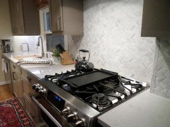
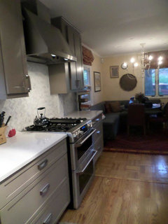
    So here are a couple of lousy photos, pre-reveal since there are some missing cover panels, plus some painting and a new/old runner for the galley. And one further caveat - my contractor installed them vertically rather than horizontally as I would have preferred. One of many unexpected miscommunications in the process that I prefer not to think too much about now:


    Here is a link that might be useful: Scroll toward the end for Kompy's beautiful backsplash

  • 12 years ago

    Hey newbie... would you mind telling me how you made that pin board of pics? Is there an app for that? ;)

  • 12 years ago

    I like the warmth of the brown floor also.
    Smalloldhouse - beautiful, beautiful backsplash. I know I've seen it before but are those new pics? It looks awesome with your countertops.

  • 12 years ago

    Juniper, there is a cool website www.olioboard.com.
    It is free to register and go to to "Create" and you can upload pictures and then drag and drop items onto a "board" and save each one you create.

    Really helps put colors, items, shapes etc. into perspective.