Software
Houzz Logo Print
flying_c

Please help me choose floor/backsplash combo

11 years ago

Greetings! We've been driving ourselves mad trying to figure out flooring, so I'd like to ask for opinions. We're doing Marmoleum floors, either sheet or a Click pattern. Uppers will be soft white, lowers will be natural cherry. Walls will most likely be soft yellow.

We're trying to get a look that's updated but sympathetic to the house (1949 cape). Modest, light, airy, a bit fun, with vintage elements but not a full-on reconstruction. How to achieve this? We've come up with a few possibilities, which DH mocked up. Do any of these work for you? Or feel free to suggest something else!

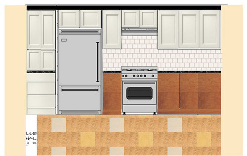
A. Marmoleum Click pattern, white penny tile

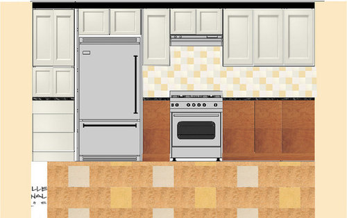
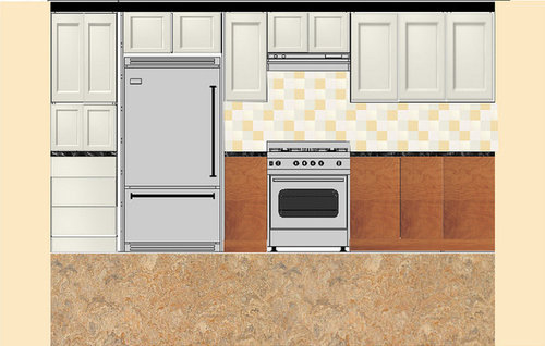
B. Click pattern, 4" square tile in tonal yellows

C. Marmoleum Donkey Island sheet, 4" squares in tonal yellows

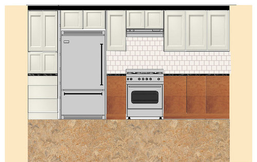
D. Click pattern, 4" white squares in a running bond

E. Donkey Island sheet, 4" white squares in a running bond

Thanks!

Comments (16)

  • 11 years ago

    I choose E

  • 11 years ago

    see Appearance: Cheap Taps surface chrome plating is very particular, usually through several processes to complete. Distinguish between good or bad depends on its shiny Waterfall Taps extent, the smoother the surface, the brighter the better representative of the Kitchen Sink Taps.

    Here is a link that might be useful: Emily Shaw

  • 11 years ago

    I like b best, but d is cute too. I do not like the last one at all. It is totally devoid of charm and personality.

  • 11 years ago

    I really like B and C. I think those two really hit on your points of "light, fun, modest, airy". I don't like E at all. And I'm not sure that A fits your description best either.

    Looks like it's going to be a great space!

  • 11 years ago

    What are you doing for counters? You left it out of your description, but it's important. If they are going to be heavily patterned or solid?

  • 11 years ago

    I like b the best...very, very cute!! I also really like a because I love penny tile but maybe you could do it in a pale yellow instead of the white. I think e is not good at all...just blah.

    This post was edited by dcward89 on Mon, Nov 24, 14 at 6:49

  • 11 years ago

    I really like A or C. I think if you are going to have a very graphic element you should avoid other graphic elements in the room. D could look good if you used matching grout but I think E is a little boring.

  • 11 years ago

    @gooster Oops, sorry, the counters are going to be honed Steel Gray granite. It's a fairly uniform charcoal gray with no movement. I've linked to a pic.

    Looks like most people are liking the patterned floor. Interesting!

    Here is a link that might be useful:

  • 11 years ago

    @SharonNM
    I think if you are going to have a very graphic element you should avoid other graphic elements in the room.

    This is what I'm struggling with. I know we want a pattern, but should we do it in the floor or on the backsplash? Or can we pull off both if the patterns are restrained and relate to each other well enough?

  • 11 years ago

    For practical reasons, I don't like marmo click in the kitchen, the reason being that the layer of lino on top of the cork base is very thin, and I've had some gouges/dents. Now that I think about it, the gouges didn't penetrate to the cork, but it just seemed like the cork was too soft for a kitchen application. One of my friends also had click in her kitchen and said she wouldn't do it again, for the same reasons I mentioned.

    So, I would recommend one of the options that includes the sheet marmoleum. I like it paired with the funky yellow and white BS. I also like the idea of a plain yellow backsplash--it creates a nice chunky colour -- I think the term is 'colour blocking'. Slightly warmer than than the straight white BS.

    Really, I like all your options :-) but I highly recommend marmo sheet rather than click.

    You can do 2 graphic elements as long as they are completely different in scale (this is what I read somewhere).

    Marmoleum feels and looks wonderful!

  • 11 years ago

    I think those patterns look pretty contemporary. Is that what you want? I would think straight checkerboard would be more traditional. Or something like one of these two patterns?

    Here is a link that might be useful: Two Other Patterns

  • 11 years ago

    And here's another pattern I love, the first one:

    Here is a link that might be useful: First Pattern in Post

  • 11 years ago

    Thanks all. Wish I could respond thoroughly to e eryone but my computer died last night (ugh) and posting from my phone is proving painful. Will be back when I can. Thanks again.

  • 11 years ago

    Computer back, hurrah! And in the meantime we've made our flooring decision: the Donkey Island sheet Marmoleum. According to the flooring guy we were going to have a 1/4" high transition to the hardwood in the next room if we went with the Click, which DH was not okay with. So sheet it is. I'm a little sad about not doing the pattern, sniff. But relieved to have one decision made. Thanks again for the opinions!

  • 11 years ago

    You made the right decision! Picture C was my favorite!

  • 11 years ago

    I am no expert, but in the older homes that I have had and been in (all circa 1868- 1942) I have only seen the penny tile in bathrooms, never in a kitchen. I don't know why that would be, but when I see penny tile I think "bathroom".

    I like the multicolor pastel backsplash. That relates to those I have seen in those older homes, too -- although usually a solid block of one color trimmed in another (which is a look I often disliked because it was a pastel trimmed in black).

Sponsored
The Steele Group
Average rating: 5 out of 5 stars1 Review
Industry Leading General Contractors in Franklin County, Ohio