Software
Houzz Logo Print
lucik77

please help pick a tile layout - pictures attached

16 years ago
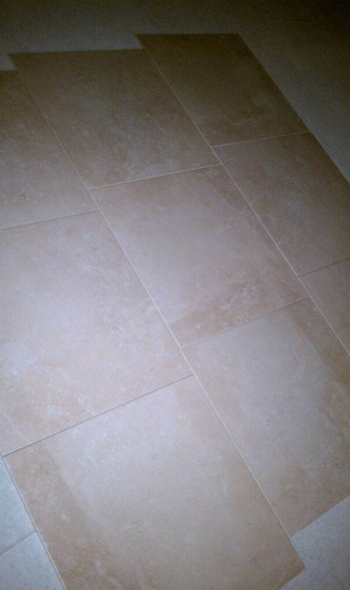
Please let me know which design you like the most and which you think is the most practical.

I have a modern / contemporary style (shaker style cherry color kitchen cabinets).

Thank you very much!

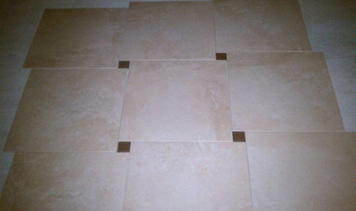
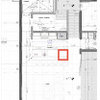
Option 1: (plain staggered tile with no inserts)

Option 2: (tile with brushed bronzed insert)

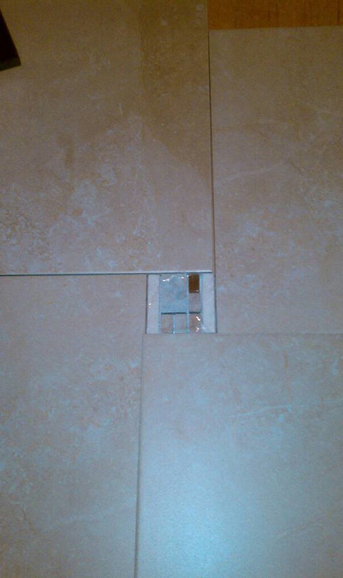
Option 3: (tile with natural stone and glass insert)

Thank you!

Comments (17)

  • 16 years ago

    Option 2! Those little squares really pop.

  • 16 years ago

    What's your countertop and backsplash?

  • 16 years ago

    I like the first one. The second one looks more like a foyer to me, and I'm not sure option 3 will age well.

  • 16 years ago

    2 all the way!

  • 16 years ago

    I choose number one. Aside from the reason mentioned by plllog, I'm envisioning the lines of a modern kitchen and I'm thinking of those little squares and I don't see either of them adding to a modern look. I like the little brown squares, but I still wouldn't.

  • 16 years ago

    So I guess its down to 1 or 2 :)
    I love option 3 but I agree, I also don't think it will age well since the natural stone is already falling apart just from a short trip home from the store and the glass insert may get damaged.
    I wish I could find something to put inside to make it a prettier design.
    I don't yet have granite or backslash so those can get matched up later.
    Do you really think that adding little squares will make it look less modern?

    Thank again!

  • 16 years ago

    I think the little squares will call attention to your floor, whether or not it makes it look less modern, and will restrict your choice of countertops and backsplash. You may find a granite or backsplash that you love which has a lot of movement, and the floor with the brown squares will distract the eye from that. #1 will give you much more freedom in your other choices.

  • 16 years ago

    As long as the little squares work with your cab color, you do not need to justify them via counter choice.
    I don't see them as an impediment to a fabulous wild counter choice. They don't add "pattern" as much as "visual interest" to me.
    The first floor looks like everyone else's...

  • 16 years ago

    Thank you everyone! And here I was hoping for a consensus ... LOL
    Thanks again!
    My next question will be about granite and backsplash but that's still days away :)

  • 16 years ago

    I totally agree that it doesn't matter about the category one puts the design in if you love it, but option 2 definitely isn't "modern". That's why I said it looked like a foyer. It's a classic, old time pattern for breaking up a large expanse of open floor. Modern is usually less patterned, finding the beauty in the simplicity of the offset in number one, rather than adding extra decoration.

    OTOH, Shaker is anything but modern! Contemporary, yes, because it's currently in style. It's of the now. But Shaker is old timey, originating in the eighteenth century. OTOH, the watchword of the Shakers was "simplicity" and they consciously chose the unadorned. OTOH, the non-Shakers they sold furniture to combined the simple furniture with other, more ornate things. Whereas modern is just plain unadorned. So if you like an extra jolt of pattern in there, maybe "Contemporary" is a better word for what you're looking for.

    I don't think #2, for all that it's attractive, is very contemporary either, but if you love it, go for it! I will mention, however, that having lived with a star of a floor for several years, I chose something that carfully wasn't a star so that I wouldn't be looking at the tops of people's heads as they're admiring the floor and ignoring the rest of the room. :)

  • 16 years ago

    I agree, I am not good with terminology and I guess belong more to the contemporary world as opposed to modern. Having said that, I mostly chose things that looked nice to me as opposed to their classification.
    I am contemplating using the same (or a very similar) tile for the front entrance area that is about 4'x6' and about 8' away from the kitchen in a straight line. Perhaps I could use the same tile and use the little squares there...
    What do you think?

  • 16 years ago

    On option 2, my eyes follow the placement of the dark dots and find that they advance an inch up the wall at each new position, creating a diagonal which would distract me unless the wall were very very large. I think the same issue happens with #3.

    How about a line of brown extending vertically along a plumb line between slabs of the light stuff, perhaps every few feet?

  • 16 years ago

    Ok, I thought this was about backsplash (so you can completely disregard my 2 cents) but it is about floor. I choose #1. Depending on how big your floor is, #2 could look like a bunch of polka-dots on your floor. And depending on what the rest of your choices are you might wind up high-lighting them and do you really want to do that?

  • 16 years ago

    Sorry--I misunderstood that this was dealing with floor. Ignore previous posting. I have no opinion on the floor choice.

  • 15 years ago

    Thank you for all of the advice - is all done now. I went with option 1 :)

  • 15 years ago

    I do like #1.

    However, I think #2 is good too and won't look out of place in a kitchen OR in a modern one at htat.

    Have you seen Pharoah's kitchen? Modern/contempo with shaker cabinets:

  • 15 years ago

    I missed your second question a couple of weeks ago. Did you already do the entry? I think your idea of doing the small squares there would give it some punch and differentiation from the kitchen, while matching in general with the same field tile. It could look really good and might actually make the entry look bigger. If you haven't done it yet, it might be worth laying it all out in place and seeing how you like it with the kitchen.