

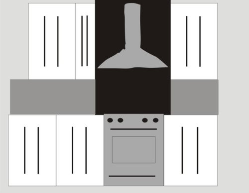
Help with backsplash (pics)
17 years ago

Sort by:Oldest
Comments (9)
Related Stories

ORGANIZINGHelp for Whittling Down the Photo Pile
Consider these 6 points your personal pare-down assistant, making organizing your photo collection easier
Full Story
KITCHEN DESIGNKey Measurements for Your Kitchen Design
Get the ideal kitchen setup by understanding spatial relationships, dimensions and work zones
Full Story
ORGANIZINGDo It for the Kids! A Few Routines Help a Home Run More Smoothly
Not a Naturally Organized person? These tips can help you tackle the onslaught of papers, meals, laundry — and even help you find your keys
Full Story
COLORPaint-Picking Help and Secrets From a Color Expert
Advice for wall and trim colors, what to always do before committing and the one paint feature you should completely ignore
Full Story
COLORPick-a-Paint Help: How to Create a Whole-House Color Palette
Don't be daunted. With these strategies, building a cohesive palette for your entire home is less difficult than it seems
Full Story
KITCHEN DESIGNDesign Dilemma: My Kitchen Needs Help!
See how you can update a kitchen with new countertops, light fixtures, paint and hardware
Full Story
MOST POPULAR7 Ways to Design Your Kitchen to Help You Lose Weight
In his new book, Slim by Design, eating-behavior expert Brian Wansink shows us how to get our kitchens working better
Full Story
SELLING YOUR HOUSE10 Tricks to Help Your Bathroom Sell Your House
As with the kitchen, the bathroom is always a high priority for home buyers. Here’s how to showcase your bathroom so it looks its best
Full Story
MATERIALSRaw Materials Revealed: Brick, Block and Stone Help Homes Last
Learn about durable masonry essentials for houses and landscapes, and why some weighty-looking pieces are lighter than they look
Full Story
HOUZZ TOURSMy Houzz: Saturated Colors Help a 1920s Fixer-Upper Flourish
Bright paint and cheerful patterns give this Spanish-style Los Angeles home a thriving new personality
Full Story
ccoombs1
claybabe
Related Professionals
Mountain Home Kitchen & Bathroom Designers · Buffalo Kitchen & Bathroom Designers · Elmira Kitchen & Bathroom Designers · Fresno Kitchen & Bathroom Designers · California Kitchen Remodelers · New London Kitchen Remodelers · Taunton Kitchen Remodelers · Murrieta Kitchen Remodelers · Jonesboro Custom Countertops · Sugar Land Custom Countertops · North Adams Custom Countertops · Duluth Custom Countertops · Lebanon Custom Countertops · Yuba City Custom Countertops · Farmington Custom Countertopscharlikin
busybme
jax1723Original Author
remodelfla
jax1723Original Author
bluekitobsessed
remodelfla