Software
Houzz Logo Print
amysrq

I'm getting a do-over...new counters, same old symmetry problem

16 years ago

Lots of you here helped me think about what kind of tile to use with my Sage Pearl Icestone counters way back in August. (thank you!) One thing lead to another and it turns out Icestone and my builder will be replacing my counters, probably next month. In all likelihood, I will be working with a new color....something neutral, still light but maybe not so, maybe with a much finer grain. In any case, the ball-and-chain of that bottle green will hopefully be history.

I am not sure which way I will go with the backsplash tile yet, either a soft gray-green (Oceanside's Equator) or maybe something neutral, a variation on a theme of white. Not my usual, but I am wondering about the longevity of a green kitchen, even though I love green. I'm planning a trip to the design center very soon, where I can visit a number of showrooms. I really want to love the tile first and pick the counter color second.

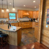
Anyway, the balance/symmetry problem on the stove wall remains an issue, though part of me thinks I should get over it, pick tile I love, find a wall color that works and forget about the balance problem. Here's a photo as a reminder. Ignore the detritus please.

Rococogurl suggested that I somehow bring "soft horizontals" to that wall. There were other suggestions, including spectacular photoshops by Blondelle and Nalcar showing some woodworking solutions. That short wall is loaded with electrical stuff, so I can't cover it up completely or cut through it either. I also just don't want to spend a lot on the solution. I want a visual fix, not a structural fix.

That leaves me with the following ideas not in any particular order:

Use a horizontally oriented tile, like a 1x4 running bond glass mosaic, or the Ann Sacks tile Kitchen Detective suggested (looks like beadboard, turned sideways)

Use Rococo's idea of running a pencil line in the cabinet color through the tile

A 47" Ikea SS Grundtal shelf spanning the range (30 inch) and the cabinet, similar to the pencil line, only functional

A 47" Grundtal rail set below the hood

A 16" SS shelf set either at hood height or just over the switches, something like what celticm00n has to the right of her range

A 30" x 12" chalkboard (Terra Viva catalog) which would be a visual fix, but not so practical for us right-handers

A shallow shadow-box style shelf, 12x36 (same height as cabs) mounted to the wall to the right of the hood. same finish as cabs, open back probably, glass shelves maybe, just a couple inches deep...

Or my favorite....ignore the balance issue and get on with my life! ;-)

Just in case you're up for a slog through my last thread, which was mostly about tile, I'll give a link. Thanks again for any and all thoughts, advice, input, admonishments!

Here is a link that might be useful: Mostly about tile

Comments (12)

  • 16 years ago

    I think the short shelves would look jammed in. Like you had a small space, so you filled it up. I considered the idea of the single, longer shelf, but am afraid it end up looking odd. When you add things to the shelf, also, your balance would be affected.

    I vote for Rococogurl's suggestion of the liner in the cabinet color to accent a horizontal tile, as I think it will really help with the visual balance of the wall. First I was thinking of hanging something colorful (red to go with toaster and teapot), but then I read the suggestion and, of course, the narrow but strong horizontal would do much better to create the asymmetrical balance with your vertical window.

  • 16 years ago

    I'm sorry, I'm not getting the problem. Is it the range + range hood? If so, I think it looks great, I wouldn't do anything more on that wall. I"m afraid if you add more it will look too busy...mostly b/c it's a short wall and you already have a lot going on on that wall (window + hood). I really do think it looks just fine...

    Is it the cabinet on the wall perpendicular to the range wall, the one w/one cabinet w/glass doors & the other w/a solid door? Probably not, but that's what I think may actually be the issue, have you considered replacing the single solid door w/glass doors? I think that solid cabinet is adding extra "weight" to that side of the window and making you think the balance is off on the range wall. Just a thought...

  • 16 years ago

    I suppose another glass fronted cabinet to the right of the hood is out of the question?

    If so, then ignore the assymetry and do a simple horizontal type tile. I think I'd skip any liners or additional color accents though. Keep it very simple and very horizontal. If you have the choice, use thin long tiles instead of fatter less long tiles. No 3"x6" subways, think 1"x6" matchsticks, in a uniform glass. Maybe a little iridescence if you like the look, but no multiple colors or odd sized inserts.

  • 16 years ago

    I think visually you are fine. If it still feels empty to you after a while you could try a narrow picture.

    I had that Grundtal rail system for a while under the hood there. In fact, the rail is still lying around here somewhere and it's yours if you want it! I found that it, and everything hanging on it, got dirty/greasy in no time so I removed it after a couple months.

    That left me without a storage spot for oils and so I redeployed the hanging basket from the Grundtal set and mounted it right on the wall. But it really was more of a function than a form thing - the counter surface and cabinet storage is tight right there and I just wanted a couple things in reach but off the counter.

    LOL, that picture is nearly 4 years old and I still haven't committed to a backsplash!

  • 16 years ago

    What about a bamboo glass tile laid vertically? I'll try to find what I'm talking about...hmm... couldn't find it but I did find this. It would be different; but what if you were to use a 4x12 sagey glass laid vertically? It would give a modern edge if that's what your aiming for. This is a ripple glass which would add texture.

    Here is a link that might be useful: glass tile store

  • 16 years ago

    Our range & hood are not centered on the short wall either, but I think it looks good. We have a 36" metal shelf from Pottery Barn on the long side. We were going to cut down a matching self for the 12" side, but recently mounted a small flatscreen on a pivoting arm around the corner. It's about perfect now ;-)

  • 16 years ago

    For the symmetry issue I might put something vertical to mirror the window, such as a print in a frame the same length as the window on the right side. Possible a custom made spice rack with pretty spice bottles and labeling or a chalkboard.

    For the backsplash, something horizontal to pull in the floor color and green and a neutral and still have the "wow" factor. Possibly Hakatai Laurel.

    Here is a link that might be useful: hakatai laurel

  • 16 years ago

    I would just leave it. It looks fine and I think that adding anything more will just make the problem apparent to others instead of only to you.

  • 16 years ago

    Rhome, I agree that I do run the risk of things looking cluttered. The kitchen always feels a bit cluttered anyway, lots of stuff, tools, cooking going on. I don't really think the symmetry problem is a problem until I think about it. Adding things in may start to look contrived.

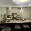
    Buehl, I think you may be on to something with the glass in the far cabinet. I am kind of ambivalent about how transparent that glass is, so I hesitate to add more. But in the grand scheme, it might lighten up that side of the room. This is a different shot of the room. Someone on one of my other threads suggested the cabinet/fridge array on the right was what made the room feel out of balance.

    This was a new build, not a renovation, and I am learning how hard it is to do this stuff on paper. I do much better standing in a space, feeling the changes. In any case, I could change out the panel on the left of the hood and see how that feels.

    Live Wire, I agree with you about the matchsticks. I have wanted to stay away from subway, just because I have seen so much of it. It may be timeless and the matchsticks may say "2009" but that's just the way I am leaning. I love the soft iridescence of the Oceanside tile. A bit of flash but not too much.

    Celticmoon, I am amazed at how much our kitchens look alike! Thanks for the dirty/greasy warning. I cook a lot and do not want something else to clean. The hood is bad enough! I appreciate the offer for the rail. If you don;t want it, I think I don't either!

    I looked more closely at the Grundtal shelf on the Ikea site and see how you attached it to the wall. That detail blew right by me. Thanks for pointing it out. I may just get one, put it up on the wall pre-tile and see how it feels. On a functional level, I'd be happy to get some of my stuff off the counter over there.

    Four years and no backsplash? Wow! I feel like Speedy Gonzales...it's only been 13 months for me!

    Remodelfla, I love Catmom's vertical tile, but I think that works best when you take it all the way to the ceiling and I wasn't planning on that. Do you think I could do that just up to the lower part of the hood? Do you think I can ignore my "symmetry problem" and go vertical? From a style perspective, I think I would love that...but I am afraid it would emphasize the imbalance in the wall... :(

    Abbycat, that is one helluvakitchen! Beautiful! Somehow, you pulled it off better than I did. I think it's because everything is so clean. I have too much molding and business with the cabs. My husband picked the trim...I don't love it, actually. It suits my faux-craftsman house I guess but it is too much for my eye.

  • 16 years ago

    I am glad to hear that you are getting your counters fixed to your satisfaction. I looked but didn't see what color you are getting instead. Will your new counters be the White Pearl or Gelato or one of Icestone's other colors? Knowing this will help us help you regarding tile colors.

  • 16 years ago

    Oh heavenly day you are getting rid of the beast!! Woohoo Amy!!

    This can be fixed. IMO it is a combo of a "fool the eye" issue together with a color issue.

    What are you now considering for counters? Can you also choose the tile to go in at the same time?

    I would love to see you free to thoroughly enjoy the kitchen rather than having the asymmetry continue to bug you. (Having just gone through my second kitchen reno in 5 years myself I can vouch for how good it feels to have the eye just happily rest, asymmetry resolved -- just don't ask me about window treatments now LOL.)

    Will you consider working within the palette you already have in the kitchen -- the beige of the walls, white of the trim and dark brown of the cabinets? And how do you feel about metallics?

  • 16 years ago

    Monkey Puzzle, thanks for the Hakatai link. I have not looked there for a long time. They have some new things.

    Writersblock, I appreciate the vote for the laissez-faire path! I like how you think. :-)

    Earth Pal, I am thinking about finding a tile I love and then figuring out the counter color. Rococo suggested in the last big thread that maybe a darker counter color would work better. I want the tile choice to drive the counter choice, as it should have in the first place. There aren't a lot of colors to choose from so it will probably be White Pearl, Alpine White (too bright probably) or Ivory Cloud if I find a tile that is not too busy.

    If I find something busy, I will probably look at the "refined" colors with a finer grain, like Gelato, Latte or Snow Flurry. I have not yet seen samples of the refined colors. I would like to use White Pearl if I can because I love the crushed oyster shell in the Sage Pearl. I am assuming it will be the same as what I have now, sans the green bottle glass. That would be fine with me.

    Rococo, the tile will go in some time after the counters, but as I said above, I really want the tile to drive the counters. I learned through this process that tile makes my heart sing more than any counter surface ever will.

    I have to say, the asymmetry does not bug me on a day-to-day basis. It is kind of a theoretical problem, mostly apparent in photographs. My hunch is that no one visiting my house sees the problem. Sometimes I think that having a backsplash tile that makes me happy, like the last kitchen did, will be contentment enough. But, of course, if I can tweak the imbalance, I should!

    I want the wall color to change. Have been thinking all along about green. (Cooking Apple Green, Ball Green, Stone White even) The symmetry problem made me think that the wall should be all one color. IOW, not white/neutral tile below and green paint above. That's why I was struggling to find a green for the backsplash that I could live with on the walls. Greens that would satisfy my wall color needs (muted) did not work with the green fleck in the counters (bright).

    More recently, I have been pondering the possibility of "white" tile and walls. Not usually my thing, but I am trying to keep an open mind. The driving issue to me seems to be that the wall should be monochromatic.

    The trim color stays. I like it. The cabs stay the same for now and maybe forever. Someday, perhaps I will have painted cabs, but thinking about that now makes my head explode just a little. :-)

    Metallics are appealing, as is a bit of subdued iridescence (Oceanside Glasstile iridescence). But, I worry about cleaning stainless tiles. I hate keeping after what little SS I have now and would like to not sign up for more. But, I am all ears/eyes! Cleaning beautiful things is not so bad.