

dark backsplash in white kitchen?
18 years ago
Sort by:Oldest
Comments (5)
Related Stories
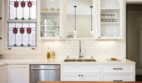
KITCHEN DESIGNKitchen of the Week: A Dark Kitchen Brightens Up
A cooking space honors the past while embracing the present
Full Story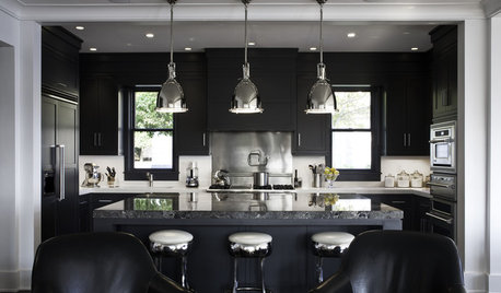
KITCHEN DESIGNDark and Regal Kitchen Designs
Black cabinets, islands and richly textured backsplashes bring surprise and sophistication to the kitchen
Full Story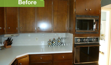
KITCHEN DESIGN3 Dark Kitchens, 6 Affordable Updates
Color advice: Three Houzzers get budget-friendly ideas to spruce up their kitchens with new paint, backsplashes and countertops
Full Story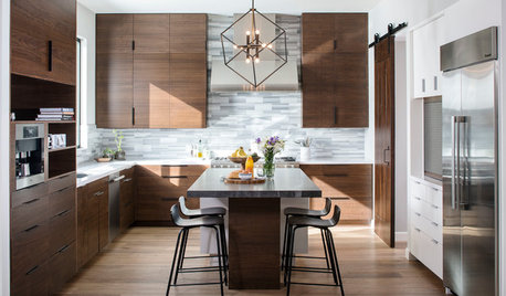
KITCHEN DESIGNNew This Week: Moody Kitchens to Make You Rethink All-White
Not into the all-white fascination? Look to these kitchens for a glimpse of the dark side
Full Story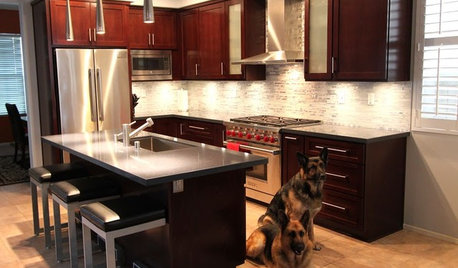
BEFORE AND AFTERSReader Project: California Kitchen Joins the Dark Side
Dark cabinets and countertops replace peeling and cracking all-white versions in this sleek update
Full Story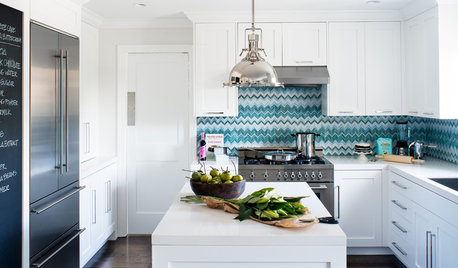
KITCHEN DESIGNKitchen of the Week: Bold Chevrons for a Backsplash
Blue and white zigzags punctuate an otherwise all-white kitchen, completely gutted and redesigned for a Northern California homeowner
Full Story
KITCHEN DESIGNCabinet Colors for Dark Appliances
See how to make your black kitchen appliances blend in and look great
Full Story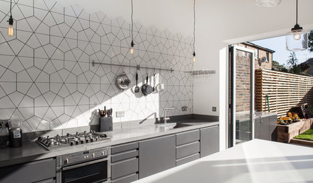
KITCHEN DESIGNKitchen of the Week: Geometric Tile Wall in a White Kitchen
Skylights, bifold doors, white walls and dark cabinets star in this light-filled kitchen addition
Full Story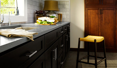
KITCHEN DESIGNAre You Ready for a Dark and Sophisticated Kitchen?
Black kitchen cabinets have a rich, timeless look. Get ideas for your next cabs — and how to paint the ones you have
Full Story
KITCHEN DESIGNHow to Keep Your White Kitchen White
Sure, white kitchens are beautiful — when they’re sparkling clean. Here’s how to keep them that way
Full Story
kitchenkelly
glad
Related Professionals
Lake City Kitchen & Bathroom Designers · Vicksburg Kitchen & Bathroom Designers · Spartanburg Kitchen & Bathroom Designers · Danbury Kitchen & Bathroom Designers · Laconia Kitchen & Bathroom Designers · Cumberland Kitchen Remodelers · Springfield Kitchen Remodelers · Fort Worth Kitchen Remodelers · Barnstable Kitchen Remodelers · Plymouth Kitchen Remodelers · Madison Kitchen Remodelers · McComb Custom Countertops · Oklahoma City Custom Countertops · Aiken Custom Countertops · Cookeville Custom Countertopswdstkdaisy
biner
kitchenkelly