

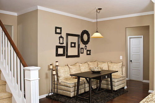
One Eat In Kitchen Space, Two Designs. Which One Wins?
11 years ago
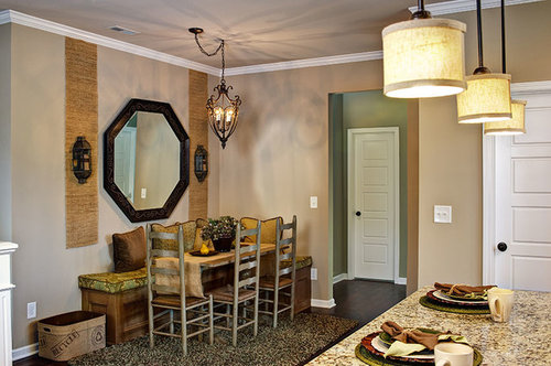

A

B
Love them both
Not my style
Featured Answer
Sort by:Oldest
Comments (25)
 PRO11 years ago
 11 years ago
Related Professionals
Florence Design-Build Firms · Harrisonburg Design-Build Firms · South Sioux City Design-Build Firms · Napa Design-Build Firms · Fort Worth General Contractors · Longview General Contractors · Spring General Contractors · Victoria General Contractors · Kankakee General Contractors · Platteville General Contractors · Rock Hill Flooring Contractors · Bloomington Flooring Contractors · North Adams Flooring Contractors · Lake Havasu City Flooring Contractors · Salem Flooring Contractors PRO11 years ago
 PRO11 years ago
 11 years ago
- PRO11 years ago
- 10 years ago
- 10 years ago
- 10 years ago
- 10 years ago
 10 years ago
 10 years ago
 10 years ago
 10 years ago
 10 years ago
 10 years ago
- 10 years ago
- 10 years ago
- 10 years ago
- 10 years ago
- 10 years ago
 10 years ago
 PRO10 years ago
 PRO10 years ago

Related Stories
KITCHEN DESIGN12 Great Kitchen Styles — Which One’s for You?
Sometimes you can be surprised by the kitchen style that really calls to you. The proof is in the pictures
Full Story
BATHROOM VANITIESShould You Have One Sink or Two in Your Primary Bathroom?
An architect discusses the pros and cons of double vs. solo sinks and offers advice for both
Full Story
HOMES AROUND THE WORLDHouzz Tour: When Two Houses Are Better Than One
Subdividing a Melbourne backyard opens up space to build a second home on this family's property
Full Story
DREAM SPACESIf You Could Choose One Dream Space ...
Yoga room, wine cellar, infinity pool or tricked-out garage — which of these luxurious rooms would be at the top of your list?
Full Story
SHOP HOUZZHouzz Products: One Mod Sofa, Two Cool Designer Looks
Choose your style slant: classic or glam. Designer Kyle Schuneman puts everything together for you with Houzz Products picks
Full Story
SMALL HOMESMicrounits Are Coming to NYC. See the Winning Design
Say goodbye to only arm-and-a-leg Manhattan rents. This plan for small prefab units opens the door to more affordable housing
Full Story
KITCHEN DESIGNKitchen Recipes: Secret Ingredients of 5 One-of-a-Kind Cooking Spaces
Learn what went into these cooks’ kitchens — and what comes out of them
Full Story
PETSWorld of Design: Pampered Pets and Their 10 One-of-a-Kind Homes
Fall in love with these critters and their clever living spaces, from a cat playground in France to a chicken house in the U.S.
Full Story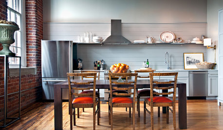
KITCHEN LAYOUTSWays to Fall in Love With a One-Wall Kitchen
You can get more living space — without losing functionality — by grouping your appliances and cabinets on a single wall
Full Story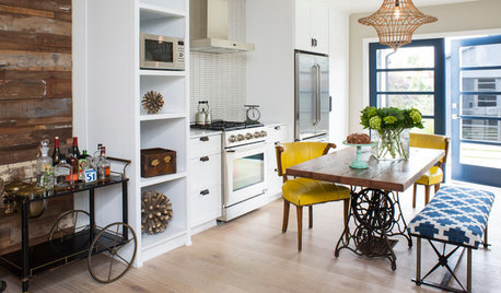
KITCHEN DESIGNKitchen of the Week: One Man's Vintage-Modern Mash-Up
Eclectic style meets Scandinavian modern in a Los Angeles bungalow kitchen designed for entertaining
Full Story




Alexandra Ryan Interiors