

Suggestion for Simple Implements.
11 years ago
last modified: 11 years ago
Comment

Related Stories
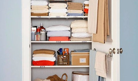
CLOSETSSimple Ways to Get Your Closet Organized Right Now
Streamline your clothing storage with strategies you can implement in a weekend
Full Story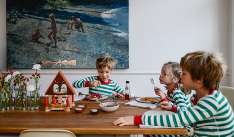
HOLIDAYSHow to Have a Just-Simple-Enough Holiday
Make this the year you say no to holiday stress and yes to joy and meaning
Full Story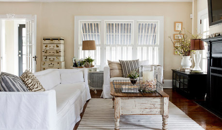
FEEL-GOOD HOMESimple Pleasures: 10 Ideas for a Buy-Less Month
Save money without feeling pinched by taking advantage of free resources and your own ingenuity
Full Story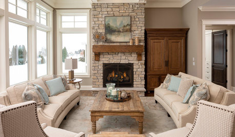
HOLIDAYSSimple Pleasures: Savoring the Season of Warmth and Light
Light up your home and lift your spirits on cold winter days with these decorative touches
Full Story
LIFESimple Pleasures: The Joy of Baking
Fill your house with a heavenly scent and your heart with cheer by making time to bake
Full Story
SIMPLE PLEASURESThe Art of Being Neighborly
Learn the heartfelt gestures that go a long way toward creating a welcoming community
Full Story
ARCHITECTUREThe Truth About 'Simple' Modern Details
They may look less costly and easier to create, but modern reveals, slab doors and more require an exacting hand
Full Story
LIFESimple Pleasures: A Room of Your Own
Free up space for your own creative or meditative pursuits, and your dreams may have freer rein too
Full Story
LIFEInviting Kids Into the Kitchen: Suggestions for Nurturing Cooks
Imagine a day when your child whips up dinner instead of complaining about it. You can make it happen with this wisdom
Full Story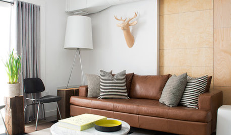
HOUZZ TOURSHouzz Tour: Nature Suggests a Toronto Home’s Palette
Birch forests and rocks inspire the colors and materials of a Canadian designer’s townhouse space
Full Story
Related Professionals
Fayetteville Landscape Architects & Landscape Designers · Cambridge Landscape Architects & Landscape Designers · Danville Landscape Architects & Landscape Designers · Brainerd Landscape Architects & Landscape Designers · Athens Landscape Contractors · Shreveport Landscape Contractors · Cambridge Landscape Contractors · Utica Landscape Contractors · Everett Landscape Contractors · St. Louis General Contractors · Columbia General Contractors · Fredericksburg General Contractors · Altoona General Contractors · Saint Marys General Contractors · Pierre General Contractors