Software
Houzz Logo Print
chrisandkaren

Backsplash decision driving me mad !!

11 years ago
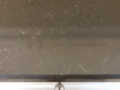
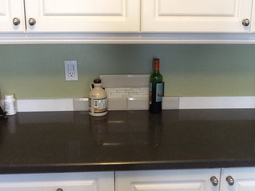
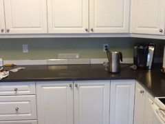
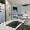
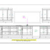
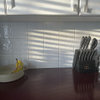
We can't decide on a backsplash. The cabinets are white and the new counter is a dark grey with light grey streakes. (Please see pictures) we think the white subway tile will make the cabinets look yellowing so we went to light grey that will match the streak in the counter. Then we thought that would look too bland so we got some granite accent strip in "white" (doesn't really look totally white). Now we don't know to put in one row of tiles up from the counter or two. With one tile up we lose the offset brick affect and two tiles up might look like a racing stripe through the middle. Maybe a darker grey? I added a pic of counter top to show the colour. We are dumbfounded at this point and would welcome any advice and a good nights sleep! Thanks


Comments (47)

  • 11 years ago

    I'd go with just the gray and lose the accent strip. If you keep the accent strip, be sure to look at how the receptacles will come in to play. FWIW, I like the gray.

    chrisandkaren thanked szruns
  • 11 years ago

    Thanks for the reply. We were hoping the strip would add some bling. We are worried about it all looking too blah. (?)

  • 11 years ago

    Blah is good :) Too many people go for "bling" and miss the boat. Add "bling" with accessories, not permanent fixtures like tile.

    Have you considered a pale grey mini-subway mosaic for the whole wall?

    chrisandkaren thanked User
  • 11 years ago

    I think you should go with all tiny mosaic tiles using dark grout to match the counter.

    chrisandkaren thanked User
  • 11 years ago

    When you say "pale grey mini subway" can you put in a link of a picture of it?

  • 11 years ago

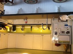
    Here is a picture of the whole kitchen

    L


  • 11 years ago

    Personally, I think if you want to add a little interest I'd look for something that is similar in scale to the other tile. To me these don't relate to each other well.

    chrisandkaren thanked Annie Lesieutre
  • 11 years ago

    Backsplash is really tough. It's difficult to look at a couple of pieces of tile & visualize what a whole wall of said tile will look like. I don't like the combo of the subways & the mosaic. If you think the grey is blah, I'd look for another tile versus looking for an accent piece.

    chrisandkaren thanked romy718
  • 11 years ago

    Ok. Thanks everyone. The accent strip is out!! Now, my daughter is saying white subway instead of the light grey. Thoughts?

  • 11 years ago

    I just saw talairys kitchen reveal, and she did the smaller accent tile close to the countertop, and subway above that. Maybe see how that looks. But it seems you might need a larger area to pull that off.

    chrisandkaren thanked happyallison
  • 11 years ago

    Hey mgmum that looks really nice. Definitely an option.

  • 11 years ago

    I like MGMUM choice also. Neutral and get the bling from objects not permanent as suggested previously. Good way not to have to live with a permanent mistake.

  • 11 years ago
    last modified: 11 years ago

    I liked the one row up shot, but you do have a lot out on the counters. It may be better to have a simpler tile in this case.

    Edited to add that the greens in your closeup and distance shots are worlds apart!!

  • 11 years ago

    ChrisandKaren - can you tell me what your countertop is? I'm thinking it looks like one of the Caesarstones I've been looking at - I really like it, and have also been trying to figure out what backsplash will look good with it & white cabinets.


  • 11 years ago

    When trying to decide on your tiles and colors, it's really better to use tape or something else clear without any color to prop them up. Those bottles you've used to prop things up fool the eye and make it harder to tell the true impact of the different colors you're choosing. You should also put your different possible backsplash scenarios in different places. Don't mix up your choices. Look at each choice individually instead of the tiles in a group. More eye fooling is going on when you mix them up together and try to choose.

    chrisandkaren thanked funkycamper
  • 11 years ago
    last modified: 11 years ago

    What about a grey blend? "Melange grey Blend" from glasstiles.com

    chrisandkaren thanked tinker1121
  • 11 years ago

    From Anchorbaytile.com. in a grey beveled. Adds interest.


    chrisandkaren thanked tinker1121
  • 11 years ago

    I know this is off base but. I think an aged bronze back splash would be beautiful as an accent . The green and copper patina......a zing without the bling.

    chrisandkaren thanked jeff-1010
  • 11 years ago

    Carry B The counter is Piatra Grey Ceasarstone

  • 11 years ago

    I'm following this - same indecision

  • 11 years ago

    Where's the follow/opt in/out link? It was in green at bottom when we first merged

  • 11 years ago

    Tinker 1121--- I really like the Melange grey Blend and the grey i have is beveled but not glass. When I looked for Glasstiles.com I found "Architectural Glass, Inc.". Is that the right site?


  • 11 years ago

    Tinker 1121---I am trying to find them in Canada.


  • 11 years ago

    It's still there, mags. Bottom-left, small spring.

  • 11 years ago

    I see the bottom left in small green font now (although wasn't there when I posted), click to switch *off* notifications...I haven't received any Notifications since I posted about the link. User frustration building

  • 11 years ago

    Ditch the accent strip. It's confusing. Go with the grey, white or beveled subway tile. All of them will work. My personal preference is the AnchorBay beveled in white. This way you get some texture rather than bling. Bling your hardware and lighting with something shiny. Those elements are more easily changed should you become tired of the look.

    chrisandkaren thanked homechef59
  • 11 years ago

    I dunno...but the benefit of going with a quiet counter and overall palette is the option of adding some interest with backsplash. I don't have specific recommendations but I do think this is a case where a quiet consistent subway isn't needed to showcase a dramatic granite or something. I'd keep looking for something that adds some depth and personality, personally.

    chrisandkaren thanked steph2000
  • 11 years ago

    HOMECHEF59...I am loving that most of you are saying the same things. As far as the white goes, i am worried that it will not match the cabinets (white) and therefore one of them will look "dirty" in comparison to the other.


  • 11 years ago

    STEPH200--I agree with you. Either white or light grey 3" by 9" or 3" by 6", it will be beveled subway and I am hoping that will create some depth. I would entertain grey glass tile but $$$$$$.

  • 11 years ago

    I wouldn't do glass since your kitchen looks traditional. I would try a gray. If you do white, you need to match it as close as you can to the cabinets. Then, use gray grout to tie in the counter with the cabinets.

    I don't think the grays that you are showing work. I would go very light. Enough to contrast with the cabinets, but then it would transition to the gray of the counter.

    When you are close to deciding, a sample board will help you even further.


    chrisandkaren thanked eld6161
  • 11 years ago

    i like the grey subway tile without any accent tile.

    chrisandkaren thanked dietitian
  • 11 years ago

    If you like an accent strip, maybe some gray and white glass mini bricks would look nice. I don't think those white mini bricks do anything for your kitchen. Your counters are not too busy for mosaics or accent strips, as some stone with a lot of movement can be. I like the gray subways you've chosen, you could do them as is, without any accents or borders if you prefer. What I would get tired of is too much color, I like accent borders in neutrals, its the colors that get old for me.

    chrisandkaren thanked lam702
  • 11 years ago

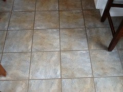
    IAM702---I should have shown a sot of your BUSY floor. Here it goes

  • 11 years ago


  • 11 years ago


  • 11 years ago

    This one is counter and floor showing a sliver of white cabinet.

  • 11 years ago

    Oh, now that I see the floor, you could do something with either grays and/or beiges. I like the floor.

    chrisandkaren thanked lam702
  • 11 years ago

    Thanks IAM702. Here is one mor shot of just the 3x12 grey tile.


  • 11 years ago

    Any suggestions o group colour?

  • 11 years ago

    Oops....on grout colour?

  • 11 years ago

    And should I go with 1/16 or 1/8 gap with such a large tile?

  • 11 years ago
    last modified: 11 years ago

    With that busy floor and the veining in the counter I don't think you need any more action at all. I like the floor by the way so I don't mean busy in a bad way. It's just that it does add a definite vibe and I think the simple gray subway you picked out could tie in nicely with it. I would not do a marble subway. You're kitchen doesn't really call for marble in my opinion. It's very nice but it's just not fancy or modern like that. Let the backsplash reflect the other elements in the kitchen: Simple, clean, non fussy. And let it tie to something- your counters and (since your have a tile floor) also your floor.

    chrisandkaren thanked Jeannine Fay
  • 11 years ago

    BEANPIELE-- Thanks so much, that is excellent advice. Do you think a white grout would tie the cabinets to the counter or should I do a matching gray grout?


  • 11 years ago

    I think a matching grout would be best. lots of white grout lines would make it look busy in my opinion. Darker grout is easier to keep clean anyway. I think you will enjoy your counters much more without a competing backsplash.

  • 11 years ago

    I think a grout to match the backsplash tiles would be best.

  • 11 years ago

    chrisandkaren -- Would you mind posting pictures of how your backsplash turned out? I am suffering the same gray piatra/white cabinet madness (I have a light gray subway picked out - but concerned, as you were, about the blah factor. Also considering a white bevel or a yellowy/cream). Greatly appreciated!