Software
Houzz Logo Print
angelcreek11

Dining room advice

11 years ago
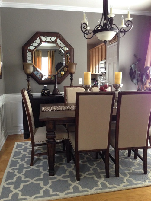
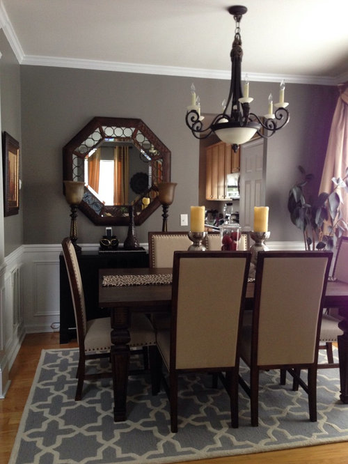
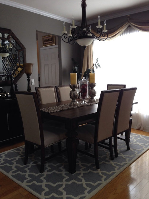
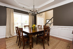
I need staging advice for my dining room. Is it too much? Not working all together?
Thank you!

Comments (107)

  • 11 years ago

    most important it looks good to you, good work


  • 11 years ago

    I think that only item that sticks out and doesn't work with the room is the overhead light fixture - a nice simple drum shade fixture would be better - your eye has to "rest" and the current fixture is a little busy.

  • 11 years ago

    MH, if English is not your first language you might want to practice "tactful criticism" on your English speaking friends.


  • 11 years ago

    "I get the creeps when I see large, live plant stuff like that in a room designated for eating"

    now that is one of the oddest comments I have ever read on houzz! daybyday, just wondering....do you eat salads?

  • 11 years ago
    I think the tall objects on the sideboard & table are distracting, and one comment mentioned the window treatment is dated. Simpler is better.
  • 11 years ago
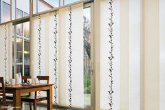
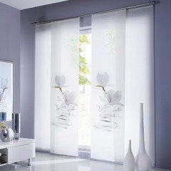
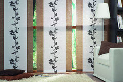
    I don't agree with some of the comments here. first I think you have great decorative ideas. I love the candles on the table and you should keep it just the way you had it including the glass. not a fan of the runner I like the idea and you should have a runner I would just choose brighter fabric. the only thing that I would change in here is the curtains. I am a fan the sliding panel curtains. not come in the US but with a little search you can find it. this are some examples but they you can find much better ones. I personally have all my curtains as sliding panels and love it. and every time I have guest at our house they love it too because it's different and looks clean and not to heavy.
  • 11 years ago

    Your place is beautiful ~~~ If i can suggest a few changes for staging purposes~~~~ (1). Remove the rug, the color is not working doing nothing~~ showcase those fabulous wood floors. (2). 4 Chairs will make the room appear more spacious. (3).2 candle holders on the table with greenery would balance the table better.

    Thanks for sharing!!!

  • 11 years ago

    I like your room and if it was my room I would change only remove the candle holders from the console below the mirror. Leave the candle holders and vase on the table. Change your runner, change the swag out and do two side panels. You need the sheers for some privacy. The chandelier as mentioned is definitely to large and heavy for the room. Otherwise I think the room looks great. Love the table, chairs and mirror.

  • 11 years ago

    I think the side board should be removed from the room for staging. It makes the room look small. I agree that 2 chairs should be removed.

  • 11 years ago

    the rug is too small and the color is wrong. I find the mirror and the light fixture heavy, remove the vases/candles? from the console and find a beautful sculptural bowl for the table.The swag needs to go

  • 11 years ago

    Are sheers really out in all styles of decorating? Shocking to me as I have seen them in many rooms on this site. Please enlighten me. As far as the room goes; I think you have a great starting point. Do you have an inspiration room or specific style you are going for? What do you like in the existing room and what do you not like? What can go and what has to stay?Maybe you would get better advice that suits you and your taste and not everyone else's.

  • 11 years ago

    Something tells me this is more conflicting advice than angelcreek bargained for. It's beginning to sound like Abbot & Costello's "who's on first" comedy routine!


  • 11 years ago
    I could not agree more! Everything in this room has been picked apart and it was a beautiful room to begin with. Your house should reflect your style and personality!
  • PRO
    11 years ago
    I'm assuming you are staging to sell...the room seems dark to me and buyers love bright, light-filled rooms. Your current draperies are dated so remove the sheers and valance. I'd do side panels with some brighter, modern fabric that will coordinate with the walls and area rug, maybe an ikat fabric print with blues & turquoise, navy. This will punch up the color palette. Remove the runner & candlesticks and either do fresh flowers with 3 cylindrical clear vases or greenery like ferns, hostas for a fresh look. I'd remove the potted floor plant and restyle the buffet.
  • 11 years ago
    I think it's beautiful just like it is!
  • PRO
    11 years ago

    Here is the issue as I see it. Opinions are just that - opinions. As I see where the information and advice comes from - this is about personal taste., and thats where most of people who put in their opinions are coming from - your personal taste, response. What is missing here - is what works and doesn't work from a design perspective. This started as a homestaging inquiry - so from a professional point - the answers made sense. But if this is not the correct question - then the information coming forward is from personal likes and dislikes and lakes what the information to give professional design answers - where does the light come from, what is the light source from - north, south, west, east - besides the obvious - how often is the room used, etc. etc etc. Most of theses questions are never addressed on this site. There is no one answer, nor is there one solution. But one person's success, is not another's answer.

  • 11 years ago
    I think your room is beautiful and with a few minor changes would be even more so. There have been a lot of suggestions made, go with your "gut" and try the ones you like the best, you have to live with the finished results. Sometimes when you make changes, it takes a few days, maybe even a week of living with it before you can tell if you really like it. When I make changes to a room I find sometimes the next day, when I look at it with fresh eyes, it becomes clearer what I like and what I don't. I know you will end up with exactly what you want.
  • PRO
    11 years ago

    If you are staging to "Sell," I would remove all of the existing window treatments and replace with a pair of light colored panels. I would also suggest for them to be hung higher than the window-trim AND out past the window trim (this would make the windows look larger and let more light in.) I would keep all six chairs. When an MLS viewer sees six chairs, they know that the table, and space, can fit six chairs. I would remove the floor plant. I would then repeat your accent color--rug somewhere on the table and on your side piece. Good luck :)

  • 11 years ago

    If the owner of this dining room were to weigh in and solve the ongoing mystery of what she meant by "staging" the advice would hopefully be more pertinent .


  • 11 years ago
    last modified: 11 years ago

    She tried to explain on Thursday at 2:03. Since she doesn't seem to understand the distinction we make between staging and makeover or redesign, we translated her comment to mean she isn't selling.

  • 11 years ago

    First of all, I want to say thank you for all the comments,suggestions,and opinions good and bad. I posted here in this site to seek advice about my dining room. I think i did not used the exact word to describe for my question about staging. What I meant was I need advice or opinions to redesign my dining room existing decor. I am not planning to sell the house and I should've mention that since I used the word stage.

    The dining room is a combo with my formal living room which I'm having a hard time to process what to do with two adjoining areas. I've been swapping the sizes for rugs since the room is too small in the dining area . I ordered bigger than this size in the picture ,but way too big either. It covers the entire vent on the floor. I'm still debating about the color of this rug also because it's kinda bluish instead of a silver color that i'm trying to achieve with the existing restoration hardware slate wall color. As the mirror and the chandelier, I am planning to keep ,but the rest of the decor like the lamps on the buffet and stuff on the table are just for now and i'm willing to let go. I have learned that sheer is so dated which houzzers mentioned here and so is the swag. My plants does look sick for the winter season and definitely not belong there. What I'm trying to achieve here is to transform my dining room to casual transitional style ,but i think I'm way far than that. I am just trying to incorporate everything I have right now.

    Once again thank you so much houzzers!

  • 11 years ago

    @Angelcreek11, Read all comments then do whatever makes you happy.

  • 11 years ago
    last modified: 11 years ago

    I'm sure it will turn out well! Sorry we're so picky about some words. It really does change the kind of advice we give, so hope you have been able to glean from the tips exactly what you needed.

  • PRO
    11 years ago

    I like everything in this room! maybe just not in this room... i actually like the silver candle sticks and the glass urn. I would try shades on the fixture. might work might not. The only thing i would truly change are the curtains and the mirror.


  • 11 years ago

    I love your room. If you are not trying to sell it leave your personality in the room. I wouldn't change anything! It is gorgeous!!!!


  • PRO
    11 years ago
    EBK...Keywords- Scale, Proportion & Balance...With that said...Based on photos & without a floor plan....It seems you can reposition light fixture using a decorative hook & swag fixture away from server to open up space for more clearance (note: clear server of all objects & replace with a seasonal bouquet of flowers to soften)....Replace mirror with a traditional, vertically gilded mirror &/lighter weight frame... Remove host/hostess chairs & caddy corner to window wall or use leaf for 6 side chairs...Replace treatment with stationary panels & 3" brass pole w/decorative finials...Open sheers to expose window...Add Venetian or Traditional blinds for privacy...Change area rug for contrast such as red background picking up color of walls...later you may want to consider wallpaper to right & left wall facing window to lighten space...Hope this helps....
  • 11 years ago

    I love the centerpiece but it's large and with the table and six chairs it tends to dwarf the size of the table. If the table is to be used only for 2-3 people that's great, (maybe remove a couple of chairs?) any more and you might want to consider something smaller. The window swag, as has been mentioned before...well, I don't know if it's that dated or not, but I wonder if another look might pull together with the personality of the room better? Something heavy and solid as opposed to filmy? You've done a great job and while I don't think beige and gray usually go well together you've absolutely mastered it here. It looks great together!

  • PRO
    11 years ago
    last modified: 11 years ago

    When houzzers ask for design help, it is because they know the room is out of balance but don't really know how to fix it. Here are my thoughts: Remove the rug entirely. The room is too small to ever have a rug big enough to properly fit the table and chairs. Remove the plant. Remove the existing draperies, but leave the sheers (or replace them with more contemporary fabric sheers) but raise the curtain rod so they do not puddle (as was mentioned in prior suggestions). Take the chairs on the end of the table and place them on either side of the window. The mirror and the doorway are conflicting one another (and I also thought the doorway was a mirror when I first looked at the picture). Take the mirror and put it in another area of your house. Place a mid-sized lamp on the sideboard, and don't forget to turn it on. Please think about replacing the chandelier with a much "lighter looking" chandelier. As far as the candlesticks are concerned, take them out of the equation. Your existing table runner will now look at home on your table. But you might consider placing things long-and-low down the center of the entire table. Basically, the only investment you need to make is for a new chandelier. I'm thinking you can "shop your home" to find the other elements that you need.

  • 11 years ago

    Remove everything from the room but the furniture leaving only 4 of the 6 chairs as it will lighten the look unless you are redecorating for yourself and need 6 chairs often. Remove swag and sheers. Add items back one at a time. Step back and observe effect from every angle in the room. Symmetry is great but in a small space two of each accent isn't necessary. Table top only needs one item in the middle, no runner.

  • 11 years ago

    I agree with many about too many large, heavy objects which make your room appear smaller than it is. The mirror is lovely but needs to move to another wall in your dining room, entry way or over a fireplace mantel. To help with the privacy issue, I have a nubby fabric shade on a large window which provides privacy yet you can still see out & also get some light in the room. Place some simple fabric curtains on each side of that so your room isn't overwhelmed with curtains. I agree that the plant needs to find another home for it--perhaps outside on a patio. Then place a dining chair on each side of the window. You are smart to decide to stage your room & bring it up to date as well as to a place where you can truly enjoy its beauty.

  • 11 years ago

    It's interesting how many people object to the size of the chandelier. I have seen so many decorator designed houses featured in houzz that have what I consider enormous light fixtures, particularly over the bed! Taking into consideration that angelcreek's taste obviously leans toward a heavier style, to my eye if the room were simplified the light fixture could work. After all there is expense involved. Putting 2 chairs by the windows as suggested may really help....if there is enough space. I think a rug is fine, but a larger one to accommodate the chairs.

  • PRO
    11 years ago

    Want lighter and brighter? Did anyone suggest to remove the console table (under the mirror)? By doing so the "white" wainscoting will be more prevalent AND the room will feel larger and lighter. Personally, I do not like when dining room chairs are pulled away from the table. It gives the impression that the room is too small to hold the table and chairs, not a very desirable impression. I would place my decorating dollars on beautiful artwork and a centerpiece for the table. p.s. If you "find a style that will make you smile" your room is a success!!!

  • 11 years ago
    I love the way it is.
  • 11 years ago

    Let me say I think you have a beautiful eye for design, but like all of us, sometimes need a little help pulling it all together ;-)

    I noticed, reflected in the mirror, you have window panels in what I assume is the adjacent living room....what if you put the same in the dining room to tie the two together.....or I think putting white shutters might be nice alternative too....it would brighten things up, tie in the trim color, and still add the privacy you need. Also I think adding a little sparkle or shine, like polished silver &/or crystal, would help make things look a little lighter and brighter....I was going to say in the mirror or chandelier, but I noticed you want to keep those, so maybe changing out some of the accessories. Would love to see pic's once you get things the way you like them ;-)

  • 11 years ago
    The latest revision looks terrific! I love the mirror. Great job on editing!
  • 11 years ago
    I would just change the chandelier. The curves don't work with all the angles. Something simpler.
  • 11 years ago
    I like the beige and grey! But I think I would go a bit warmer with the area rug....beige or maybe a cinnamon or even a relaxed purple...there are a lot of options. Four chairs (2 on one side and 2 on the opposite) will ground the setting ( I hope that makes sense), but two extras maybe set into corners for additional guests are always a plus. I think you did a lovely job!
  • 11 years ago
    Sorry I thought I was on the houzz web site!
  • 11 years ago

    Someone mention the color of your walls. Leaving like is ok, If your were to consider a change of color, I would suggest a lighter color of maybe in the grey family, they say that grey are really in, not dark but light and soft, If you went in that direction, maybe get some samples of the ones in the gray family and maybe the blue, not real blue a hit of blue to test it out in the room to see how it looks in the am and pm, just a suggestion, I struggle with colors myself

    Cat


  • 11 years ago

    I like the suggestions above. I had a similar color scheme in my last house, so I'm posting this pic to see if it helps. You can definitely have gray and beige without it getting too dark. Keep in mind that this is more bare than I have my room currently, but we had it staged to sell and didn't want to spend extra $$, so there isn't any art work up on the walls, etc. There is a sideboard with round silver mirror on wall you can't see. You have to incorporate some of your own personality.


  • 11 years ago

    I think it looks really nice.

  • 11 years ago
    I think the way you had it the first time was better. Less is not always better.
  • 10 years ago

    I think you can add something to the center of the dining table but keep it simple and low lying. Also, I feel that there is also a lot going on with the mirror, which I like, but those two candlesticks are too much next to it. Consider a simpler set of candlesticks.

  • 10 years ago

    Also remove whatever is on the table in the center underneath the mirror. Consider placing a few books and a candle on top or something else. Too much stuff going on over there. You have a busy chandelier, busy carpet, dark furniture, lighten up the space now with what you put on that table. Stay away from heavy looking, dark objects. Beautiful room overall, though!

  • 9 years ago

    You are a very brave woman.

  • 8 years ago

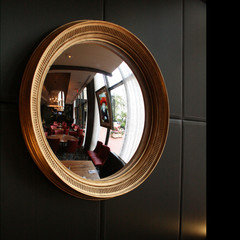
    Not sure I care for the mirror. Something like this would compliment the colour theme but bring some relief from an overwhelmingly brown ambiance. Don't get me wrong. I like your colours, I just feel like your mirror ir not right. Maybe Gold Leaf it. The candle sticks on the table are too heavy. Just an opinion. The mirror is from www.reflectingdesign.com


  • 8 years ago
    Clear off the table top and the cabinet top. The runner doesn’t seem long enough: it should hang about a foot over each end.
  • 8 years ago
    Mirror and light together are too many curlicues.