Software
Houzz Logo Print
lyndao

Whats Wrong With This Picture, Part II

11 years ago
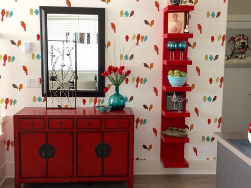
I hope your answer 'nothing'.

Thank you everyone for all responses to my original question. We bought 7 mirrors and returned 6 but I think we got it right.

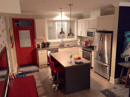
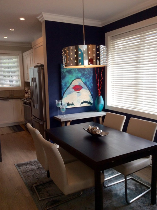
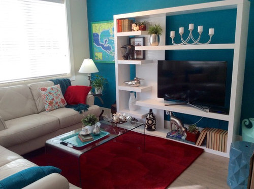
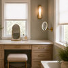
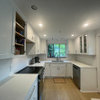
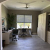
I attached a few pics of the mostly finished main floor of our townhouse.

Thank you

Comments (28)

  • 11 years ago
    Beautiful
  • 11 years ago

    you are very talented!


  • 11 years ago

    Wow! This is stunning. Nice job!

  • PRO
    11 years ago
    Oh, I love it! Great job!!!
  • 11 years ago

    Looks great!! Did you wallpaper the box?

  • 11 years ago
    Love the colors. What a unique space!
  • 11 years ago

    love it!

  • 11 years ago
    Love it, where is the wallpaper from?
  • 11 years ago
    Love it! Want to come to my place & redo mine
  • 11 years ago
    last modified: 11 years ago

    What's wrong? Not much, but the rug under the dining table is too small. It should be 4' wider and longer than the table top without running into walls or furniture on the walls. I don't think you can fit a rug into that area. For some fabric softness there, add a runner in the turquoise of the painting. I think someone on the earlier post mentioned putting the wallpaper on the bumpout up top and I do think that will help. You should keep these pix with the original post for the benefit of the Houzzers who helped out on your dilemma.

  • 11 years ago

    I just saw your red first photo. I'd say you need to move the mirror to line up with the right edge of the chest, which will help bring the wall shelf into a single unit with the chest. Take the vase of red flowers and move it left of the mirror. Edit the items on the shelf unit, and take the bowl of green apples off there and place it somewhere low like in front of the mirror, removing a couple of the apples--or better yet, get a low wide bowl and keep all the apples. Hang the muscleman photo left of the mirror or lean it against the vase of red flowers on top of the chest. Move something heavy and low to the bottom shelf of the shelf unit, and if you have a very large stemware item (I'm thinking $1 margarita night 5 drink glass) and put it all by itself on the shelf where the apples were.

    I think that should visually balance things that you already have in the photo. Except for the large margarita glass. Something clear and shiny like glass could give the eyes a rest. You have lots of vibrant color already.


  • 11 years ago
    Perfect.
  • 11 years ago
    last modified: 11 years ago

    So much better! Very nice!

  • 11 years ago
    I ordered the wallpaper from www.totalwallcovering.com, book Bistro 750, Birds
  • 11 years ago
    Moccasin
    I feel if I move the mirror to the right it puts all the weight on one side. The 'Muscle Man' photo is actually Anthony Bordain's Les Halles cook book. Since the wall shelf is directly (3') behind the eating area I thought it ok to include a few cook books and the bowl of apples. I do have a heavier object for the bottom shelf but haven't found it yet. I took out a couple of the apples and dropped the bowl down a shelf. Thank you for your suggestions.
  • 11 years ago

    HI -- It's very young and fun looking ... good job ! Yes , the rug should be twice the size of the table top .

  • 11 years ago
    I had a problem with the rug for the dining room. First the dining room area is very small, but the floor space just outside of it is large (relatively) . I wasn't going to use a rug but it looked to bare so Even though it is too small it added some warmth to a bare area. Compromise.
  • 11 years ago

    The colors in your home are stunning! Love what you've done to the place..... :-)

  • 11 years ago
    Oh My God ! I want to live there !
  • 11 years ago

    I love, love, love the bird wallpaper! Different and cute!

  • 11 years ago

    Hi, LyndaO, I appreciate your kind response to my comments. It is obvious that you enjoy color and design as well. I agree that the mirror moved to the right would weight the wall on the right hand side--unless you used something taller with substance (a lamp or a heavy candlestick or the vase of flowers in that spot would work I think) on the left hand side. I was thinking to make the objects on this wall read as a single "set". They share the lovely bird wallpaper, the geometric squared up/lined up structures. It has an oriental sort of look about it. I feel that moving the mirror would provide one more oriental style feature to the setup. It wouldn't hurt to temporarily TRY the mirror on the chest and move the vase or try a candlestick to the left, huh? I notice all the wiring wall plates you must deal with. Even try moving the chest itself a few inches away from them, to the right?

    Could you give us a photo update with the bowl of apples in place? Do you notice a better balance? I like Anthony Bourdain and sure did not recognize him in the picture (he does look so good, doesn't he?) but that is due to HOUZZ's poor photo quality for the forums and not your camera.
    However, I think the wall unit is not the right size for standing cookbook display. For books to look okay there, they would be laid flat with the covers on and the spine readable. If anything shares a shelf with those books, it could be a paperweight or some heavy thingy.
    Actually what would be really great in that nice shiny wall unit besides your cookbooks flat on the bottom shelf, would be bird figurines. That would tie in with your bird wallpaper. You might think about it casually, and should the opportunity to acquire a bird figurine arise, place it there. Obviously you like birds, to choose them from all the wallpaper subjects available. So try a bird sitting on your shelves. Give the birds some nice nestboxes on the shelves! Emphasize things you enjoy. You'll be decorating with your personal favorites then.

  • 11 years ago

    Beautiful job. looks 100% better. Congratulations

  • 11 years ago

    I like the look and the colors. A few too many "things" sitting around for my taste.

  • 11 years ago
    Moccasin

    Funny you should mention that i must love birds. I'm actually quite afraid of birds and terrified of crows but I liked all the colours in the wallpaper and the modern style of the birds

    When I was about 6 standing at a bus stop with my Mom and sister a crow landed right on my head. Luckily I was wearing a jacket with a hood so it didn't hurt too much but I have been ridiculously afraid of birds flying close to me ever since. You know what a group of crows is called: A Murder of Crows. sorry to get of topic.

    I have a large ceramic chubby blue chicken with a red beak for the bottom shelf that is still in an unpacked box in the garage.

    Thanks for all your suggestions, its been fun.
  • 11 years ago

    What a happy space to call home. Enjoy it!!!

  • 11 years ago

    Ah! great to hear the back story, as it were. Love the chubby blue chicken {:>}=


  • 9 years ago

    I love the cheerful, bold colors! I also love the bird-print wallpaper! It would be nice if you have any of the wallpaper left so that you could cut some pieces that you could frame and use as wall art in the rooms where you have plain walls. This also will help tie the decorating/color scheme together a bit more.